


 本文介绍了Flutter中的几个重要UI组件:Offstage用于在视觉上隐藏子组件且不占用空间;OverflowBar用于处理水平空间不足时的布局排列;OverflowBox允许子组件溢出父组件的约束;Overlay提供悬浮组件展示功能;PageStorage和PageStorageBucket用于跨页面保存状态;以及PaginatedDataTable用于数据分页展示。每个组件的关键属性和用法都进行了详细说明。
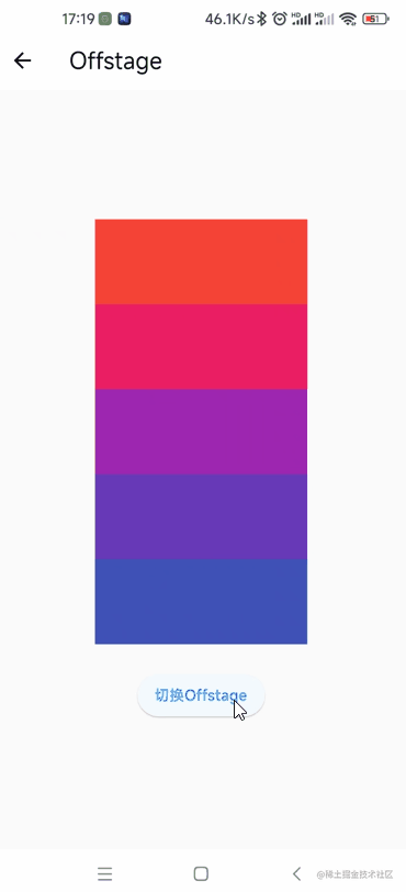
Offstage
创建一个在视觉上隐藏其子项的小部件。隐藏后不占空间。
该组件有以下几个属性:
Key? key:标识键bool offstage = true:是否隐藏。默认为trueWidget? child:子组件
Center(child: Column(mainAxisAlignment: MainAxisAlignment.center,children: [...List.generate(5,(index) => Offstage(offstage: index == 2 ? _flag : false,child: Container(width: 200,height: 80,color: Colors.primaries[index % Colors.primaries.length],),),).toList(),const SizedBox(height: 24),ElevatedButton(onPressed: () {_flag = !_flag;setState(() {});},child: const Text("切换Offstage"),),],),
)
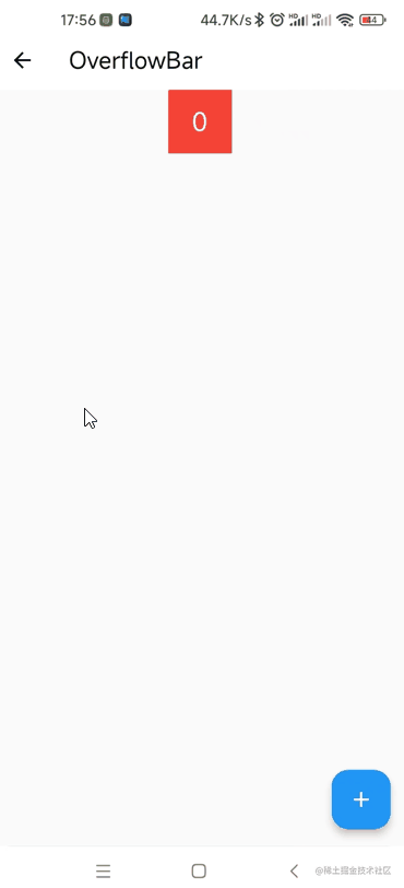
OverflowBar
一个小部件,它的子部件排成一行,除非它们“溢出”了可用的水平空间,在这种情况下,它将它们排成一列。
该组件有以下几个属性:
Key? key:标志键double spacing:水平排列时子组件的间距MainAxisAlignment? alignment:水平排列时的对齐方式double overflowSpacing:垂直排列时组件的间距OverflowBarAlignment overflowAlignment:垂直排列时的对齐方式。默认为OverflowBarAlignment.startVerticalDirection overflowDirection = VerticalDirection.down:盒子垂直流动的方向TextDirection? textDirection:文本流动的方向Clip clipBehavior = Clip.none:内容将根据此选项被剪裁(或不剪裁)List<Widget> children:子组件
OverflowBar(spacing: 10,alignment: MainAxisAlignment.center,overflowSpacing: 10,overflowAlignment: OverflowBarAlignment.start,overflowDirection: VerticalDirection.down,textDirection: TextDirection.ltr,clipBehavior: Clip.none,children: List.generate(_count,(index) => Container(width: 60,height: 60,color: Colors.primaries[index % Colors.primaries.length],alignment: Alignment.center,child: Text(index.toString(),style: const TextStyle(fontSize: 24, color: Colors.white),),),).toList(),
)
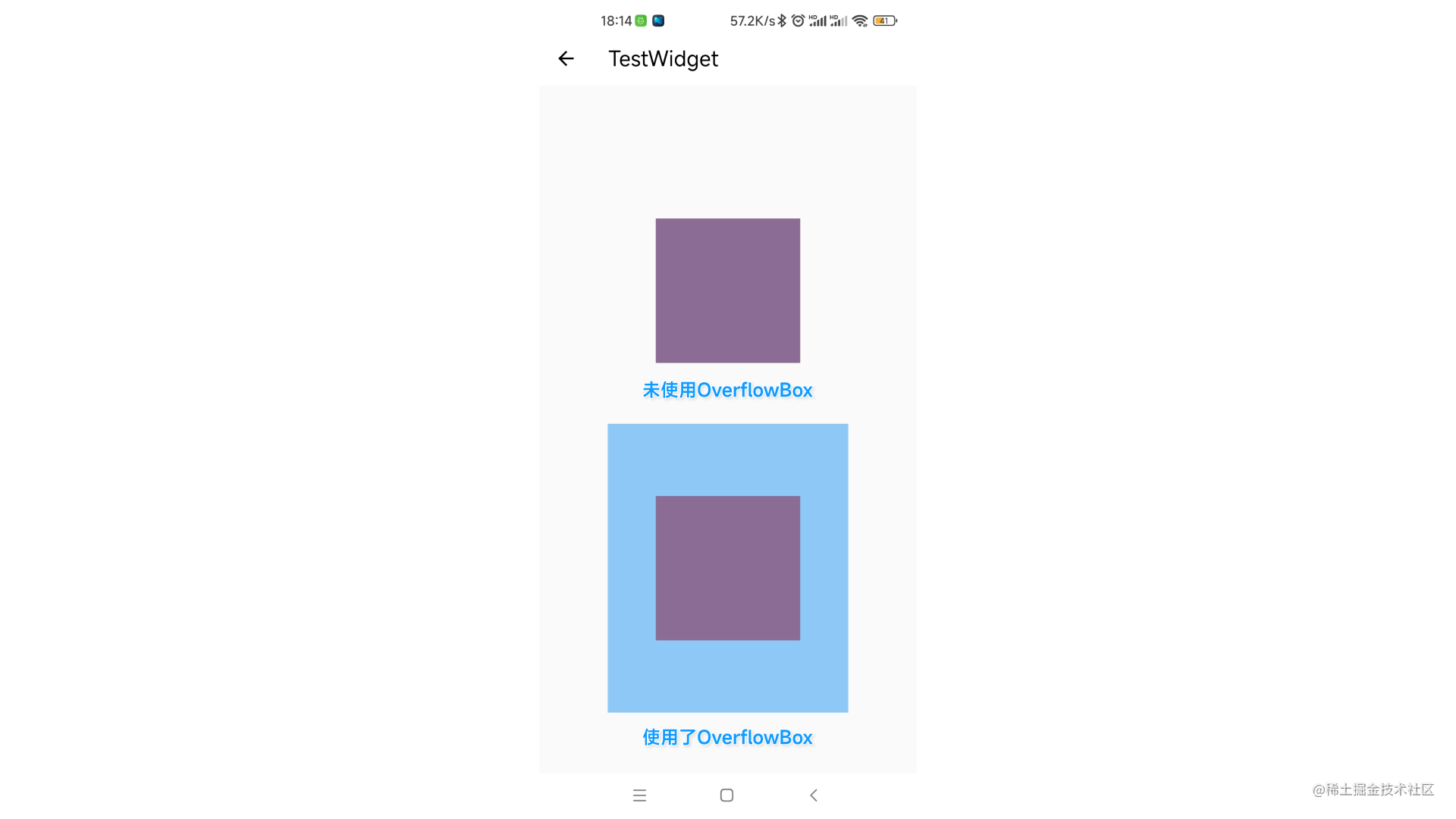
OverflowBox
对子组件施加的约束与从父组件获得的约束不同,可能会允许子组件溢出父组件。
该组件有以下几个属性:
Key? key:标识键AlignmentGeometry alignment:子组件对齐方式。默认为Alignment.centerdouble? minWidth:最小宽double? maxWidth:最大宽double? minHeight:最小高double? maxHeight:最大高Widget? child:子组件
Center(child: Column(mainAxisAlignment: MainAxisAlignment.spaceEvenly,children: [Container(height: 150,width: 150,color: Colors.red,child: Container(height: 250,width: 250,color: Colors.blue.withOpacity(.5),),),Container(height: 150,width: 150,color: Colors.red,child: OverflowBox(minWidth: 50,minHeight: 50,maxWidth: 300,maxHeight: 300,child: Container(height: 350, // 无效,最终为300width: 250,color: Colors.blue.withOpacity(.5),),),),],),
)
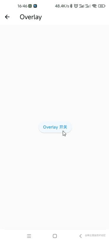
Overlay 和 OverlayEntry
在所有页面顶部悬浮一个组件。
使用OverlayEntry来创建要显示的组件:
final _entry = OverlayEntry(builder: (context) {return Positioned(bottom: 100,right: 20,child: Image.asset("assets/images/st.png", width: 80),);},
);
创建一个显示或隐藏的方法:
showOverlay() {final overlay = Overlay.of(context);if (_flag) {_entry.remove();} else {overlay?.insert(_entry);}_flag = !_flag;setState(() {});
}
在页面中调用方法:
body: Center(child: ElevatedButton(onPressed: showOverlay,child: const Text("Overlay 开关"),),
)
PageStorage 和 PageStorageBucket
用来保存页面状态。
PageStorage有以下几个属性:
Key? key:标识键PageStorageBucket bucket:PageStorageBucket对象Widget child:子组件
创建一个PageStorageBucket对象:
final PageStorageBucket _bucket = PageStorageBucket();
创建一个组件用来显示在不同的页面:
class ColorPage extends StatelessWidget {const ColorPage({Key? key}) : super(key: key);@overrideWidget build(BuildContext context) {return ListView.builder(itemExtent: 200,itemBuilder: (context, index) {return Container(color: Colors.primaries[index % Colors.primaries.length],alignment: Alignment.center,child: Text("$index",style: const TextStyle(fontSize: 24, color: Colors.white),),);},);}
}
创建主页面:
Scaffold(appBar: AppBar(title: const Text('PageStorage')),body: PageStorage(bucket: _bucket,child: const [ColorPage(key: PageStorageKey("one")),ColorPage()][_index],),bottomNavigationBar: BottomNavigationBar(currentIndex: _index,onTap: (int index) {_index = index;setState(() {});},showSelectedLabels: false,showUnselectedLabels: false,items: const <BottomNavigationBarItem>[BottomNavigationBarItem(icon: Icon(Icons.home), label: ''),BottomNavigationBarItem(icon: Icon(Icons.person), label: ''),],),
);
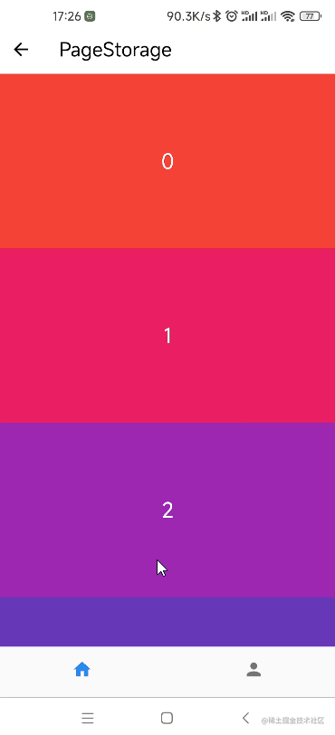
可以发现,只有设置了PageStorageKey的才能保存界面状态。
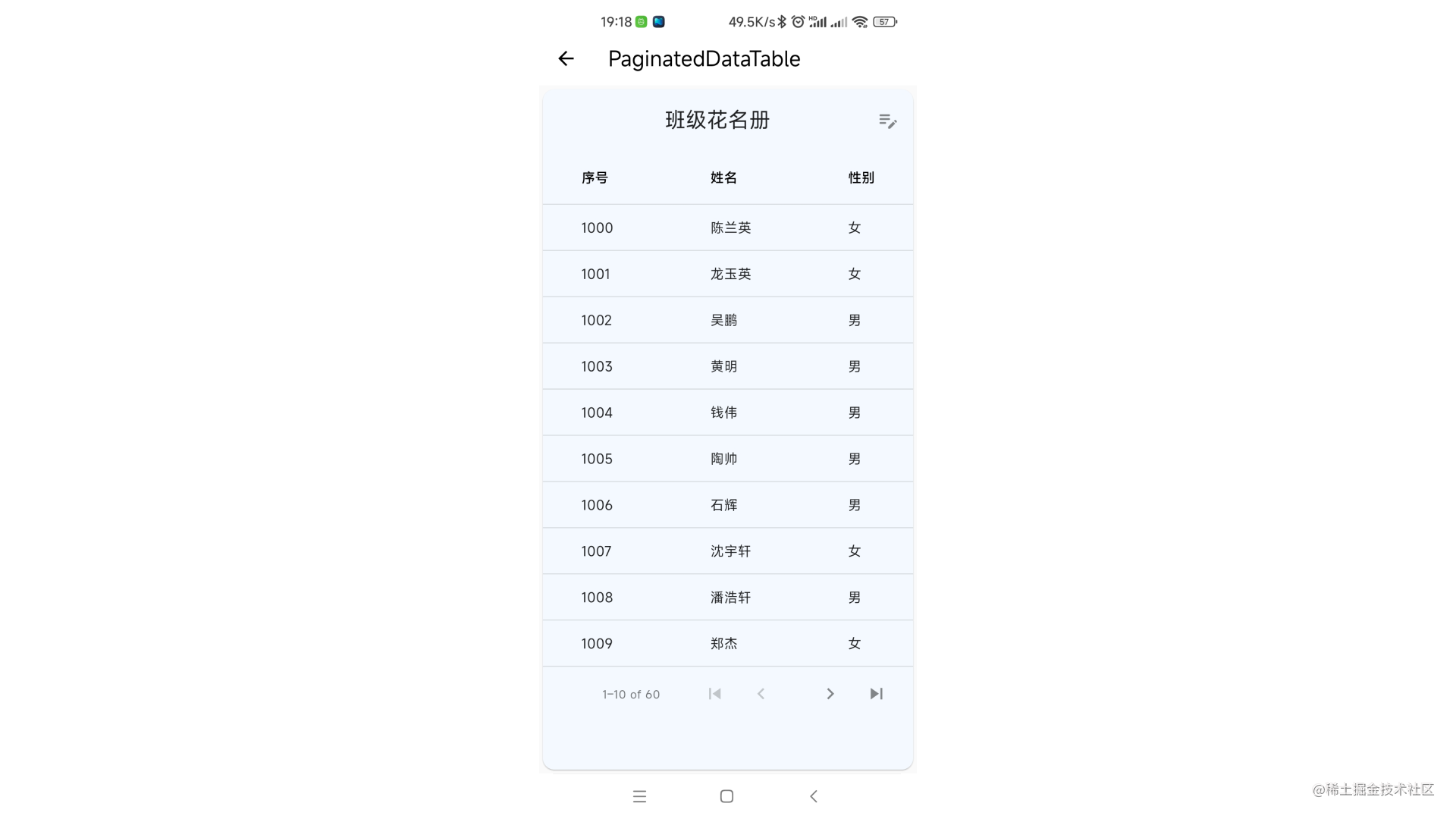
PaginatedDataTable
数据分页表格。
该组件有以下几个属性:
Key? key:标识键Widget? header:表格顶部的组件List<Widget>? actions:header最右边的组件List<DataColumn> columns:DataColumn对象,表头int? sortColumnIndex:当前主排序键的列bool sortAscending:是否按升序排序。默认为truevoid Function(bool?)? onSelectAll:当用户使用标题行中的复选框选择或取消选择每一行时调用double dataRowHeight:数据行高。默认为kMinInteractiveDimension(48.0)double headingRowHeight:表头行高。默认为56.0double horizontalMargin:表格边缘与每行第一个和最后一个单元格中的内容之间的水平边距。默认24.0double columnSpacing:每个数据列内容之间的水平边距。默认为56.0bool showCheckboxColumn:是否显示可选行的复选框。默认为truebool showFirstLastButtons:标记以显示分页按钮以转到第一页和最后一页。默认为falseint? initialFirstRowIndex:首次创建小部件时显示的第一行的索引。默认为0void Function(int)? onPageChanged:数据页面改变时调用int rowsPerPage = defaultRowsPerPage:每页显示的行数。默认为10List availableRowsPerPage = const [defaultRowsPerPage, defaultRowsPerPage * 2, defaultRowsPerPage * 5, defaultRowsPerPage * 10]:为rowsPerPage提供的选项void Function(int?)? onRowsPerPageChanged:当用户每页选择不同数量的行时调用DragStartBehavior dragStartBehavior:确定处理拖动开始行为的方式。默认为DragStartBehavior.startColor? arrowHeadColor:翻页箭头的颜色DataTableSource source:DataTableSource对象double? checkboxHorizontalMargin:复选框周围的水平边距
创建一个继承自DataTableSource的类
class MyData extends DataTableSource {final List<Map<String, dynamic>> _data = List.generate(60,(index) => {"id": index + 1000,"name": Username.cn().fullname,"sex": Random().nextInt(10).isEven ? "男" : "女"},);@overrideDataRow? getRow(int index) {return DataRow(cells: [DataCell(Text(_data[index]["id"].toString())),DataCell(Text(_data[index]["name"].toString())),DataCell(Text(_data[index]["sex"].toString())),],);}@override// TODO: implement isRowCountApproximatebool get isRowCountApproximate => false;@override// TODO: implement rowCountint get rowCount => _data.length;@override// TODO: implement selectedRowCountint get selectedRowCount => 0;
}
在页面中使用PaginatedDataTable:
PaginatedDataTable(header: const Center(child: Text("班级花名册")),actions: const [Icon(Icons.edit_note_rounded)],columns: const [DataColumn(label: Text("序号")),DataColumn(label: Text("姓名")),DataColumn(label: Text("性别")),],sortColumnIndex: 0,sortAscending: true,onSelectAll: (flag) {},dataRowHeight: kMinInteractiveDimension,headingRowHeight: 56,horizontalMargin: 40,columnSpacing: 100,showCheckboxColumn: true,showFirstLastButtons: true,initialFirstRowIndex: 0,onPageChanged: (value) {},rowsPerPage: 10,// onRowsPerPageChanged: (value) {},dragStartBehavior: DragStartBehavior.start,// arrowHeadColor: Colors.blue,source: MyData(),checkboxHorizontalMargin: 20,
)
关于行和列数据操作的方法请参考DataTable组件,具体的想过教程请自行搜索。
最后
为大家准备了一个前端资料包。包含54本,2.57G的前端相关电子书,《前端面试宝典(附答案和解析)》,难点、重点知识视频教程(全套)。


有需要的小伙伴,可以点击下方卡片领取,无偿分享


 扫一扫
扫一扫


 647
647

 被折叠的 条评论
为什么被折叠?
被折叠的 条评论
为什么被折叠?
 到【灌水乐园】发言


