


文章目录
12. 盒子模型
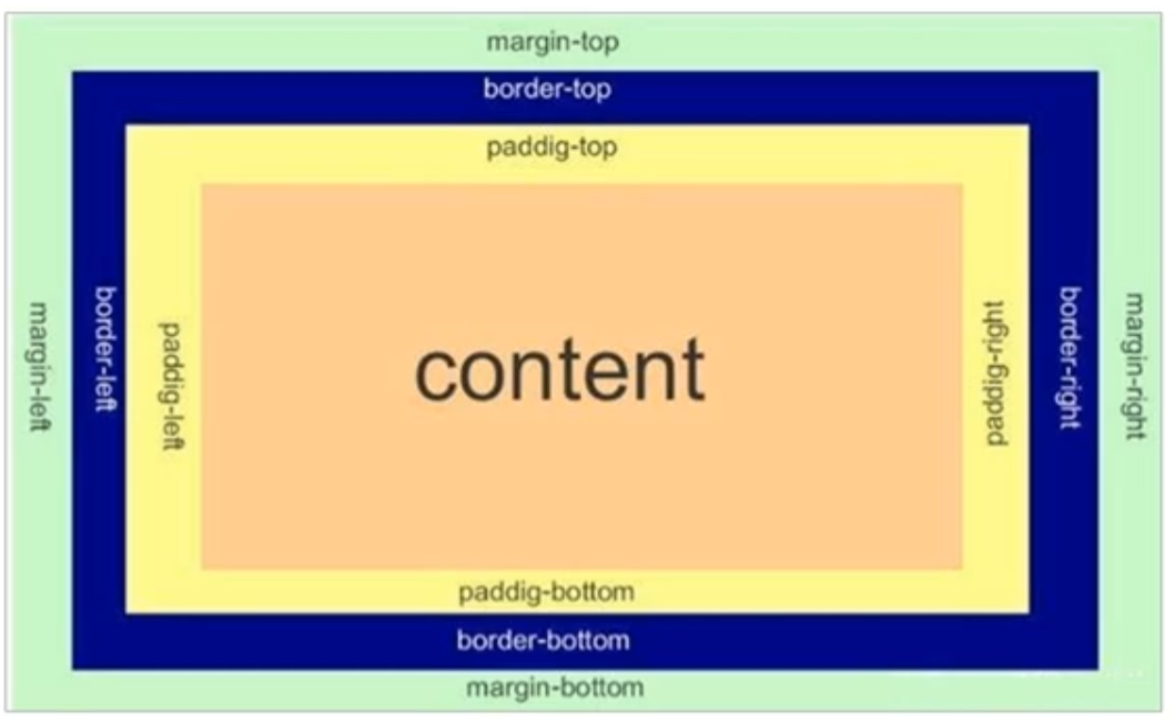
12.1 盒子模型的组成
**盒子模型:**本质是一个盒子,用来装内容
组成:边框,外边距,内边距和内容
-
content:内容
-
padding:内边距(内容与盒子之间的距离)
-
border:边框
-
margin:外边距(盒子之间距离)
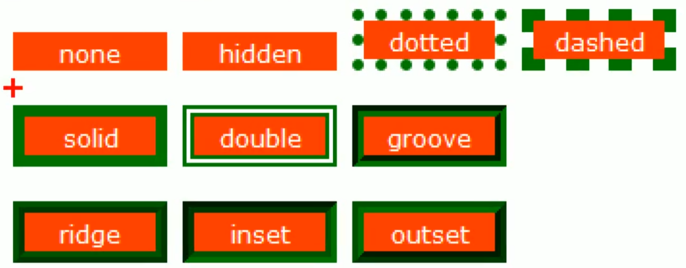
12.2 盒子边框 border:1px solid red;
border:边框粗细、边框样式、边框颜色
盒子边框的属性:
-
border-width:边框粗细,单位px
-
border-style:边框样式(常用的:solid实线边框,dashed虚线边框,dotted点线边框)
-
border-color:边框颜色
<!DOCTYPE html>
<html lang="en">

<head>
    <meta charset="UTF-8">
    <meta http-equiv="X-UA-Compatible" content="IE=edge">
    <meta name="viewport" content="width=device-width, initial-scale=1.0">
    <title>Document</title>
    <link rel="stylesheet" href="style.css">
    <style>
        div
        {
            width: 300px;
            height: 300px;
            border-width: 3px;
            border-style: solid;
            border-color: pink;
        }
    </style>
</head>

<body>
    <div>边框</div>
</body>

</html>
边框样式简写:
border:1px solid red; 没有顺序要求
也可以给边框的某个边单独设置样式:
如:border-top:给上边框单独指定样式。
border: 1px solid blue;   左右边框按border来
border-top: 1px solid red;    层叠性:把上边框覆盖了
border-bottom: 2px solid red;
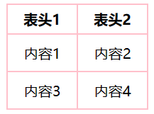
12.3 表格边框 border-collapse: collapse;
表格本身就是一个大的盒子,也可以通过盒子边框设置表格边框
border-collapse: collapse; 合并相邻的边框,使边框重叠,而不是累加变粗!!!
<!DOCTYPE html>
<html lang="en">

<head>
    <meta charset="UTF-8">
    <meta http-equiv="X-UA-Compatible" content="IE=edge">
    <meta name="viewport" content="width=device-width, initial-scale=1.0">
    <title>Document</title>
    <link rel="stylesheet" href="style.css">
    <style>
        table{
            width:160px;
            height:120px;
        }
        th{
            height:30px;
        }
        table,
        th,      并集选择器:<table>,<th>和<td>样式都会发生变化
        td {
            border: 2px solid pink;   表格边框样式更改
            text-align: center;   表格内部文字居中
            border-collapse: collapse;
        }
    </style>
</head>

<body>
    <table>
    <thead>
        <tr>
            <th>表头1</th>
            <th>表头2</th>
        </tr>
    </thead>
    <tbody>
        <tr>
            <td>内容1</td>
            <td>内容2</td>
        </tr>
        <tr>
            <td>内容3</td>
            <td>内容4</td>
        </tr>
    </tbody>
    </table>
</body>

</html>
效果:
12.4 盒子边框会使实际盒子变大
<!DOCTYPE html>
<html lang="en">
<head>
    <meta charset="UTF-8">
    <meta http-equiv="X-UA-Compatible" content="IE=edge">
    <meta name="viewport" content="width=device-width, initial-scale=1.0">
    <title>Document</title>
    <style>
        div{
            width: 200px;
            height: 200px;
            border-width: 10px;
            background-color: rgb(2, 14, 10);
        }
    </style>
</head>
<body>
    <div>biankuang</div>
</body>
</html>
定义一个200X200像素的盒子后加了一个10px像素的边框,最后会显示一个220X220像素的盒子,所以要提前扣减!
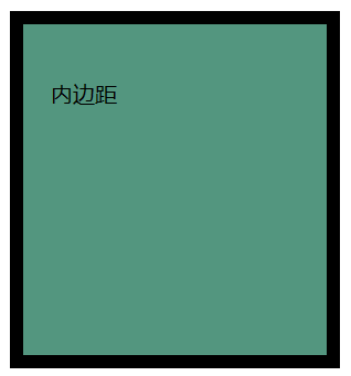
12.5 内边距 padding
控制内容在盒子内部的位置,通过内边距padding实现
- padding-left: 左内边距
- padding-right: 右内边距
- padding-top: 上内边距
- padding-bottom: 下内边距
<!DOCTYPE html>
<html lang="en">
<head>
    <meta charset="UTF-8">
    <meta http-equiv="X-UA-Compatible" content="IE=edge">
    <meta name="viewport" content="width=device-width, initial-scale=1.0">
    <title>Document</title>
    <style>
        div{
            width: 200px;
            height: 200px;
            border-width: 10px;
            border-style: solid;
            border-color: black;
            background-color: rgb(83, 150, 127);
            padding-left: 20px;   左边距
            padding-top: 40px;    上边距
        }
    </style>
</head>
<body>
    <div>内边距</div>
</body>
</html>
最后的实现效果:
padding 属性可以有一到四个值:
注意:边距与边框一样,也会使盒子变大!
同样的,原本盒子设计为200X200,内边距设置为上下左右都是10,那么最后盒子的尺寸就为:(200+10X2)X(200+10X2),所以要提前扣减(盒子设计为160X160)!
高度固定,宽度上怎么让盒子只根据文字变化?
<!DOCTYPE html>
<html lang="en">

<head>
    <meta charset="UTF-8">
    <meta http-equiv="X-UA-Compatible" content="IE=edge">
    <meta name="viewport" content="width=device-width, initial-scale=1.0">
    <title>新浪导航</title>
    <style>
        .nav {     定义长盒子的样式
            height: 41px;
            border-top: 3px solid #ff8500;
            border-bottom: 1px solid #edeef0;
            background-color: #fcfcfc;
            line-height: 41px;
        }
        .nav a {    定义小链接盒子的样式
            display: inline-block;  行内元素<a>转行内块元素,定义高度
            height: 41px;           链接的盒子高度
            padding: 0 20px;        定义上下内边距为0,左右内边距为20px
            font-size: 12px;
            color: #4c4c4c;
            text-decoration: none;
        }
        .nav a:hover{
            background-color: #eee;
            color:#ff8500;
        }
    </style>
</head>
<body>
    <div class="nav">
        <a href="#">新浪导航</a>
        <a href="#">手机新浪网</a>
        <a href="#">移动客户端</a>
        <a href="#">微博</a>
        <a href="#">三个字</a>
    </div>
</body>
</html>

特殊情况:下面两种情况padding不会加大盒子 !!!
情况一:盒子不指定宽度/高度 !
固定宽度/高度值,设置padding后那个值就会被撑大
情况二:子块级元素继承的父块元素的宽/高 !(盒子不直接指定宽度/高度 !)
<!DOCTYPE html>
<html lang="en">

<head>
    <meta charset="UTF-8">
    <meta http-equiv="X-UA-Compatible" content="IE=edge">
    <meta name="viewport" content="width=device-width, initial-scale=1.0">
    <title>Document</title>
    <style>
        div{
            width: 300px;
            height: 300px;
            background-color: aqua;
        }
        div p {
            /* width: 100%; */    自己定义了宽,盒子就会被撑大,最后超过100%
            background-color:brown;
            padding: 20px 20px;   此时高宽还是300px,不会撑大
        }
    </style>
</head>

<body>
    <div>
        <p>p继承与div盒子</p>
    </div>
</body>

</html>
12.6 外边距 margin
外边距(margin):控制盒子之间的距离
- margin-left:左外边距
- margin-right: 右外边距
- margin-top:上外边距
- margin-bottom:下外边距
控制其外边距时:
<!DOCTYPE html>
<html lang="en">

<head>
    <meta charset="UTF-8">
    <meta http-equiv="X-UA-Compatible" content="IE=edge">
    <meta name="viewport" content="width=device-width, initial-scale=1.0">
    <title>Document</title>
    <style>
        .one{
            width: 200px;
            height: 200px;
            background-color: aqua;
            margin-bottom: 20px;
        }
        .two{
            width: 200px;
            height: 200px;
            background-color: blueviolet;
            margin-top: 20px;   和上面 margin-bottom: 20px的最终效果一样
        }
    </style>
</head>

<body>
    <div class="one"></div>
    <div class="two"></div>
</body>

</html>
margin 属性可以有一到四个值:简写语法与padding一样
注意:
-
上面的块级元素向下margin 20,下面的块级元素向上margin了20,这两个20不会叠加为40!这两个块之间的距离就是为20
-
当蓝色的块向下margin20,紫色的块向上margin10,最后这两个块之间的距离还是20
12.7 盒子水平居中
12.7.1 块级元素 margin: 0 auto;
如果块级元素始终在页面的水平居中位置,需要满足两个条件:
-
块级元素的宽度必须设置
-
块级元素的左右margin设置为:
auto三种设置方式:
margin-left: auto;
margin-right: auto;
margin: auto;margin: 0 auto;
当自己需要设置上下外边距时:
margin:20px,auto;
12.7.2 行内元素/行内块元素 text-align:center
给 行内元素/行内块元素 的父级元素加上 text-align:center 实现 水平居中效果
<!DOCTYPE html>
<html lang="en">

<head>
    <meta charset="UTF-8">
    <meta http-equiv="X-UA-Compatible" content="IE=edge">
    <meta name="viewport" content="width=device-width, initial-scale=1.0">
    <title>Document</title>
    <style>
        .one{
            width: 600px;
            height: 50px;
            background-color: pink;
            margin-bottom: 10px;
            margin-left: auto;    div居中了,但span内文字没居中
            margin-right: auto;
            text-align: center;   行内元素<span>/行内块元素<img> 水平居中
        }
    </style>
</head>

<body>
    <div class="one">
        <span>这是一个行内元素</span>   给span的父级div加text-align:center实现文字水平居中
    </div>
</body>

</html>

12.8 解决嵌套块父元素塌陷 父级 overflow:hidden;
<!DOCTYPE html>
<html lang="en">

<head>
    <meta charset="UTF-8">
    <meta http-equiv="X-UA-Compatible" content="IE=edge">
    <meta name="viewport" content="width=device-width, initial-scale=1.0">
    <title>Document</title>
    <style>
        .father {
            width: 600px;
            height: 600px;
            background-color: aqua;
            margin-top: 50px;    给父级加上边距50px
        }
        .son{
            width: 300px;
            height: 300px;
            background-color: blue;
        }
    </style>
</head>

<body>
    <div class="father">
        <div class="son"></div>
    </div>

</body>

</html>
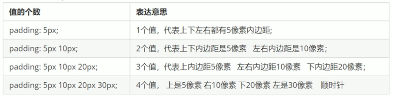
定义两个嵌套关系的块,给父级块的上外边距加50px,子级块也会上外边距加50px:
如果我们想要把子块和父块分开:
<!DOCTYPE html>
<html lang="en">

<head>
    <meta charset="UTF-8">
    <meta http-equiv="X-UA-Compatible" content="IE=edge">
    <meta name="viewport" content="width=device-width, initial-scale=1.0">
    <title>Document</title>
    <style>
        .father {
            width: 600px;
            height: 600px;
            background-color: aqua;
            margin-top: 50px;  让父块下移50px
        }
        .son{
            width: 300px;
            height: 300px;
            background-color: blue;
            margin-top: 150px;  让子块下移更多
        }
    </style>
</head>

<body>
    <div class="father">
        <div class="son"></div>
    </div>
</body>

</html>
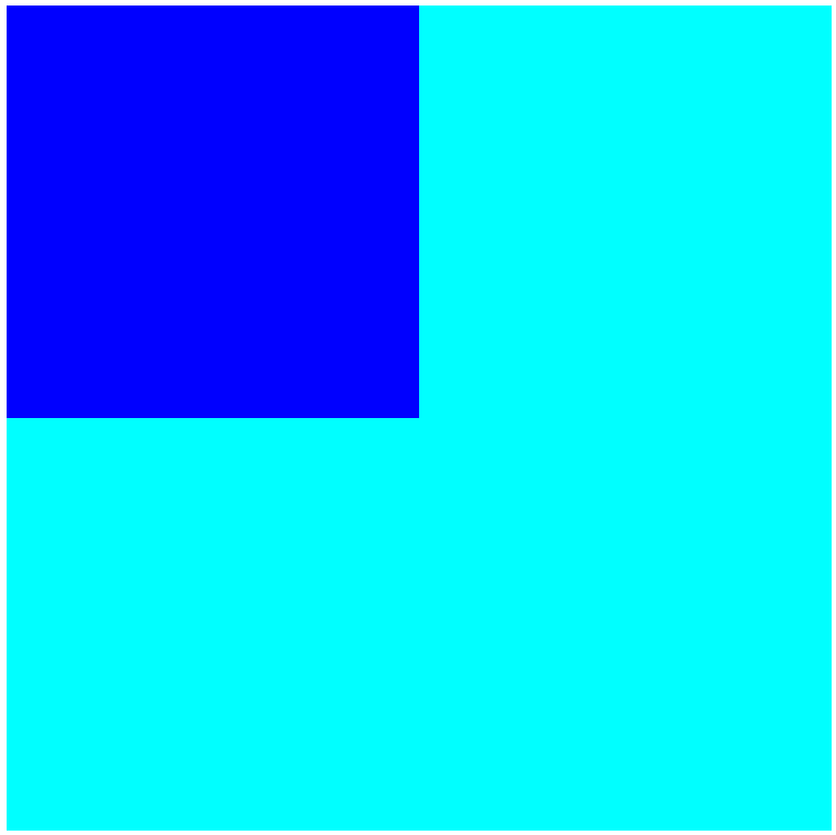
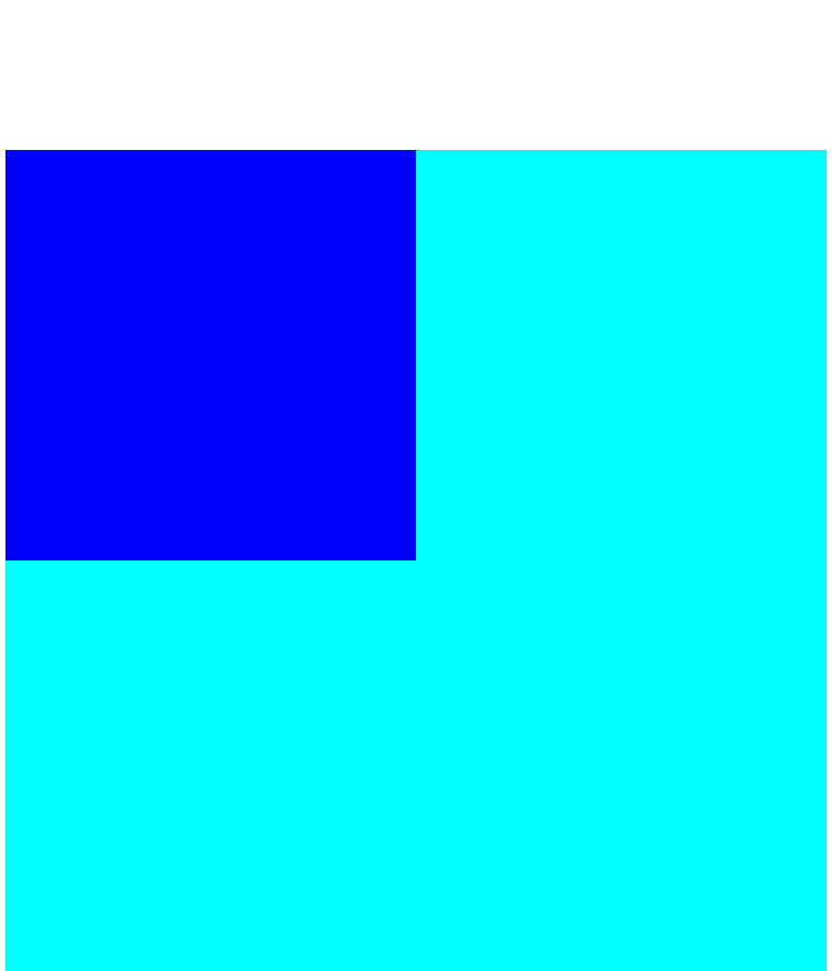
结果这两个还是连在一起,并且一起向下了150px:
想要分开子块和父块,可以通过三种方法:
- 可以为父元素定义上边框
- 可以为父元素定义上内边距
- 可以为父元素加上
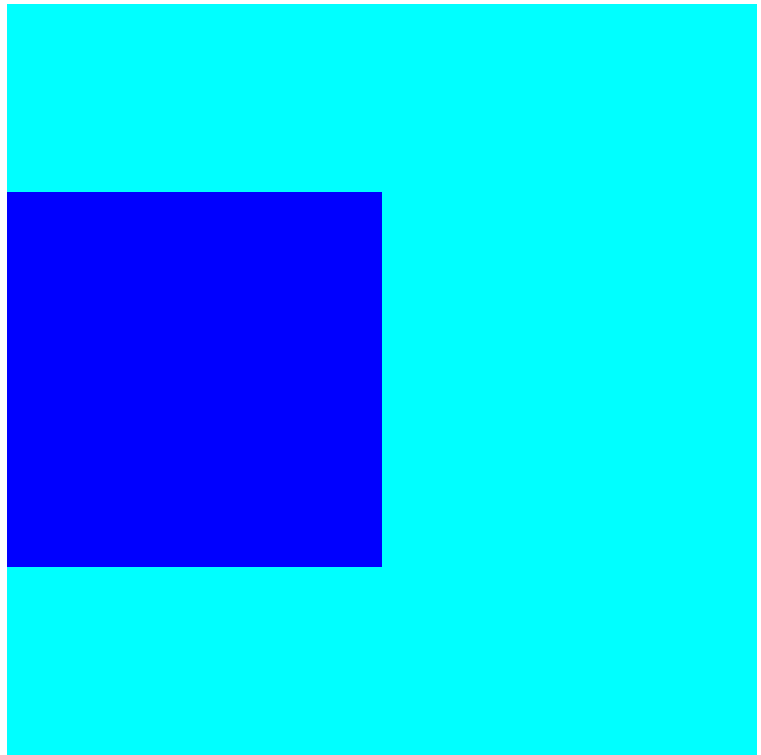
overflow:hidden(常用,因为这种不会影响盒子大小)
<!DOCTYPE html>
<html lang="en">

<head>
    <meta charset="UTF-8">
    <meta http-equiv="X-UA-Compatible" content="IE=edge">
    <meta name="viewport" content="width=device-width, initial-scale=1.0">
    <title>Document</title>
    <style>
        .father {
            width: 600px;
            height: 600px;
            background-color: aqua;
            margin-top: 50px;
            border-top: 1px solid transparent;  为父元素定义上边框
            //或者替换成 padding-top: 1px;或者:overflow:hidden;
        }
        .son{
            width: 300px;
            height: 300px;
            background-color: blue;
            margin-top: 150px;
        }
    </style>
</head>

<body>
    <div class="father">
        <div class="son"></div>
    </div>
</body>

</html>
12.9 清除元素默认内外边距 *{margin: 0;padding: 0;}
当我们使用元素时,系统会自带内外边距,如:无序列表左边会自带一个外边距、div上面和左面会自带一个外边距。
清除内外边距,需要在CSS首行加上:
*{
    margin: 0;
    padding: 0;
}
注意:行内元素为了照顾兼容性,只能设置左右内外边距,不设置上下内外边距(设置了不会显示)。但是转换为块级和行内块元素后就可以都显示。
另外:
无序列表前面的小圆点可以通过以下代码删除:
list-style: none;
12.10 圆角边框 border-radius:10px
可以将上面黄色的盒子变成圆角的。
border-radius:length;
<!DOCTYPE html>
<html lang="en">

<head>
    <meta charset="UTF-8">
    <meta http-equiv="X-UA-Compatible" content="IE=edge">
    <meta name="viewport" content="width=device-width, initial-scale=1.0">
    <title>Document</title>
    <style>
        *{
            margin: 0;
            padding: 0;
        }
        div{
            width: 300px;
            height: 300px;
            background-color: yellow;
            border-radius: 10px;       10px为相切圆的半径,值越大弧度越大
        }
    </style>
</head>

<body>
    <div></div>
</body>

</html>
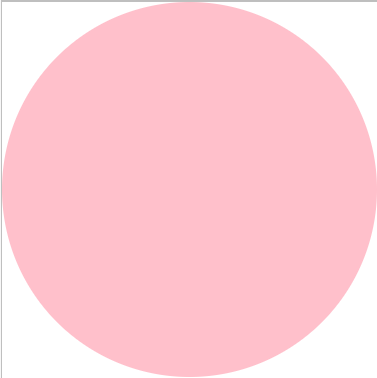
12.10.1 制作圆 border-radius: 50%;
要求:
- 盒子必须为正方形
- 圆角边框的半径为正方形的长或者宽的一半
<!DOCTYPE html>
<html lang="en">

<head>
    <meta charset="UTF-8">
    <meta http-equiv="X-UA-Compatible" content="IE=edge">
    <meta name="viewport" content="width=device-width, initial-scale=1.0">
    <title>Document</title>
    <style>
        *{
            margin: 0;
            padding: 0;
        }
        div{
            width: 300px;
            height: 300px;
            background-color: yellow;
            border-radius: 150px;   //或者border-radius: 50%;
        }
    </style>
</head>

<body>
    <div></div>
</body>

</html>
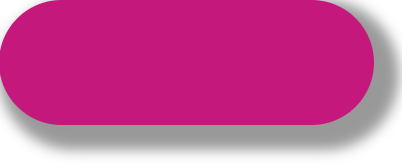
12.10.2 制作胶囊 border-radius: height/2 px;
要求:
- 盒子需要为矩形
- 圆角边框的半径为矩形高的一半
<!DOCTYPE html>
<html lang="en">

<head>
    <meta charset="UTF-8">
    <meta http-equiv="X-UA-Compatible" content="IE=edge">
    <meta name="viewport" content="width=device-width, initial-scale=1.0">
    <title>Document</title>
    <style>
        *{
            margin: 0;
            padding: 0;
        }
        div{
            width: 300px;
            height: 100px;
            background-color: rgb(196, 24, 124);
            border-radius: 50px;
        }
    </style>
</head>

<body>
    <div></div>
</body>

</html>

-
border-radius输入1个值,4个角都是相同的弧度 -
border-radius输入2个值,左上,右下10px,右上,左下40pxborder-radius: 10px,40px ;
-
border-radius输入4个值,分别代表左上,右上,右下,左下(顺时针)border-radius: 10px,20px,30px,40px ;
-
只有指定地方有圆角:border-top-left-radius、border-top-right-radius、border-bottom-right-radius、border-bottom-left-radius
12.11 阴影
12.11.1 盒子阴影 box-shadow: h-shadow v-shadow blur spread color inset;
css3中新增了盒子阴影,我们可以使用box-shadow属性为盒子添加阴影
box-shadow: h-shadow v-shadow blur spread color inset;
- h-shadow: 控制盒子水平位置的阴影,正值往右移动,负值往左移动(必须写)
- v-shadow: 控制盒子垂直位置的阴影,正值往下移动,负值往上移动(必须写)
- blur: 控制阴影模糊程度(虚实)
- spread: 控制阴影的尺寸(大小)
- color: 阴影颜色(0,0,0,.3)(颜色和透明度)
- inset: 外部阴影(outset)改为内部阴影
<!DOCTYPE html>
<html lang="en">

<head>
    <meta charset="UTF-8">
    <meta http-equiv="X-UA-Compatible" content="IE=edge">
    <meta name="viewport" content="width=device-width, initial-scale=1.0">
    <title>Document</title>
    <style>
        *{
            margin: 0;
            padding: 0;
        }
        div{
            width: 300px;
            height: 100px;
            background-color: rgb(196, 24, 124);
            border-radius: 50px;
            box-shadow: 10px 10px 10px 10px rgba(0, 0, 0, 0.4);
        }
    </style>
</head>

<body>
    <div></div>
</body>

</html>
鼠标一移动到盒子上就出现阴影:
div:hover {
		  box-shadow: 10px 10px 10px 10px rgba(0, 0, 0, 0.4);
}
注意:不光是div,a,所有的盒子都可以加上hover。
注意:盒子阴影不占用空间,不会影响其他盒子的排列。
12.11.2 文字阴影 text-shadow: h-shadow v-shadow blur color;
<!DOCTYPE html>
<html lang="en">

<head>
    <meta charset="UTF-8">
    <meta http-equiv="X-UA-Compatible" content="IE=edge">
    <meta name="viewport" content="width=device-width, initial-scale=1.0">
    <title>文字阴影</title>
    <style>
        div{
            font- size: 50px;
            color: orangered;
            font-weight: 700;
            text-shadow: 5px 5px 6px rgba(0, 0, 0, .3);  文字阴影
        }
    </style>
</head>
<body>
    <div>你是阴影,我是火影</div>
</body>

</html>


 扫一扫
扫一扫


 被折叠的 条评论
为什么被折叠?
被折叠的 条评论
为什么被折叠?
 到【灌水乐园】发言


