


页面布局:流式布局(百分比)+弹性布局(flex)。
1.将页面 html,bodey设置宽高百分百
 html,body{
            width: 100%;
            height: 100%;
        }
2.使用flex弹性布局
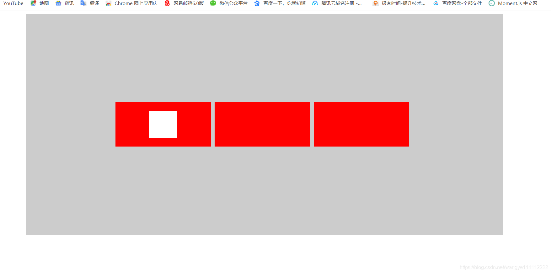
<style>
	.box{
            display: flex;
            flex-direction:row;
            justify-content:center;
            align-items:center;
            width: 80%;
            height: 80%;
            background-color: #ccc;
            margin: 0 auto;
        }
        .box>div{
            width: 20%;
            height: 20%;
            background-color: red;
            margin-right: 10px;
        }
        .d1{
            display: flex;
            flex-direction: column;
            justify-content: center;
            align-items: center;
        }
        .d1 div{
            width: 30%;
            height: 30%;
            background-color: #fff;
        }
</style>

<body>
    <div class="box">
        <div class="d1">
            <div></div>
            <div></div>
        </div>
        <div></div>
        <div></div>
    </div>
</body>
3.如果兼容到最大或最小屏幕尺寸 可以给html,body设置最大最小值(具体根据设计稿尺寸)
 html,body{
            width: 100%;
            height: 100%;
            min-width: 1266px;/*最小兼容屏幕1266px,超出不兼容*/
            max-width: 1620px;/*最大兼容屏幕1620px,超出不兼容*/
        }
4.如果是vue项目 可以把html,body写在app.vue中,下面是Vue 流式布局+弹性布局+sass
app.vue
body,
html {
  width: 100%;
  height: 100%;
}
组件.vue
.role-check{
  display: flex;
  justify-content: space-between;
  align-items: center;
  width: 60%;
  margin: 0 auto;
}
.role-info{
  flex: 1;
  display: flex;
  flex-direction: column;
  img{
    display: block;
    width: 180px;
    height: 180px;
  }


 扫一扫
扫一扫


 1528
1528

 被折叠的 条评论
为什么被折叠?
被折叠的 条评论
为什么被折叠?
 到【灌水乐园】发言


