


display:flex
影响子元素的排列方式,使得块级元素不再独占一行。无论多少个元素都始终在同一行显示。
display: none; /* 删除元素,不占位置 */
visibility: hidden;/* 隐藏,占据原先位置 */
设置布局方向
| flex-direction值 | 设置布局方向 |
|---|---|
| row | 从左到右(默认) |
| row-reverse | 从右至左 |
| column | 从上到下 |
| column-reverse | 从下至上 |
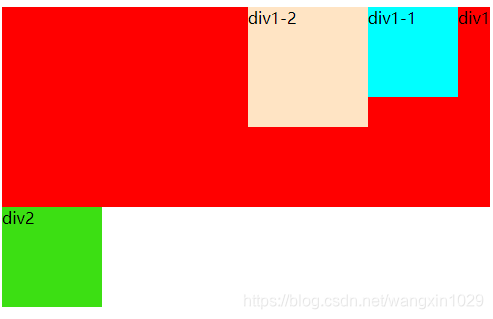
<style>
    /* 定义外盒子*/
    .div1{
        width: auto;
        height: 200px;
        background-color: red;
        /* 设置弹性盒子 */
        display: flex;
        /* 设置内容为从右至左  */
        flex-direction: row-reverse;
    }
    .div1-1{
        display: inline-block;
        width: 90px;
        height: 90px;
        background-color: aqua;
    }
    .div1-2{
        display: inline-block;
        width: 120px;
        height: 120px;
        background-color: bisque;
    }
    .div2{
        height: 100px;
        width: 100px;
        background-color: rgb(60, 223, 19);
    }
</style>
</head>
<body>
    <div class="div1">
        div1
        <div class="div1-1">div1-1</div>
        <div class="div1-2">div1-2</div>
    </div>
    <div class="div2">div2</div>
</body>
效果图
设置对齐方式
| justify-content的值 | 设置对齐方式 |
|---|---|
| center | 根据布局方向,居中对齐 |
| flex-start | 对齐开始位置 |
| flex-end | 对齐结束位置 |
| space-around | 元素之间距离等分,左右留白(元素之间距离一半) |
| space-between | 不留白,等分 |
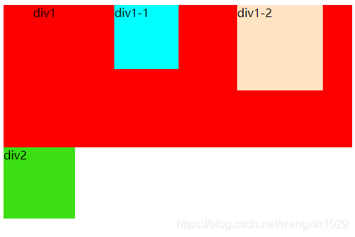
<style>
    /* 定义外盒子 */
    .div1{
        width: auto;
        height: 200px;
        background-color: red;
        /* 设置弹性盒子 */
        display: flex;
        /* 设置内容中元素之间距离等分且左右留白部分为元素之间距离的一半 */
        justify-content: space-around;
    }
    .div1-1{
        display: inline-block;
        width: 90px;
        height: 90px;
        background-color: aqua;
    }
    .div1-2{
        display: inline-block;
        width: 120px;
        height: 120px;
        background-color: bisque;
    }
    .div2{
        height: 100px;
        width: 100px;
        background-color: rgb(60, 223, 19);
    }
</style>
</head>
<body>
    <div class="div1">
        div1
        <div class="div1-1">div1-1</div>
        <div class="div1-2">div1-2</div>
    </div>
    <div class="div2">div2</div>
</body>


 扫一扫
扫一扫


 528
528

 被折叠的 条评论
为什么被折叠?
被折叠的 条评论
为什么被折叠?
 到【灌水乐园】发言


