


 本文介绍了如何使用Datav和Charts这两个Vue组件库进行大屏数据展示。首先,通过访问datav官网获取资源,接着安装必要的插件。随后,在main.js文件中引入组件,并在Vue应用的页面中进行使用,其操作方式类似于ECharts。通过这样的步骤,可以实现丰富的大屏数据可视化效果。
datav官网http://datav.jiaminghi.com/
先装这两个插件

然后在main.js中引用
import dataV from '@jiaminghi/data-view'

Vue.use(dataV)
然后就可以在页面中使用了,chart和echart类似
<template>
<div>
这是datav组件
<dv-border-box-10 class="panel_box" >
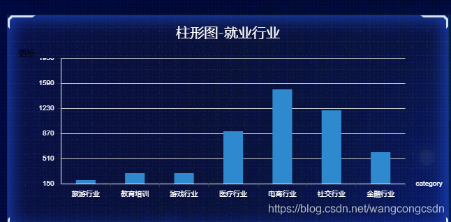
<h2>柱形图-就业行业</h2>
<div class="chart" id="container">图标</div>
</dv-border-box-10>
</div>
</template>
<script>
//先导入charts
import Charts from '@jiaminghi/charts'
export default {
data () {
return {
};
},
created(){
},
mounted(){
在mouted里面做了一个立即执行函数 ,防止里面的变量污染
(function(){
//下面和eacharts差不多
const container =document.getElementById('container')
const myChart = new Charts(container)
var option={
color:['#2f89cf'],
grid:{
top:'0px'
},
// 这是控制标题的
title: {
text: '周销售额趋势',
show:false,
offset:[0,-20],//标题位置偏移
style:{ //标题默认样式
fill: '#fff',
fontSize: 17,
fontWeight: '400',
textAlign: 'center',
textBaseline: 'bottom'
},
},
//legend为图表提供图例标签功能,它允许用户隐藏/显示series中的某个子图表。
// legend:{
// show:true,
// orient:'horizontal' | 'vertical',
// left:'50%'//图例标签左边距
// },
xAxis: {
name: 'category',
data: ["旅游行业","教育培训", "游戏行业", "医疗行业", "电商行业", "社交行业", "金融行业"],
nameTextStyle: {
fill: '#fff',
fontSize: 10
},
axisLabel:{
style: {
fill: '#fff',
fontSize: 10,
rotate: 0
}
},
axisLine:{
style: {
stroke: '#fff',
lineWidth: 1
}
}
},
yAxis: {
data: 'value',
max:'0%',
axisLabel:{
style: {
fill: '#fff',
fontSize: 10,
rotate: 0
}
},
axisLine:{
style: {
stroke: '#fff',
lineWidth: 1
}
},
splitLine:{
style: {
color: '#fff',
lineWidth: 1
}
}
},
series: [
{
data: [200, 300, 300, 900, 1500, 1200, 600],
type: 'bar',
barWidth:'50%',
}
]
}
myChart.setOption(option)
//图表自适应
window.addEventListener("resize", function() {
myChart.resize();
});
})()
},
methods:{
}
}
</script>
<style scoped lang="less">
.chart{
height: 240px;
margin-left: 15px;
}
h2{
height: 48px;
color: white;
font-size: 20px;
font-weight: 400;
text-align: center;
line-height: 48px;
}
</style>
效果


 3271
3271

 被折叠的 条评论
为什么被折叠?
被折叠的 条评论
为什么被折叠?
 到【灌水乐园】发言


