


 本文介绍了HTML元素在CSS中的盒子模型概念,它包括margin、border、padding和content四个部分。通过示例代码展示了如何使用CSS设置盒子模型的样式,包括边框宽度、内边距和外边距,以及box-sizing属性的使用,帮助读者更好地理解和布局网页元素。
001_盒子模型(h3)
-
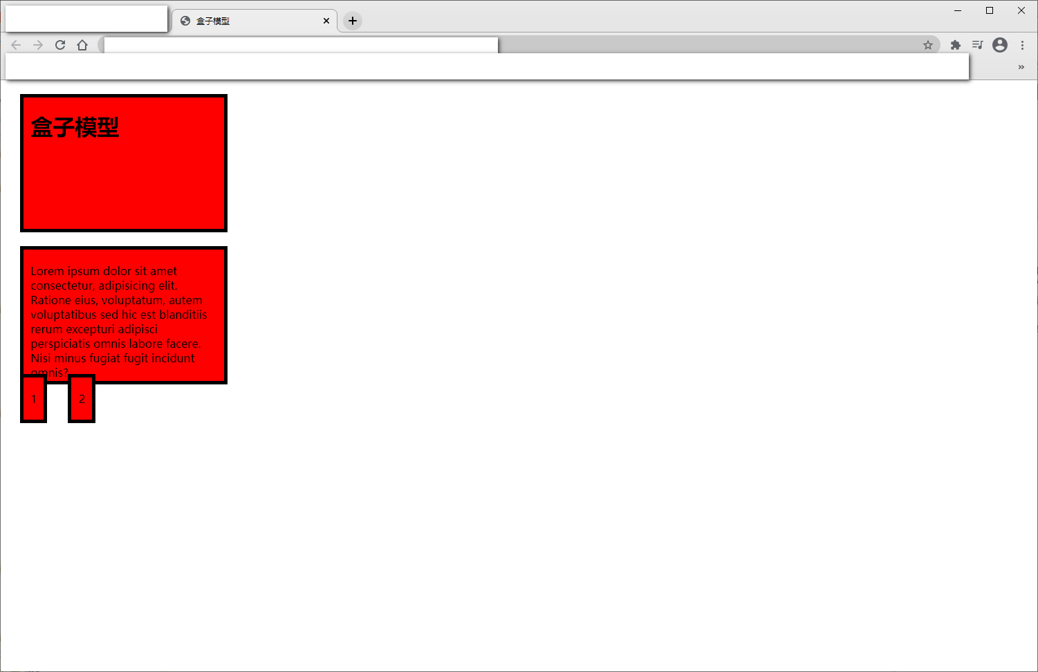
什么是盒子模型
- 在CSS⾥面,所有的HTML元素你都可以看成是⼀个盒子
-
由以下部分组成
- 盒子和盒子之间的间隙(margin)
- 盒子的边框(border)
- 盒子的内部间隙(padding)
- 盒子的内容(content)
-
源代码
<!DOCTYPE html>
<html lang="en">
  <head>
    <meta charset="UTF-8" />
    <meta name="viewport" content="width=device-width, initial-scale=1.0" />
    <title>盒子模型</title>
    <style>
      h1, p, span {
		  /*  box-sizing 指定两个boxes接壤
		  content-box 这是 CSS2.1 指定的宽度和高度的行为。
			指定元素的宽度和高度(最小/最大属性)适用于box的宽度和高度。
			元素的填充和边框布局和绘制指定宽度和高度除外

		  border-box 指定宽度和高度(最小/最大属性)确定元素边框。
			也就是说,对元素指定宽度和高度包括了 padding 和 border 。
			通过从已设定的宽度和高度分别减去边框和内边距才能得到内容的宽度和高度。
		  */
        /* 比较容易布局 */
        box-sizing: border-box;
        background-color: red;
        width: 300px;
        height: 200px;
        /* 上右下左边距 */
        margin: 20px 10px 10px 20px;
        padding: 20px 10px;
        border: 5px solid #000;
        /* 上下边距20,左右边距20 */
        /* margin: 20px 10px; */
      }
    </style>
  </head>
  <body>
    <h1>盒子模型</h1>
    <p>
      Lorem ipsum dolor sit amet consectetur, adipisicing elit. Ratione eius,
      voluptatum, autem voluptatibus sed hic est blanditiis rerum excepturi
      adipisci perspiciatis omnis labore facere. Nisi minus fugiat fugit
      incidunt omnis?
    </p>
    <span>1</span><span>2</span>
  </body>
</html>
- 浏览器界面


 扫一扫
扫一扫


 被折叠的 条评论
为什么被折叠?
被折叠的 条评论
为什么被折叠?
 到【灌水乐园】发言


