


功能:
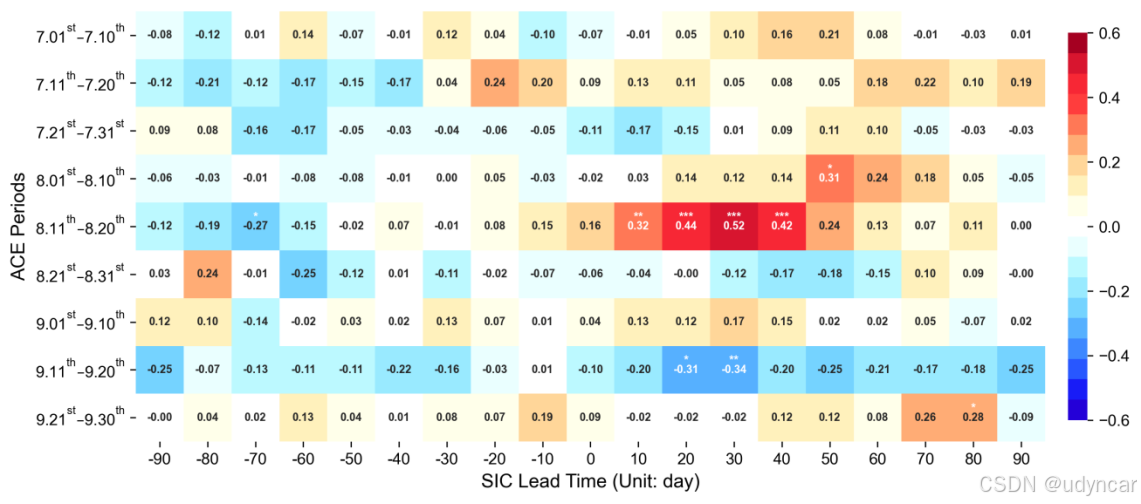
- 热力图常用于展示多个气象变量之间的两两相关性(横纵坐标均为变量名称),也可用于展示两个气象变量之间的超前滞后相关关系(纵坐标为变量1的时间,横坐标为变量2超前于变量1的时间)。示例图为ACE和SIC在7-9月的十天尺度的超前滞后相关关系
程序清单:
#导入包
import numpy as np
import pandas as pd
import xarray as xr
import seaborn as sns
import matplotlib.pyplot as plt
from matplotlib import colors
#读入数据
data = xr.open_dataset('F:/python/data/6.21.7_corr.nc')
corr = data['corr']
p = data['p']
#绘图
#统一修改字体为Arial
plt.rcParams['font.family'] = ['Arial']
#定义绘制热力图的函数
def heatmap(data,ax):
len_x = int(len(data[0,:])/2)
sns.heatmap(data,
vmin = -0.6, #colobar最小值
vmax = 0.6, #colobar最大值
cmap = colors.ListedColormap(pd.read_csv('BlueDarkRed182.rgb',sep='\s+').values/255), #颜色
fmt = '.2f', #值保留两位小数
annot = True,
annot_kws = {'size':7,'weight':'bold'}, #定义方框内的文字大小,设置加粗
linewidths = 0, #设置方框边缘线宽度
linecolor = 'white', #设置方框边缘线颜色
cbar = True, #显示colorbar
cbar_kws={'pad': 0.02,'shrink': 0.9}, #设置colorbar格式,pad为距主图的距离,shrink为缩放比例
cbar_ax = None,
square = True, #设置方框为正方形
xticklabels = np.arange(-len_x,len_x+1)*10, #设置横坐标
yticklabels =[ '7.0$\mathregular{1^{st}}$–7.1$\mathregular{0^{th}}$',
'7.1$\mathregular{1^{th}}$–7.2$\mathregular{0^{th}}$',
'7.2$\mathregular{1^{st}}$–7.3$\mathregular{1^{st}}$',
'8.0$\mathregular{1^{st}}$–8.1$\mathregular{0^{th}}$',
'8.1$\mathregular{1^{th}}$–8.2$\mathregular{0^{th}}$',
'8.2$\mathregular{1^{st}}$–8.3$\mathregular{1^{st}}$',
'9.0$\mathregular{1^{st}}$–9.1$\mathregular{0^{th}}$',
'9.1$\mathregular{1^{th}}$–9.2$\mathregular{0^{th}}$',
'9.2$\mathregular{1^{st}}$–9.3$\mathregular{0^{th}}$',],#设置纵坐标
mask = None,
ax = ax,
)
for label in ax.get_yticklabels():
label.set_rotation(360) #y轴坐标旋转
return ax
fig = plt.figure(figsize=(13, 5),dpi=300)
ax=fig.add_subplot(1,1,1)
#调用热力图函数
heatmap(corr,ax)
#添加色标
cbar = ax.collections[0].colorbar
#显著性检验可视化:在置信度水平为99%的值上方添加***,95-99%的值上方添加**,90-95%的值上方添加*
widthx,widthy = 0, -0.12
for n in ax.get_xticks():
for m in ax.get_yticks():
pv = (p[int(m),int(n)])
if pv< 0.1 and pv>= 0.05:
ax.text(n+widthx,m+widthy,'*',ha = 'center',color = 'w',size=8, weight='bold')
if pv< 0.05 and pv>= 0.01:
ax.text(n+widthx,m+widthy,'**',ha = 'center',color = 'w',size=8, weight='bold')
if pv< 0.01:
ax.text(n+widthx,m+widthy,'***',ha = 'center',color = 'w',size=8, weight='bold')
#添加横纵坐标
ax.set_xlabel('SIC Lead Time (Unit: day)',loc='center',fontsize=12)
ax.set_ylabel('ACE Periods',loc='center',fontsize=12)
plt.show()


 2万+
2万+

 被折叠的 条评论
为什么被折叠?
被折叠的 条评论
为什么被折叠?
 到【灌水乐园】发言


