


 本文介绍了一种使用CSS画圆环的方法,通过设置元素的宽高、圆角效果,并利用::before伪元素创建两个圆,再通过定位使两圆圆心重合。涉及border-radius、元素水平竖直居中等知识点。
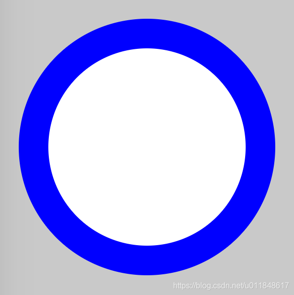
画圆环思想很简单:首先画两个圆,设置不同的背景色;然后让两个圆的圆心重合即可。
难度系数
☆☆
HTML
<div class="container">
    <span class="ring-style"></span>
</div>
解析:
- 此处有父容器
CSS
.container {
    position: relative;
    top: 0;
    left: 0;
    width: 300px;
    height: 300px;
    background-color: lightgrey;
}
.ring-style {
    display: inline-block;
    position: absolute;
    top: 50%;
    left: 50%;
    transform: translate(-50%, -50%);
    background-color: blue;
    width: 260px;
    height: 260px;
    border-radius: 260px;
}
.ring-style::before {
    content: ' ';
    display: inline-block;
    position: absolute;
    top: 50%;
    left: 50%;
    transform: translate(-50%, -50%);
    background-color: white;
    width: 200px;
    height: 200px;
    border-radius: 200px;
}
解析:
- 设置元素的宽高、圆角效果,即可画出一个圆
- 通过 ::before 伪元素和本体元素,创建两个圆
- 通过基于父容器的绝对定位,设置 top、left、translate 属性,让元素基于父容器水平、竖直居中,即可让两个圆的圆心重合
效果图
知识点
- border-radius
- ::before && ::after
- 元素水平、竖直居中
Gitbub 源码
https://github.com/nanzhangren/CSS_skills/blob/master/ring/ring.html
---------
更多 CSS 技巧,请关注微信公众号

公众号菜单栏有微信交流群,欢迎加入~~~


 扫一扫
扫一扫


 2436
2436

 被折叠的 条评论
为什么被折叠?
被折叠的 条评论
为什么被折叠?
 到【灌水乐园】发言


