


 本文详细探讨了如何封装BottomBarLayout及其组件BottomBarItem。通过自定义View实现底部导航栏,避免使用复杂嵌套布局。文章重点介绍了封装布局的思路、动态操作元素的方法以及内存回收时的状态保存策略,同时解析了BottomBarItem的属性设置,帮助读者理解如何通过代码控制布局属性。
github地址
是对下方底部的封装
如果不封装的话,更多的是
大的布局轮廓是 外面是一个大的容器(比如LinearLayout),里面是四个小的容器(比如LinearLayout)
而BottomBarLayout是上面大的容器的自定义View封装,BottomBarItem是下面每个四个小容器的自定义View的封装
所以大致思路清晰了,不是一件特别复杂的,就把它自定义组合布局去看
如何封装布局
- 如何动态灵活的操作元素
- 内存回收情况下的处理
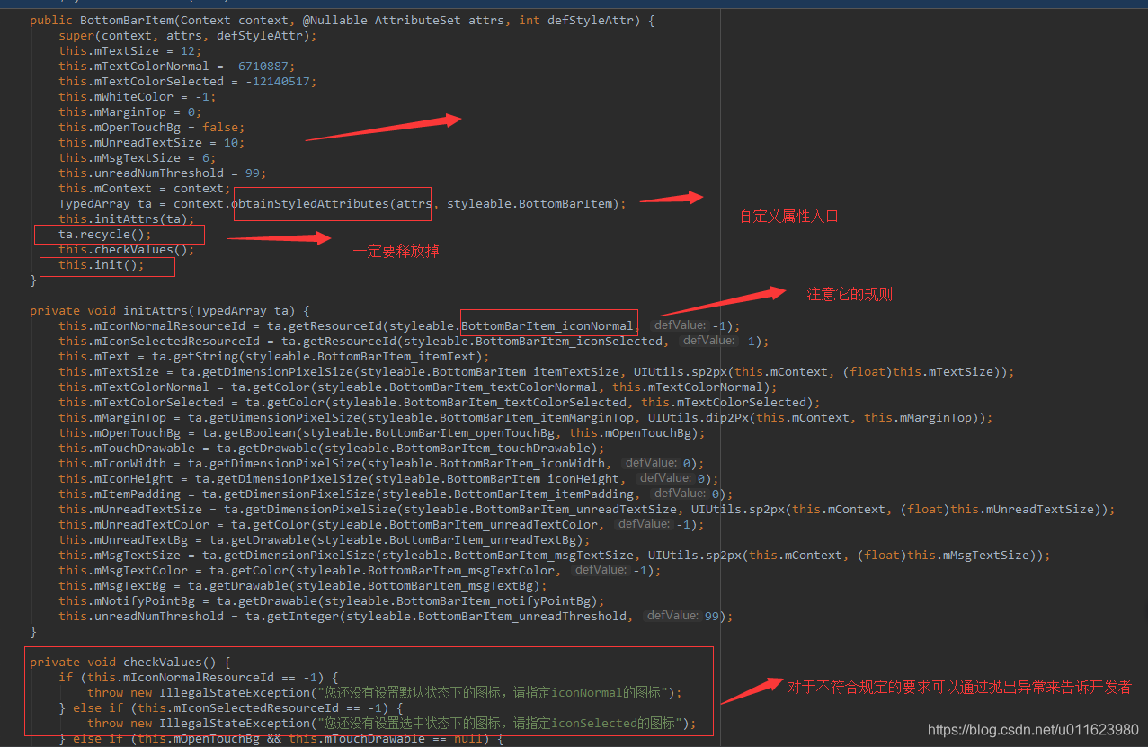
BottomBarItem属性介绍
如何封装布局
- BottomBarItem
属于一种组合布局
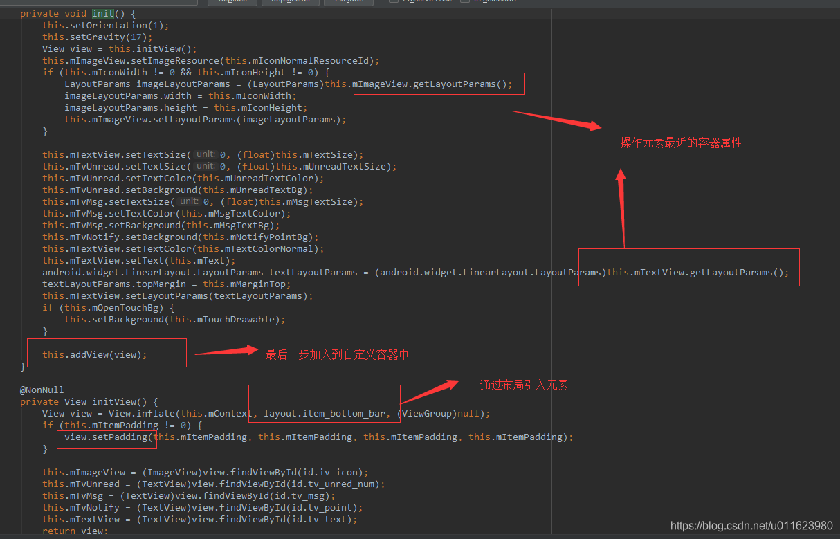
@NonNull
private View initView() {
    View view = View.inflate(this.mContext, layout.item_bottom_bar, (ViewGroup)null);
关键是学习如何用代码操作布局的属性,而这些属性和外部的自定义属性相关联。
比如给mImageView控件设置
private void init() {
    this.setOrientation(1);
    this.setGravity(17);
    View view = this.initView();
    this.mImageView.setImageResource(this.mIconNormalResourceId);
    if (this.mIconWidth != 0 && this.mIconHeight != 0) {
        LayoutParams imageLayoutParams = (LayoutParams)this.mImageView.getLayoutParams();
        imageLayoutParams.width = this.mIconWidth;
        imageLayoutParams.height = this.mIconHeight;
        this.mImageView.setLayoutParams(imageLayoutParams);
    }

    this.mTextView.setTextSize(0, (float)this.mTextSize);
    this.mTvUnread.setTextSize(0, (float)this.mUnreadTextSize);
    this.mTvUnread.setTextColor(this.mUnreadTextColor);
    this.mTvUnread.setBackground(this.mUnreadTextBg);
    this.mTvMsg.setTextSize(0, (float)this.mMsgTextSize);
    this.mTvMsg.setTextColor(this.mMsgTextColor);
    this.mTvMsg.setBackground(this.mMsgTextBg);
    this.mTvNotify.setBackground(this.mNotifyPointBg);
    this.mTextView.setTextColor(this.mTextColorNormal);
    this.mTextView.setText(this.mText);
    android.widget.LinearLayout.LayoutParams textLayoutParams = (android.widget.LinearLayout.LayoutParams)this.mTextView.getLayoutParams();
    textLayoutParams.topMargin = this.mMarginTop;
    this.mTextView.setLayoutParams(textLayoutParams);
    if (this.mOpenTouchBg) {
        this.setBackground(this.mTouchDrawable);
    }

    this.addView(view);
}

@NonNull
private View initView() {
    View view = View.inflate(this.mContext, layout.item_bottom_bar, (ViewGroup)null);
    if (this.mItemPadding != 0) {
        view.setPadding(this.mItemPadding, this.mItemPadding, this.mItemPadding, this.mItemPadding);
    }

    this.mImageView = (ImageView)view.findViewById(id.iv_icon);
    this.mTvUnread = (TextView)view.findViewById(id.tv_unred_num);
    this.mTvMsg = (TextView)view.findViewById(id.tv_msg);
    this.mTvNotify = (TextView)view.findViewById(id.tv_point);
    this.mTextView = (TextView)view.findViewById(id.tv_text);
    return view;
}
- BottomBarLayout
大致逻辑同上,
然而要注意如何考虑在系统回收的时候做的处理
关键核心方法onSaveInstanceState 和 onRestoreInstanceState
就是在系统回收的时候会回调onSaveInstanceState然后这里做状态保存,以便于onRestoreInstanceState回调后把状态重新初始化到最初源自
protected Parcelable onSaveInstanceState() {
    Bundle bundle = new Bundle();
    bundle.putParcelable("instance_state", super.onSaveInstanceState());
    bundle.putInt("state_item", this.mCurrentItem);
    return bundle;
}

protected void onRestoreInstanceState(Parcelable state) {
    if (state instanceof Bundle) {
        Bundle bundle = (Bundle)state;
        this.mCurrentItem = bundle.getInt("state_item");
        this.resetState();
        ((BottomBarItem)this.mItemViews.get(this.mCurrentItem)).setStatus(true);
        super.onRestoreInstanceState(bundle.getParcelable("instance_state"));
    } else {
        super.onRestoreInstanceState(state);
    }

}
BottomBarItem属性介绍
values.xml
<?xml version="1.0" encoding="utf-8"?>
<resources>
    <color name="red">#ff0000</color>
    <color name="selector_grey">#DDDDDD</color>
    <color name="white">#ffffff</color>
    <declare-styleable name="BottomBarItem">
        <attr name="iconNormal" format="reference" />
        <attr name="iconSelected" format="reference" />
        <attr name="itemText" format="string" />
        <attr name="itemTextSize" format="dimension" />
        <attr name="textColorNormal" format="color" />
        <attr name="textColorSelected" format="color" />
        <attr name="itemMarginTop" format="dimension" />
        <attr name="openTouchBg" format="boolean" />
        <attr name="touchDrawable" format="reference" />
        <attr name="iconWidth" format="dimension" />
        <attr name="iconHeight" format="dimension" />
        <attr name="itemPadding" format="dimension" />
        <attr name="unreadTextSize" format="dimension" />
        <attr name="unreadTextColor" format="reference" />
        <attr name="unreadTextBg" format="reference" />
        <attr name="msgTextSize" format="dimension" />
        <attr name="msgTextColor" format="reference" />
        <attr name="msgTextBg" format="reference" />
        <attr name="notifyPointBg" format="reference" />
        <attr name="unreadThreshold" format="integer" />
    </declare-styleable>
    <declare-styleable name="BottomBarLayout">
        <attr name="smoothScroll" format="boolean" />
    </declare-styleable>
    <string name="app_name">library</string>
</resources>
 <!--默认状态下的图标-->
    <attr name="iconNormal" format="reference"/>
    <!--选中状态下的图标-->
    <attr name="iconSelected" format="reference"/>

    <!--底部文字-->
    <attr name="itemText" format="string"/>
    <!--文字大小-->
    <attr name="itemTextSize" format="dimension"/>
    <!--默认状态下的文字颜色-->
    <attr name="textColorNormal" format="color"/>
    <!--选中状态下的文字颜色-->
    <attr name="textColorSelected" format="color"/>

    <!--文字和图标的顶部距离-->
    <attr name="itemMarginTop" format="dimension"/>

    <!--是否开启触摸背景效果-->
    <attr name="openTouchBg" format="boolean"/>
    <!--设置触摸背景-->
    <attr name="touchDrawable" format="reference"/>

    <!--设置图标的宽度-->
    <attr name="iconWidth" format="dimension"/>
    <!--设置图标的高度-->
    <attr name="iconHeight" format="dimension"/>

    <!--设置BottomBarItem的padding-->
    <attr name="itemPadding" format="dimension"/>

    <!--设置未读数字体大小-->
    <attr name="unreadTextSize" format="dimension"/>
    <!--设置未读数字体颜色-->
    <attr name="unreadTextColor" format="reference"/>
    <!--设置未读数背景色-->
    <attr name="unreadTextBg" format="reference"/>

    <!--设置提示消息字体大小-->
    <attr name="msgTextSize" format="dimension"/>
    <!--设置提示消息字体颜色-->
    <attr name="msgTextColor" format="reference"/>
    <!--设置提示消息背景-->
    <attr name="msgTextBg" format="reference"/>

    <!--设置提示点背景-->
    <attr name="notifyPointBg" format="reference"/>

    <!--设置未读数组阈值 大于阈值的数字将显示为 n+ n为设置的阈值-->
    <attr name="unreadThreshold" format="integer"/>


 扫一扫
扫一扫


 9882
9882

 被折叠的 条评论
为什么被折叠?
被折叠的 条评论
为什么被折叠?
 到【灌水乐园】发言


