


想直接拿走的老板,链接放在这里:上传后更新
缘
创作随缘,不定时更新。
创作背景
刚看到csdn出活动了,赶时间,直接上代码。
html结构
<div class="rain-container">
	<div class='rain'></div>
	<div class='rain'></div>
	<div class='rain'></div>
	<div class='rain'></div>
</div>
css样式
.rain-container {
  position: relative;
  width: 100vw;
  height: 100vh;
  background: #0a2e5d;  /* 暗色背景 */
  overflow: hidden;
}

/* 雨滴基础样式 */
.rain-container::before,
.rain-container::after {
  content: '';
  position: absolute;
  width: 2px;
  height: 40px;
  background: linear-gradient(
    to bottom,
    transparent 20%,
    rgba(255,255,255,0.8) 50%,
    transparent 80%
  );
  animation: fall 1.2s linear infinite;
}

/* 雨滴分层动画 */
.rain-container::before {
  left: 20%;
  animation-delay: 0.3s;
  filter: blur(1px);
}

.rain-container::after {
  left: 60%;
  height: 60px;
  animation-duration: 0.8s;
}
@keyframes fall {
  0% {
    transform: translateY(-100vh) rotate(15deg);
    opacity: 0;
  }
  90% {
    opacity: 1;
  }
  100% {
    transform: translateY(100vh) rotate(15deg);
    opacity: 0;
  }
}


.rain-container::before {
  box-shadow:
    -80px 50px 0 -1px rgba(255,255,255,0.6),
    -10px 50px 0 -1px rgba(255,255,255,0.6),
    10px 50px 0 -1px rgba(255,255,255,0.6),
    80px 50px 0 -1px rgba(255,255,255,0.6),
    160px 50px 0 1px rgba(255,255,255,0.7),
    340px 50px 0 0 rgba(255,255,255,0.5),
    440px 50px 0 0 rgba(255,255,255,0.5),
    540px 50px 0 0 rgba(255,255,255,0.5),
    640px 50px 0 0 rgba(255,255,255,0.5),
    740px 50px 0 0 rgba(255,255,255,0.5),
    80px 50px 0 -1px rgba(255,255,255,0.6),
    160px 150px 0 1px rgba(255,255,255,0.7),
    340px 250px 0 0 rgba(255,255,255,0.5),
    440px 350px 0 0 rgba(255,255,255,0.5),
    540px 450px 0 0 rgba(255,255,255,0.5),
    640px 550px 0 0 rgba(255,255,255,0.5),
    740px 650px 0 0 rgba(255,255,255,0.5);
}


.rain-container {
  background:
    linear-gradient(45deg,
      rgba(10,46,93,0.9) 30%,
      transparent 100%
    ),
    linear-gradient(
      to bottom,
      #081320,
      #0a2e5d
    );
  background-size: 200% 200%;
  animation: storm 15s linear infinite;
}

@keyframes storm {
  50% { background-position: 100% 100%; }
}

.rain-container::after {
  /* 添加水花伪元素 */
  content: '';
  width: 20px;
  height: 20px;
  background: radial-gradient(circle,
    rgba(255,255,255,0.4) 10%,
    transparent 60%
  );
  animation:
    fall 1s linear infinite,
    splash 0.4s ease-out forwards;
}

@keyframes splash {
  0% { transform: scale(0); }
  90% { opacity: 1; }
  100% {
    transform: scale(2);
    opacity: 0;
  }
}
完整代码
<!DOCTYPE html>
<html lang="en">
<head>

<title>页面特效</title>
<style type="text/css">
.rain-container {
  position: relative;
  width: 100vw;
  height: 100vh;
  background: #0a2e5d;  /* 暗色背景 */
  overflow: hidden;
}

/* 雨滴基础样式 */
.rain-container::before,
.rain-container::after {
  content: '';
  position: absolute;
  width: 2px;
  height: 40px;
  background: linear-gradient(
    to bottom,
    transparent 20%,
    rgba(255,255,255,0.8) 50%,
    transparent 80%
  );
  animation: fall 1.2s linear infinite;
}

/* 雨滴分层动画 */
.rain-container::before {
  left: 20%;
  animation-delay: 0.3s;
  filter: blur(1px);
}

.rain-container::after {
  left: 60%;
  height: 60px;
  animation-duration: 0.8s;
}
@keyframes fall {
  0% {
    transform: translateY(-100vh) rotate(15deg);
    opacity: 0;
  }
  90% {
    opacity: 1;
  }
  100% {
    transform: translateY(100vh) rotate(15deg);
    opacity: 0;
  }
}


.rain-container::before {
  box-shadow:
    -80px 50px 0 -1px rgba(255,255,255,0.6),
    -10px 50px 0 -1px rgba(255,255,255,0.6),
    10px 50px 0 -1px rgba(255,255,255,0.6),
    80px 50px 0 -1px rgba(255,255,255,0.6),
    160px 50px 0 1px rgba(255,255,255,0.7),
    340px 50px 0 0 rgba(255,255,255,0.5),
    440px 50px 0 0 rgba(255,255,255,0.5),
    540px 50px 0 0 rgba(255,255,255,0.5),
    640px 50px 0 0 rgba(255,255,255,0.5),
    740px 50px 0 0 rgba(255,255,255,0.5),
    80px 50px 0 -1px rgba(255,255,255,0.6),
    160px 150px 0 1px rgba(255,255,255,0.7),
    340px 250px 0 0 rgba(255,255,255,0.5),
    440px 350px 0 0 rgba(255,255,255,0.5),
    540px 450px 0 0 rgba(255,255,255,0.5),
    640px 550px 0 0 rgba(255,255,255,0.5),
    740px 650px 0 0 rgba(255,255,255,0.5);
}


.rain-container {
  background:
    linear-gradient(45deg,
      rgba(10,46,93,0.9) 30%,
      transparent 100%
    ),
    linear-gradient(
      to bottom,
      #081320,
      #0a2e5d
    );
  background-size: 200% 200%;
  animation: storm 15s linear infinite;
}

@keyframes storm {
  50% { background-position: 100% 100%; }
}

.rain-container::after {
  /* 添加水花伪元素 */
  content: '';
  width: 20px;
  height: 20px;
  background: radial-gradient(circle,
    rgba(255,255,255,0.4) 10%,
    transparent 60%
  );
  animation:
    fall 1s linear infinite,
    splash 0.4s ease-out forwards;
}

@keyframes splash {
  0% { transform: scale(0); }
  90% { opacity: 1; }
  100% {
    transform: scale(2);
    opacity: 0;
  }
}
</style>

</head>
<body>
<div class="rain-container">
	<div class='rain'></div>
	<div class='rain'></div>
	<div class='rain'></div>
	<div class='rain'></div>
</div>

</body>
</html>
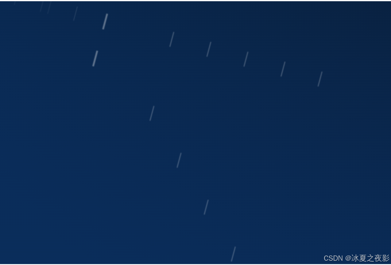
效果图


 扫一扫
扫一扫


 被折叠的 条评论
为什么被折叠?
被折叠的 条评论
为什么被折叠?
 到【灌水乐园】发言


