


想直接拿走的老板,链接放在这里:上传后更新
缘
创作随缘,不定时更新。
创作背景
刚看到csdn出活动了,赶时间,直接上代码。
html结构
	<div class="container">

  <div class="glass-card">
    <h2>毛玻璃卡片</h2>
  </div>
</div>
css样式
.container {
  position: relative;
  min-height: 100vh; /* 确保容器足够高 */
}

.background {
  background-image: url('your-image.jpg');
  background-size: cover;
  background-position: center;
  height: 100vh;
  position: fixed; /* 关键!让背景相对视口固定 */
  width: 100%;
}
.glass-card {
  height: 40vh;
  width: 40%;
  position: absolute;
  top: 50%;
  left: 50%;
  transform: translate(-50%, -50%);
  padding: 2rem;
  border-radius: 15px;

  backdrop-filter: blur(10px);
  -webkit-backdrop-filter: blur(10px); /* Safari 兼容 */

  background-color: rgba(255, 255, 255, 0.1); /* 半透明白提升可读性 */
  border: 1px solid rgba(255, 255, 255, 0.2); /* 细腻边框 */

  /* 可选阴影增强层次感 */
  box-shadow: 0 8px 32px 0 rgba(31, 38, 135, 0.37);
}

body{
	background-image: url(a.gif);
}
完整代码
<!DOCTYPE html>
<html lang="en">
<head>

<title>页面特效</title>
<style type="text/css">
.container {
  position: relative;
  min-height: 100vh; /* 确保容器足够高 */
}

.background {
  background-image: url('your-image.jpg');
  background-size: cover;
  background-position: center;
  height: 100vh;
  position: fixed; /* 关键!让背景相对视口固定 */
  width: 100%;
}
.glass-card {
  height: 40vh;
  width: 40%;
  position: absolute;
  top: 50%;
  left: 50%;
  transform: translate(-50%, -50%);
  padding: 2rem;
  border-radius: 15px;

  backdrop-filter: blur(10px);
  -webkit-backdrop-filter: blur(10px); /* Safari 兼容 */

  background-color: rgba(255, 255, 255, 0.1); /* 半透明白提升可读性 */
  border: 1px solid rgba(255, 255, 255, 0.2); /* 细腻边框 */

  /* 可选阴影增强层次感 */
  box-shadow: 0 8px 32px 0 rgba(31, 38, 135, 0.37);
}

body{
	background-image: url(a.gif);
}
</style>

</head>
<body >

	<div class="container">

  <div class="glass-card">
    <h2>毛玻璃卡片</h2>
  </div>
</div>

</body>
</html>
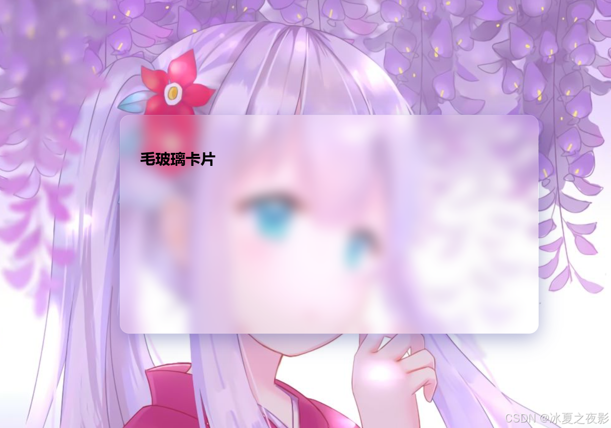
效果图


 扫一扫
扫一扫


 1万+
1万+

 被折叠的 条评论
为什么被折叠?
被折叠的 条评论
为什么被折叠?
 到【灌水乐园】发言


