


想直接拿走的老板,链接放在这里:https://download.youkuaiyun.com/download/u011561335/90490479
缘
创作随缘,不定时更新。
创作背景
刚看到csdn出活动了,赶时间,直接上代码。
html结构
<div class="typewriter">
    <p class="typing-text">Welcome to CSS Magic!</p>
</div>
css样式
.typewriter {
    width: fit-content;
}

.typing-text {
    width: 0;
    overflow: hidden;
    white-space: nowrap;
    border-right: 2px solid #333; /* 光标模拟 */
    font-family: 'Courier New', monospace; /* 等宽字体 */
    animation: typing 3s steps(16) forwards,
               cursor-blink 0.8s step-end infinite;
}

@keyframes typing {
    from { width: 0; }
    to { width: 16ch; } /* 字符数(ch单位) */
}

@keyframes cursor-blink {
    from, to { border-color: transparent; }
    50% { border-color: #333; }
}
完整代码
基础版
<!DOCTYPE html>
<html>
<head>
<style>
.typewriter {
    width: fit-content;
}

.typing-text {
    width: 0;
    overflow: hidden;
    white-space: nowrap;
    border-right: 2px solid #333; /* 光标模拟 */
    font-family: 'Courier New', monospace; /* 等宽字体 */
    animation: typing 3s steps(16) forwards,
               cursor-blink 0.8s step-end infinite;
}

@keyframes typing {
    from { width: 0; }
    to { width: 16ch; } /* 字符数(ch单位) */
}

@keyframes cursor-blink {
    from, to { border-color: transparent; }
    50% { border-color: #333; }
}
</style>
</head>
<body>
    <div style='text-align:center;margin-top:50px;'>
		<div class="typewriter">
			<p class="typing-text">Welcome to CSS Magic!</p>
		</div>
	</div>

</body>
</html>
进阶版(彩色光标)
<!DOCTYPE html>
<html>
<head>
<style>
.typewriter {
    width: fit-content;
}

.typing-text {
    width: 0;
    overflow: hidden;
    white-space: nowrap;
    border-right: 2px solid #333; /* 光标模拟 */
    font-family: 'Courier New', monospace; /* 等宽字体 */
    animation: typing 3s steps(16) forwards,
               cursor-blink 0.8s step-end infinite;
    border-image: linear-gradient(45deg, #ff6b6b, #4ecdc4) 1;
    border-width: 3px;
}

@keyframes typing {
    from { width: 0; }
    to { width: 16ch; } /* 字符数(ch单位) */
}

@keyframes cursor-blink {
    from, to { border-color: transparent; }
    50% { border-color: #333; }
}

</style>
</head>
<body>
    <div style='text-align:center;margin-top:50px;'>
		<div class="typewriter">
			<p class="typing-text">Welcome to CSS Magic!</p>
		</div>
	</div>

</body>
</html>
进阶版2(彩色多行打印)
<!DOCTYPE html>
<html>
<head>
<style>
.typewriter {
    width: fit-content;
}

.typing-text {
    width: 0;
    overflow: hidden;
    white-space: nowrap;
    border-right: 2px solid #333; /* 光标模拟 */
    font-family: 'Courier New', monospace; /* 等宽字体 */
    animation: typing 3s steps(16) forwards,
               cursor-blink 0.8s step-end infinite;
    border-image: linear-gradient(45deg, #ff6b6b, #4ecdc4) 1;
    border-width: 3px;
    height: 1.2em; /* 单行高度 */
    animation:
        typing 4s steps(40),
        line-change 0.5s step-end 2,
        cursor-blink 0.8s infinite;
}

@keyframes line-change {
    0% { height: 1.2em; }
    100% { height: 3.4em; }
}
@keyframes typing {
    from { width: 0; }
    to { width: 16ch; } /* 字符数(ch单位) */
}

@keyframes cursor-blink {
    from, to { border-color: transparent; }
    50% { border-color: #333; }
}

</style>
</head>
<body>
    <div style='text-align:center;margin-top:50px;'>
		<div class="typewriter">
			<p class="typing-text">Welcome to CSS Magic!</p>
			<p class="typing-text">Welcome to CSS Magic!</p>
		</div>
	</div>

</body>
</html>
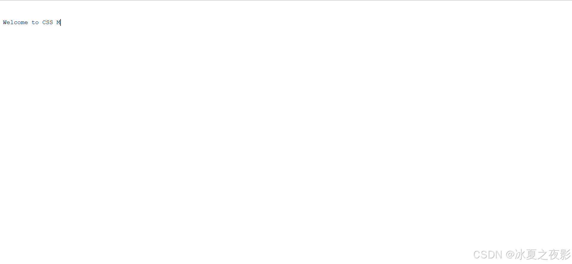
效果图


 扫一扫
扫一扫


 1652
1652

 被折叠的 条评论
为什么被折叠?
被折叠的 条评论
为什么被折叠?
 到【灌水乐园】发言


