


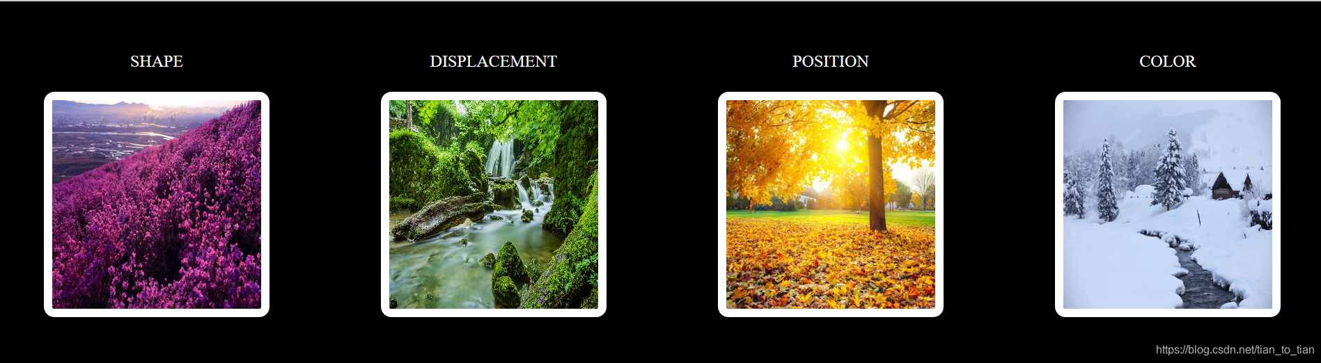
 本文展示了一组精美的图片,通过CSS的过渡与变形效果,实现了从圆形到方形的平滑过渡,图片放大缩小,旋转及颜色变化等视觉效果。每个效果都精心设计,展现了CSS的强大能力。
HTML
<!DOCTYPE html>
<html lang="en">
<head>
    <meta charset="UTF-8">
    <link rel="stylesheet" href="过渡变形.css">
    <title>过渡与变形的综合应用</title>
</head>
<body>
    <div class="one">
        <div class="two1">
            <span>SHAPE</span>
            <img src="images/春.jpg" >
        </div>
        <div class="two2">
            <span >DISPLACEMENT</span>
            <div class="gu">
            <img src="images/夏.jpg" >
            </div>

        </div>
        <div class="two3">
            <span>POSITION</span>
            <img src="images/秋.jpg" >
        </div>
        <div class="two4">
            <span>COLOR</span>
            <img src="images/冬.jpg">
        </div>
    </div>

</body>
</html>
css
body{
    background-color: black;
    padding: 40px;
}
.one{
    display: flex;
    justify-content: space-between;

}
.two1,.two2,.two3,.two4{
    display: flex;
    color: white;
    flex-direction: column;
}
span{
    text-align: center;
}
img{
    margin-top: 20px;
    width: 200px;
    height: 200px;
    border: 8px solid white;
    border-radius:10px ;
    transition: all 3s ;
}
.two1 img:hover {
    border-radius: 50%;
    box-shadow: 0 0 20px 5px white;
}
.gu{
    margin-top: 20px;
    width: 200px;
    height: 200px;
    overflow: hidden;
    border: 8px solid white;
    display: inline-block;
    border-radius:10px ;
    transition: all 3s;
}
.two2 img{
    margin-top: 0;
    border: 0px;
    border-radius:0 ;
}
.two2 img:hover{
    transform: scale(2);
}
.gu:hover{
     box-shadow: 0 0 20px 5px white;
 }
.two3 img:hover{
    transform: rotate(15deg);
    box-shadow: 0 0 20px 5px white;
}
.two4 img:hover{
    transform: perspective(50px);
    box-shadow: 0 0 20px 5px white;
    filter: grayscale(0.9);
}


 扫一扫
扫一扫


 877
877

 被折叠的 条评论
为什么被折叠?
被折叠的 条评论
为什么被折叠?
 到【灌水乐园】发言


