


三次方贝塞尔,让CSS动画更加的灵动。
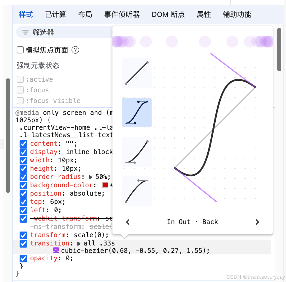
transition: all .33s cubic-bezier(0.68, -0.55, 0.27, 1.55);
完整代码:
<ul>
    <li>
        <p><text>这是一段填充文本</text></p>
    </li>
</ul>

<style>
    * {
        box-sizing: border-box;
    }

    ul {
        list-style: none;
    }

    p {
        display: inline-flex;
        justify-content: space-between;
        position: relative;
    }

    p>text {
        transition: all .33s cubic-bezier(0.68, -0.55, 0.27, 1.55);
    }

    p::before {
        content: "";
        display: inline-block;
        width: 10px;
        height: 10px;
        border-radius: 50%;
        background-color: red;
        margin-right: 10px;
        transition: all .33s cubic-bezier(0.68, -0.55, 0.27, 1.55);
        transform: scale(0);
        opacity: 0;
        position: absolute;
        left: 0;
        top: 6px;

    }

    li:hover {
        cursor: pointer;
    }

    li:hover p::before {
        transform: scale(1);
        opacity: 1;
    }

    li:hover p>text {
        transform: translateX(30px);
    }
</style>
💡 技巧:在浏览器开发者工具中拖动句柄预览和调整效果


 扫一扫
扫一扫


 被折叠的 条评论
为什么被折叠?
被折叠的 条评论
为什么被折叠?
 到【灌水乐园】发言


