


在第三个页面花的时间有点长,意识到自己的CSS知识掌握还是有点薄弱
于是在这个网站开始学习CSS布局:https://zh.learnlayout.com/
display属性
- block
- div 是一个标准的块级元素。一个块级元素会新开始一行并且尽可能撑满容器。
- 块级元素包括 p 、 form 和HTML5中的新元素: header 、 footer 、 section 等等
- 设置块级元素的 width 可以防止它从左到右撑满整个容器。同时可以设置左右外边距为 auto 来使其水平居中。元素会占据所指定的宽度,然后剩余的宽度会一分为二成为左右外边距。
#main {
  width: 600px;
  margin: 0 auto;
}
- 当浏览器窗口比元素的宽度还要窄时,浏览器会显示一个水平滚动条来容纳页面,在这种情况下使用 max-width 替代 width 可以使浏览器更好地处理小窗口的情况。
#main {
  max-width: 600px;
  margin: 0 auto;
}
- inline
- none
- 把 display 设置成 none 元素不会占据它本来应该显示的空间
- 设置成 visibility: hidden; 还会占据空间
- inline-block
- 困难方式(使用浮动)
.box {
  float: left;
  width: 200px;
  height: 100px;
  margin: 1em;
}
.after-box {
  clear: left;
}

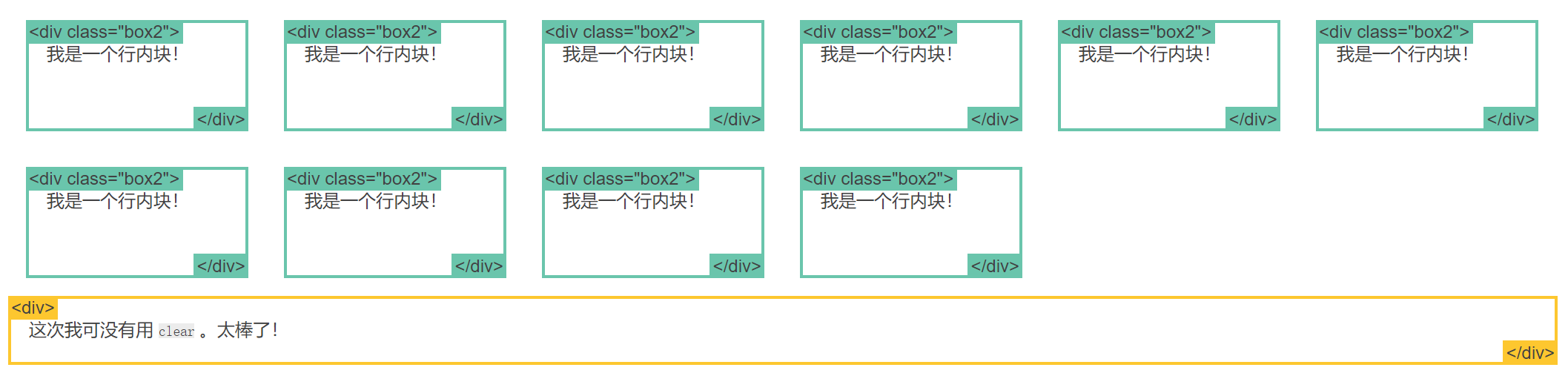
- 简单方式(使用 inline-block)
.box2 {
  display: inline-block;
  width: 200px;
  height: 100px;
  margin: 1em;
}
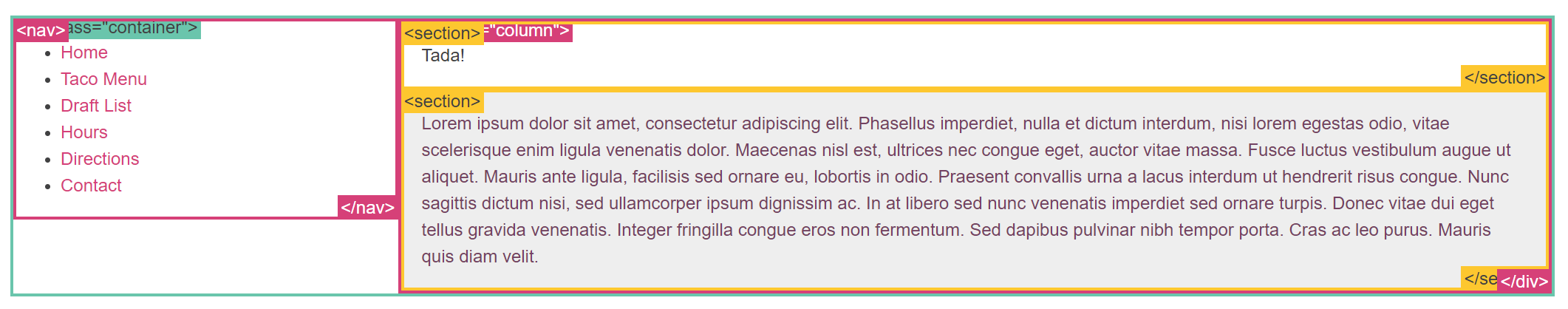
- flex
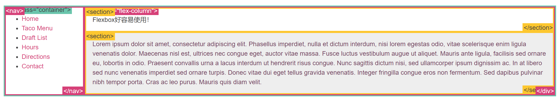
- 使用 Flexbox 的简单布局
.container {
  display: -webkit-flex;
  display: flex;
}
nav {
  width: 200px;
}
.flex-column {
  -webkit-flex: 1;
          flex: 1;
}
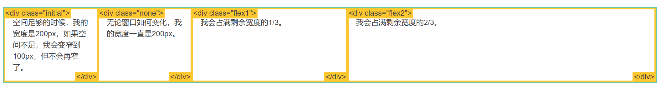
- 使用 Flexbox 的牛逼布局
.container {
  display: -webkit-flex;
  display: flex;
}
.initial {
  -webkit-flex: initial;
          flex: initial;
  width: 200px;
  min-width: 100px;
}
.none {
  -webkit-flex: none;
          flex: none;
  width: 200px;
}
.flex1 {
  -webkit-flex: 1;
          flex: 1;
}
.flex2 {
  -webkit-flex: 2;
          flex: 2;
}
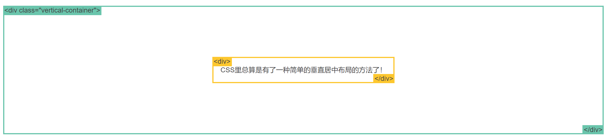
- 使用 Flexbox 的居中布局
.vertical-container {
  height: 300px;
  display: -webkit-flex;
  display:         flex;
  -webkit-align-items: center;
          align-items: center;
  -webkit-justify-content: center;
          justify-content: center;
}
盒模型
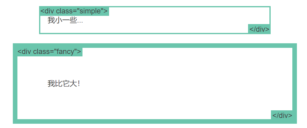
当设置了元素的宽度,实际展现的元素却超出设置:这是因为元素的边框和内边距会撑开元素。
如下,两个相同宽度的元素显示的实际宽度却不一样。
.simple {
  width: 500px;
  margin: 20px auto;
}

.fancy {
  width: 500px;
  margin: 20px auto;
  padding: 50px;
  border-width: 10px;
}
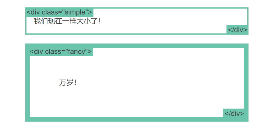
当设置一个元素为 box-sizing: border-box; 时,此元素的内边距和边框不再会增加它的宽度
.simple {
  width: 500px;
  margin: 20px auto;
  box-sizing: border-box;
}

.fancy {
  width: 500px;
  margin: 20px auto;
  padding: 50px;
  border: solid blue 10px;
  box-sizing: border-box;
}
position属性
- static
- static 是默认值。
- 任意 position: static; 的元素不会被特殊的定位。
- 一个 static 元素表示它不会被“positioned”
- 一个 position 属性被设置为其他值的元素表示它会被“positioned”。
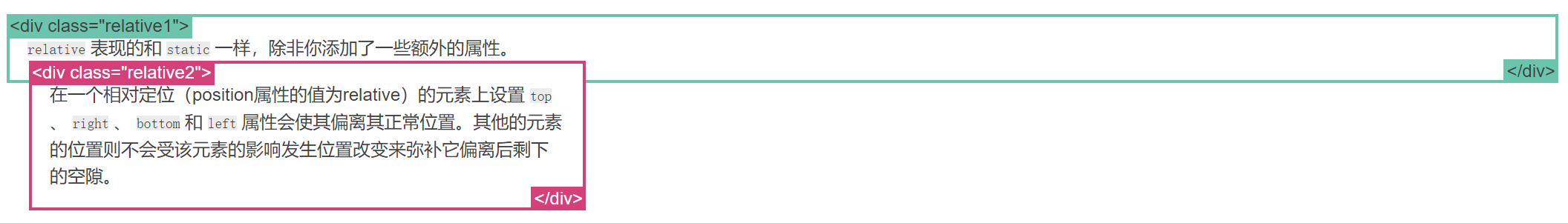
- relative
- 在一个相对定位(position属性的值为relative)的元素上设置 top 、 right 、 bottom 和 left 属性会使其偏离其正常位置。其他的元素的位置则不会受该元素的影响发生位置改变来弥补它偏离后剩下的空隙。
.relative1 {
  position: relative;
}
.relative2 {
  position: relative;
  top: -20px;
  left: 20px;
  background-color: white;
  width: 500px;
}
- fixed
- 一个固定定位(position属性的值为fixed)元素会相对于视窗来定位,这意味着即便页面滚动,它还是会停留在相同的位置。和 relative 一样, top 、 right 、 bottom 和 left 属性都可用。
- 一个固定定位元素不会保留它原本在页面应有的空隙(脱离文档流)。
.fixed {
  position: fixed;
  bottom: 0;
  right: 0;
  width: 200px;
  background-color: white;
}
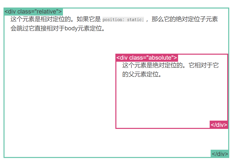
- absolute
- absolute 是最棘手的position值。 absolute 与 fixed 的表现类似,但是它不是相对于视窗而是相对于最近的“positioned”祖先元素。
- 如果绝对定位(position属性的值为absolute)的元素没有“positioned”祖先元素,那么它是相对于文档的 body 元素,并且它会随着页面滚动而移动。
- 记住一个“positioned”元素是指 position 值不是 static 的元素。
.relative {
  position: relative;
  width: 600px;
  height: 400px;
}
.absolute {
  position: absolute;
  top: 120px;
  right: 0;
  width: 300px;
  height: 200px;
}
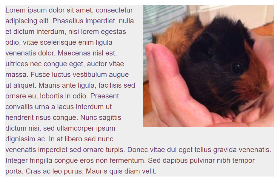
float属性:可用于实现文字环绕图片
- right
- left
img {
  float: right;
  margin: 0 0 1em 1em;
}
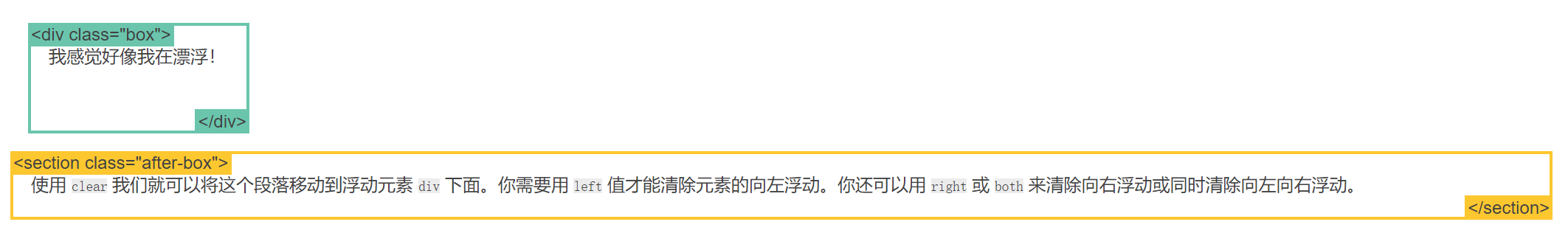
clear 属性:用于控制浮动
<div class="box">...</div>
<section>...</section>

.box {
  float: left;
  width: 200px;
  height: 100px;
  margin: 1em;
}

增加clear属性后
.after-box {
  clear: left;
}
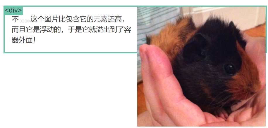
overflow属性:该属性规定当内容溢出元素框时发生的事情,可设置当内容溢出元素框时的4种处理方式:
- visible 默认值。内容不会被修剪,会呈现在元素框之外。
- hidden 内容会被修剪,并且其余内容是不可见的。
- scroll 内容会被修剪,但是浏览器会显示滚动条以便查看其余的内容。
- auto 如果内容被修剪,则浏览器会显示滚动条以便查看其余的内容。
img {
  float: right;
}
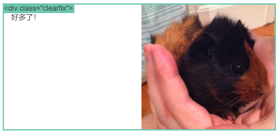
overflow属性清除浮动:
.clearfix {
  overflow: auto;
}
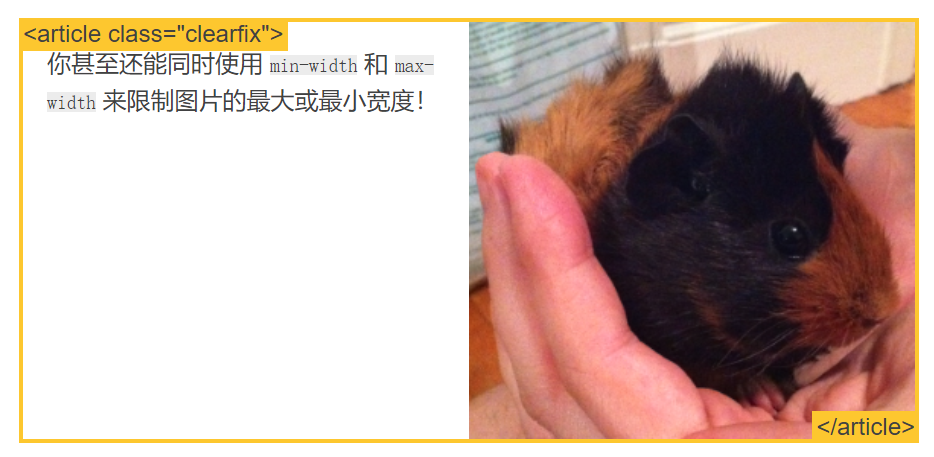
百分比:一种相对于包含块的计量单位
article img {
  float: right;
  width: 50%;
}
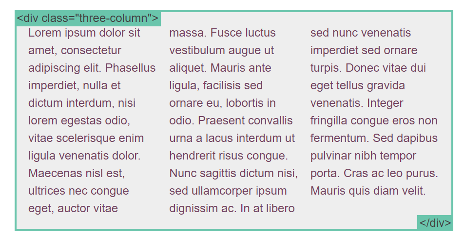
columns属性: 用来设置元素的列宽和列数(唯一可以分割内容的 CSS 布局方法)
- column-width:理想的列宽,auto 关键字。
- column-count:元素内容应分成的理想列数,或 auto 关键字。
.three-column {
  column-count: 3;
}
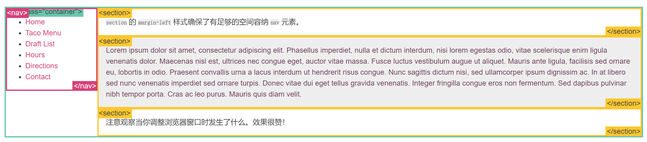
简单的布局例子
position例子
.container {
  position: relative;
}
nav {
  position: absolute;
  left: 0px;
  width: 200px;
}
section {
  /* position is static by default */
  margin-left: 200px;
}
footer {
  position: fixed;
  bottom: 0;
  left: 0;
  height: 70px;
  background-color: white;
  width: 100%;
}
body {
  margin-bottom: 120px;
}
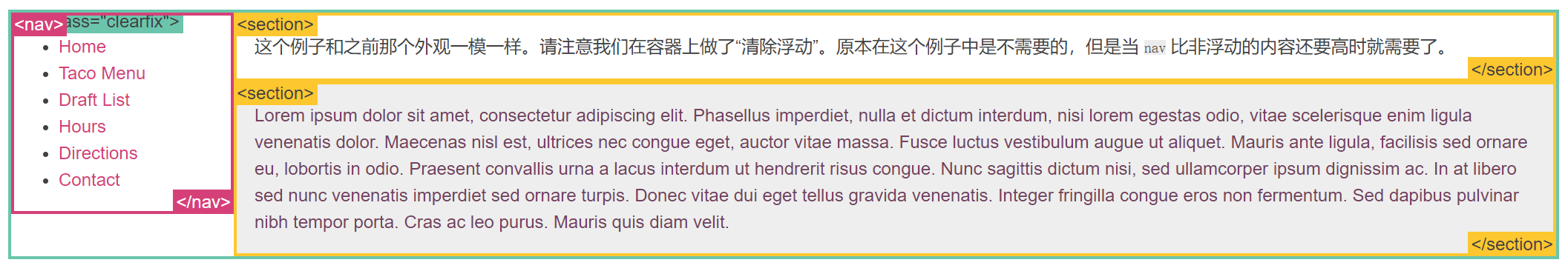
浮动布局例子
nav {
  float: left;
  width: 200px;
}
section {
  margin-left: 200px;
}
inline-block 布局例子
- vertical-align 属性会影响到 inline-block 元素,你可能会把它的值设置为 top 。
- 你需要设置每一列的宽度
- 如果HTML源代码中元素之间有空格,那么列与列之间会产生空隙
nav {
  display: inline-block;
  vertical-align: top;
  width: 25%;
}
.column {
  display: inline-block;
  vertical-align: top;
  width: 75%;
}


 扫一扫
扫一扫


 被折叠的 条评论
为什么被折叠?
被折叠的 条评论
为什么被折叠?
 到【灌水乐园】发言


