


 本文介绍如何使用CSS解决网页布局中常见的元素垂直对齐问题,包括span和div标签的对齐调整方法。
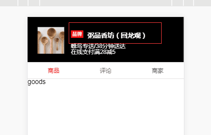
一、在一个div里面的两个span标签没有对齐,如下图红色圈所示
红色圈的html如下
<div class="title">
  <span class="brand"></span>
  <span class="name">{{seller.name}}</span>
</div>
部分css如下
.title
  margin:2px 0 8px 0
  .brand
    display: inline-block   /*span是inline元素,需设置成inline-block/block,设置width/height才能生效*/
    width:30px
    height:18px
    bg-image('brand')
    background-size :30px 18px
    background-repeat :no-repeat
  .name
    font-size:16px
    margin-left:6px
    font-weight:bold
    line-height:18px
要想让.brand和.name对齐,只需要在.brand或者.name中设置对齐方式:vertical-align:top,就ok了
更改后的css代码如下:
.title
margin:2px 0 8px 0
.brand
display: inline-block /*span是inline元素,需设置成inline-block/block,设置width/height才能生效*/
width:30px
height:18px
bg-image('brand')
background-size :30px 18px
background-repeat :no-repeat
vertical-align:top
.name
font-size:16px
margin-left:6px
font-weight:bold
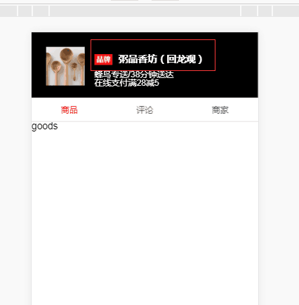
line-height:18px显示效果如下:
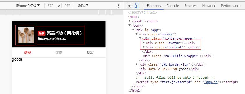
二、在一个div里面的两个div没有对齐,下图中的左边是显示的效果,右边是代码结构
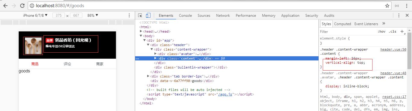
解决的方法还是在.avatar或者.content中设置对齐的方式,即vertical-align:top。
在.avatar或者.content中设置对齐的方式,即vertical-align:top之后,显示的效果.avatar和.content元素靠顶对齐了


 扫一扫
扫一扫


 2万+
2万+

 被折叠的 条评论
为什么被折叠?
被折叠的 条评论
为什么被折叠?
 到【灌水乐园】发言


