


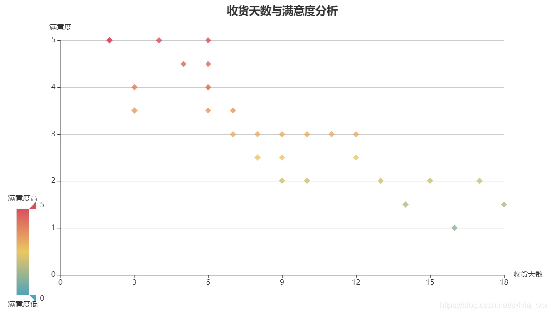
数据(收货天数与满意度之间的关系):
[[6, 4.5], [12, 3], [8, 3], [6, 5], [18, 1.5], [7, 3.5], [3, 4], [8, 2.5],
[11, 3], [2, 5], [12, 2.5], [15, 2], [6, 4], [9, 2], [2, 5], [10, 2],
[4, 5], [13, 2], [14, 1.5], [9, 3], [7, 3], [3, 3.5], [6, 4], [5, 4.5],
[16, 1], [9, 2.5], [6, 3.5], [10, 3], [17, 2]]
每一个小列表里的第一个元素代表收货天数,第二个元素代表满意度。
from pyecharts.charts import Scatter
from pyecharts import options as opts

#数据处理
arr = [[6, 4.5], [12, 3], [8, 3], [6, 5], [18, 1.5], [7, 3.5], [3, 4], [8, 2.5],
[11, 3], [2, 5], [12, 2.5], [15, 2], [6, 4], [9, 2], [2, 5], [10, 2],
[4, 5], [13, 2], [14, 1.5], [9, 3], [7, 3], [3, 3.5], [6, 4], [5, 4.5],
[16, 1], [9, 2.5], [6, 3.5], [10, 3], [17, 2]]
x = []
y = []
for i in arr:
    x.append(i[0])
    y.append(i[1])

#创建散点图对象
scatter = Scatter()
scatter.add_xaxis(x)
scatter.add_yaxis("满意度",y,symbol="diamond")   #symbol设置标记图形
scatter.set_global_opts(
    title_opts=opts.TitleOpts(
        title="收货天数与满意度分析",
        pos_left="center"   #设置标题居中显示
    ),
    legend_opts=opts.LegendOpts(
        is_show=False),   #不显示图例组件
    xaxis_opts=opts.AxisOpts(
        name="收货天数",   #添加x轴名称
        type_="value") ,  #设置x轴为数值轴
    yaxis_opts=opts.AxisOpts(
        name="满意度",   #添加y轴名称
        splitline_opts=opts.SplitLineOpts(
            is_show=True   #y轴分割线
        )
    ),
    visualmap_opts=opts.VisualMapOpts(   #视觉映射配置项,以颜色来体现满意度的高低。
        min_=0,
        max_=5,
        range_text=["满意度高","满意度低"]
    )
)
scatter.set_series_opts(
    label_opts=opts.LabelOpts(
        is_show=False   #不显示标签值
    )
)
scatter.render()
最后呈现出来的结果


 4112
4112

 被折叠的 条评论
为什么被折叠?
被折叠的 条评论
为什么被折叠?
 到【灌水乐园】发言


