


      *{margin: 0;padding: 0;box-sizing: border-box;}
        body{
            display: flex;
            justify-content: center;
            align-items: center;
            background-color: black;
            height: 100vh;
            overflow: hidden;
        }
        .ring{
            width: 500px;
            height: 500px;
            position: relative;
            display: flex;
            align-items: center;
            justify-content: center;
        }
        .ring i{
            position: absolute;
            inset: 0;
            border: 2px solid #fff;
            transition: all 0.6s;
        }
        .ring i:nth-child(1){
            border-radius: 38% 62% 63% 37%;
            animation: animate 6s linear infinite;
        }
        .ring i:nth-child(2){
            border-radius: 41% 44% 56% 59%;
            animation: animate 4s linear infinite;
        }
        .ring i:nth-child(3){
            border-radius: 31% 44% 36% 69%;
            animation: animate 3s linear infinite reverse;
        }
        .ring:hover i{
            /* 引用css变量*/
            border: 6px solid var(--clr);
            filter: drop-shadow(0 0 20px var(--clr));
        }

        .login{
    position: absolute;
    width: 300px;
    height: 100%;
    display: flex;
    flex-direction: column;
    justify-content: center;
    align-items: center;
    gap: 20px;
}
.login h2{
    color: #fff;
    font-size: 32px;
    letter-spacing: 16px;
    text-indent: 16px;
    margin-bottom: 16px;
}
.login .ipt-box{
    position: relative;
    width: 100%;
}
.login .ipt-box input{
    position: relative;
    width: 100%;
    padding: 12px 20px;
    background-color: transparent;
    border: 2px solid #fff;
    border-radius: 40px;
    font-size: 18px;
    color: #fff;
    box-shadow: none;
    outline: none;
}
.login .ipt-box input[type="submit"]{
    width: 100%;
    background: linear-gradient(45deg,#ff357a,#fff172);
    border: none;
    cursor: pointer;
}
.login .ipt-box input::placeholder{
    color: rgba(255,255,255,0.75);
}
.login .links{
    position: relative;
    width: 100%;
    display: flex;
    justify-content: space-between;
    align-items: center;
    padding: 0 20px;
}
.login .links a{
    color: #fff;
    text-decoration: none;
}
.msgTip{
    opacity: 1;
    color:#fff;
    transition: all 0.6s;
}

.msgTip.show{
    color:#fff;

    opacity: 1;
}

.msgTip.hidden{
    color:#fff;

    opacity: 0;
}


        @keyframes animate{
            0%{
                transform: rotate(0deg);
            }
            100%{
                transform: rotate(360deg);
            }
        }
html代码
<div class="ring">
        <!-- clr是指css变量-->
        <i style="--clr:#00ff0a;"></i>
        <i style="--clr:#ff0057;"></i>
        <i style="--clr:#fffd44;"></i>
        <div class="login">
            <h2>登录</h2>
            <div class="ipt-box">
                <input type="text" placeholder="账号" id="userName">
            </div>
            <div class="ipt-box">
                <input type="password" placeholder="密码" id="pwd">
            </div>
            <div class="ipt-box">
                <input type="submit" value="登录" id="btnlogin">
            </div>
            <div class="msgTip">提示</div>
            <div class="links">
                <a href="#">忘记密码</a>
                <a href="#">注册</a>
            </div>
        </div>
        </div>


    </div>
具体代码如下:
<!DOCTYPE html>
<html lang="en">
<head>
    <meta charset="UTF-8">
    <meta name="viewport" content="width=device-width, initial-scale=1.0">
    <title>Document</title>
    <style>
        *{margin: 0;padding: 0;box-sizing: border-box;}
        body{
            display: flex;
            justify-content: center;
            align-items: center;
            background-color: black;
            height: 100vh;
            overflow: hidden;
        }
        .ring{
            width: 500px;
            height: 500px;
            position: relative;
            display: flex;
            align-items: center;
            justify-content: center;
        }
        .ring i{
            position: absolute;
            inset: 0;
            border: 2px solid #fff;
            transition: all 0.6s;
        }
        .ring i:nth-child(1){
            border-radius: 38% 62% 63% 37%;
            animation: animate 6s linear infinite;
        }
        .ring i:nth-child(2){
            border-radius: 41% 44% 56% 59%;
            animation: animate 4s linear infinite;
        }
        .ring i:nth-child(3){
            border-radius: 31% 44% 36% 69%;
            animation: animate 3s linear infinite reverse;
        }
        .ring:hover i{
            /* 引用css变量*/
            border: 6px solid var(--clr);
            filter: drop-shadow(0 0 20px var(--clr));
        }

        .login{
    position: absolute;
    width: 300px;
    height: 100%;
    display: flex;
    flex-direction: column;
    justify-content: center;
    align-items: center;
    gap: 20px;
}
.login h2{
    color: #fff;
    font-size: 32px;
    letter-spacing: 16px;
    text-indent: 16px;
    margin-bottom: 16px;
}
.login .ipt-box{
    position: relative;
    width: 100%;
}
.login .ipt-box input{
    position: relative;
    width: 100%;
    padding: 12px 20px;
    background-color: transparent;
    border: 2px solid #fff;
    border-radius: 40px;
    font-size: 18px;
    color: #fff;
    box-shadow: none;
    outline: none;
}
.login .ipt-box input[type="submit"]{
    width: 100%;
    background: linear-gradient(45deg,#ff357a,#fff172);
    border: none;
    cursor: pointer;
}
.login .ipt-box input::placeholder{
    color: rgba(255,255,255,0.75);
}
.login .links{
    position: relative;
    width: 100%;
    display: flex;
    justify-content: space-between;
    align-items: center;
    padding: 0 20px;
}
.login .links a{
    color: #fff;
    text-decoration: none;
}
.msgTip{
    opacity: 1;
    color:#fff;
    transition: all 0.6s;
}

.msgTip.show{
    color:#fff;

    opacity: 1;
}

.msgTip.hidden{
    color:#fff;

    opacity: 0;
}


        @keyframes animate{
            0%{
                transform: rotate(0deg);
            }
            100%{
                transform: rotate(360deg);
            }
        }
    </style>
</head>
<body>
    <div class="ring">
        <!-- clr是指css变量-->
        <i style="--clr:#00ff0a;"></i>
        <i style="--clr:#ff0057;"></i>
        <i style="--clr:#fffd44;"></i>
        <div class="login">
            <h2>登录</h2>
            <div class="ipt-box">
                <input type="text" placeholder="账号" id="userName">
            </div>
            <div class="ipt-box">
                <input type="password" placeholder="密码" id="pwd">
            </div>
            <div class="ipt-box">
                <input type="submit" value="登录" id="btnlogin">
            </div>
            <div class="msgTip">提示</div>
            <div class="links">
                <a href="#">忘记密码</a>
                <a href="#">注册</a>
            </div>
        </div>
        </div>


    </div>
    <script>


    </script>
</body>
</html>
实现效果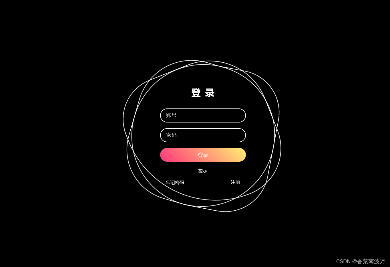


 扫一扫
扫一扫


 5932
5932

 被折叠的 条评论
为什么被折叠?
被折叠的 条评论
为什么被折叠?
 到【灌水乐园】发言


