摩天轮代码
<!DOCTYPE html>
<html>
    <head>
        <meta charset="UTF-8">
        <title></title>
        <style>
            *{margin: 0;padding: 0;}
            html,body{height:100%;}
            body{
                background: url("img3/2.jpg")no-repeat;
                background-size:100% 100%;
                overflow:hidden;
            }
            .box{
                width:620px;
                height:520px;
                background:url(img3/bracket.png)no-repeat center bottom;
                position:fixed;
                left:0;
                right:0;
                bottom:-140px;
                margin:auto;
            }
            .box img:nth-child(1){
                position:absolute;
                top:-380px;
                left:-73px;
                animation:move1 60s linear infinite;
            }
            .box img:nth-child(2){
                position:absolute;
                top:-134px;
                left:30px;
            }
            .box2{
                width: 768px;
                height: 768px;
                position:fixed;
                top:0px;
                left:0px;
                bottom:0px;
                right:0px;
                margin:auto;
                animation:move1 60s linear infinite;
            }
            .box2 img{
                position:absolute;
                animation:move2 60s linear infinite;
                transform-origin:50% 0;
            }
            .box2 img:nth-child(1){
                top:40px;
                left:324px;
            }
            .box2 img:nth-child(2){
                top:132px;
                right:88px;
            }
            .box2 img:nth-child(3){
                top:380px;
                right:-25px;
            }
            .box2 img:nth-child(4){
                bottom:-30px;
                right:86px;
            }
            .box2 img:nth-child(5){
                bottom:-127px;
                right:306px;
            }
            .box2 img:nth-child(6){
                bottom:-27px;
                left:75px;
            }
            .box2 img:nth-child(7){
                bottom:215px;
                left:0px;
            }
            .box2 img:nth-child(8){
                top:144px;
                left:80px;
            }

           @keyframes move1{
                0%{
                    transform:rotate(0deg);
                }
                50%{
                    transform:rotate(180deg);
                }
                100%{
                    transform:rotate(360deg);
                }
            }

           @keyframes move2{
                0%{transform:rotate(0deg);}
                50%{
                    transform:rotate(-180deg);
                }
                100%{
                    transform:rotate(-360deg);
                }
            }
        </style>
    </head>
    <body>
        <div class="box">
            <img src="img3/fsw.png" alt="" />
            <img src="img3/big-title.png" alt="" />
        </div>
        <div class="box2">
            <img src="img3/boy.png"/>
            <img src="img3/girl.png"/>
            <img src="img3/girls.png"/>
            <img src="img3/hairboy.png"/>
            <img src="img3/mimi.png"/>
            <img src="img3/mudog.png"/>
            <img src="img3/dog.png"/>
            <img src="img3/mudog.png"/>
        </div>

    </body>
</html>
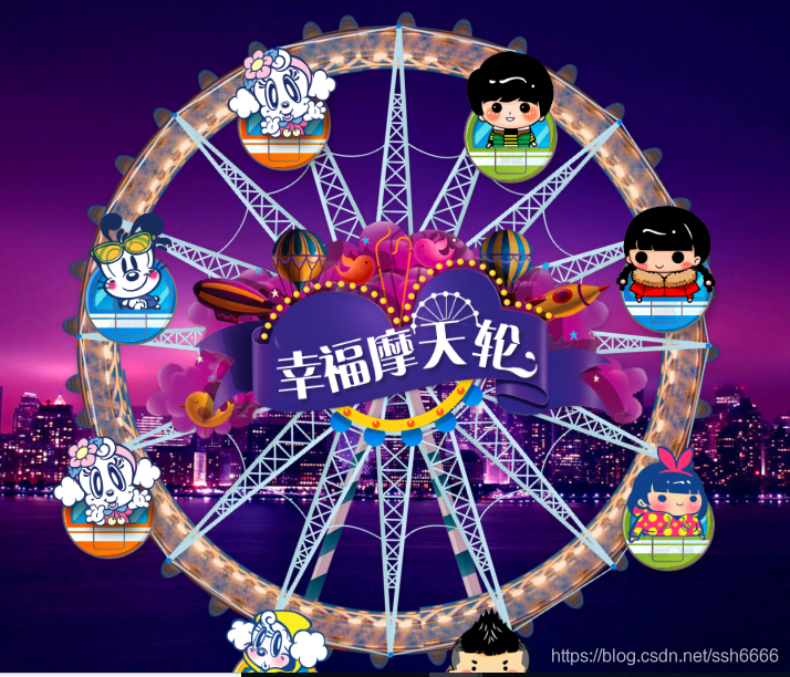


 本文介绍如何使用CSS3技术创建一个逼真的3D摩天轮动画效果,详细阐述了关键代码和实现步骤,帮助读者理解并掌握CSS3在网页交互设计中的应用。


 扫一扫
扫一扫


 2559
2559

 被折叠的 条评论
为什么被折叠?
被折叠的 条评论
为什么被折叠?
 到【灌水乐园】发言


