


最近项目里有个页面,需要上下两个图表,我这里提供两个做法:
第一种:直接建两个div,然后使用两个图表就行。但这样有个弊端,给图表写工具的时候,要写的代码会多一些,还有数据渲染的时候也会有一定的冗余。
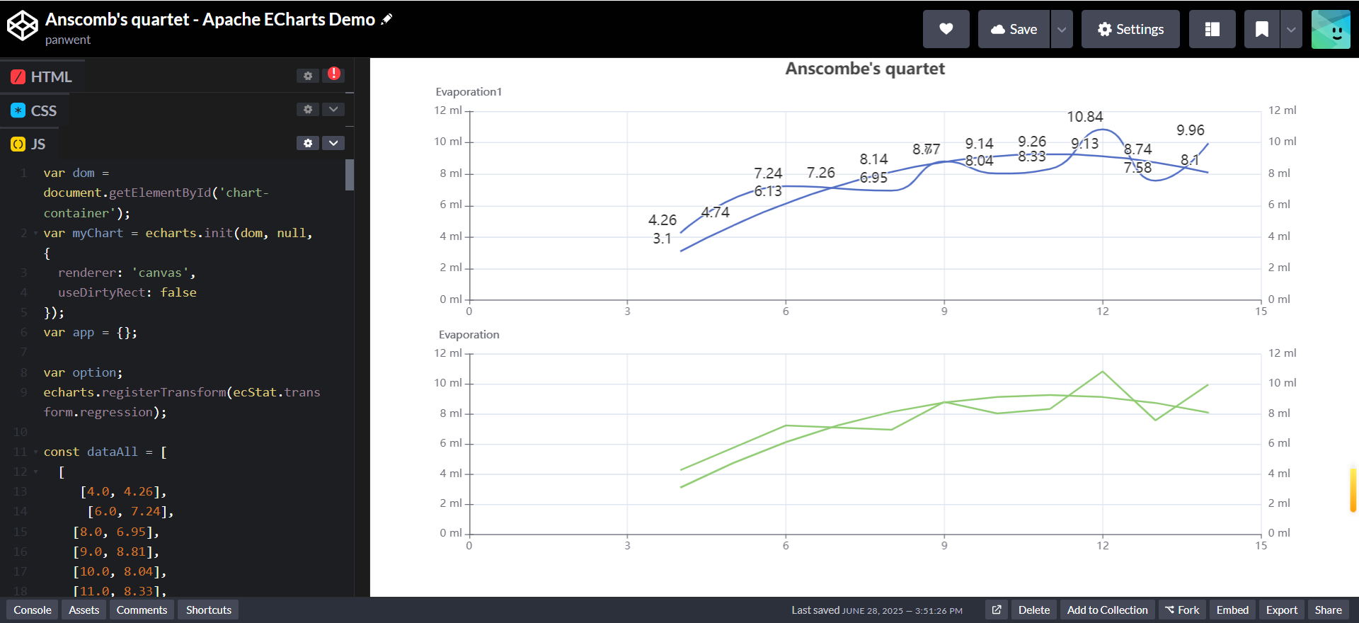
第二种:在xAxis中直接使用gridIndex来建立两个坐标系,搭配grid使用即可。上代码:
var dom = document.getElementById('chart-container');
var myChart = echarts.init(dom, null, {
renderer: 'canvas',
useDirtyRect: false
});
var app = {};
var option;
echarts.registerTransform(ecStat.transform.regression);
const dataAll = [
[
[4.0, 4.26],
[6.0, 7.24],
[8.0, 6.95],
[9.0, 8.81],
[10.0, 8.04],
[11.0, 8.33],
[12.0, 10.84],
[13.0, 7.58],
[14.0, 9.96],
],
[
[4.0, 3.1],
[5.0, 4.74],
[6.0, 6.13],
[7.0, 7.26],
[8.0, 8.14],
[9.0, 8.77],
[10.0, 9.14],
[11.0, 9.26],
[12.0, 9.13],
[13.0, 8.74],
[14.0, 8.1]
],
// [
// [10.0, 7.46],
// [8.0, 6.77],
// [13.0, 12.74],
// [9.0, 7.11],
// [11.0, 7.81],
// [14.0, 8.84],
// [6.0, 6.08],
// [4.0, 5.39],
// [12.0, 8.15],
// [7.0, 6.42],
// [5.0, 5.73]
// ],
// [
// [8.0, 6.58],
// [8.0, 5.76],
// [8.0, 7.71],
// [8.0, 8.84],
// [8.0, 8.47],
// [8.0, 7.04],
// [8.0, 5.25],
// [19.0, 12.5],
// [8.0, 5.56],
// [8.0, 7.91],
// [8.0, 6.89]
// ]
];
// const markLineOpt = {
// animation: false,
// label: {
// formatter: 'y = 0.5 * x + 3',
// align: 'right'
// },
// lineStyle: {
// type: 'solid'
// },
// tooltip: {
// formatter: 'y = 0.5 * x + 3'
// },
// data: [
// [
// {
// coord: [0, 3],
// symbol: 'none'
// },
// {
// coord: [20, 13],
// symbol: 'none'
// }
// ]
// ]
// };
option = {
dataset: [
{
source: dataAll[0]
},
{
source: dataAll[1]
},
{
transform: {
fromDatasetIndex: 1,
type: 'ecStat:regression',
config: {
method: 'exponential'
// 'end' by default
// formulaOn: 'start'
}
}
},
{
transform: {
type: 'ecStat:regression',
config: { method: 'polynomial', order: 3 }
}
}
],
title: {
text: "Anscombe's quartet",
left: 'center',
top: 0
},
grid: [
{ bottom: '55%' }, { top: '55%' }
// { left: '7%', top: '7%', width: '90%', height: '38%' },
// { right: '7%', top: '7%', width: '38%', height: '38%' },
// { left: '7%', bottom: '7%', width: '90%', height: '38%' },
// { right: '7%', bottom: '7%', width: '38%', height: '38%' }
],
tooltip: {
formatter: 'Group {a}: ({c})'
},
xAxis: [
{ gridIndex: 0},
// { gridIndex: 1, min: 0, max: 20 },
{ gridIndex: 1}
// { gridIndex: 3, min: 0, max: 20 }
],
yAxis: [
// { gridIndex: 0},
{
// gridIndex: 0,
type: 'value',
name: 'Evaporation1',
position: 'right',
alignTicks: true,
axisLine: {
show: true,
// lineStyle: {
// color: colors[0]
// }
},
axisLabel: {
formatter: '{value} ml'
}
},
{
// gridIndex: 0,
type: 'value',
name: 'Evaporation1',
position: 'left',
alignTicks: true,
axisLine: {
show: true,
// lineStyle: {
// color: colors[0]
// }
},
axisLabel: {
formatter: '{value} ml'
}
},
{
gridIndex: 1,
type: 'value',
name: 'Evaporation',
position: 'right',
alignTicks: true,
axisLine: {
show: true,
// lineStyle: {
// color: colors[0]
// }
},
axisLabel: {
formatter: '{value} ml'
}
},
{
gridIndex: 1,
type: 'value',
name: 'Evaporation',
position: 'left',
alignTicks: true,
axisLine: {
show: true,
// lineStyle: {
// color: colors[0]
// }
},
axisLabel: {
formatter: '{value} ml'
}
},
// { gridIndex: 1, min: 0, max: 15 },
// { gridIndex: 1}
// { gridIndex: 3, min: 0, max: 15 }
],
series: [
{
name: 'I',
type: 'line',
xAxisIndex: 0,
yAxisIndex: 0,
datasetIndex: 0,
smooth: true,
// data: dataAll[0],
// markLine: markLineOpt,
symbolSize: 0.1,
symbol: 'circle',
label: { show: true, fontSize: 16 },
labelLayout: { dx: -20 },
encode: { label: 2, tooltip: 1 },
},
{
name: 'I',
type: 'line',
xAxisIndex: 0,
yAxisIndex: 1,
datasetIndex: 1,
smooth: true,
// data: dataAll[0],
// markLine: markLineOpt,
symbolSize: 0.1,
symbol: 'circle',
label: { show: true, fontSize: 16 },
labelLayout: { dx: -20 },
encode: { label: 2, tooltip: 1 },
},
{
name: 'II',
type: 'line',
xAxisIndex: 1,
yAxisIndex: 2,
// data: dataAll[1],
datasetIndex: 0,
symbolSize: 0.1,
// markLine: markLineOpt
},
{
name: 'II',
type: 'line',
xAxisIndex: 1,
yAxisIndex: 3,
// data: dataAll[1],
datasetIndex: 1,
symbolSize: 0.1,
// markLine: markLineOpt
},
// {
// name: 'III',
// type: 'scatter',
// xAxisIndex: 2,
// yAxisIndex: 2,
// data: dataAll[2],
// markLine: markLineOpt
// },
// {
// name: 'IV',
// type: 'scatter',
// xAxisIndex: 3,
// yAxisIndex: 3,
// data: dataAll[3],
// markLine: markLineOpt
// }
]
};
if (option && typeof option === 'object') {
myChart.setOption(option);
}
window.addEventListener('resize', myChart.resize);
我也是使用echarts自带的多图表调试出来的,原始echarts图表是这个:
有问题欢迎联系我交流


 3658
3658

 被折叠的 条评论
为什么被折叠?
被折叠的 条评论
为什么被折叠?
 到【灌水乐园】发言


