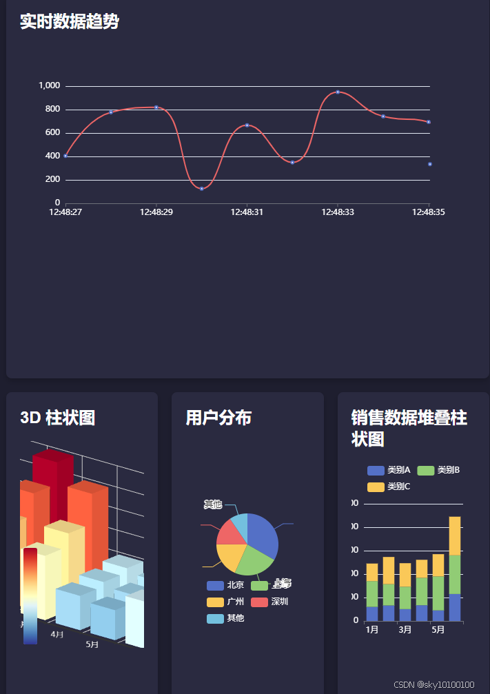
效果图:
完整代码
<!DOCTYPE html>
<html>
<head>
<meta charset="utf-8">
<title>复杂 ECharts 智慧大屏 - Vue2</title>
<script src="https://cdn.jsdelivr.net/npm/vue@2"></script>
<script src="https://cdn.jsdelivr.net/npm/echarts@5.4.2/dist/echarts.min.js"></script>
<script src="https://cdn.jsdelivr.net/npm/echarts-gl@2/dist/echarts-gl.min.js"></script>
<style>
body {
font-family: Arial, sans-serif;
background-color: #1e1e2f;
color: #fff;
margin: 0;
padding: 0;
}
.dashboard {
display: grid;
grid-template-columns: repeat(3, 1fr);
grid-template-rows: repeat(2, 1fr);
gap: 20px;
padding: 20px;
height: 100vh;
}
.card {
background: #2a2a40;
border-radius: 8px;
box-shadow: 0 4px 8px rgba(0, 0, 0, 0.2);
padding: 20px;
}
.card h2 {
margin-top: 0;
color: #fff;
}
.chart {
width: 100%;
height: 300px;
}
.full-width {
grid-column: span 3;
}
</style>
</head>
<body>
<div id="app">
<div class="dashboard">
<div class="card full-width">
<h2>实时数据趋势</h2>
<div class="chart" ref="lineChart"></div>
</div>
<div class="card">
<h2>3D 柱状图</h2>
<div class="chart" ref="bar3dChart"></div>
</div>
<div class="card">
<h2>用户分布</h2>
<div class="chart" ref="pieChart"></div>
</div>
<div class="card">
<h2>销售数据堆叠柱状图</h2>
<div class="chart" ref="stackedBarChart"></div>
</div>
</div>
</div>
<script>
new Vue({
el: '#app',
data() {
return {
lineData: [],
pieData: [
{ value: 1048, name: '北京' },
{ value: 735, name: '上海' },
{ value: 580, name: '广州' },
{ value: 484, name: '深圳' },
{ value: 300, name: '其他' }
],
stackedBarData: {
categories: ['1月', '2月', '3月', '4月', '5月', '6月'],
series: [
{ name: '类别A', data: [120, 132, 101, 134, 90, 230] },
{ name: '类别B', data: [220, 182, 191, 234, 290, 330] },
{ name: '类别C', data: [150, 232, 201, 154, 190, 330] }
]
},
bar3dData: {
xAxis: ['1月', '2月', '3月', '4月', '5月', '6月'],
yAxis: ['A', 'B', 'C'],
data: [
[0, 0, 100],
[1, 0, 200],
[2, 0, 150],
[3, 0, 80],
[4, 0, 70],
[5, 0, 110],
[0, 1, 120],
[1, 1, 250],
[2, 1, 180],
[3, 1, 90],
[4, 1, 80],
[5, 1, 130],
[0, 2, 200],
[1, 2, 300],
[2, 2, 250],
[3, 2, 100],
[4, 2, 90],
[5, 2, 150]
]
}
};
},
mounted() {
this.initLineChart();
this.initBar3dChart();
this.initPieChart();
this.initStackedBarChart();
this.simulateRealTimeData();
},
methods: {
initLineChart() {
const chart = echarts.init(this.$refs.lineChart);
const option = {
tooltip: {
trigger: 'axis'
},
xAxis: {
type: 'category',
boundaryGap: false,
data: [],
axisLabel: {
color: '#fff'
}
},
yAxis: {
type: 'value',
axisLabel: {
color: '#fff'
}
},
series: [{
name: '实时数据',
type: 'line',
data: [],
smooth: true,
lineStyle: {
color: '#ee6666'
}
}]
};
chart.setOption(option);
this.lineChart = chart;
},
initBar3dChart() {
const chart = echarts.init(this.$refs.bar3dChart);
const option = {
tooltip: {},
visualMap: {
max: 300,
inRange: {
color: ['#313695', '#4575b4', '#74add1', '#abd9e9', '#e0f3f8', '#ffffbf', '#fee090', '#fdae61', '#f46d43', '#d73027', '#a50026']
}
},
xAxis3D: {
type: 'category',
data: this.bar3dData.xAxis,
axisLabel: {
color: '#fff'
}
},
yAxis3D: {
type: 'category',
data: this.bar3dData.yAxis,
axisLabel: {
color: '#fff'
}
},
zAxis3D: {
type: 'value',
axisLabel: {
color: '#fff'
}
},
grid3D: {
boxWidth: 200,
boxDepth: 80,
viewControl: {
projection: 'orthographic'
},
light: {
main: {
intensity: 1.2,
shadow: true
},
ambient: {
intensity: 0.3
}
}
},
series: [{
type: 'bar3D',
data: this.bar3dData.data,
shading: 'lambert',
label: {
show: false
},
emphasis: {
label: {
show: false
},
itemStyle: {
color: '#ff7f50'
}
}
}]
};
chart.setOption(option);
},
initPieChart() {
const chart = echarts.init(this.$refs.pieChart);
const option = {
tooltip: {
trigger: 'item'
},
legend: {
bottom: '10%',
left: 'center',
textStyle: {
color: '#fff'
}
},
series: [{
name: '用户分布',
type: 'pie',
radius: '50%',
data: this.pieData,
emphasis: {
itemStyle: {
shadowBlur: 10,
shadowOffsetX: 0,
shadowColor: 'rgba(0, 0, 0, 0.5)'
}
}
}]
};
chart.setOption(option);
},
initStackedBarChart() {
const chart = echarts.init(this.$refs.stackedBarChart);
const option = {
tooltip: {
trigger: 'axis',
axisPointer: {
type: 'shadow'
}
},
legend: {
data: this.stackedBarData.series.map(s => s.name),
textStyle: {
color: '#fff'
}
},
xAxis: {
type: 'category',
data: this.stackedBarData.categories,
axisLabel: {
color: '#fff'
}
},
yAxis: {
type: 'value',
axisLabel: {
color: '#fff'
}
},
series: this.stackedBarData.series.map(s => ({
name: s.name,
type: 'bar',
stack: '总量',
data: s.data
}))
};
chart.setOption(option);
},
simulateRealTimeData() {
setInterval(() => {
const now = new Date().toLocaleTimeString();
const value = Math.random() * 1000;
this.lineData.push({ name: now, value });
if (this.lineData.length > 10) {
this.lineData.shift();
}
this.lineChart.setOption({
xAxis: {
data: this.lineData.map(d => d.name)
},
series: [{
data: this.lineData.map(d => d.value)
}]
});
}, 1000);
}
}
});
</script>
</body>
</html>


 3746
3746

 被折叠的 条评论
为什么被折叠?
被折叠的 条评论
为什么被折叠?
 到【灌水乐园】发言


