


上一章讲了Nest View,Fragment。
SAP学习笔记 - 开发20 - 前端Fiori开发 Nest View(嵌套视图) ,Fragment(片段)-优快云博客
本章继续学习Fiori 开发的知识。
目录
下面是详细内容。
1,Icons(图标)
SAP Fiori UI5 提供很多的图标,开发者只需要查一下就可以直接使用,这也一定程度上保证了Fiori程序外观的一致性。
这些图标呢,本身不是图片,更像是一种字体,所以放大也不会变形太厉害,用起来非常方便。
1),Icon Explorer(图标浏览器)
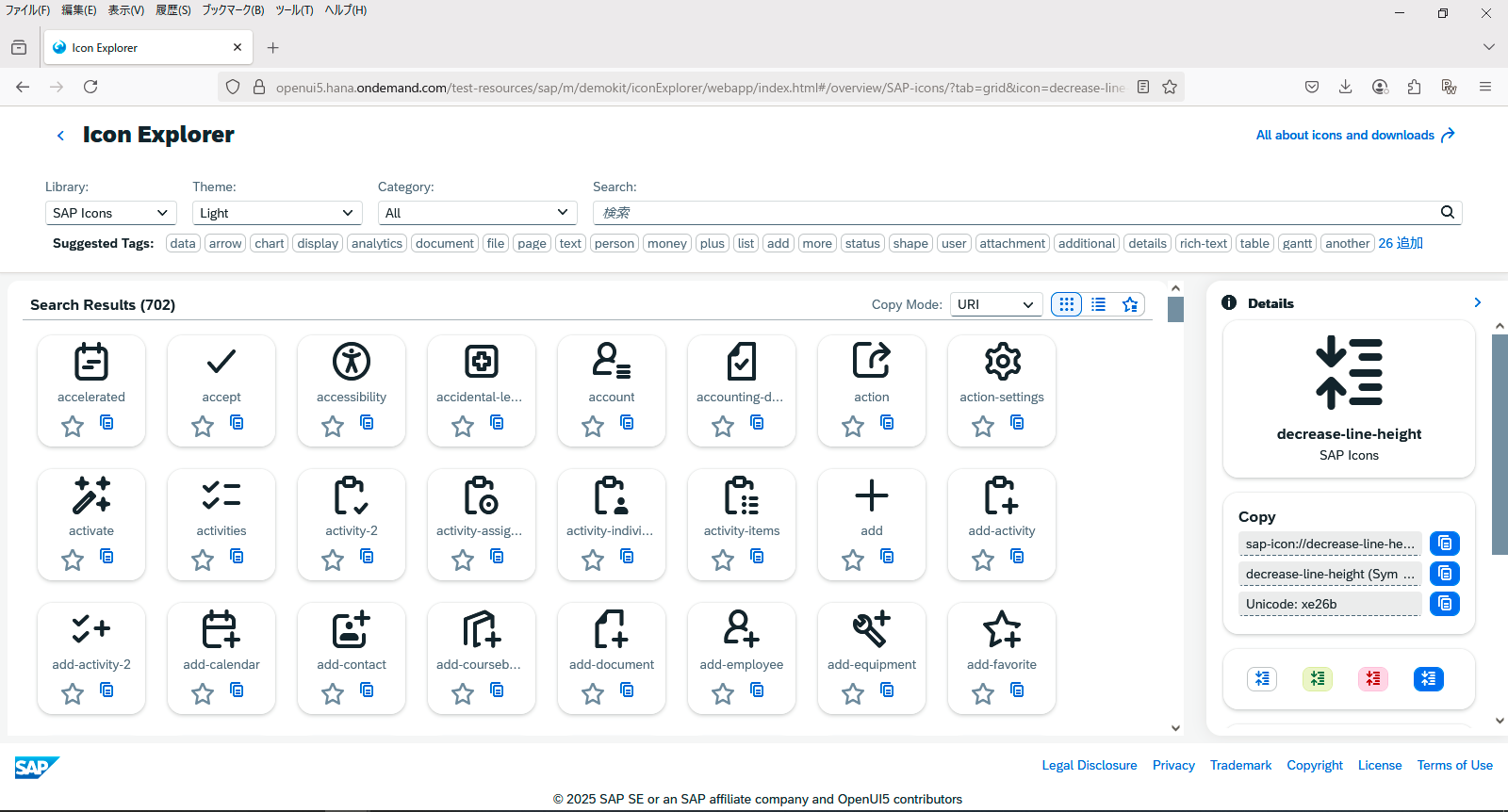
那么要怎么查找有哪些图标呢?就是通过Icon Explorer。
输入任意关键字,就会出来很多选择
点击任意图标,右侧会出现该Icon的明细,其中下面这个就是Icon的ID,加上它就可以用了
- sap-icon://decrease-line-height
下面来在程序当中用一下。
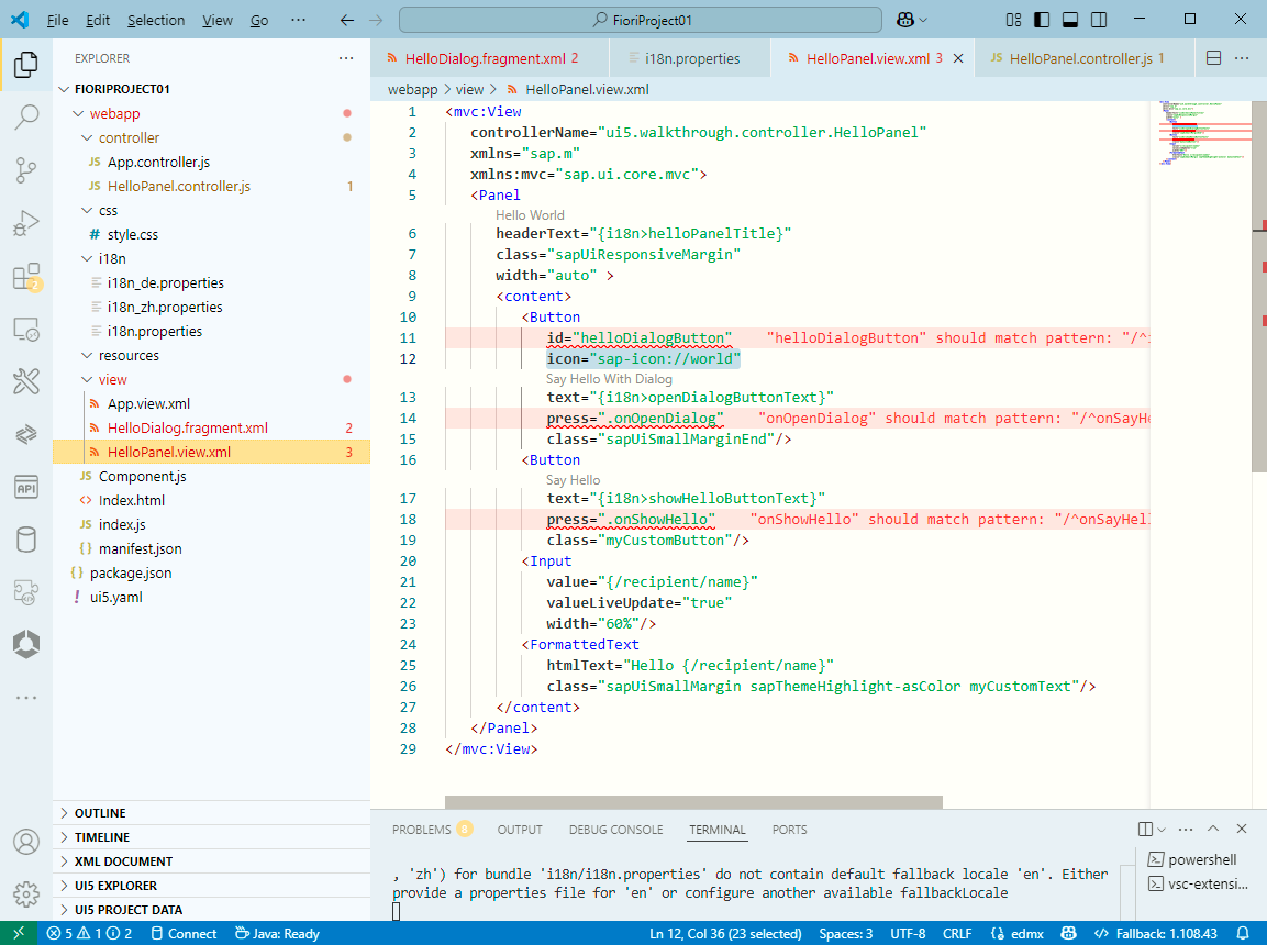
2),HelloPanel.view.xml
<mvc:View
   controllerName="ui5.walkthrough.controller.HelloPanel"
   xmlns="sap.m"
   xmlns:mvc="sap.ui.core.mvc">
   <Panel
      headerText="{i18n>helloPanelTitle}"
      class="sapUiResponsiveMargin"
      width="auto" >
      <content>
         <Button
            id="helloDialogButton"
            icon="sap-icon://world"
            text="{i18n>openDialogButtonText}"
            press=".onOpenDialog"
            class="sapUiSmallMarginEnd"/>
         <Button
            text="{i18n>showHelloButtonText}"
            press=".onShowHello"
            class="myCustomButton"/>
         <Input
            value="{/recipient/name}"
            valueLiveUpdate="true"
            width="60%"/>
         <FormattedText
            htmlText="Hello {/recipient/name}"
            class="sapUiSmallMargin sapThemeHighlight-asColor myCustomText"/>
      </content>
   </Panel>
</mvc:View>
- icon="sap-icon://world"
通过Icon的ID来引用,用在按钮的 icon 属性上
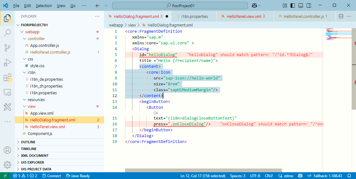
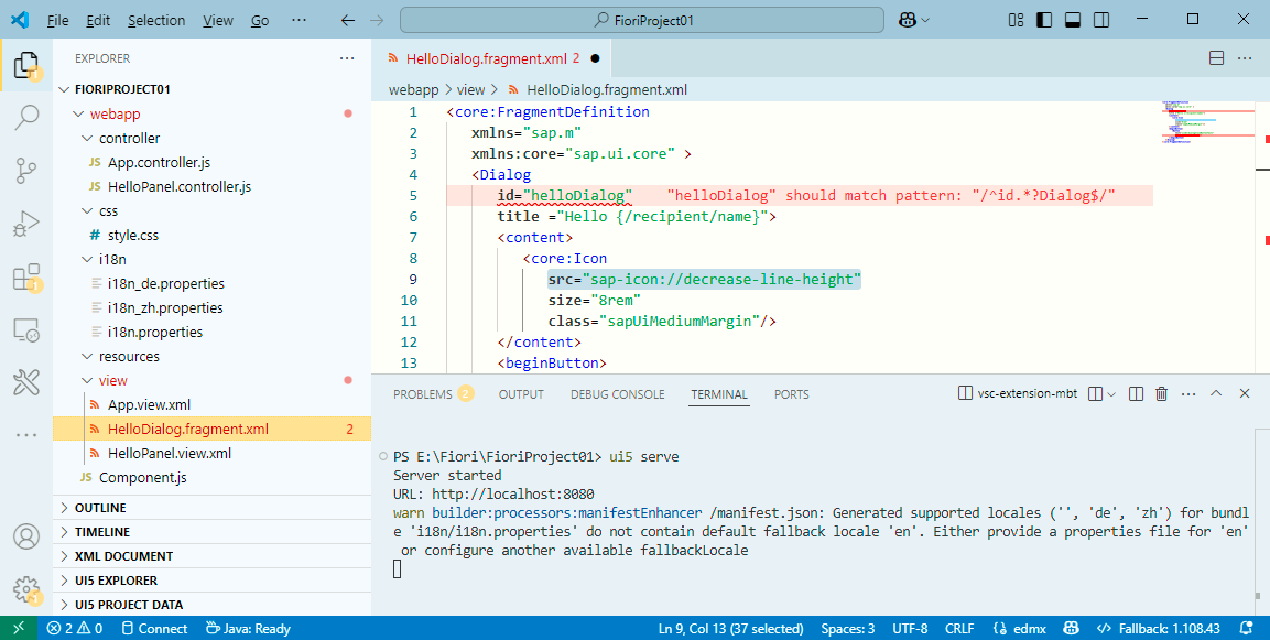
3),HelloDialog.fragment.xml
<core:FragmentDefinition
   xmlns="sap.m"
   xmlns:core="sap.ui.core" >
   <Dialog
      id="helloDialog"
      title ="Hello {/recipient/name}">
      <content>
         <core:Icon
            src="sap-icon://hello-world"
            size="8rem"
            class="sapUiMediumMargin"/>
      </content>
      <beginButton>
         <Button
            text="{i18n>dialogCloseButtonText}"
            press=".onCloseDialog"/>
      </beginButton>
   </Dialog>
</core:FragmentDefinition>
- <core:Icon src="sap-icon://hello-world"
通过Icon的ID,用在 src 属性上
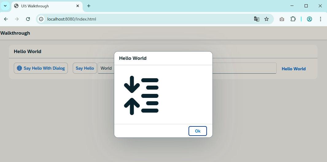
4),运行看效果
注意按钮左侧,弹出框都显示了图标
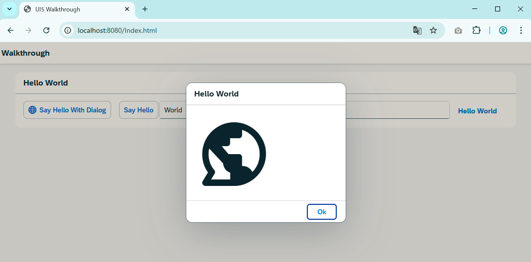
上面咱们不是从Icon Explorer找了一个嘛,给放上去试试看
就是这样的,是不是感觉还不错哈
咱们看到别人 Fiori App 界面上那些漂亮的图标,基本上就是这么做出来的
以上就是本篇的全部内容。
更多SAP顾问业务知识请点击下面目录链接或东京老树根的博客主页


 扫一扫
扫一扫


 1283
1283

 被折叠的 条评论
为什么被折叠?
被折叠的 条评论
为什么被折叠?
 到【灌水乐园】发言


