


 本文详细介绍了CSS弹性盒子模型,包括flex属性、flex-grow、flex-shrink、flex-basis等关键概念,以及flex-flow、align-content、align-items、align-self、justify-content和order属性的用法,帮助理解如何在网页布局中使用这些属性来实现灵活的响应式设计。
文章目录
| 属性 | 说明 | 版本 |
|---|---|---|
| flex | 复合属性。设置子元素如何分配空间。 | CSS3 |
| flex-grow | 设置弹性盒子项的扩展比率。 | CSS3 |
| flex-shrink | 设置弹性盒子项的收缩比率。 | CSS3 |
| flex-basis | 设置弹性盒子项伸缩基准值。 | CSS3 |
| flex-flow | 复合属性。设置弹性盒子项排列方式。 | CSS3 |
| flex-direction | 设置弹性盒子子项的方向。 | CSS3 |
| flex-wrap | 设置 flex 容器是单行或者多行。 | CSS3 |
| align-content | 在弹性容器内的各项没有占用交叉轴上所有可用的空间时对齐容器内的各项(垂直)。 | CSS3 |
| align-items | 定义flex子项在flex容器的当前行的侧轴(纵轴)方向上的对齐方式。 | CSS3 |
| align-self | 定义flex子项单独在侧轴(纵轴)方向上的对齐方式。 | CSS3 |
| justify-content | 设置或检索弹性盒子元素在主轴(横轴)方向上的对齐方式。 | CSS3 |
| order | 设置或检索弹性盒模型对象的子元素出现的順序。 | CSS3 |
浏览器支持:

弹性盒子属性只适用于弹性盒子,在非弹性盒子中无效。声明弹性盒子:
div{
  display: -webkit-flex; /*低版本 Safari */
  display:flex;
}
弹性盒子属性中用于子项的属性:flex, flex-grow, flex-shrink, flex-basis,order, 其他属性都用于外层包裹元素。当一个元素声明为弹性盒子时,他的子元素默认设置了 flex:0 1 auto 属性。
当元素被声明是弹性盒子时,他的子元素的尺寸和定位属性将会受到影响(不会影响孙辈元素)。
flex
flex 属性用于设置子元素如何分配空间。可以有1-3个值。
flex 属性是 flex-grow、flex-shrink 和 flex-basis 属性的简写属性。
语法:flex: auto|none|flex-grow flex-shrink flex-basis;
| 值 | 描述 |
|---|---|
auto | 默认值,与 1 1 auto 相同。 |
none | 与 0 0 auto 相同。 |
| flex-grow | 一个数字,规定项目将相对于其他灵活的项目进行扩展的量。 |
| flex-shrink | 一个数字,规定项目将相对于其他灵活的项目进行收缩的量。 |
| flex-basis | 项目的长度。合法值:“auto”/数值单位/百分比。 |
flex:1;
flex:1 1;
flex:1 1 none;
flex:1 1 20px;


flex-grow
flex-grow 属性用于设置弹性盒子子项的扩展比率。
.div1{
  flex-grow:2;
  flex-basis:0;
}
.div2{
  flex-grow:2;
  flex-basis:auto;
}

/*上面等效下面*/
.div1{ flex:2; }
.div2{ flex:2 1 auto; }
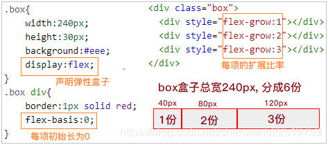
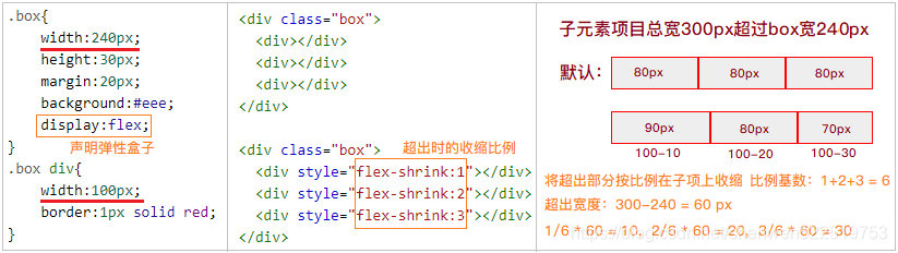
flex-shrink
flex-shrink 属性指定了 flex 元素的收缩规则。当子项的默认宽度之和大于容器的时候会发生收缩,其收缩的大小是依据 flex-shrink 的值。
flex-shrink的默认值为1,如果没有显示定义该属性,将会自动按照默认值1在所有因子相加之后计算比率来进行空间收缩。
flex-shrink:1; /*默认值为 1 */
flex-shrink:3;
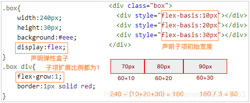
flex-basis
flex-basis 属性用于设置弹性盒子项伸缩基准值。
| 值 | 描述 |
|---|---|
auto | 默认值。如果该项目未指定长度,则长度将根据内容决定。 |
| number | 一个长度单位或者一个百分比,规定项目的初始长度。 |
flex-basis:auto;
flex-basis:10%;
flex-basis:30px;
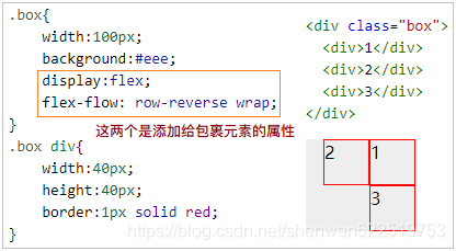
flex-flow
flex-flow 属性是 flex-direction 和 flex-wrap 属性的复合属性。
flex-flow 属性用于设置或检索弹性盒模型对象的子元素排列方式。
  -webkit-flex-flow: row-reverse wrap; /*低版本 Safari 6.1+ */
  flex-flow: row-reverse wrap;
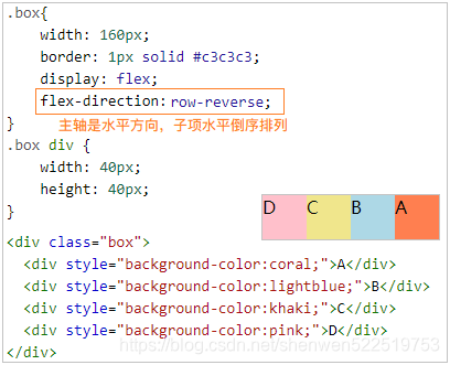
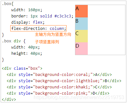
flex-direction
flex-direction 属性规定弹性盒子子项的方向。
| 值 | 描述 |
|---|---|
row | 默认值。子项水平显示。 |
row-reverse | 子项水平相反的顺序显示。 |
column | 子项垂直显示。 |
column-reverse | 子项垂直相反的顺序显示。 |
-webkit-flex-direction: column; /*低版本 Safari */
flex-direction: column;
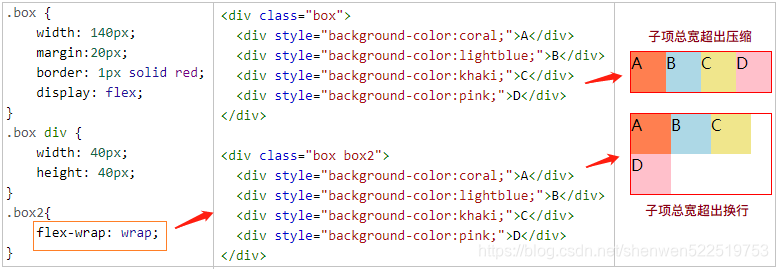
flex-wrap
flex-wrap 属性规定 flex 容器是单行或者多行。
| 值 | 描述 |
|---|---|
nowrap | 默认值。子项不拆行或不拆列。 |
wrap | 子项在必要的时候拆行或拆列。 |
wrap-reverse | 子项在必要的时候拆行或拆列,但是以相反的顺序。 |
-webkit-flex-wrap: wrap; /*低版本 Safari */
flex-wrap: wrap;
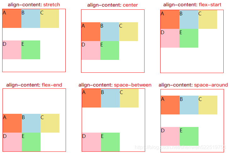
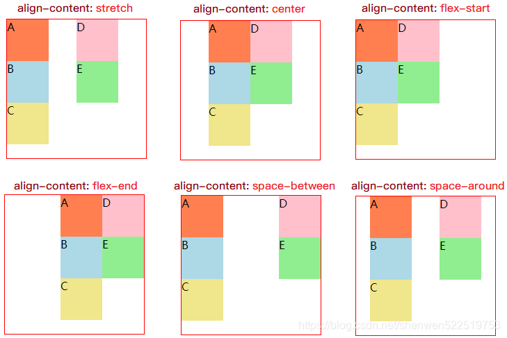
align-content
align-content 属性在弹性容器内的各项没有占用交叉轴上所有可用的空间时对齐容器内的各项(垂直)。
| 值 | 描述 |
|---|---|
stretch | 默认值。元素被拉伸以适应容器。 |
center | 元素位于容器的中心。 |
flex-start | 元素位于容器的开头。 |
flex-end | 元素位于容器的结尾。 |
space-between | 元素位于各行之间留有空白的容器内。 |
space-around | 元素位于各行之前、之间、之后都留有空白的容器内。 |
<style>
.box {
    width: 200px;
	height: 200px;
	margin:20px;
    border: 1px solid red;
    display: flex;
	flex-wrap: wrap;
    align-content: center;
}
.box div {
    width: 60px;
    height: 60px;
}
</style>

<div class="box">
  <div style="background-color:coral;">A</div>
  <div style="background-color:lightblue;">B</div>
  <div style="background-color:khaki;">C</div>
  <div style="background-color:pink;">D</div>
  <div style="background-color:lightgreen;">E</div>
</div>
上例中若主轴是水平方向:flex-direction:row|row-reverse 时:
.box{
    display: flex;
    flex-direction:row;
	flex-wrap: wrap;
    align-content: stretch;
}
上例中若主轴是竖直方向:flex-direction:column|column-reverse 时:
.box{
    display: flex;
    flex-direction:column;
	flex-wrap: wrap;
    align-content: stretch;
}
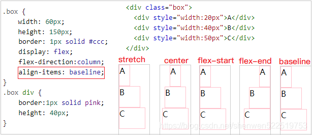
align-items
align-items 定义flex子项在flex容器的当前行的侧轴(纵轴)方向上的对齐方式。
| 值 | 描述 |
|---|---|
stretch | 默认值。元素被拉伸以适应容器。 |
center | 元素位于容器的中心。 |
flex-start | 元素位于容器的开头。 |
flex-end | 元素位于容器的结尾。 |
baseline | 元素位于容器的基线上。 |
-webkit-align-items: center; /* Safari 7.0+ */
align-items: center;
主轴是水平方向:flex-direction:row|row-reverse 时:
主轴是竖直方向:flex-direction:column|column-reverse 时:
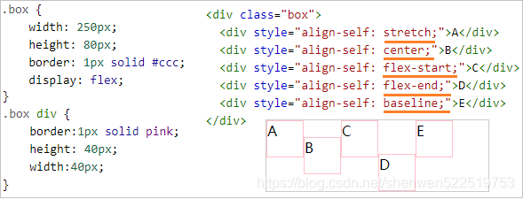
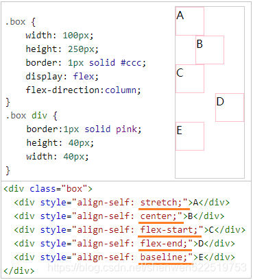
align-self
align-self 属性定义flex子项单独在侧轴(纵轴)方向上的对齐方式。
| 值 | 描述 |
|---|---|
auto | 默认值。元素继承了它的父容器的 align-items 属性。如果没有父容器则为 “stretch”。 |
stretch | 元素被拉伸以适应容器。 |
center | 元素位于容器的中心。 |
flex-start | 元素位于容器的开头。 |
flex-end | 元素位于容器的结尾。 |
baseline | 元素位于容器的基线上。 |
-webkit-align-self:center;
align-self:center;
主轴是水平方向:flex-direction:row|row-reverse 时:
主轴是竖直方向:flex-direction:column|column-reverse 时:
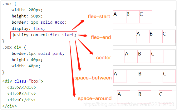
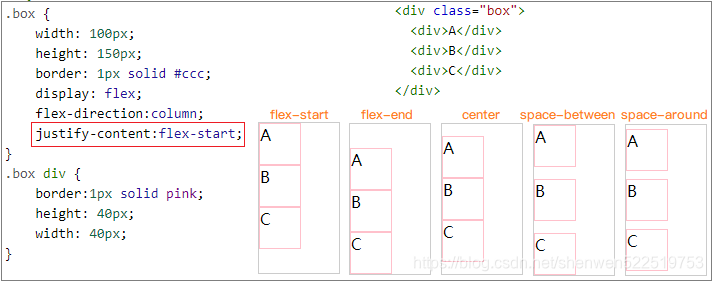
justify-content
justify-content 用于设置弹性盒子元素在主轴(横轴)方向上的对齐方式。
| 值 | 描述 |
|---|---|
flex-start | 默认值。项目位于容器的开头。 |
flex-end | 项目位于容器的结尾。 |
center | 项目位于容器的中心。 |
space-between | 项目位于各行之间留有空白的容器内。 |
space-around | 项目位于各行之前、之间、之后都留有空白的容器内。 |
-webkit-justify-content: space-around; /* Safari 6.1+ */
justify-content: space-around;
主轴是水平方向:flex-direction:row|row-reverse 时:
主轴是竖直方向:flex-direction:column|column-reverse 时:
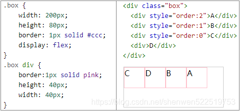
order
order 属性设置弹性盒模型对象的子元素出现的順序。
| 值 | 描述 |
|---|---|
| number | 默认值是 0。规定子项的顺序。 |
-webkit-order: 2;
order: 2;


 扫一扫
扫一扫


 2318
2318

 被折叠的 条评论
为什么被折叠?
被折叠的 条评论
为什么被折叠?
 到【灌水乐园】发言


