<!DOCTYPE html>
<html>
<head>
<meta http-equiv="Content-Type" content="text/html;charset=utf-8">
<title>flex表单布局对比</title>
</head>
<body>
<div>
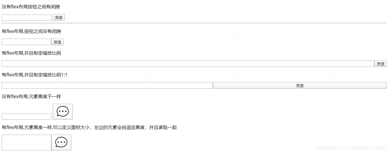
<p>没有flex布局按钮之间有间隙</p>
<input type="email" name="email" />
<button type="submit">发送</button>
</div>
<hr>
<style>
.myflex{display: flex;}
</style>
<p>有flex布局,按钮之间没有间隙</p>
<div class="myflex">
<input type="email" name="email" />
<button type="submit">发送</button>
</div>
<style>
.myflex2{display: flex;}
.myinput{flex-grow: 1;}
</style>
<p>有flex布局,并且制定缩放比例</p>
<div class="myflex2">
<input class="myinput" type="email" name="email" />
<button type="submit">发送</button>
</div>
<style>
.myflex3{display: flex;}
.myinput{flex-grow: 1;}
</style>
<p>有flex布局,并且制定缩放比例1:1</p>
<div class="myflex3">
<input class="myinput" type="email" name="email" />
<button class="myinput" type="submit">发送</button>
</div>
<style>
</style>
<p>没有flex布局,元素高度不一样</p>
<div>
<input type="email" name="email" />
<button type="submit">
<img src="1.png" />
</button>
</div>
<style>
.myflex4{display: flex;}
</style>
<p>有flex布局,元素高度一样,可以定义图标大小,左边的元素会自适应高度,并且紧贴一起</p>
<div class="myflex4">
<input type="email" name="email" />
<button type="submit">
<img src="1.png" />
</button>
</div>
</body>
</html>


 本文探讨了使用Flex布局在网页表单设计中的优势,包括消除元素间间隙、统一元素高度、自适应宽度及高度,以及如何通过设置flex-grow属性实现元素间的比例分配。通过对比分析,展示了Flex布局在提升用户体验方面的显著效果。


 扫一扫
扫一扫


 721
721

 被折叠的 条评论
为什么被折叠?
被折叠的 条评论
为什么被折叠?
 到【灌水乐园】发言


