


组件结构:
SliverToBoxAdapter-Container-Column-Text(标题)+ [ Container-Text ](内容)
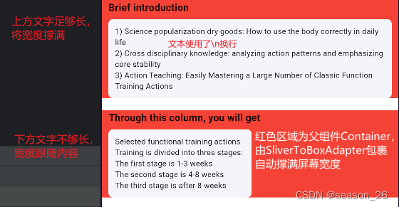
外层Container不需要设置宽度,会自动拉伸到屏幕宽度。
内层Container随内容伸缩,当文字足够长,撑满屏幕(不会溢出);文字不够长时跟随文字宽度。
2个解决方法:
①设置Column的属性crossAxisAlignment: CrossAxisAlignment.stretch。而且设置了stretch后文字自动从左开始
②将内层Container设置为width: MediaQuery.of(context).size.width
设置外层Conatiner的属性不起作用
constraints: BoxConstraints(
        minWidth: MediaQuery.of(context).size.width,
),
尝试理解原理:
Container组件默认会尽可能地填充其父组件的空间,因此,如果将Container直接包裹在SliverToBoxAdapter中,Container会尝试撑满整个可用空间,所以其宽度与屏幕宽度一致。- 而
Column的宽度是由其子组件的宽度和Column的布局约束一起确定的。
代码
Container(
      color: Colors.red,
      margin: const EdgeInsets.only(
        bottom: 22
      ),
      padding: const EdgeInsets.symmetric(
        horizontal: 12,
      ),
      child:Column(
        crossAxisAlignment:  CrossAxisAlignment.stretch,
        // crossAxisAlignment: CrossAxisAlignment.start,
        children: [
          Text(
            title,
            style: AppFontStyle.H1.copyWith(fontWeight: FontWeight.w600),
          ),
          const SizedBox(
            height: 8,
          ),
         Container(
           // width: MediaQuery.of(context).size.width,
           padding: EdgeInsets.all(12),
           decoration: BoxDecoration(
               color: Color.fromRGBO(244, 245, 250, 1),
               borderRadius: BorderRadius.circular(8)
           ),
           child: Text(
               content
           ),
         )
        ],
      ),
    )


 扫一扫
扫一扫


 1771
1771

 被折叠的 条评论
为什么被折叠?
被折叠的 条评论
为什么被折叠?
 到【灌水乐园】发言


