


 本文介绍如何使用Python结合MongoDB数据库,自定义绘制两条股票K线在同一图表上的方法,通过放大处理收盘价以增强对比性,并提供源代码实现。展示了一种解决K线图软件不好用问题的方案,代码实现了数据抓取、处理及matplotlib绘图功能。
系列文章:
- 策略1:使用python+mongodb实现股票网格交易代码----附python源码
- 使用matplotlib画k线(2条k线同列)----附python源码
- 策略3:动态再平衡----附python源代码
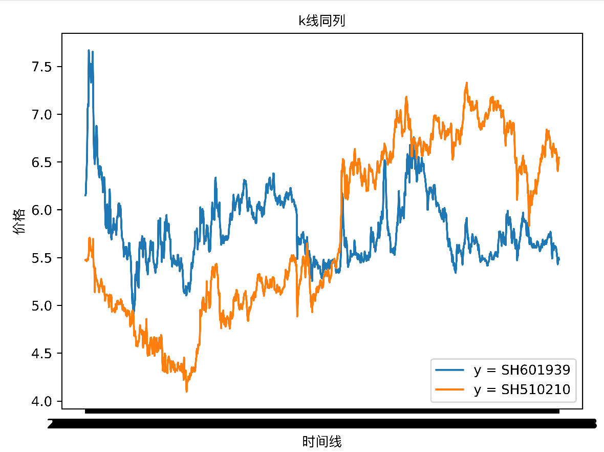
在网上找一些关于k先2图同列的软件,发现都不太好用,于是自己动手画一个。
背景:
- 关于目标股票的历史数据已经抓取下来。
- 画出来的线,不是蜡烛图,因为主要的目标是看2条k线,走势是否有一定相关性
- 是按照股票的收盘价来画的
- 为了防止股票价格差异较大,导致线画出来缺乏对比性,所以会对收盘价进行一定倍数的放大处理
最终的结果如下图:
源代码如下:
import pymongo
import matplotlib.pyplot as plt
import pandas as pd
# 中文字体显示方块问题解决
from matplotlib.font_manager import FontProperties


def get_chinese_font():
    """
    这个是中文不显示的问题,取用系统中文字体
    :return:
    """
    return FontProperties(fname='/System/Library/Fonts/PingFang.ttc')


def enlarge(origin_number, multiple):
    """
    放大函数
    :param origin_number: 原值
    :param multiple: 放大beishu2
    :return:
    """
    return origin_number * multiple


meta_info = {
    # 要显示的数据内容,这个是在mongodb中的collection名称
    'security': ['SH601939', 'SH510210'],
    # 需要从哪个时间开始画线。如果不设时间,那么值为 {}
    'start_date': {'date': {'$gt': '2018-01-10'}},
    # 定义所需的放大函数。目的是为了防止这条线的y值太小,导致看出来基本是一条水平线。*号前面是要执行的函数,*号后面值是放大的beishu2
    'enlarge_functions': ['', 'enlarge*7'],
    # mongodb数据
    'mongo_meta': {'host': 'my.tengxun', 'port': '27017', 'user_name': 'xxxxx', 'password': 'xxxxx', 'db': 'admin'}
}
# 设置像素,不然默认会比较小
fig = plt.figure(dpi=800)
# 设置title、x轴、y轴的描述信息
plt.title(u'k线同列', fontproperties=get_chinese_font())
plt.xlabel(u'时间线', fontproperties=get_chinese_font())
plt.ylabel(u'价格', fontproperties=get_chinese_font())

# 加载数据
mongo_meta = meta_info['mongo_meta']
mongo_client = pymongo.MongoClient('mongodb://%s:%s@%s:%s/' % (
    mongo_meta['user_name'], mongo_meta['password'], mongo_meta['host'], mongo_meta['port']))
db = mongo_client[mongo_meta['db']]
security_history_array = []
for security in meta_info['security']:
    tmp = pd.DataFrame(list(db[security].find(meta_info['start_date']).sort("date", 1)))
    tmp.set_index('date', inplace=True)
    security_history_array.append(tmp)

# 开始构造画图的x轴、y轴数据
# x轴数据
axis = []
# y轴数据的列表(因为有多条线,每条线的y轴数据是y_array[index])
y_array = []
# 构造x轴
for today_date in security_history_array[0].index:
    axis.append(today_date)
# 构造y轴数据(多个)
for i in range(len(security_history_array)):
    security_history = security_history_array[i]
    y_values = []
    for today_date in axis:
        if today_date in security_history.index:
            y_row = security_history.loc[today_date]
            y_value = y_row['close']
            # 如果有放大函数,那么进行调用。目的是为了防止这条线的y值太小,导致看出来基本是一条水平线
            if meta_info['enlarge_functions'][i] != '':
                function_name = meta_info['enlarge_functions'][i].split('*')[0]
                enlarge_multiple = meta_info['enlarge_functions'][i].split('*')[1]
                y_value = eval(function_name)(y_value, int(enlarge_multiple))
            y_values.append(y_value)
            y_value_before = y_value
        else:
            y_values.append(y_value_before)
    y_array.append(y_values)

# 准备画图数据
for i in range(len(y_array)):
    plt.plot(axis, y_array[i])
# 打出图例,就是在图上,对于y轴线的描述
comment = []
for i in range(len(meta_info['security'])):
    tmp = 'y = %s' % meta_info['security'][i]
    comment.append(tmp)
plt.legend(comment)
# 为了避免多个图重叠,可以使用fig.tight_layout()或fig.subplots_adjust()
fig.tight_layout()
plt.show()


 被折叠的 条评论
为什么被折叠?
被折叠的 条评论
为什么被折叠?
 到【灌水乐园】发言


