


BootstrapBlazor是一套基于 Bootstrap 和 Blazor 的企业级组件库,可以认为是 Bootstrap 项目的 Blazor 版实现。基于 Bootstrap 样式库精心打造,并且额外增加了 100 多种常用的组件,为您快速开发项目带来非一般的感觉(喜欢Bootstrap风格的同学推荐使用)。
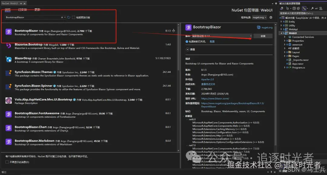
BootstrapBlazor类库安装
管理Nuget程序包=>搜索BootstrapBlazor进行安装。
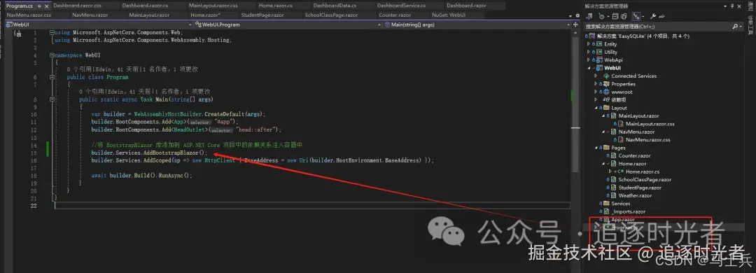
BootstrapBlazor库注入容器
在
Program.cs中将 BootstrapBlazor 库添加到 ASP.NET Core 项目中的依赖关系注入容器中。
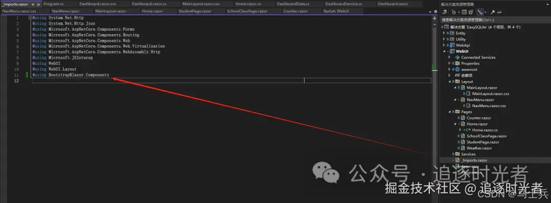
导入BootstrapBlazor组件库命名空间
打开_Imports.razor文件,导入BootstrapBlazor组件库命名空间:@using BootstrapBlazor.Components。
Menu 导航菜单设置
MainLayout.razor
ini
代码解读
复制代码
@inherits LayoutComponentBase <Layout SideWidth="0" IsPage="true" ShowGotoTop="true" ShowCollapseBar="true" IsFullSide="@IsFullSide" IsFixedHeader="@IsFixedHeader" IsFixedFooter="@IsFixedFooter" ShowFooter="@ShowFooter" TabDefaultUrl="/" Menus="@Menus" UseTabSet="@UseTabSet" AdditionalAssemblies="new[] { GetType().Assembly }" class="@Theme"> <Header> <span class="ms-3 flex-sm-fill d-none d-sm-block">Bootstrap of Blazor</span> <div class="flex-fill d-sm-none"> </div> <div class="layout-drawer" @onclick="@(e => IsOpen = !IsOpen)"><i class="fa fa-gears"></i></div> </Header> <Side> <div class="layout-banner"> <div class="layout-title"> <span>EasySQLite</span> </div> </div> <div class="layout-user"> <img class="layout-avatar" src="./favicon.png"> <div class="layout-title"> <span>管理员</span> </div> <div class="layout-user-state"></div> </div> </Side> <Main> <CascadingValue Value="this" IsFixed="true"> @Body </CascadingValue> </Main> <Footer> <div class="text-center flex-fill"> <a class="page-layout-demo-footer-link" href="https://gitee.com/LongbowEnterprise/BootstrapAdmin" target="_blank">Bootstrap Admin</a> </div> </Footer> <NotFound> <p>Sorry, there's nothing at this address.</p> </NotFound> </Layout> <Drawer Placement="Placement.Right" @bind-IsOpen="@IsOpen" IsBackdrop="true"> <div class="layout-drawer-body"> <div class="btn btn-info w-100" @onclick="@(e => IsOpen = false)">点击关闭</div> <div class="page-layout-demo-option"> <p>布局调整</p> <div class="row"> <div class="col-6"> <div class="layout-item @(IsFullSide ? "active d-flex" : "d-flex")" @onclick="@(e => IsFullSide = true)" data-toggle="tooltip" title="左右结构"> <div class="layout-left d-flex flex-column"> <div class="layout-left-header"></div> <div class="layout-left-body flex-fill"></div> </div> <div class="layout-right d-flex flex-column flex-fill"> <div class="layout-right-header"></div> <div class="layout-right-body flex-fill"></div> <div class="layout-right-footer"></div> </div> </div> </div> <div class="col-6"> <div class="layout-item flex-column @(IsFullSide ? "d-flex" : "active d-flex")" @onclick="@(e => IsFullSide = false)" data-toggle="tooltip" title="上下结构"> <div class="layout-top"> </div> <div class="layout-body d-flex flex-fill"> <div class="layout-left"> </div> <div class="layout-right flex-fill"> </div> </div> <div class="layout-footer"> </div> </div> </div> </div> </div> <div class="page-layout-demo-option"> <p>固定调整</p> <div class="row"> <div class="col-6 d-flex align-items-center"> <Switch @bind-Value="@IsFixedHeader" OnColor="@Color.Success" OffColor="@Color.Secondary"></Switch> </div> <div class="col-6 text-right"> <span class="cell-label">固定页头</span> </div> </div> <div class="row mt-3"> <div class="col-6 d-flex align-items-center"> <Switch @bind-Value="@IsFixedFooter" OnColor="@Color.Success" OffColor="@Color.Secondary"></Switch> </div> <div class="col-6 text-right"> <span class="cell-label">固定页脚</span> </div> </div> <div class="row mt-3"> <div class="col-6 d-flex align-items-center"> <Switch @bind-Value="@ShowFooter" OnColor="@Color.Success" OffColor="@Color.Primary"></Switch> </div> <div class="col-6 text-right"> <span class="cell-label">显示页脚</span> </div> </div> </div> <div class="page-layout-demo-option"> <p>主题配色</p> <div class="row"> <div class="col-2"> <span class="color color1" @onclick="@(e => Theme = "color1")"></span> </div> <div class="col-2"> <span class="color color2" @onclick="@(e => Theme = "color2")"></span> </div> <div class="col-2"> <span class="color color3" @onclick="@(e => Theme = "color3")"></span> </div> <div class="col-2"> <span class="color color4" @onclick="@(e => Theme = "color4")"></span> </div> <div class="col-2"> <span class="color color5" @onclick="@(e => Theme = "color5")"></span> </div> <div class="col-2"> <span class="color color6" @onclick="@(e => Theme = "color6")"></span> </div> </div> </div> <div class="page-layout-demo-option"> <p>更多设置</p> <div class="row"> <div class="col-6 d-flex align-items-center"> <Switch @bind-Value="@UseTabSet" OnColor="@Color.Success" OffColor="@Color.Primary"></Switch> </div> <div class="col-6 text-right"> <span class="cell-label">@(UseTabSet ? "多标签" : "单页")</span> </div> </div> </div> </div> </Drawer>
MainLayout.razor.cs
csharp
代码解读
复制代码
public partial class MainLayout { private bool UseTabSet { get; set; } = true; private string Theme { get; set; } = ""; private bool IsOpen { get; set; } private bool IsFixedHeader { get; set; } = true; private bool IsFixedFooter { get; set; } = true; private bool IsFullSide { get; set; } = true; private bool ShowFooter { get; set; } = true; private List<MenuItem>? Menus { get; set; } /// <summary> /// OnInitialized 方法 /// </summary> protected override void OnInitialized() { base.OnInitialized(); Menus = GetIconSideMenuItems(); } private static List<MenuItem> GetIconSideMenuItems() { var menus = new List<MenuItem> { new MenuItem() { Text = "Home", Icon = "fa-solid fa-fw fa-flag", Url = "/" , Match = NavLinkMatch.All}, new MenuItem() { Text = "班级管理", Icon = "fa-solid fa-fw fas fa-user-secret", Url = "SchoolClass" }, new MenuItem() { Text = "学生管理", Icon = "fa-solid fa-fw fas fa-universal-access", Url = "Student" }, }; return menus; } }
Collapse 折叠面板组件引入
Home.razor
xml
代码解读
复制代码
@page "/" <!-- 引用 BootstrapBlazor.FontAwesome 字体库包 --> <link href="_content/BootstrapBlazor.FontAwesome/css/font-awesome.min.css" rel="stylesheet"> <!-- 引用 BootstrapBlazor 组件库包 --> <link href="_content/BootstrapBlazor/css/bootstrap.blazor.bundle.min.css" rel="stylesheet"> <!--引入BootstrapBlazor 组件库包--> <script src="_content/BootstrapBlazor/js/bootstrap.blazor.bundle.min.js"></script> <PageTitle>Home</PageTitle> <h2>七天.NET 8操作SQLite入门到实战详细教程</h2> <h5>SQLite是一个轻量级的嵌入式关系型数据库,它以一个小型的C语言库的形式存在。它是一个自包含、无需服务器、零配置的数据库引擎。与传统的数据库系统不同,SQLite直接读写普通磁盘文件,不需要单独的数据库服务器。它支持标准的SQL查询语言,并提供了事务支持和ACID属性(原子性、一致性、隔离性和持久性)。</h5> <div class="images-item" style="width:60%;margin-top:10px;"> <ImageViewer Url="./七天.NET 8操作SQLite入门到实战.png" ShowPlaceHolder="false" /> </div> <DemoBlock Title="基础用法" Introduction="可同时展开多个面板,面板之间不影响" Name="Normal"> <Collapse OnCollapseChanged="@OnChanged"> <CollapseItems> <CollapseItem Text="嵌入式"> <div>SQLite的库可以轻松地嵌入到应用程序中,不需要独立的数据库服务器进程。</div> </CollapseItem> <CollapseItem Text="无服务器" IsCollapsed="false"> <div>与大多数数据库系统不同,SQLite不需要单独的数据库服务器,所有数据都存储在一个磁盘文件中。</div> </CollapseItem> <CollapseItem Text="零配置"> <div>使用SQLite时,没有任何复杂的配置或管理任务。只需引入SQLite库,并开始使用即可。</div> </CollapseItem> <CollapseItem Text="轻量级"> <div>SQLite是一个轻量级的数据库引擎,库文件的大小很小,并且在内存使用方面也非常高效。</div> </CollapseItem> </CollapseItems> </Collapse> <ConsoleLogger @ref="NormalLogger" /> </DemoBlock> <AttributeTable Items="@GetAttributes()" />
Home.razor.cs
csharp
代码解读
复制代码
public partial class Home { [NotNull] private ConsoleLogger? NormalLogger { get; set; } private Task OnChanged(CollapseItem item) { NormalLogger.Log($"{item.Text}: {item.IsCollapsed}"); return Task.CompletedTask; } private bool State { get; set; } private void OnToggle() { State = !State; } /// <summary> /// 获得属性方法 /// </summary> /// <returns></returns> private AttributeItem[] GetAttributes() => [ new() { Name = "CollapseItems", Description = "内容", Type = "RenderFragment", ValueList = " — ", DefaultValue = " — " }, new() { Name = "IsAccordion", Description = "是否手风琴效果", Type = "bool", ValueList = "true|false", DefaultValue = "false" }, new() { Name = "OnCollapseChanged", Description = "项目收起展开状态改变回调方法", Type = "Func<CollapseItem, Task>", ValueList = " — ", DefaultValue = " — " } ]; } public class AttributeItem { /// <summary> /// 获取或设置属性的名称。 /// </summary> public string Name { get; set; } /// <summary> /// 获取或设置属性的描述。 /// </summary> public string Description { get; set; } /// <summary> /// 获取或设置属性的类型。 /// </summary> public string Type { get; set; } /// <summary> /// 获取或设置属性的取值列表(如果有)。 /// </summary> public string ValueList { get; set; } /// <summary> /// 获取或设置属性的默认值。 /// </summary> public string DefaultValue { get; set; } }


 扫一扫
扫一扫


 396
396

 被折叠的 条评论
为什么被折叠?
被折叠的 条评论
为什么被折叠?
 到【灌水乐园】发言


