


pyecharts
在过去,在python进行数据可视化通常使用matplotlib,虽然matplotlib简洁明了,但是图表样式较为单调,难以满足美观和交互需要。
因此,通常在html的页面上展示的时候,往往使用echarts进行绘图。但是,echarts虽然很好,却需要编写javascript代码,如果对js不够了解,使用会有一定的难度。
好消息是,现在通过pyecharts,无需编写js代码,仅使用python编程,一样也可以进行echarts绘图了!
这全都要得益于pyecharts库,pyecharts的官方网站
快速使用
安装
通过pip进行安装:pip install pyecharts
查看是否安装成功
import pyecharts
print(pyecharts.__version__)
绘图
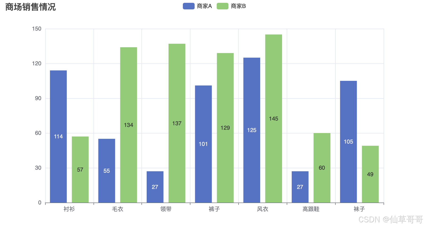
from pyecharts.charts import Bar
from pyecharts import options as opts

bar = (
    Bar()
    .add_xaxis(["衬衫", "毛衣", "领带", "裤子", "风衣", "高跟鞋", "袜子"])
    .add_yaxis("商家A", [114, 55, 27, 101, 125, 27, 105])
    .add_yaxis("商家B", [57, 134, 137, 129, 145, 60, 49])
    .set_global_opts(title_opts=opts.TitleOpts(title="商场销售情况"))
)
bar.render("bar_chart.html")
结果
运行代码以后,可以得到一个生成的html文件,如下所示:
<!DOCTYPE html>
<html>
<head>
    <meta charset="UTF-8">
    <title>Awesome-pyecharts</title>
                <script type="text/javascript" src="https://assets.pyecharts.org/assets/v5/echarts.min.js"></script>

</head>
<body >
    <div id="506c18ae21364e4aa31896cee8918ebb" class="chart-container" style="width:900px; height:500px; "></div>
    <script>
        var chart_506c18ae21364e4aa31896cee8918ebb = echarts.init(
            document.getElementById('506c18ae21364e4aa31896cee8918ebb'), 'white', {renderer: 'canvas'});
        var option_506c18ae21364e4aa31896cee8918ebb = {
    "animation": true,
    "animationThreshold": 2000,
    "animationDuration": 1000,
    "animationEasing": "cubicOut",
    "animationDelay": 0,
    "animationDurationUpdate": 300,
    "animationEasingUpdate": "cubicOut",
    "animationDelayUpdate": 0,
    "aria": {
        "enabled": false
    },
    "color": [
        "#5470c6",
        "#91cc75",
        "#fac858",
        "#ee6666",
        "#73c0de",
        "#3ba272",
        "#fc8452",
        "#9a60b4",
        "#ea7ccc"
    ],
    "series": [
        {
            "type": "bar",
            "name": "\u5546\u5bb6A",
            "legendHoverLink": true,
            "data": [
                114,
                55,
                27,
                101,
                125,
                27,
                105
            ],
            "realtimeSort": false,
            "showBackground": false,
            "stackStrategy": "samesign",
            "cursor": "pointer",
            "barMinHeight": 0,
            "barCategoryGap": "20%",
            "barGap": "30%",
            "large": false,
            "largeThreshold": 400,
            "seriesLayoutBy": "column",
            "datasetIndex": 0,
            "clip": true,
            "zlevel": 0,
            "z": 2,
            "label": {
                "show": true,
                "margin": 8,
                "valueAnimation": false
            }
        },
        {
            "type": "bar",
            "name": "\u5546\u5bb6B",
            "legendHoverLink": true,
            "data": [
                57,
                134,
                137,
                129,
                145,
                60,
                49
            ],
            "realtimeSort": false,
            "showBackground": false,
            "stackStrategy": "samesign",
            "cursor": "pointer",
            "barMinHeight": 0,
            "barCategoryGap": "20%",
            "barGap": "30%",
            "large": false,
            "largeThreshold": 400,
            "seriesLayoutBy": "column",
            "datasetIndex": 0,
            "clip": true,
            "zlevel": 0,
            "z": 2,
            "label": {
                "show": true,
                "margin": 8,
                "valueAnimation": false
            }
        }
    ],
    "legend": [
        {
            "data": [
                "\u5546\u5bb6A",
                "\u5546\u5bb6B"
            ],
            "selected": {},
            "show": true,
            "padding": 5,
            "itemGap": 10,
            "itemWidth": 25,
            "itemHeight": 14,
            "backgroundColor": "transparent",
            "borderColor": "#ccc",
            "borderRadius": 0,
            "pageButtonItemGap": 5,
            "pageButtonPosition": "end",
            "pageFormatter": "{current}/{total}",
            "pageIconColor": "#2f4554",
            "pageIconInactiveColor": "#aaa",
            "pageIconSize": 15,
            "animationDurationUpdate": 800,
            "selector": false,
            "selectorPosition": "auto",
            "selectorItemGap": 7,
            "selectorButtonGap": 10
        }
    ],
    "tooltip": {
        "show": true,
        "trigger": "item",
        "triggerOn": "mousemove|click",
        "axisPointer": {
            "type": "line"
        },
        "showContent": true,
        "alwaysShowContent": false,
        "showDelay": 0,
        "hideDelay": 100,
        "enterable": false,
        "confine": false,
        "appendToBody": false,
        "transitionDuration": 0.4,
        "textStyle": {
            "fontSize": 14
        },
        "borderWidth": 0,
        "padding": 5,
        "order": "seriesAsc"
    },
    "xAxis": [
        {
            "show": true,
            "scale": false,
            "nameLocation": "end",
            "nameGap": 15,
            "gridIndex": 0,
            "inverse": false,
            "offset": 0,
            "splitNumber": 5,
            "minInterval": 0,
            "splitLine": {
                "show": true,
                "lineStyle": {
                    "show": true,
                    "width": 1,
                    "opacity": 1,
                    "curveness": 0,
                    "type": "solid"
                }
            },
            "animation": true,
            "animationThreshold": 2000,
            "animationDuration": 1000,
            "animationEasing": "cubicOut",
            "animationDelay": 0,
            "animationDurationUpdate": 300,
            "animationEasingUpdate": "cubicOut",
            "animationDelayUpdate": 0,
            "data": [
                "\u886c\u886b",
                "\u6bdb\u8863",
                "\u9886\u5e26",
                "\u88e4\u5b50",
                "\u98ce\u8863",
                "\u9ad8\u8ddf\u978b",
                "\u889c\u5b50"
            ]
        }
    ],
    "yAxis": [
        {
            "show": true,
            "scale": false,
            "nameLocation": "end",
            "nameGap": 15,
            "gridIndex": 0,
            "inverse": false,
            "offset": 0,
            "splitNumber": 5,
            "minInterval": 0,
            "splitLine": {
                "show": true,
                "lineStyle": {
                    "show": true,
                    "width": 1,
                    "opacity": 1,
                    "curveness": 0,
                    "type": "solid"
                }
            },
            "animation": true,
            "animationThreshold": 2000,
            "animationDuration": 1000,
            "animationEasing": "cubicOut",
            "animationDelay": 0,
            "animationDurationUpdate": 300,
            "animationEasingUpdate": "cubicOut",
            "animationDelayUpdate": 0
        }
    ],
    "title": [
        {
            "show": true,
            "text": "\u5546\u573a\u9500\u552e\u60c5\u51b5",
            "target": "blank",
            "subtarget": "blank",
            "padding": 5,
            "itemGap": 10,
            "textAlign": "auto",
            "textVerticalAlign": "auto",
            "triggerEvent": false
        }
    ]
};
        chart_506c18ae21364e4aa31896cee8918ebb.setOption(option_506c18ae21364e4aa31896cee8918ebb);
    </script>
</body>
</html>
效果
打开生成的页面以后,可以看到这样的页面
如何使用生成结果
方法一:直接通过html打开
那么,生成的页面,该怎么样使用呢?
刚刚通过render()方法,成功生成了一个html文件,这个文件可以直接打开。因此,可以直接通过打开这个页面,进行使用。
方法二:嵌入其他页面
当然,虽然生成的页面很好,但是毕竟只有单独的一个页面,这样一个页面可能不能满足我们的需要。因此,另一种使用方法是,通过iframe将其嵌入其他页面。
<iframe src="在此处填写要嵌入的页面地址" width="600" height="400"></iframe>此时,你可以正常的创建你自己的页面,然后将图表引入需要的位置。
方法三:生成html字符串
通过render_embed()的方法,可以生成html的字符串,然后通过将该字符串动态引入,实现页面的显示。
常用于flask/django的动态内容生成之中
from flask import Flask, render_template_string
from pyecharts.charts import Bar
from pyecharts import options as opts

app = Flask(__name__)

def create_chart():
    bar = (
        Bar()
        .add_xaxis(["衬衫", "毛衣", "领带", "裤子", "风衣", "高跟鞋", "袜子"])
        .add_yaxis("商家A", [114, 55, 27, 101, 125, 27, 105])
        .add_yaxis("商家B", [57, 134, 137, 129, 145, 60, 49])
        .set_global_opts(title_opts=opts.TitleOpts(title="某商场销售情况"))
    )
    return bar.render_embed()

@app.route("/")
def index():
    chart_html = create_chart()
    return render_template_string(
        """
        <!DOCTYPE html>
        <html lang="en">
        <head>
            <meta charset="UTF-8">
            <meta name="viewport" content="width=device-width, initial-scale=1.0">
            <title>pyecharts 示例</title>
        </head>
        <body>
            <h1>我的图表</h1>
            <div id="chart">
                {{ chart_html | safe }}
            </div>
        </body>
        </html>
        """,
        chart_html=chart_html
    )


if __name__ == "__main__":
    app.run()
常见图表绘制
条形图
from pyecharts.charts import Bar
from pyecharts import options as opts

x_data = ["苹果", "香蕉", "橘子", "葡萄", "桃子"]
y_data = [12, 34, 45, 20, 15]

bar = Bar()
bar.add_xaxis(x_data)
bar.add_yaxis("销量", y_data)

bar.set_global_opts(
    title_opts=opts.TitleOpts(title="水果销量", subtitle="2024年11月"),
    xaxis_opts=opts.AxisOpts(axislabel_opts=opts.LabelOpts(rotate=45))
)

bar.render("bar_chart.html")
饼图
from pyecharts.charts import Pie
from pyecharts import options as opts

data = [("苹果", 40), ("香蕉", 25), ("橙子", 20), ("葡萄", 15)]

pie = (
    Pie()
    .add(
        "",
        data,
        radius=["40%", "75%"],
        label_opts=opts.LabelOpts(is_show=True, formatter="{b}: {c} ({d}%)"),
    )
    .set_global_opts(
        title_opts=opts.TitleOpts(title="水果分布", subtitle="2024年11月"),
        legend_opts=opts.LegendOpts(orient="vertical", pos_top="15%", pos_left="2%"),
    )
)

pie.render("pie_chart.html")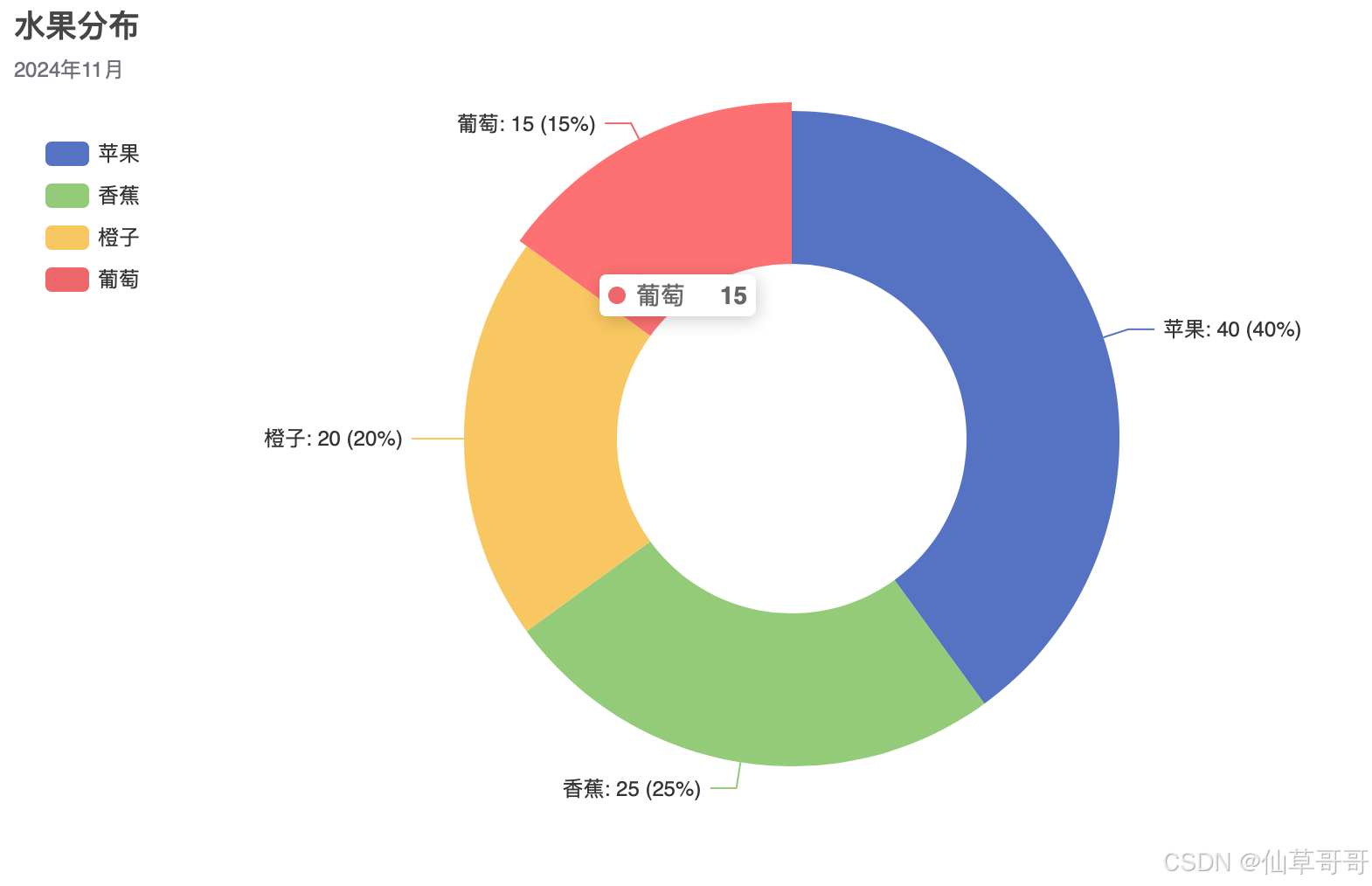
折线图
from pyecharts.charts import Line
from pyecharts import options as opts

x_data = ["周一", "周二", "周三", "周四", "周五", "周六", "周日"]
y_data = [10, 22, 31, 44, 28, 35, 20]

line = (
    Line()
    .add_xaxis(x_data)
    .add_yaxis(
        series_name="销量",
        y_axis=y_data,
        is_smooth=True,
        label_opts=opts.LabelOpts(is_show=True),
    )
    .set_global_opts(
        title_opts=opts.TitleOpts(title="销量趋势", subtitle="一周数据折线图"),
        tooltip_opts=opts.TooltipOpts(trigger="axis"),
        xaxis_opts=opts.AxisOpts(type_="category", boundary_gap=False),
        yaxis_opts=opts.AxisOpts(type_="value"),
        legend_opts=opts.LegendOpts(pos_top="5%"),
    )
)

line.render("line_chart.html")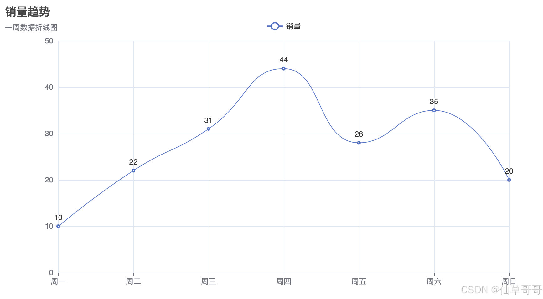
地图
from pyecharts.charts import Geo
from pyecharts import options as opts
from pyecharts.globals import ChartType

geo = Geo()

geo.add_schema(maptype="美国")

geo.add_coordinate("Los Angeles", -118.2437, 34.0522)
geo.add_coordinate("New York", -74.0060, 40.7128)
geo.add_coordinate("Chicago", -87.6298, 41.8781)
geo.add_coordinate("Houston", -95.3698, 29.7604)
geo.add_coordinate("Phoenix", -112.0740, 33.4484)


data = [
    ("Los Angeles", 120),
    ("New York", 100),
    ("Chicago", 90),
    ("Houston", 80),
    ("Phoenix", 70),
]


geo.add(
    series_name="城市数据",
    data_pair=data,
    type_=ChartType.EFFECT_SCATTER,
)


geo.set_global_opts(
    title_opts=opts.TitleOpts(title="美国城市分布地图"),
    visualmap_opts=opts.VisualMapOpts(max_=150),
)


geo.render("usa_geo_map.html")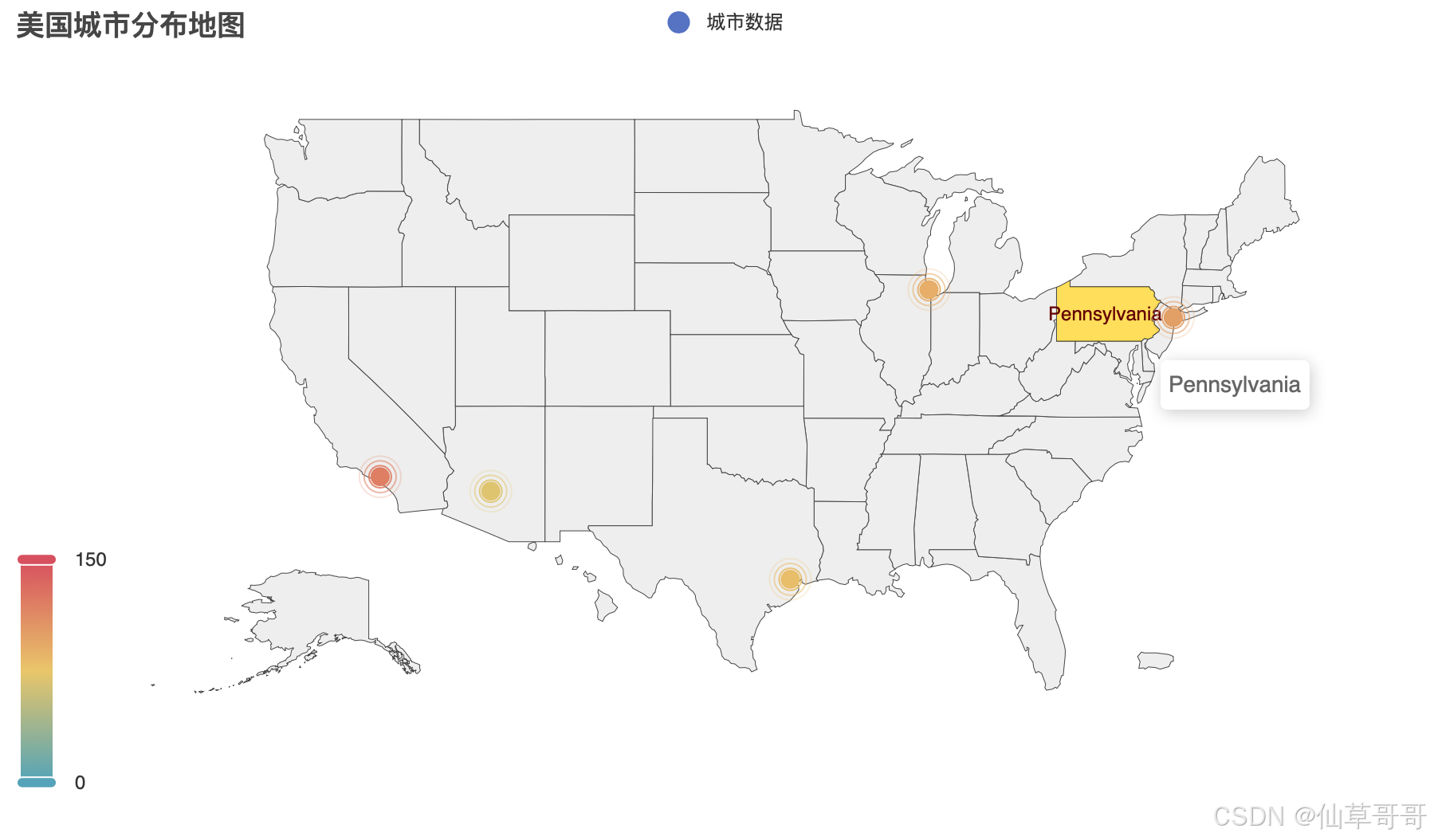
更多图表
需要更多图表样例,可以参考pyecharts官方文档


 1万+
1万+

 被折叠的 条评论
为什么被折叠?
被折叠的 条评论
为什么被折叠?
 到【灌水乐园】发言


