


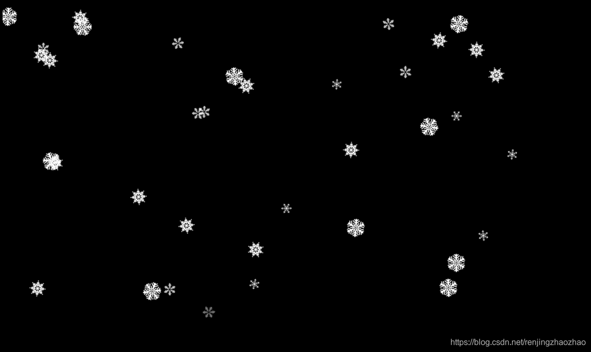
多种雪花图片,自由下落到底端渐变消失
html代码
<!DOCTYPE html>

<html style="background-color: black">

<head>

	<meta charset="UTF-8">

	<title>雪花飘落</title>

	<meta content='width=device-width, initial-scale=1, maximum-scale=1, user-scalable=no' name='viewport'>

	<style>

			html,body {width: 100%;}

			#leafContainer

			{

				position: fixed;

				z-index: 2;

				width: 100%;

				height: 100%;

				top: 0;

				overflow: hidden;

			}


			#leafContainer > div

			{

				position: absolute;

				max-width: 100px;

				max-height: 100px;

				-webkit-animation-iteration-count: infinite, infinite;
				-webkit-animation-direction: normal, normal;

				-webkit-animation-timing-function: linear, ease-in;

			}


			#leafContainer > div > img

			{

				width: 100%;

				-webkit-animation-iteration-count: infinite;

				-webkit-animation-direction: alternate;

				-webkit-animation-timing-function: ease-in-out;

				-webkit-transform-origin: 50% -100%;

			}

			@-webkit-keyframes fade

			{

				0%   {

				opacity: 1;

			}

			95%

			{

				opacity: 1;

			}

			100%

			{

				opacity: 0;

			}

			}

			@-webkit-keyframes drop

			{

				0%   {

				-webkit-transform: translate(0px, -50px);

			}

			100%

			{

				-webkit-transform: translate(0px, 650px);

			}

			}

			@-webkit-keyframes clockwiseSpin

			{

				0%   {

				-webkit-transform: rotate(-50deg);

			}

			100%

			{

				-webkit-transform: rotate(50deg);

			}

			}

			@-webkit-keyframes counterclockwiseSpinAndFlip

			{

				0%   {

				-webkit-transform: scale(-1, 1) rotate(50deg);

			}

			100%

			{

				-webkit-transform: scale(-1, 1) rotate(-50deg);

			}

			}

		</style>

	<script>


		const NUMBER_OF_LEAVES = 50;


	function init()

		{


		    var container = document.getElementById('leafContainer');


		    for (var i = 0; i < NUMBER_OF_LEAVES; i++)

		    {

		        container.appendChild(createALeaf());

		    }

		}


		function randomInteger(low, high)

		{

		    return low + Math.floor(Math.random() * (high - low));

		}


		function randomFloat(low, high)

		{

		    return low + Math.random() * (high - low);

		}


		function pixelValue(value)

		{

		    return value + 'px';

		}


		function durationValue(value)

		{

		    return value + 's';

		}


		function createALeaf()

		{


    var leafDiv = document.createElement('div');

    var image = document.createElement('img');


    image.src ='snow' + randomInteger(1, 5) + '.png';


    leafDiv.style.top = "-10px";


    leafDiv.style.left = pixelValue(randomInteger(0, 1000));


    var spinAnimationName = (Math.random() < 0.5) ? 'clockwiseSpin' : 'counterclockwiseSpinAndFlip';


    leafDiv.style.webkitAnimationName = 'fade, drop';

    image.style.webkitAnimationName = spinAnimationName;


    var fadeAndDropDuration = durationValue(randomFloat(5, 11));


    var spinDuration = durationValue(randomFloat(4, 8));


    leafDiv.style.webkitAnimationDuration = fadeAndDropDuration + ', ' + fadeAndDropDuration;


    var leafDelay = durationValue(randomFloat(0, 5));

    leafDiv.style.webkitAnimationDelay = leafDelay + ', ' + leafDelay;


    image.style.webkitAnimationDuration = spinDuration;


    leafDiv.appendChild(image);


    return leafDiv;

	}


		window.addEventListener('load', init);

		</script></head>

<body>

	<div id="leafContainer">

		</div>

</body>

</html>
images素材:4个, 能 。。。看清的吧。。
”
“
保存图片方法:鼠标放到雪花上(不要点,点开雪花是白色的你不一定能找到),右键—图片另存为
喜欢的话点个赞吧~~
————————————————————————调皮的分割线4月9日更——————————————————————————————————————————————
各种通过html写成的类似ppt字体特效,
鼠标跟随特效
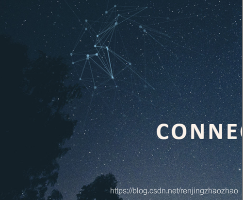
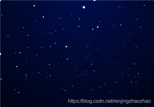
星空粒子背景,雪花背景,气泡背景,树叶飘落,烟花光束背景,
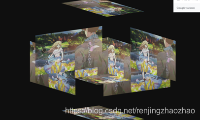
轮播图,3D轮播图
各种卡通动画效果
成型404界面
3D六面体(盒子)
翻书特效
画轴特效
翻书特效
返回顶部小插件
照片影集特效
登录界面
导航栏侧边栏
各种button样式
返回顶部 3D六面体 鼠标绑定跟随 星空粒子背景


 扫一扫
扫一扫


 269
269

 被折叠的 条评论
为什么被折叠?
被折叠的 条评论
为什么被折叠?
 到【灌水乐园】发言


