


 这个博客包含多个示例,展示了HTML和CSS用于创建彩色滚动字体的动画效果,以及JavaScript实现的原生和jQuery随机数生成。还涉及了CSS的动画延迟和3D翻转导航栏效果,以及图片3D旋转展示。通过这些实例,可以深入了解前端开发中动态效果和交互的实现。
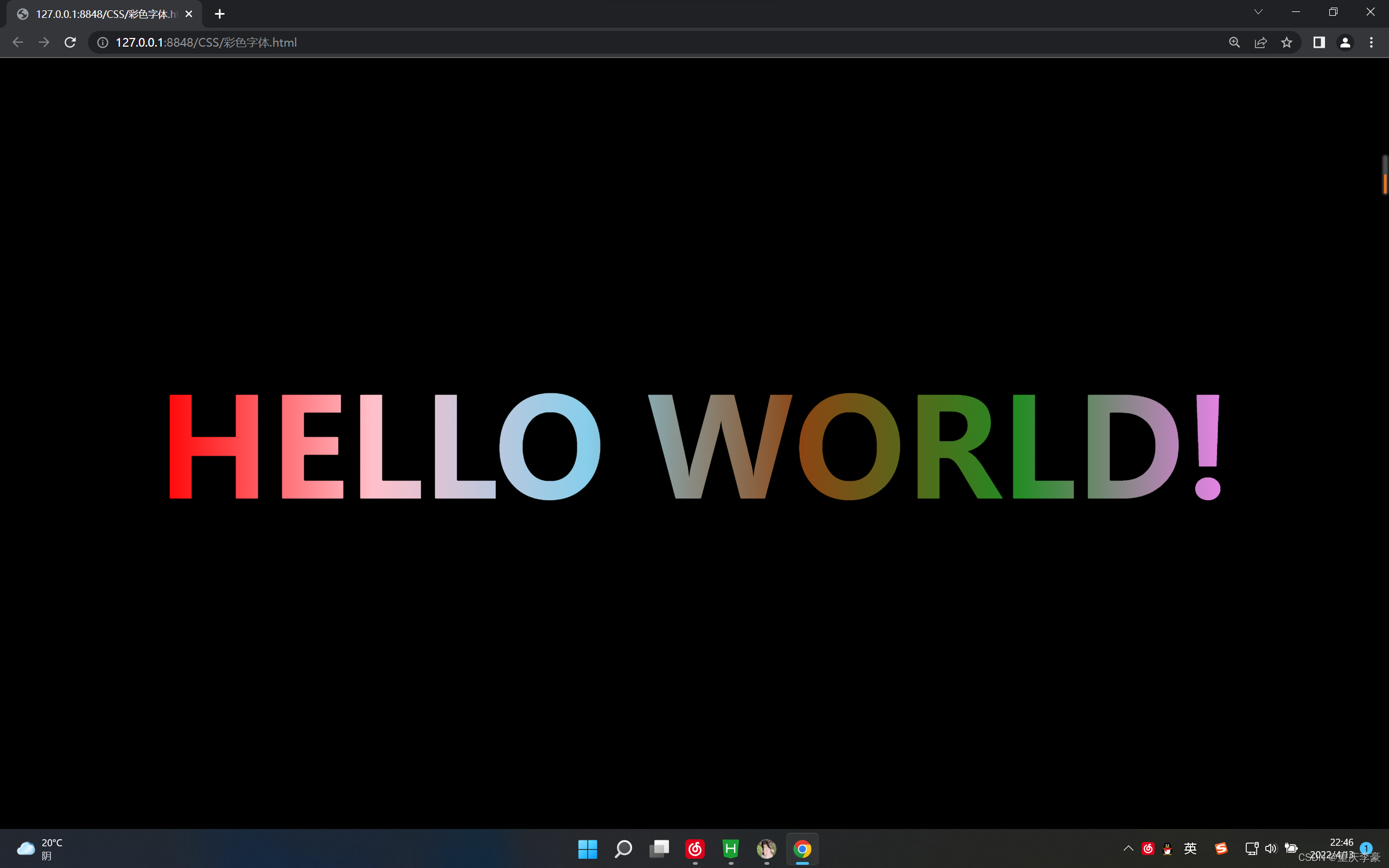
·1.彩色滚动字体
<!DOCTYPE html>
<html>
	<head>
		<meta charset="utf-8">
		<title></title>
		<style>
		*{
			padding: 0;
			margin: 0;
		}
		body{
			background: black;
			display: flex;/*弹性布局*/
			justify-content: center;/*水平居中*/
			align-items: center;/*垂直居中*/
			height:100vh;/*100%的窗口高度*/
		}
		h1{
			font-size:112px;
			color:black;
			text-transform: uppercase;/*小写转大写*/
			position: relative;
		}
		h1::after{
			content: "hello world!";
			color:transparent;/*设置新增的元素为透明颜色*/
			position: absolute;/*设置重叠*/
			left:0;
			top:0;
			background: linear-gradient(to right,red,pink,skyblue,saddlebrown,forestgreen,violet);
			-webkit-background-clip: text;/*以文字范围裁剪背景颜色*/
			/*将元素裁剪成一个圆形(100px表示圆的直径,0% 50%表示圆心的位置)*/
			clip-path: circle(5000px at 0% 50%);
			/*动画 时长 infinte表示无限次播放*/
			animation: light  infinite;
		}
		@keyframes light{
			0%{
			clip-path: circle(100px at 0% 50%);
			}
			50%{
			clip-path: circle(100px at 100% 50%);
			}
			100%{
			clip-path: circle(100px at 0% 50%);
			}
		}
	</style>
	</head>
	<body>
<h1> hello world!</h1>
	</body>
</html>
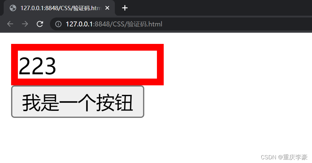
2.原生js挑选随机数
<!DOCTYPE html>
<html>
	<head>
		<meta charset="utf-8">
		<title></title>
		<style>
#tt{
	width: 100px;
	height: 20px;
	border:5px solid red;
}
</style>
	</head>
	<body>
		<div id="tt"></div>
		<button id="anniu" onclick="huoqu()">我是一个按钮</button>
	</body>
</html>
<script>
function huoqu(){
	var yanzhengma=["1","2","3","a","b"];
	var k="";
	for(var i = 0 ; i < 3 ; i++){
		var xiabiao=Math.floor(Math.random()*(yanzhengma.length-1));
		k+=yanzhengma[xiabiao];
	}
	document.getElementById("tt").innerHTML=k;
}</script>
3.juqery随机数
<!DOCTYPE html>
<html>
	<head>
		<meta charset="utf-8">
		<title></title>
		<style>
#tt{
	width: 100px;
	height: 20px;
	border:5px solid red;
}
</style>
	</head>
	<body>
		<div id="tt"></div>
		<button id="anniu">点击获取验证码</button>
		<br>
		<input type="text" id="shurukuang">
		<br>
		<button id="anniu1">点击验证</button>
	</body>
</html>
<script src="https://cdn.staticfile.org/jquery/1.10.2/jquery.min.js"></script>
<script>
$(function(){
	var that;
	$('#anniu').click(function(){
		var yanzhengma=["1","2","3","a","b","c","d","e"];
		var k="";
		for(var i = 0 ; i < 3 ; i++){
			var xiabiao=Math.floor(Math.random()*(yanzhengma.length-1));
			k+=yanzhengma[xiabiao];
		}
		$('#tt').text(k);
that=k;
	});
	$('#anniu1').click(function(){
		// console.log($('#shurukuang').val());
		var str = $("#shurukuang").val();
		if(str==that){
			alert("验证成功");
		}
		else{
			alert("验证失败");
		}
		});
		$('#shurukuang').keydown(function(e){
			 if(e.which == 13) {
				 var str = $("#shurukuang").val();
				 if(str==that){
				 	alert("验证成功");
				 }
				 else{
				 	alert("验证失败");
				 }
			}
			});
});
</script>
3.动画延时
<!DOCTYPE html>
<html>
<head>
<meta charset="utf-8">
<title></title>
<style>
body{
background: black;
display: flex;/*弹性布局*/
justify-content: center;/*水平居中*/
align-items: center;/*垂直居中*/
height:100vh;/*100%的窗口高度*/
}
img:hover{
transform: scale(2.5,2.5); /*宽高放大2.5倍*/
transition:all 2s; /*所有属性动画延时2s*/
}
</style>
</head>
<body>
<img src="img/jk1.webp">
</body>
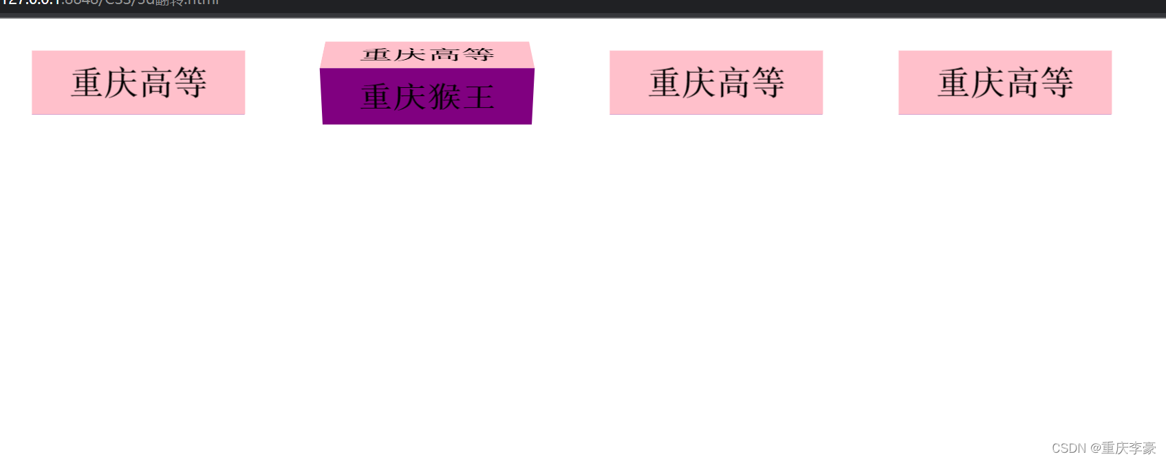
</html>4.3D翻转导航栏
<!DOCTYPE html>
<html>
	<head>
		<meta charset="utf-8">
		<title></title>
		<style>

		li{
			float: left;
			margin: 0 0 0 40px;
			list-style: none;
			width: 100px;
			height: 30px;
			perspective: 500px;/*透视效果 */
		}
		#box{
			position: relative;
			width: 100%;
			height: 100%;
			transform-style:preserve-3d ;
			transition: all 4s;
		}
		#box:hover{
			transform: rotateX(90deg);
		}
		.q,.w{
			position: absolute;
            left: 0;
			top: 0;
			width: 100%;
			height: 100%;
			text-align: center;
			line-height:30px;
			font-family: '宋体';
			font-weight: 700;
		}
		.q{
			background: pink;
			z-index:1;
			transform:translateZ(15px);/*往前走15px;*/
		}
		.w{
			background: purple;
			transform: translateY(15px) rotateX(-90deg);/*先移动再旋转*/
		}
		</style>
	</head>
	<body>
		<ul>
			<li>
				<div id="box">
					<div class="q">重庆高等</div>
					<div class="w">重庆猴王</div>
				</div>
			</li>
			<li>
				<div id="box">
					<div class="q">重庆高等</div>
					<div class="w">重庆猴王</div>
				</div>
			</li>
			<li>
				<div id="box">
					<div class="q">重庆高等</div>
					<div class="w">重庆猴王</div>
				</div>
			</li>
			<li>
				<div id="box">
					<div class="q">重庆高等</div>
					<div class="w">重庆猴王</div>
				</div>
			</li>
		</ul>
	</body>
</html>
5.图片旋转3d案例
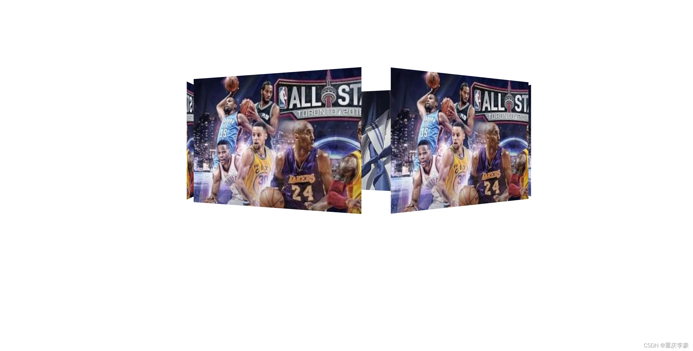
<!DOCTYPE html>
<html>
	<head>
		<meta charset="utf-8">
		<title></title>
		<style>
		body{
			perspective: 1000px;
		}
		section{
			position: relative;
			height: 200px;
			width: 300px;
			margin: 200px auto;
			transform-style:preserve-3d;
			animation: ww 10s linear infinite;/*定义ww 10秒 匀速 无限循环*/
			background: url(img/jk2.webp) no-repeat;
		}
		section:hover{
			animation-play-state:paused; /*鼠标移入停止动画*/
		}
		@keyframes ww {
			0%{
				transform: rotateY(0deg);
			}
			100%{
				transform: rotateY(360deg);
			}
		}
		section div{
			position: absolute;
			height: 100%;
			width: 100%;
			left: 0;
			top: 0;
			background: url(img/介绍1.jpeg) no-repeat;

		}
		section div:nth-child(1){
			transform: translateZ(300px)
		}
			section div:nth-child(2){
				transform:rotateY(60deg) translateZ(300px)
			}
			section div:nth-child(3){
				transform:rotateY(120deg) translateZ(300px)
			}
			section div:nth-child(4){
				transform:rotateY(180deg) translateZ(300px)
			}
			section div:nth-child(5){
				transform:rotateY(240deg) translateZ(300px)
			}
			section div:nth-child(6){
				transform:rotateY(300deg) translateZ(300px)
			}
		</style>
	</head>
	<body>
		<section>
			<div></div>
			<div></div>
			<div></div>
			<div></div>
			<div></div>
			<div></div>
		</section>
	</body>
</html>


 扫一扫
扫一扫


 被折叠的 条评论
为什么被折叠?
被折叠的 条评论
为什么被折叠?
 到【灌水乐园】发言


