


flex布局与grid布局简析
flex布局
flex布局又称之为弹性布局;主要用于在一维上盒子的布局排列;
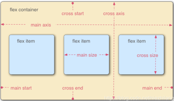
一、主要概念
1、容器
设置 display: flex 或 display: inline-flex 的元素,即为容器;作为 Flexbox 布局的父容器,控制其内部子元素的排列方式。
2、项目
Flex 容器内的直接子元素,即为项目;每个子元素都是一个 Flex 项目,可以通过 Flexbox 属性控制其行为。
3、主轴
Flex 容器的主要方向,由 flex-direction 属性决定。
4、交叉轴
与主轴垂直的轴。控制项目在垂直于主轴方向上的对齐方式。
5、对齐方式
- 主轴对齐:通过
justify-content属性控制项目在主轴上的对齐方式。- 取值:
flex-start、flex-end、center、space-between、space-around、space-evenly。
- 取值:
- 交叉轴对齐:通过
align-items属性控制项目在交叉轴上的对齐方式。- 取值:
flex-start、flex-end、center、baseline、stretch。
- 取值:
- 多行对齐:通过
align-content属性控制多行项目在交叉轴上的对齐方式。- 取值:
flex-start、flex-end、center、space-between、space-around、stretch。
- 取值:
二、容器属性
1. display
- 作用:定义容器为 Flex 容器。
- 取值:
flex:块级 Flex 容器。inline-flex:行内 Flex 容器。
2. flex-direction
- 作用:定义主轴方向,即子元素的排列方向。
- 取值:
row(默认):水平排列,从左到右。row-reverse:水平排列,从右到左。column:垂直排列,从上到下。column-reverse:垂直排列,从下到上。
3. flex-wrap
- 作用:定义子元素是否换行|换行方式。
- 取值:
nowrap(默认):不换行。wrap:换行,第一行在上方。wrap-reverse:换行,第一行在下方。
4. justify-content
- 作用:定义子元素在主轴上的对齐方式。
- 取值:
flex-start(默认):左对齐。flex-end:右对齐。center:居中对齐。space-between:两端对齐,项目间间隔相等。space-around:项目两侧间隔相等。space-evenly:项目间及两侧间隔相等。
5. align-items
- 作用:定义子元素在交叉轴上的对齐方式。
- 取值:
stretch(默认):拉伸以填满容器高度。flex-start:顶部对齐。flex-end:底部对齐。center:垂直居中对齐。baseline:基线对齐。
6. align-content
- 作用:定义多行子元素在交叉轴上的对齐方式(仅适用于多行布局)。
- 取值:
stretch(默认):拉伸以填满容器高度。flex-start:顶部对齐。flex-end:底部对齐。center:垂直居中对齐。space-between:两端对齐,行间间隔相等。space-around:行两侧间隔相等。space-evenly:行间及两侧间隔相等。
7. gap / row-gap / column-gap
- 作用:定义子元素之间的间距。
- 取值:
gap:同时设置行和列的间距。row-gap:设置行间距。column-gap:设置列间距。- 值可以是长度单位(如
px,em,rem等)。
三、项目属性
1. order
- 作用:定义项目的排列顺序。
- 取值:
- 整数(默认值为
0),数值越小,排列越靠前。
- 整数(默认值为
.item {
  order: 2; /* 该项目将排在 order 值为 0 或 1 的项目之后 */
}
2. flex-grow
- 作用:定义项目的放大比例,分配剩余空间。
- 取值:
- 数值(默认值为
0),表示不放大。 - 如果所有项目的
flex-grow都为1,则剩余空间将等分。
- 数值(默认值为
.item {
  flex-grow: 1; /* 该项目将占据剩余空间 */
}
3. flex-shrink
- 作用:定义项目的缩小比例,当空间不足时,项目会缩小。
- 取值:
- 数值(默认值为
1),表示可以缩小。 - 如果设置为
0,则项目不会缩小。
- 数值(默认值为
.item {
  flex-shrink: 0; /* 该项目不会缩小 */
}
4. flex-basis
- 作用:定义项目在分配多余空间之前的初始大小。
- 取值:
- 长度值(如
px,%,em等)。 auto(默认值):根据内容大小决定。content:根据内容自动调整。
- 长度值(如
.item {
  flex-basis: 200px; /* 初始宽度为 200px */
}
5. flex
- 作用:
flex-grow、flex-shrink和flex-basis的简写形式。 - 取值:
- 默认值为
0 1 auto。 - 常用值:
auto:等同于1 1 auto。none:等同于0 0 auto。1:等同于1 1 0%。
- 默认值为
.item {
  flex: 1; /* 等同于 flex: 1 1 0% */
}
6. align-self
- 作用:定义单个项目在交叉轴上的对齐方式,覆盖容器的
align-items属性。 - 取值:
auto(默认):继承容器的align-items值。flex-start:顶部对齐。flex-end:底部对齐。center:垂直居中对齐。baseline:基线对齐。stretch:拉伸以填满容器高度。
.item {
  align-self: flex-end; /* 该项目底部对齐 */
}
四、简单案例
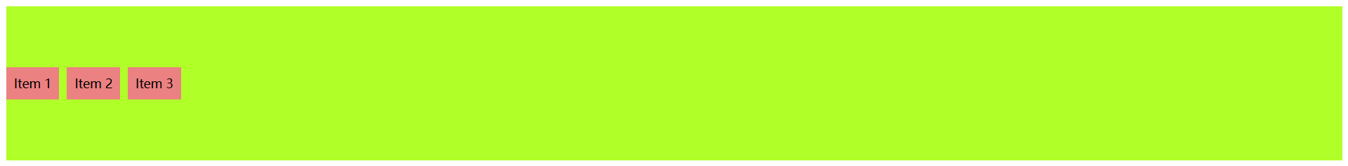
1、水平居中布局
场景:将子元素水平居中排列。

<!DOCTYPE html>
<html lang="en">
  <head>
    <meta charset="UTF-8" />
    <meta name="viewport" content="width=device-width, initial-scale=1.0" />
    <title>弹性布局</title>
    <style>
      .container {
        display: flex;
        justify-content: center; /* 水平居中 */
        gap: 10px; /* 项目之间的间距 */
      }
      .item {
        padding: 10px;
        background-color: lightblue;
      }
    </style>
  </head>
  <body>
    <div class="container">
      <div class="item">Item 1</div>
      <div class="item">Item 2</div>
      <div class="item">Item 3</div>
    </div>
  </body>
</html>
2. 垂直居中布局
场景:将子元素垂直居中排列。
<!DOCTYPE html>
<html lang="en">
  <head>
    <meta charset="UTF-8" />
    <meta name="viewport" content="width=device-width, initial-scale=1.0" />
    <title>弹性布局</title>
    <style>
      .container {
        display: flex;
        align-items: center; /* 垂直居中 */
        height: 200px; /* 容器需要明确高度 */
        gap: 10px;
        background-color: greenyellow;
      }
      .item {
        padding: 10px;
        background-color: lightcoral;
      }
    </style>
  </head>
  <body>
    <div class="container">
      <div class="item">Item 1</div>
      <div class="item">Item 2</div>
      <div class="item">Item 3</div>
    </div>
  </body>
</html>
3. 等分布局
场景:子元素等分容器宽度。

<!DOCTYPE html>
<html lang="en">
  <head>
    <meta charset="UTF-8" />
    <meta name="viewport" content="width=device-width, initial-scale=1.0" />
    <title>弹性布局</title>
    <style>
      .container {
        display: flex;
        background-color: red;
      }
      .item {
        flex: 1; /* 等分剩余空间 */
        padding: 10px;
        background-color: lightgreen;
        border: 1px solid #333;
      }
    </style>
  </head>
  <body>
    <div class="container">
      <div class="item">Item 1</div>
      <div class="item">Item 2</div>
      <div class="item">Item 3</div>
    </div>
  </body>
</html>
4. 固定宽度与自适应布局
场景:一个子元素固定宽度,另一个子元素自适应剩余空间。

<!DOCTYPE html>
<html lang="en">
  <head>
    <meta charset="UTF-8" />
    <meta name="viewport" content="width=device-width, initial-scale=1.0" />
    <title>弹性布局</title>
    <style>
      .container {
        display: flex;
      }
      .item {
        padding: 10px;
        background-color: lightblue;
        border: 1px solid #333;
      }
      .fixed {
        flex: 0 0 200px; /* 固定宽度 200px */
      }
      .fluid {
        flex: 1; /* 自适应剩余空间 */
      }
    </style>
  </head>
  <body>
    <div class="container">
      <div class="item fixed">Fixed Width</div>
      <div class="item fluid">Fluid Width</div>
    </div>
  </body>
</html>
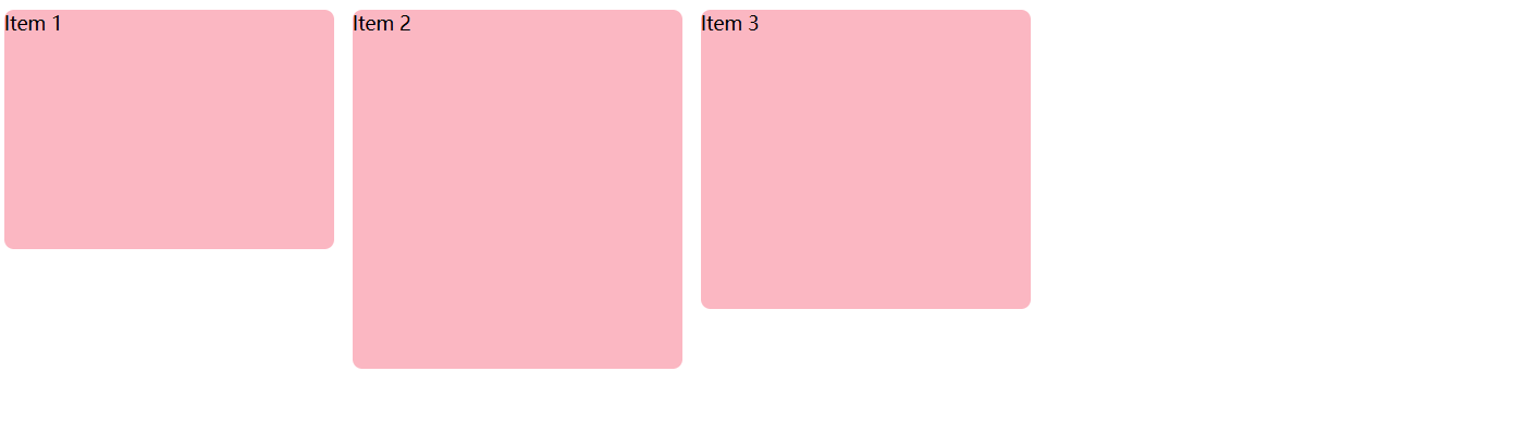
5. 多行布局
场景:子元素超出容器宽度时换行。

<!DOCTYPE html>
<html lang="en">
  <head>
    <meta charset="UTF-8" />
    <meta name="viewport" content="width=device-width, initial-scale=1.0" />
    <title>弹性布局</title>
    <style>
      .container {
        display: flex;
        flex-wrap: wrap; /* 允许换行 */
        width: 800px;
        gap: 10px;
        background: greenyellow;
      }
      .item {
        flex: 0 0 200px; /* 宽度 200px,不允许放大和缩小 */
        padding: 10px;
        background-color: lightpink;
      }
    </style>
  </head>
  <body>
    <div class="container">
      <div class="item">Item 1</div>
      <div class="item">Item 2</div>
      <div class="item">Item 3</div>
      <div class="item">Item 4</div>
      <div class="item">Item 5</div>
    </div>
  </body>
</html>

<!DOCTYPE html>
<html lang="en">
  <head>
    <meta charset="UTF-8" />
    <meta name="viewport" content="width=device-width, initial-scale=1.0" />
    <title>弹性布局</title>
    <style>
      .container {
        display: flex;
        flex-wrap: wrap; /* 允许换行 */
        width: 800px;
        gap: 10px;
        background: greenyellow;
      }
      .item {
        flex: 1 1 200px; /* 最小宽度 200px,允许放大和缩小 */
        padding: 10px;
        background-color: lightpink;
      }
    </style>
  </head>
  <body>
    <div class="container">
      <div class="item">Item 1</div>
      <div class="item">Item 2</div>
      <div class="item">Item 3</div>
      <div class="item">Item 4</div>
      <div class="item">Item 5</div>
    </div>
  </body>
</html>
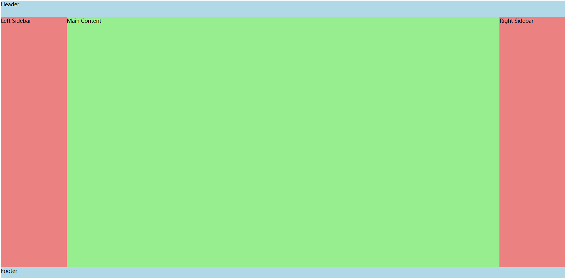
6. 圣杯布局(Holy Grail Layout)
场景:经典的头部、底部、侧边栏和内容区布局。
<!DOCTYPE html>
<html lang="en">
  <head>
    <meta charset="UTF-8" />
    <meta name="viewport" content="width=device-width, initial-scale=1.0" />
    <title>弹性布局</title>
    <style>
      .container {
        display: flex;
        flex-direction: column; /* 主轴方向 垂直方向 从上到下 */
        min-height: 100vh; /* 容器高度占满整个视口 */
      }
      header,
      footer {
        flex: 0 0 50px; /* 不可放大 不可缩小 固定高度 */
        background-color: lightblue;
      }
      main {
        display: flex;
        flex: 1; /* 占据剩余空间 */
      }
      .left,
      .right {
        flex: 0 0 200px; /* 固定宽度 */
        background-color: lightcoral;
      }
      .content {
        flex: 1; /* 自适应剩余空间 */
        background-color: lightgreen;
      }
    </style>
  </head>
  <body>
    <div class="container">
      <header>Header</header>
      <main>
        <aside class="left">Left Sidebar</aside>
        <section class="content">Main Content</section>
        <aside class="right">Right Sidebar</aside>
      </main>
      <footer>Footer</footer>
    </div>
  </body>
</html>
7. 响应式导航栏
场景:导航栏在小屏幕上垂直排列,在大屏幕上水平排列。
大屏幕

宽度缩小到阈值后

<!DOCTYPE html>
<html lang="en">
  <head>
    <meta charset="UTF-8" />
    <meta name="viewport" content="width=device-width, initial-scale=1.0" />
    <title>弹性布局</title>
    <style>
      .navbar {
        display: flex;
        flex-direction: column; /* 小屏幕垂直排列 */
        align-items: center;
        gap: 10px;
        padding: 10px;
        background-color: lightblue;
      }
      .menu {
        display: flex;
        flex-direction: column;
        gap: 10px;
        list-style: none;
        padding: 0;
      }
      @media (min-width: 768px) {
        .navbar {
          flex-direction: row; /* 大屏幕水平排列 */
          justify-content: space-between;
        }
        .menu {
          flex-direction: row;
        }
      }
    </style>
  </head>
  <body>
    <nav class="navbar">
      <div class="logo">Logo</div>
      <ul class="menu">
        <li>Home</li>
        <li>About</li>
        <li>Services</li>
        <li>Contact</li>
      </ul>
    </nav>
  </body>
</html>
grid布局
一、主要概念
1、容器
应用 display: grid 或 display: inline-grid 的元素,即为网格容器;其子元素成为网格项;
2、网格项(项目) 和 网格单元格 以及 网格区域
网格容器的直接子元素,放置在网格单元格中。
网格行和列交叉形成的最小单位,每个单元格可以放置一个网格项。
由一个或多个网格单元格组成的矩形区域,可以通过命名或指定行列来定义。
3、网格线
- 网格的分隔线,可以是水平或垂直的,用于定义网格的结构。
4、网格轨道
- 两条相邻网格线之间的空间,可以是行或列。
5、网格间距
- 网格行和列之间的间距,使用
row-gap和column-gap或简写gap设置。
二、容器属性
1. display
- 将元素定义为网格容器。
- 值:
grid(块级)或inline-grid(行内)。
.container {
  display: grid;
}
2. grid-template-rows 和 grid-template-columns
- 定义显式网格的行和列的尺寸。
- 支持值:长度(
px、%)、fr、auto、minmax()、repeat()。
.container {
  grid-template-rows: 100px 1fr;
  grid-template-columns: repeat(3, 1fr);
}
3. grid-template-areas
- 通过命名区域定义布局。
.container {
  grid-template-areas:
    "header header"
    "sidebar main"
    "footer footer";
}
4. grid-template
- 简写属性:合并
grid-template-rows、grid-template-columns和grid-template-areas。
.container {
  grid-template:
    "header header" 80px
    "sidebar main" 1fr
    / 200px 1fr; /* 列宽定义在斜杠后 */
}
5. gap(或 row-gap / column-gap)
- 定义行和列之间的间距。
.container {
  gap: 20px;          /* 行和列间距 */
  row-gap: 10px;      /* 仅行间距 */
  column-gap: 30px;   /* 仅列间距 */
}
6. justify-items 和 align-items
- 控制所有网格项在单元格内的对齐方式:
justify-items:水平方向(默认stretch)。align-items:垂直方向(默认stretch)。
- 值:
start、end、center、stretch。
.container {
  justify-items: center;
  align-items: start;
}
7. justify-content 和 align-content
- 当网格总尺寸小于容器时,控制整个网格在容器内的对齐。
- 值:
start、end、center、stretch、space-around、space-between、space-evenly。
.container {
  justify-content: space-between;
  align-content: center;
}
8. grid-auto-rows 和 grid-auto-columns
- 定义隐式网格(自动生成的行/列)的尺寸。
.container {
  grid-auto-rows: 50px; /* 隐式行高为50px */
}
9. grid-auto-flow
- 控制自动放置的网格项的排列方向。
- 值:
row(默认)、column、row dense、column dense。
.container {
  grid-auto-flow: column dense; /* 按列填充,紧凑布局 */
}
三、项目属性
1. grid-row 和 grid-column
- 定义项目占据的行或列范围。
- 值:
- 行号:
grid-row: 1 / 3(从第1行到第3行前)。 span:grid-column: span 2(跨越2列)。
- 行号:
.item {
  grid-row: 1 / 3;    /* 跨第1行到第2行 */
  grid-column: span 2; /* 跨2列 */
}
2. grid-area
-
简写属性,定义项目的位置或关联命名区域。
-
两种用法:
- 直接指定位置:
grid-row-start/grid-column-start/grid-row-end/grid-column-end。
.item { grid-area: 1 / 1 / 3 / 3; /* 行起/列起/行终/列终 */ }- 关联命名区域:
.item { grid-area: header; /* 对应容器中 grid-template-areas 的命名 */ } - 直接指定位置:
3. justify-self 和 align-self
- 覆盖容器的
justify-items和align-items,控制单个项目的对齐。 - 值:
start、end、center、stretch。
.item {
  justify-self: end;   /* 水平对齐到单元格末尾 */
  align-self: center;  /* 垂直居中对齐 */
}
4. order
- 控制项目的显示顺序(默认值为0,数值越小越靠前)。
.item {
  order: -1; /* 显示在默认顺序之前 */
}
四、简单案例
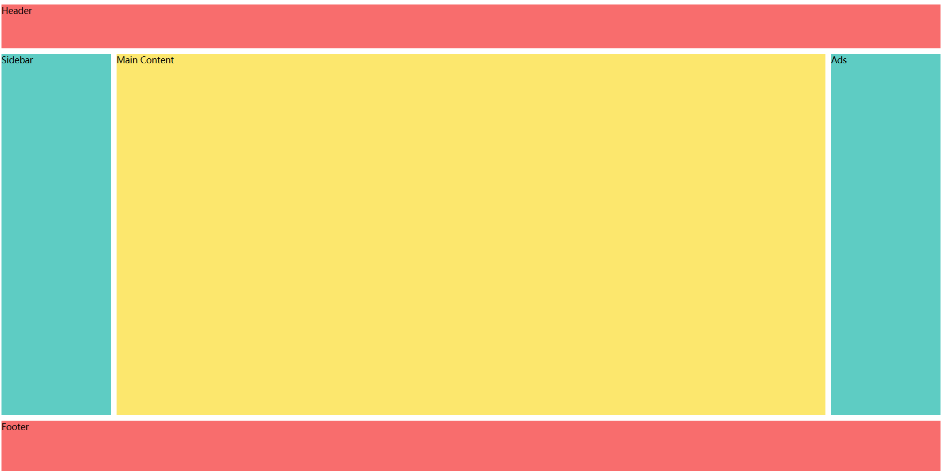
1. 经典圣杯布局(Holy Grail Layout)
- 包含页头、页脚、侧边栏和主要内容区,适合后台管理系统。
<!DOCTYPE html>
<html lang="en">
  <head>
    <meta charset="UTF-8" />
    <meta name="viewport" content="width=device-width, initial-scale=1.0" />
    <title>grid布局</title>
    <style>
      .holy-grail {
        display: grid;
        grid-template:
          "header  header  header" 80px
          "sidebar main    ads" 1fr
          "footer  footer  footer" 100px
          / 200px 1fr 200px;
        gap: 10px;
        height: 100vh;
      }
      header {
        grid-area: header;
        background: #ff6b6b;
      }
      nav {
        grid-area: sidebar;
        background: #4ecdc4;
      }
      main {
        grid-area: main;
        background: #ffe66d;
      }
      aside {
        grid-area: ads;
        background: #4ecdc4;
      }
      footer {
        grid-area: footer;
        background: #ff6b6b;
      }
    </style>
  </head>
  <body>
    <div class="holy-grail">
      <header>Header</header>
      <nav>Sidebar</nav>
      <main>Main Content</main>
      <aside>Ads</aside>
      <footer>Footer</footer>
    </div>
  </body>
</html>
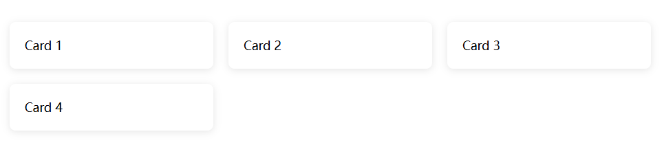
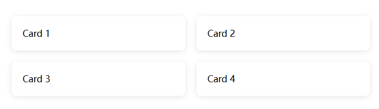
2. 响应式卡片网格
- 自动适应不同屏幕尺寸的卡片布局,适合商品列表或博客。

<!DOCTYPE html>
<html lang="en">
  <head>
    <meta charset="UTF-8" />
    <meta name="viewport" content="width=device-width, initial-scale=1.0" />
    <title>grid布局</title>
    <style>
      .card-grid {
        display: grid;
        grid-template-columns: repeat(auto-fit, minmax(250px, 1fr));
        gap: 20px;
        padding: 20px;
      }
      .card {
        background: #fff;
        padding: 20px;
        border-radius: 8px;
        box-shadow: 0 2px 10px rgba(0, 0, 0, 0.1);
      }
    </style>
  </head>
  <body>
    <div class="card-grid">
      <div class="card">Card 1</div>
      <div class="card">Card 2</div>
      <div class="card">Card 3</div>
      <div class="card">Card 4</div>
    </div>
  </body>
</html>
3. 自适应表单布局
- 标签和输入框对齐的响应式表单。

<!DOCTYPE html>
<html lang="en">
  <head>
    <meta charset="UTF-8" />
    <meta name="viewport" content="width=device-width, initial-scale=1.0" />
    <title>grid布局</title>
    <style>
      .form-grid {
        display: grid;
        grid-template-columns: 100px 1fr;
        gap: 15px;
        max-width: 600px;
        margin: 20px auto;
      }
      button {
        grid-column: span 2; /* 按钮跨两列 */
        padding: 10px;
      }
    </style>
  </head>
  <body>
    <form class="form-grid">
      <label>Name:</label>
      <input type="text" />
      <label>Email:</label>
      <input type="email" />
      <label>Message:</label>
      <textarea></textarea>
      <button>Submit</button>
    </form>
  </body>
</html>
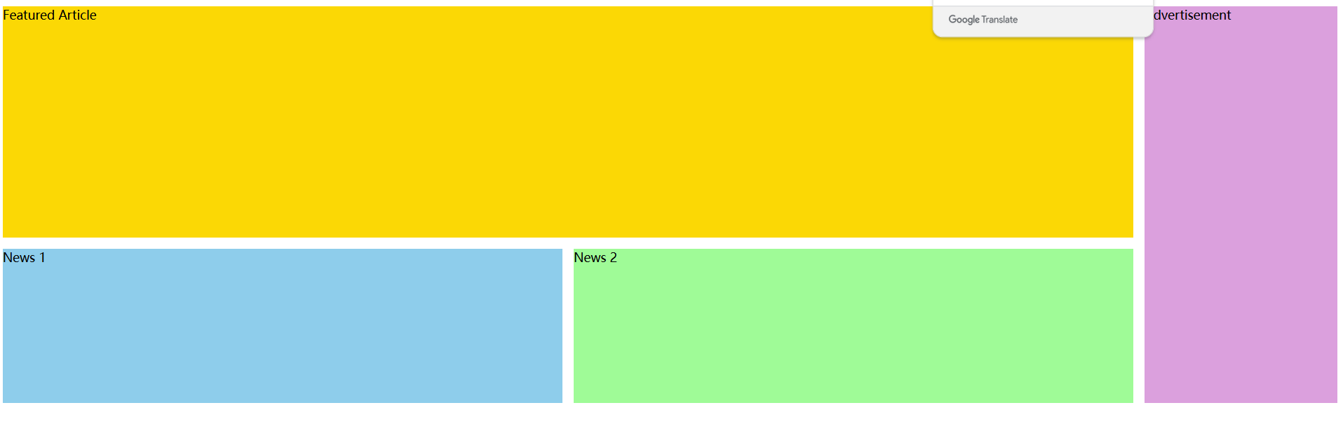
4. 杂志式复杂布局
- 类似新闻网站的混合内容布局。
<!DOCTYPE html>
<html lang="en">
  <head>
    <meta charset="UTF-8" />
    <meta name="viewport" content="width=device-width, initial-scale=1.0" />
    <title>grid布局</title>
    <style>
      .magazine {
        display: grid;
        grid-template:
          "featured featured ad" 300px
          "news1    news2    ad" 200px
          / 1fr 1fr 250px;
        gap: 15px;
      }
      .featured {
        grid-area: featured;
        background: #ffd700;
      }
      .news1 {
        grid-area: news1;
        background: #87ceeb;
      }
      .news2 {
        grid-area: news2;
        background: #98fb98;
      }
      .ad {
        grid-area: ad;
        background: #dda0dd;
      }
    </style>
  </head>
  <body>
    <div class="magazine">
      <div class="featured">Featured Article</div>
      <div class="news1">News 1</div>
      <div class="news2">News 2</div>
      <div class="ad">Advertisement</div>
    </div>
  </body>
</html>
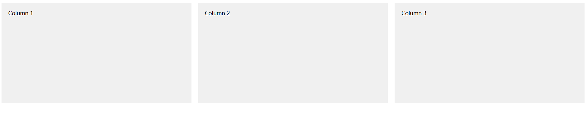
5. 等高分栏布局
- 多列等高的经典布局,适合对比展示内容。
<!DOCTYPE html>
<html lang="en">
  <head>
    <meta charset="UTF-8" />
    <meta name="viewport" content="width=device-width, initial-scale=1.0" />
    <title>grid布局</title>
    <style>
      .equal-columns {
        display: grid;
        grid-template-columns: repeat(3, 1fr);
        gap: 20px;
        min-height: 300px; /* 确保容器有高度 */
      }
      .col {
        background: #f0f0f0;
        padding: 20px;
      }
    </style>
  </head>
  <body>
    <div class="equal-columns">
      <div class="col">Column 1</div>
      <div class="col">Column 2</div>
      <div class="col">Column 3</div>
    </div>
  </body>
</html>
6. 瀑布流布局(Pinterest Style)
- 自适应高度的瀑布流,适合图片墙展示。
<!DOCTYPE html>
<html lang="en">
  <head>
    <meta charset="UTF-8" />
    <meta name="viewport" content="width=device-width, initial-scale=1.0" />
    <title>grid布局</title>
    <style>
      .masonry {
        display: grid;
        grid-template-columns: repeat(auto-fill, minmax(250px, 1fr));
        gap: 15px;
        grid-auto-flow: dense; /* 紧凑填充 */
      }
      .item {
        background: #ffb6c1;
        border-radius: 8px;
      }
    </style>
  </head>
  <body>
    <div class="masonry">
      <div class="item" style="height: 200px">Item 1</div>
      <div class="item" style="height: 300px">Item 2</div>
      <div class="item" style="height: 250px">Item 3</div>
      <!-- 更多不同高度的 item -->
    </div>
  </body>
</html>
二者区别
Flex 布局和 Grid 布局是 CSS 中两种强大的布局方案,但它们的适用场景和核心逻辑有显著差异。
一、核心区别
| 特性 | Flex 布局 | Grid 布局 |
|---|---|---|
| 维度 | 一维布局(沿主轴排列) | 二维布局(同时控制行和列) |
| 控制方向 | 通过 flex-direction 定义主轴方向 | 同时定义行和列的轨道 |
| 子项独立性 | 子项按主轴顺序排列,互相影响 | 子项可精确定位到任意单元格,独立性更强 |
| 对齐方式 | 基于主轴和交叉轴对齐 | 基于行和列对齐,支持更复杂的对齐规则 |
| 适用场景 | 局部组件布局(如导航栏、列表项) | 整体页面结构或复杂二维布局(如仪表盘) |
二、适用场景
1. Flex 布局的典型场景
-
单行/单列布局
-
导航栏、按钮组、表单控件对齐。
-
示例:水平居中的导航菜单:
.nav {
  display: flex;
  justify-content: space-between;
  align-items: center;
}
-
-
动态内容容器
-
子项数量不确定时自动调整间距(如卡片列表)。
-
示例:等宽卡片自动换行:
.card-list {
  display: flex;
  flex-wrap: wrap;
  gap: 20px;
}
.card { flex: 1 1 250px; } /* 最小宽度250px,自动换行 */
-
-
垂直居中
-
快速实现内容在容器内垂直居中:
.container {
  display: flex;
  justify-content: center;
  align-items: center;
}
-
2. Grid 布局的典型场景
-
复杂二维布局
-
圣杯布局、仪表盘、杂志式排版。
-
示例:经典圣杯布局:
.layout {
  display: grid;
  grid-template:
    "header  header  header" 80px
    "sidebar main    ads"    1fr
    "footer  footer  footer" 100px
    / 200px  1fr     200px;
}
-
-
响应式网格系统
-
自适应列数和行高(如商品列表、图片墙)。
-
示例:自动适配屏幕的卡片网格:
.grid {
  display: grid;
  grid-template-columns: repeat(auto-fit, minmax(250px, 1fr));
  gap: 20px;
}
-
-
精确控制行列关系
-
单元格跨行/跨列、行列对齐方式独立控制。
-
示例:跨列的表单提交按钮:
.submit-btn {
  grid-column: 1 / -1; /* 跨所有列 */
}
-
三、如何选择?
1、优先使用 Flex 的情况
- 组件内部布局(如按钮组、导航栏)。
- 需要简单的一维排列(单行或单列)。
- 子项需要动态收缩或拉伸(如
flex-grow/flex-shrink)。
2、优先使用 Grid 的情况
- 整体页面框架(如页头、侧边栏、主内容区、页脚)。
- 需要同时控制行和列的复杂布局。
- 需要精确的单元格定位或跨行/列操作。
四、协作与结合
在实际项目中,Flex 和 Grid 可以协同使用:
-
外层用 Grid:定义页面整体结构。
-
内层用 Flex:处理局部组件对齐。
-
示例:在 Grid 单元格内使用 Flex 对齐内容:
.grid-container {
  display: grid;
  grid-template-columns: 1fr 1fr;
}
.grid-item {
  display: flex;
  justify-content: center;
  align-items: center;
}
五、总结
| 布局方案 | 核心优势 | 典型场景 |
|---|---|---|
| Flex | 简单、灵活的一维排列 | 导航栏、表单、动态列表 |
| Grid | 强大的二维控制与复杂结构定义 | 页面框架、仪表盘、响应式网格系统 |
最终建议:
-
优先用 Flex 处理微观组件布局。
-
优先用 Grid 处理宏观页面结构。
t(auto-fit, minmax(250px, 1fr));
gap: 20px;
} -
精确控制行列关系
-
单元格跨行/跨列、行列对齐方式独立控制。
-
示例:跨列的表单提交按钮:
.submit-btn {
  grid-column: 1 / -1; /* 跨所有列 */
}
-


 扫一扫
扫一扫


 2万+
2万+

 被折叠的 条评论
为什么被折叠?
被折叠的 条评论
为什么被折叠?
 到【灌水乐园】发言


