


9.1 DIV+CSS概述
DIV+CSS是WEB设计标准,它是一种网页的布局方法,可以实现网页页面内容与表现相分离。其中DIV(Division)是一个块级元素,用于组织和结构化网页内容。CSS(Cascading Style Sheets)则用于设置这些DIV元素的样式,包括宽高、颜色、边距等。
9.1.1 认识DIV
div标签在Web标准的网页中使用非常频繁,属于块状元素。div标签是双标签,即以<div></div>的形式存在,中间可以放置任何内容,包括其他的div标签。但是在没有CSS的影响下,每个div标签只占据一行,即一行只能容纳一个div标签。
9.1.2 DIV的宽高设置
9.1.2.1 宽高属性
在CSS中,可以通过width和height属性来设置<div>元素的宽度和高度。这两个属性接受长度值(如px,em)或百分比值。
9.1.2.2 div标签内直接设置宽高
虽然可以直接在<div>标签内使用style属性来设置宽度和高度,但这种方法并不推荐。因为内联样式会使HTML代码变得冗长且难以维护,不利于代码的复用。
9.1.2.3 div使用选择器设置宽高
更推荐的方式是通过外部CSS文件或者<style>标签来设置<div>的宽度和高度。例如,可以为<div>设置一个类名.myDiv,
示例代码:
<!DOCTYPE html>
<html>
	<head>
		<meta charset="utf-8" />
		<title></title>
		<style type="text/css">
			/* 第九章DIV+CSS布局 */
			/* 9.1 DIV+CSS概述 */
			/* 9.1.1 认识DIV */
			/* 9.1.2 DIV的宽高设置 */
			/* 9.1.2.1 宽高属性 */
			/* 9.1.2.2 div标签内直接设置宽高 */
			/* 9.1.2.3 div使用选择器设置宽高 */
			.d1{
				width: 100px;
				height: 80px;
				border: #77ff00 3px solid;
			}
			#d2{
				width: 300px;
				height: 140px;
				border: #77ff00 3px solid;
			}
		</style>
	</head>
	<body>
		<div class="d1">设置宽高</div>
		<div id="d2">百分百设置宽高</div>
	</body>
</html>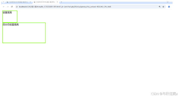
9.1.2.4 div高度的百分比设置问题
当给<div>设置百分比高度时,它实际上是相对于其父容器的高度。如果父容器没有明确的高度,则子元素的百分比高度可能不会按预期工作。为了使百分比高度生效,通常需要确保所有祖先元素都有明确的高度设置。
例如:
-
<!DOCTYPE html>
<html>
	<head>
		<meta charset="utf-8" />
		<title></title>
		<style type="text/css">
			/* 第九章DIV+CSS布局 */
			/* 9.1 DIV+CSS概述 */
			/* 9.1.1 认识DIV */
			/* 9.1.2 DIV的宽高设置 */
			/* 9.1.2.1 宽高属性 */
			/* 9.1.2.2 div标签内直接设置宽高 */
			/* 9.1.2.3 div使用选择器设置宽高 */
			.d1{
				width: 100px;
				height: 80px;
				border: #77ff00 3px solid;
			}
			/* 9.1.2.4 div高度的百分比设置问题 */
			*{
				width: 100%;
				height: 100%;
			}
			#d2{
				width: 50%;
				height: 40%;
				border: #77ff00 3px solid;
			}
		</style>
	</head>
	<body>
		<div class="d1">设置宽高</div>
		<div id="d2">百分百设置宽高</div>
	</body>
</html>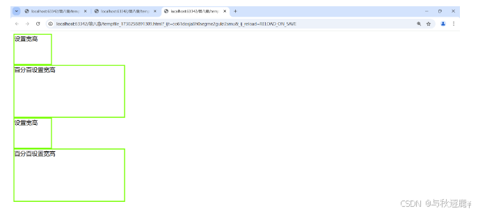
9.2 DIV+CSS的应用
9.2.1 DIV元素的布局技巧
浮动布局:使用float属性可以让<div>浮动到页面的左侧或右侧,常用于创建多列布局。
定位布局:通过position属性(如relative,absolute,fixed或sticky),可以精确控制<div>在页面上的位置。
Flexbox布局:Flexbox是一种一维布局模型,提供了更加灵活的布局方式,能够轻松实现响应式设计。
示例代码:<!DOCTYPE html> <html> <head> <meta charset="utf-8" /> <title></title> <style type="text/css"> /* 第九章DIV+CSS布局 */ /* 9.1 DIV+CSS概述 */ /* 9.1.1 认识DIV */ /* 9.1.2 DIV的宽高设置 */ /* 9.1.2.1 宽高属性 */ /* 9.1.2.2 div标签内直接设置宽高 */ /* 9.1.2.3 div使用选择器设置宽高 */ .d1{ width: 100px; height: 80px; border: #77ff00 3px solid; } /* 9.1.2.4 div高度的百分比设置问题 */ *{ width: 100%; height: 100%; } #d2{ width: 50%; height: 40%; border: #77ff00 3px solid; } /* 9.2 DIV+CSS的应用 */ /* 9.2.1 DIV元素的布局技巧 */ #d3{ width: 50%; height: 20%; border: #77ff00 3px solid; margin-left: auto; margin-right: auto; } </style> </head> <body> <div class="d1">设置宽高</div> <div id="d2">百分百设置宽高</div> <div id="d3">DIV元素居中</div> </body> </html>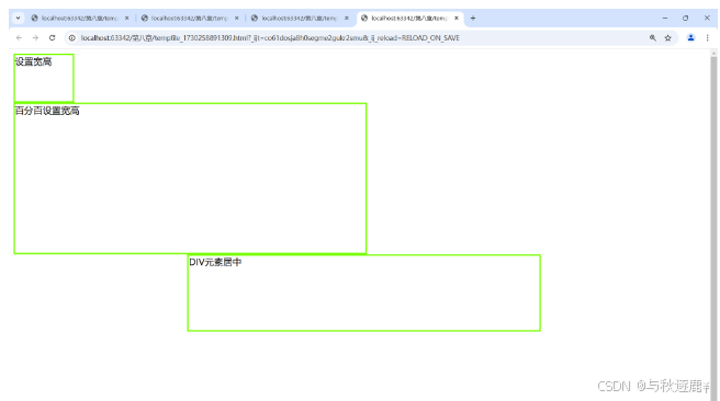
9.2.2 DIV元素的宽度自适应
宽度自适应是指两个并排的div中,左边的div为固定宽度,右边的div则根据浏览器的宽度自动调整。这种用法常用于文章列表和文章内容的页面布局。
示例:
<!DOCTYPE html>
<html>
	<head>
		<meta charset="utf-8" />
		<title></title>
		<style type="text/css">
			/* 第九章DIV+CSS布局 */
			/* 9.1 DIV+CSS概述 */
			/* 9.1.1 认识DIV */
			/* 9.1.2 DIV的宽高设置 */
			/* 9.1.2.1 宽高属性 */
			/* 9.1.2.2 div标签内直接设置宽高 */
			/* 9.1.2.3 div使用选择器设置宽高 */
			.d1{
				width: 100px;
				height: 80px;
				border: #77ff00 3px solid;
			}
			/* 9.1.2.4 div高度的百分比设置问题 */
			*{
				width: 100%;
				height: 100%;
			}
			#d2{
				width: 50%;
				height: 40%;
				border: #77ff00 3px solid;
			}
			/* 9.2 DIV+CSS的应用 */
			/* 9.2.1 DIV元素的布局技巧 */
			#d3{
				width: 50%;
				height: 20%;
				border: #77ff00 3px solid;
				margin-left: auto;
				margin-right: auto;
			}
			/* 9.2.2 DIV元素的宽度自适应 */
			*{
				margin: 0;
				padding: 0;
			}
			#all{
				height: 100px;
				border: #77ff00 3px solid;
			}
			#left{
				width: 100px;
				height: 100px;
				border: #0099ff 3px solid;
				float: left;
			}
			#right{
				border: #4400ff 3px solid;
				margin-left: 100px;
			}
		</style>
	</head>
	<body>
		<div class="d1">设置宽高</div>
		<div id="d2">百分百设置宽高</div>
		<div id="d3">DIV元素居中</div>
		<div id="all">
			<div id="left">左边固定宽度</div>
			<div id="right">右边宽度自适应</div>
		</div>
	</body>
</html>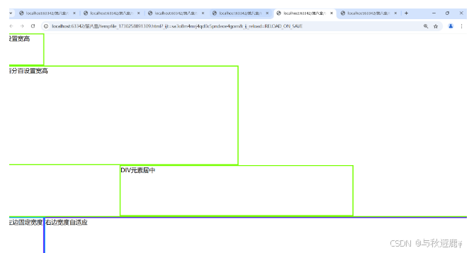
9.2.3 DIV内容的居中
对于块级元素,可以设置margin-left和margin-right为auto来实现水平居中;对于行内元素,可以使用text-align: center来实现水平居中。另外,可以利用Flexbox的align-items: center或者Grid的align-items: center来实现垂直居中。示例:
<!DOCTYPE html>
<html>
	<head>
		<meta charset="utf-8" />
		<title></title>
		<style type="text/css">
			/* 第九章DIV+CSS布局 */
			/* 9.1 DIV+CSS概述 */
			/* 9.1.1 认识DIV */
			/* 9.1.2 DIV的宽高设置 */
			/* 9.1.2.1 宽高属性 */
			/* 9.1.2.2 div标签内直接设置宽高 */
			/* 9.1.2.3 div使用选择器设置宽高 */
			.d1{
				width: 100px;
				height: 80px;
				border: #77ff00 3px solid;
			}
			/* 9.1.2.4 div高度的百分比设置问题 */
			*{
				width: 100%;
				height: 100%;
			}
			#d2{
				width: 50%;
				height: 40%;
				border: #77ff00 3px solid;
			}
			/* 9.2 DIV+CSS的应用 */
			/* 9.2.1 DIV元素的布局技巧 */
			#d3{
				width: 50%;
				height: 20%;
				border: #77ff00 3px solid;
				margin-left: auto;
				margin-right: auto;
			}
			/* 9.2.2 DIV元素的宽度自适应 */
			*{
				margin: 0;
				padding: 0;
			}
			#all{
				height: 100px;
				border: #77ff00 3px solid;
			}
			#left{
				width: 100px;
				height: 100px;
				border: #0099ff 3px solid;
				float: left;
			}
			#right{
				border: #4400ff 3px solid;
				margin-left: 100px;
			}
			/* 9.2.3 DIV内容的居中 */
			#d4{
				width: 300px;
				height: 100px;
				border: #77ff00 3px solid;
				text-align: center;
				line-height: 100px;
			}
		</style>
	</head>
	<body>
		<div class="d1">设置宽高</div>
		<div id="d2">百分百设置宽高</div>
		<div id="d3">DIV元素居中</div>
		<div id="all">
			<div id="left">左边固定宽度</div>
			<div id="right">右边宽度自适应</div>
		</div>
		<div id="d4">DIV内容居中</div>
	</body>
</html>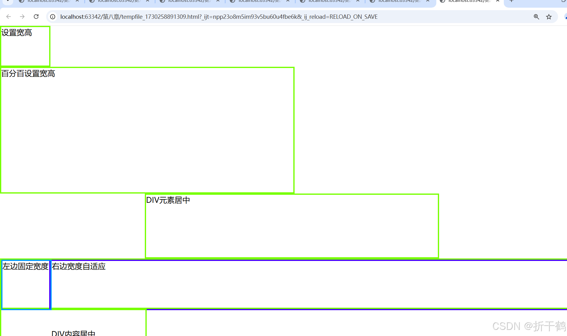
9.2.4 DIV元素的嵌套
DIV元素可以嵌套使用,即一个DIV元素内部可以包含其他DIV元素或其他HTML元素。通过CSS,可以对这些嵌套的DIV元素进行样式设置,实现复杂的布局效果。
示例:
<!DOCTYPE html>
<html>
	<head>
		<meta charset="utf-8">
		<title>示例9.10</title>
		<style type="text/css">
			.all{
				width: 700px;
				height: 700px;
				border: 2px solid red;
				margin: 0px auto;
			}
			.top{
				width: 700px;
				height: 100px;
				background-color: lightcyan;
			}
			.main{
				width: 700px;
				height: 520px;
			}
			.left{
				width: 180px;
				height: 500px;
				background-color: yellow;
				float: left;
				margin: 10px;
			}
			.right{
				width: 480px;
				height: 500px;
				background-color: lightgreen;
				float: left;
				margin: 10px;
			}
			.footer{
				width: 700px;
				height: 80px;
				background-color: lightgray;
			}
		</style>
	</head>
	<body>
		<div class="all">
			<div class="top"></div>
			<div class="main">
				<div class="left"></div>
				<div class="right"></div>
			</div>
			<div class="footer"></div>
		</div>
	</body>
</html>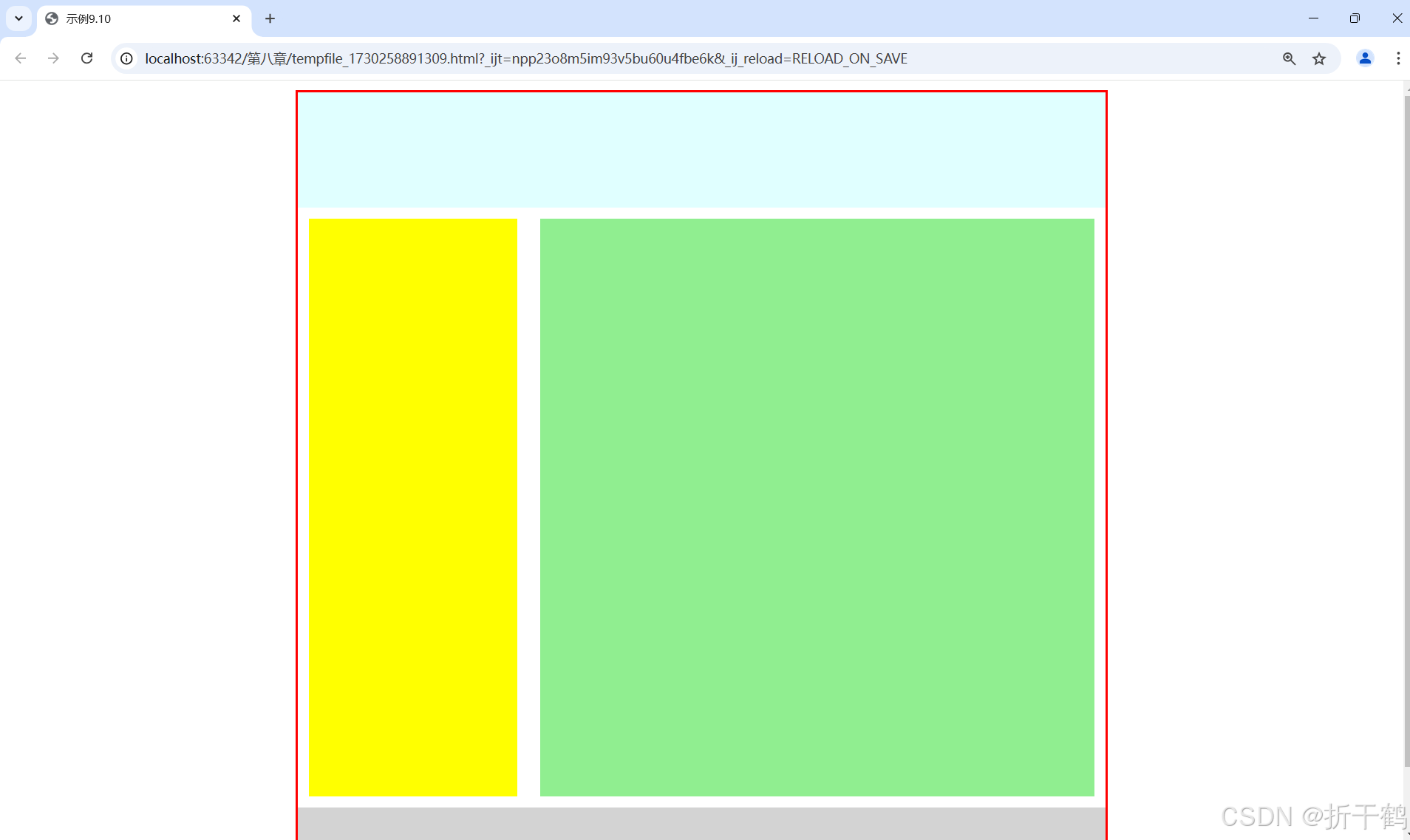
9.3 DIV+CSS的典型布局
9.3.1 左中右布局
左中右布局是一种常见的网页布局方式,通常用于将网页内容分为左侧导航栏、中间主内容区和右侧边栏三个部分。
示例:
<!DOCTYPE html>
<html>
	<head>
		<meta charset="utf-8">
		<title>示例9.11</title>
		<style type="text/css">
			*{
				margin: 10px auto;
				padding: 0px auto;
				font-size: large;
			}
			.all{
				background-color: red;
				width: 700px;
				height: 500px;
			}
			.left,.main,.right{
				text-align: center;
				height: 480px;
				line-height: 480px;
				float: left;
			}
			.left{
				background-color: antiquewhite;
				width: 150px;
			}
			.main{
				background-color: lightcyan;
				width: 400px;
			}
			.right{
				background-color: antiquewhite;
				width: 150px;
			}
		</style>
	</head>
	<body>
		<div class="all">
			<div class="left">导航菜单</div>
			<div class="main">视觉集中区域,主要内容</div>
			<div class="right">表单或链接</div>
		</div>
	</body>
</html>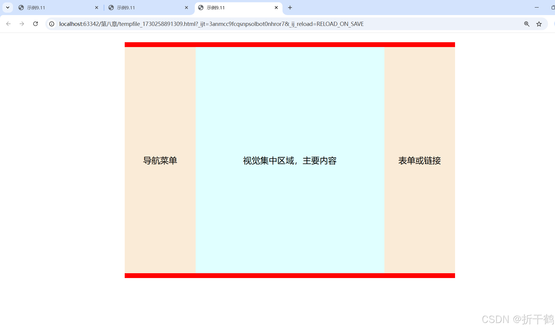
9.3.3 混合布局
混合布局是指将上述两种或多种布局方式组合在一起,以实现更加复杂和灵活的网页布局效果。综上所述,DIV+CSS布局是现代网页设计的基础,它提供了一种灵活且强大的方式来控制网页的结构和样式。通过掌握DIV+CSS布局技巧,可以创建出各种美观、实用的网页布局。
代码:
<!DOCTYPE html>
<html>
	<head>
		<meta charset="utf-8">
		<title>示例9.13</title>
		<style type="text/css">
			*{
				margin: 0px auto;
				padding: 0px auto;
				width:100%;
				height: 100%;
			}
			.all{
				border: 2px dashed red;
				width: 95%;
				height: 100%;
			}
			.top{
				background-color: pink;
				width: 100%;
				height: 15%;
			}
			.main{
				width: 100%;
				height: 75%;
			}
			.left{
				background-color: yellow;
				width: 20%;
				float: left;
			}
			.center{
				background-color: lightcyan;
				width: 60%;
				float: left;
			}
			.right{
				background-color: yellow;
			}
			.footer{
				background-color: pink;
				width: 100%;
				height: 10%;
			}
		</style>
	</head>
	<body>
		<div class="all">
			<div class="top"></div>
			<div class="main">
				<div class="left"></div>
				<div class="center"></div>
				<div class="right"></div>
			</div>
			<div class="footer"></div>
		</div>
	</body>
</html>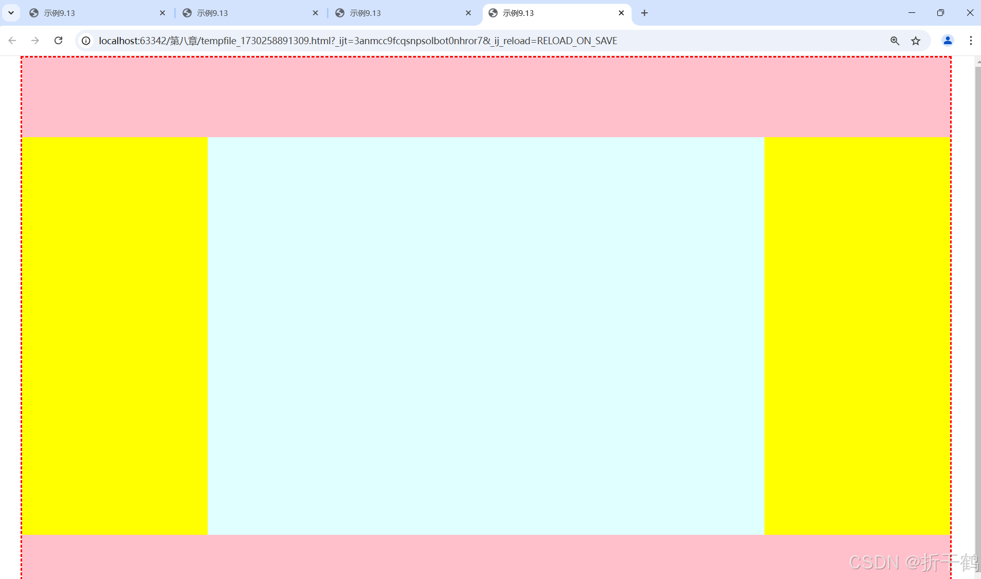
9.4 综合案例——众成远程教育
布局代码:
<!DOCTYPE html>
<html>
	<head>
		<meta charset="utf-8">
		<title>众成远程教育--布局</title>
		<style>
			*{
				margin: 0 auto;
				font-family:"宋体";
				font-size:30px;
				text-align: center;
				font-weight:700;
			}
			.all{
				width: 1000px;
				height: 840px;
				background-image: url(img/9-bg.jpg);
			}
			.top{
				width: 1000px;
				height: 150px;
			}
			.main{
				background-color: aliceblue;
				width: 1000px;
				height: 630px;
			}
			.left{
				width: 200px;
				height: 630px;
				float: left;
			}
			.center{
				border-left: 2px dashed blue;
				border-right: 2px dashed blue;
				width: 500px;
				height: 630px;
				float: left;
			}
			.right{
				width: 250px;
				height: 630px;
				float: left;
			}
			.footer{
				width: 1000px;
				height: 60px;
			}
		</style>
	</head>
	<body>
		<div class="all">
			<div class="top">top</div>
			<div class="main">
				<div class="left">left</div>
				<div class="center">center</div>
				<div class="right">right</div>
			</div>
			<div class="footer">footer</div>
		</div>
	</body>
</html>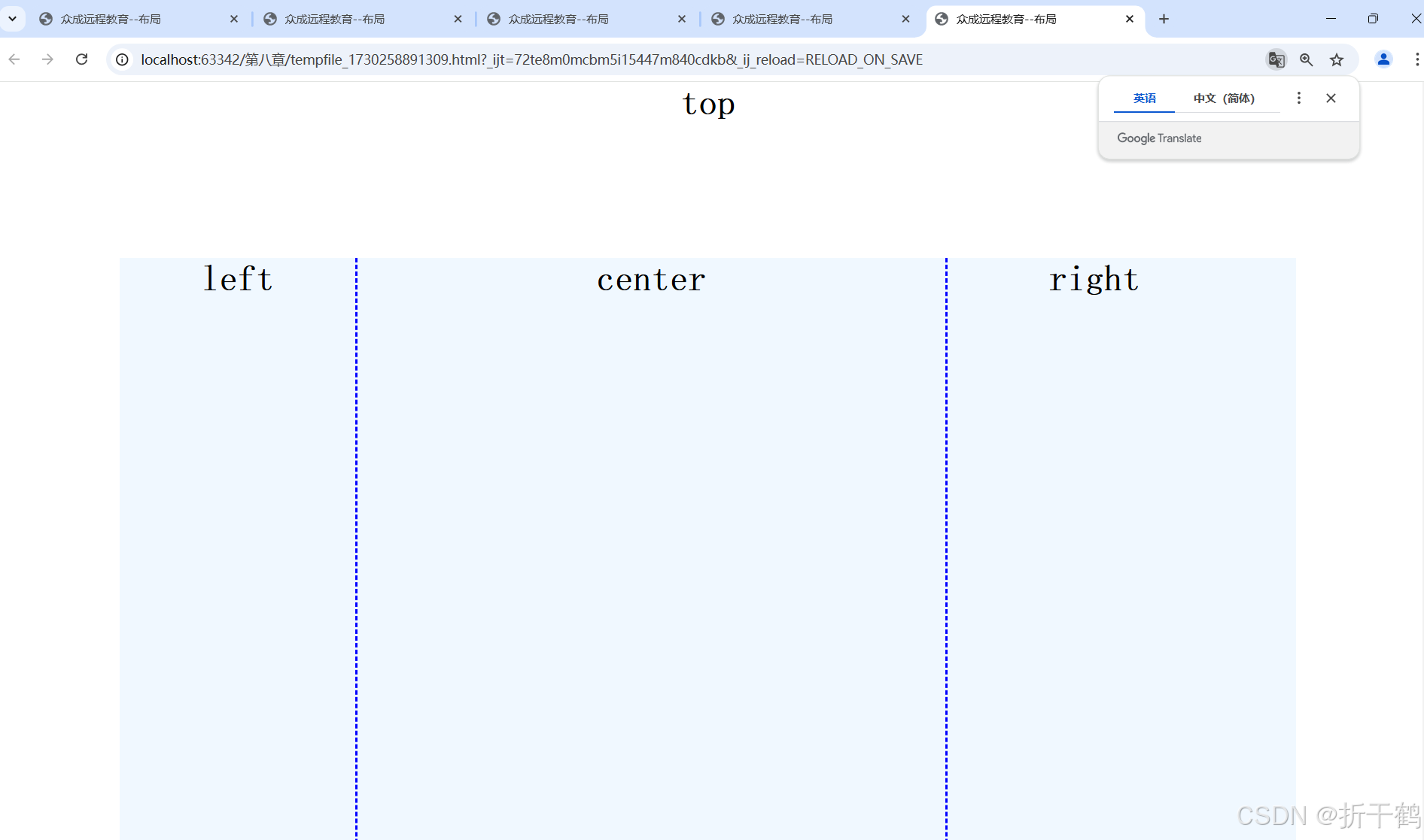
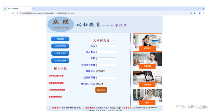
<!DOCTYPE html> <html> <head> <meta charset="utf-8" /> <title>众成远程教育</title> <style> *{ margin: 0 auto; } .all{ width: 1000px; height: 840px; background-image: url(img/9-bg.jpg); } .top{ width: 1000px; height: 150px; } .main{ background-color: aliceblue; width: 1000px; height: 630px; } .left{ padding-top: 30px; padding-left: 20px; width: 200px; height: 570px; float: left; line-height: 60px; } .center{ border-left: 2px dashed blue; border-right: 2px dashed blue; padding-top: 50px; width: 500px; height: 580px; float: left; } .right{ padding-left: 20px; width: 250px; height: 630px; float: left; } .footer{ width: 1000px; height: 60px; font-family: "楷体"; font-size: 18px; text-align: center; line-height: 30px; } a,span{ color: red; font-weight: 700; text-align: center; } p{ font-family: "黑体"; font-family: 700px; color: brown; font-size: 28px; text-align: center; } table{ font-family: "黑体"; font-weight: 700px; color: blue; font-size: 20px; line-height: 55px; } </style> </head> <body> <div class="all"> <div class="top"> <img src="img/9-logo.jpg" width="708px" height="150px"/> </div> <div class="main"> <div class="left"> <p><img src="img/but2.jpg"/></p> <p><img src="img/but3.jpg"/></p> <p><img src="img/but4.jpg"/></p> <p><img src="img/but5.jpg"/></p> <p>相关信息</p> <a href="#">4 大学历提升方案</a><br /> <a href="#">新报考政策解读击</a><br /> <a href="#">6 大类专业报考指南</a><br /> <a href="#">更多信息请点击</a><br /> </div> <div class="center"> <p>入学报名报</p> <form id="form2" name="form2" method="post" action=""> <table width="400" border="0" align="center" cellpadding="0" cellspacing="0"> <tr> <td width="158" align="right">姓名:<label for="textfield"></label></td> <td width="242"><input type="text" name="textfield" id="textfield"/></td> </tr> <tr> <td align="right">联系电话:</td> <td><input type="text" name="textfield2" id="textfield2"/></td> </tr> <tr> <td align="right">邮箱:</td> <td><input type="text" name="textfield3" id="textfield3"/></td> </tr> <tr> <td align="right">资料邮寄地址:</td> <td><input type="text" name="textfield4" id="textfield4"/></td> </tr> <tr> <td align="right">最高学历:</td> <td> <select name="select2" id="select2"> <option>大学本科</option> <option>专科</option> <option>高中</option> <option>初中</option> <option>小学</option> </select> </td> </tr> <tr> <td align="right">选择的课程:</td> <td><input type="text" name="textfield6" id="textfield6"/></td> </tr> <tr> <td align="right">意向学习方式: <label for="select2"></label> </td> <td> <select name="select" id="select"> <option>网络授课</option> <option>周末班</option> <option>全日制</option> </select> </td> </tr> <tr> <td colspan="2" align="center"> <input type="image" name="imageFied" id="imageFied" src="img/but1.jpg"/> </td> </tr> </table> </form> </div> <div class="right"> <img src="img/pho1.jpg"/> <img src="img/pho2.jpg"/> <img src="img/pho3.jpg"/> <img src="img/pho4.jpg"/> </div> </div> <div class="footer"> <span>免费电话:</span>400-XXX-XXX(18条线)|| <span>(北京校区)</span>北京路XX大厦一楼0000号;|| <span>(上海校区)</span>上海路XX科技园7栋9999号<br /> 此网站信息最终解释权©众诚远程教育 </div> </div> </body> </html>
浏览效果如图:


 扫一扫
扫一扫


 1009
1009

 被折叠的 条评论
为什么被折叠?
被折叠的 条评论
为什么被折叠?
 到【灌水乐园】发言


