


 本文深入浅出地介绍了Flex布局中的伸缩比属性,包括flex-grow、flex-shrink和flex-basis。详细讲解了它们的默认值、作用及应用场景,并通过实例演示了如何设置和调整弹性盒子的伸缩行为,帮助读者更好地掌握弹性布局。
之前在做移动端内容左右滑动时,被flex属性绕晕了。说实话,在网上看了很多讲述flex属性的相关博客,说的非常复杂,不如自己总结的香。今天用一篇博客带你玩转flex属性!
准备工作
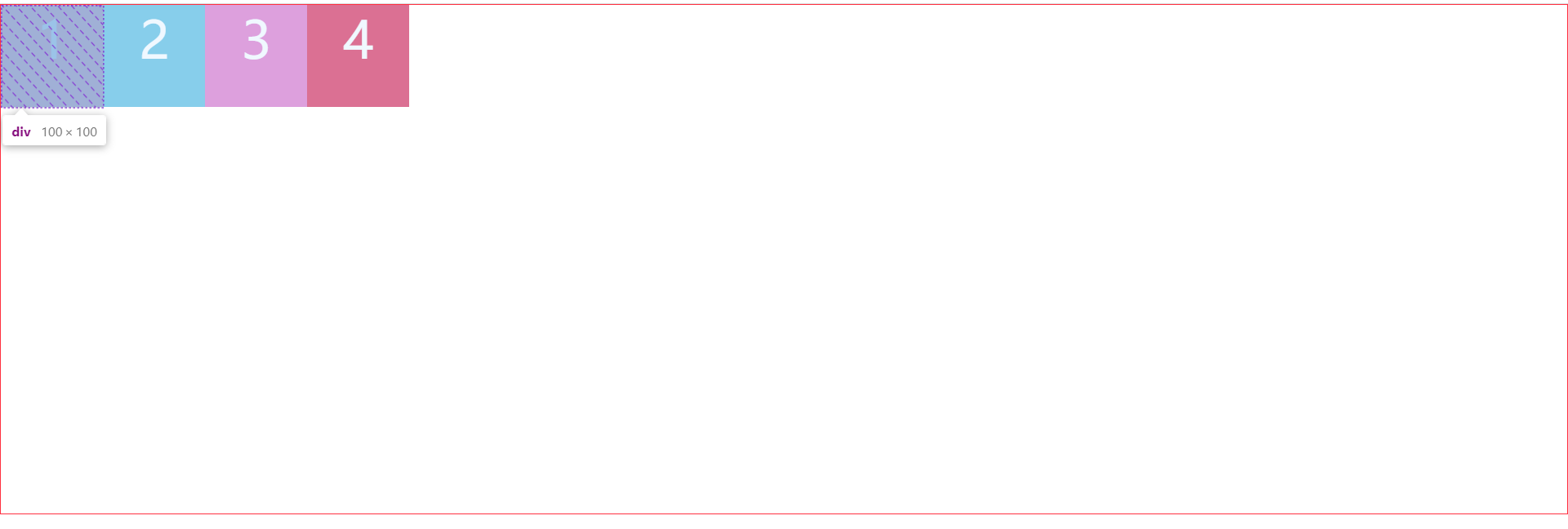
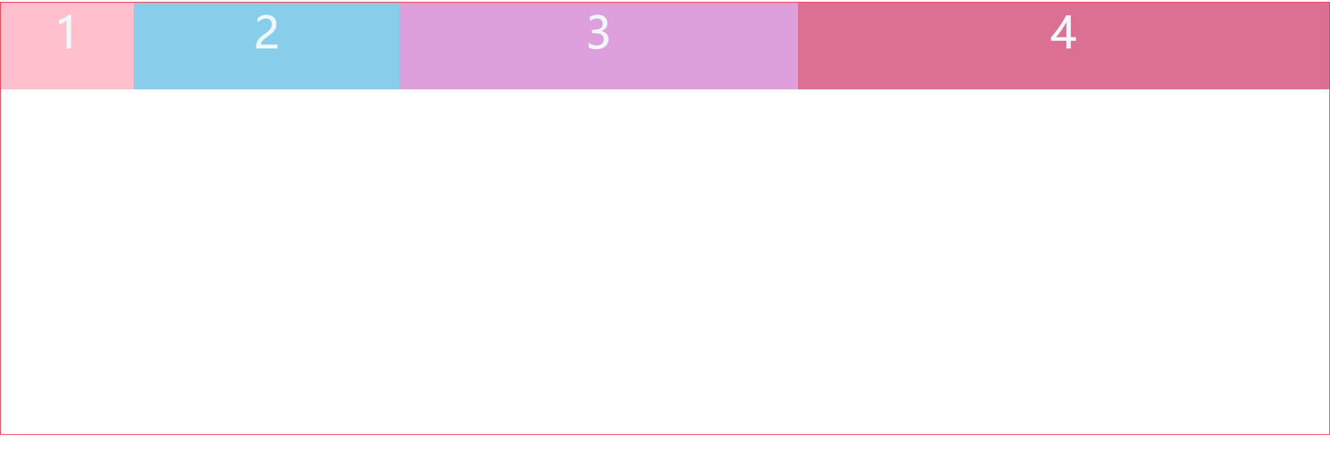
弹性容器开启弹性布局display:flex,弹性盒子默认从起点依次排列。

    <style>
        * {
            margin: 0;
            padding: 0;
            box-sizing: border-box;
        }
        .box {
            display: flex;
            height: 500px;
            border: 1px solid #ff3040;
        }
        .box div {
            width: 100px;
            height: 100px;
            color: aliceblue;
            font-size: 50px;
            text-align: center;
        }
        .box div:nth-child(1) {
            background-color: pink;
        }
        .box div:nth-child(2) {
            background-color: skyblue;
        }
        .box div:nth-child(3) {
            background-color: plum;
        }
        .box div:nth-child(4) {
            background-color: palevioletred;
        }
    </style>
<div class="box">
<div>1</div>
<div>2</div>
<div>3</div>
<div>4</div>
</div>flex属性详解
弹性容器开启弹性布局display:flex,弹性盒子才具有flex属性。flex属性包括三个部件:扩展比率(flex-grow)、收缩比率(flex-shrink)和伸缩基准线(flex-basis)。
扩展比率(flex-grow):弹性盒子如何分配剩余空间。若省略,则flex-grow为1。
收缩比率(flex-shrink):弹性容器宽度不够时压缩弹性盒子的宽度。若省略,则flex-shrink为1。
伸缩基准线(flex-basis):弹性盒子分配多余空间之前,弹性盒子占据弹性容器的空间。若省略,则flex-basis为0%,即宽度为0。
flex常见值
flex的默认值:由于 flex-grow、flex-shrink、flex-basis三个属性值在不设置的情况下默认值分别为 0、1、auto,所以flex的默认值为:flex:0 1 auto
flex: 0 auto:由于0默认为flex-grow的值,省略了flex-shrink的值,则该值指定为 1。所以flex:0 auto就相当于flex:0 1 auto(与flex取默认值一样)
flex: auto:相当于flex: 1 1 auto
flex: none:相当于flex: 0 0 auto
一、flex-basis
basis是基础、基准的意思,这个属性用来定义在分配多余空间之前,弹性盒子占据弹性容器的空间。若在flex缩写时省略了此值,则flex-basis的指定值是 0%。
flex-basis取值:固定的长度值、auto、百分比
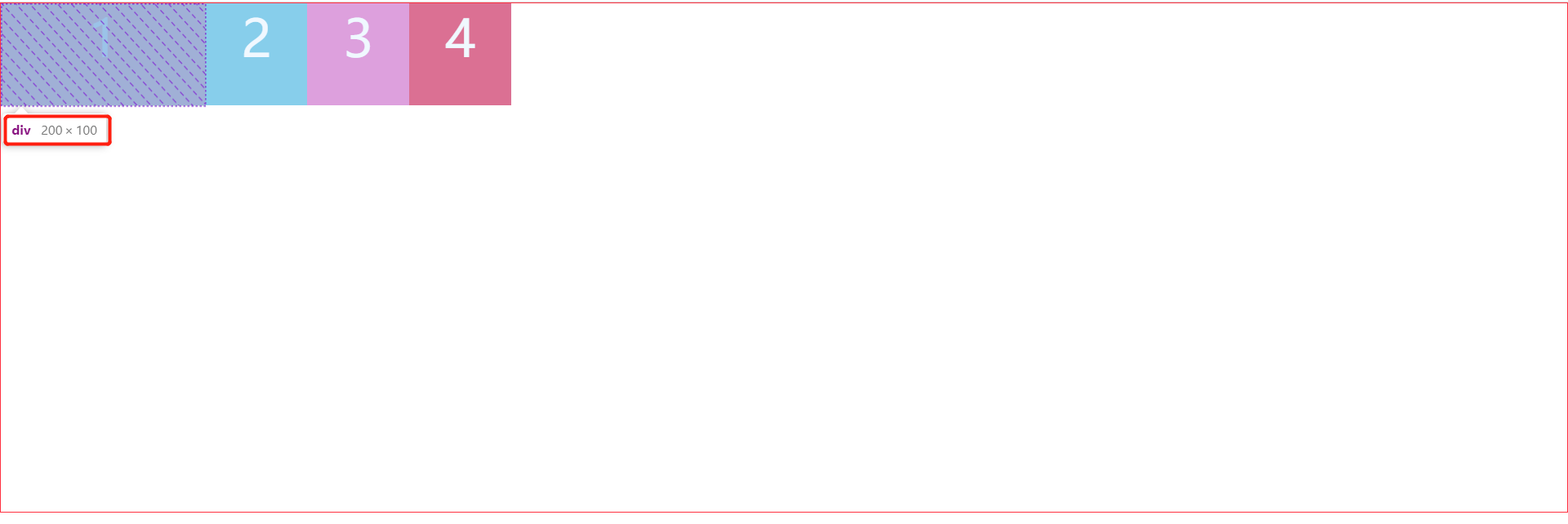
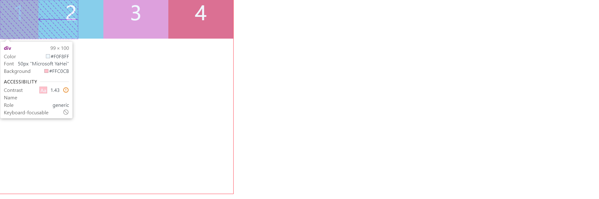
1.固定的长度值:该弹性盒子将占据固定长度空间。如下图所示,不论我们是否给弹性盒子设置宽度,200px都会覆盖我们先前设置的宽度。
        .box div:nth-child(1) {
            background-color: pink;
            width: 100px;
            flex: 0 0 200px;
        }
        .box div:nth-child(2) {
            background-color: skyblue;
            width: 100px;
        }
        .box div:nth-child(3) {
            background-color: plum;
            width: 100px;
        }
        .box div:nth-child(4) {
            background-color: palevioletred;
            width: 100px;
}2.auto:如果弹性盒子没有设置宽,弹性盒子内容的宽度就是宽高与其内容一致。
如果弹性盒子设置了宽度,auto自动变成我们设置的宽度值。
        .box div:nth-child(1) {
            background-color: pink;
        //没有设置宽时,默认为内容的宽度
            flex: 0 0 auto;
        }
        .box div:nth-child(2) {
            background-color: skyblue;
            width: 100px;
        }
        .box div:nth-child(3) {
            background-color: plum;
            width: 100px;
        }
        .box div:nth-child(4) {
            background-color: palevioletred;
            width: 100px;
        }
        .box div:nth-child(1) {
            background-color: pink;
        // auto为我们设置的宽度
            width: 100px;
            flex: 0 0 auto;
        }
        .box div:nth-child(2) {
            background-color: skyblue;
            width: 100px;
        }
        .box div:nth-child(3) {
            background-color: plum;
            width: 100px;
        }
        .box div:nth-child(4) {
            background-color: palevioletred;
            width: 100px;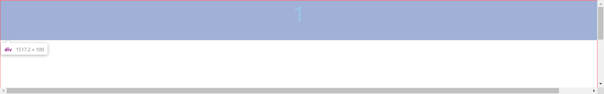
}3.百分比:根据弹性容器宽度进行计算。如下图所示,如果弹性容器没有宽度,默认弹性盒子沾满整个浏览器的可视区。其他盒子则被挤出可视区,需要拉动下方滚动条才可查看。
        .box {
            display: flex;
            height: 500px;
            border: 1px solid #ff3040;
        }
        .box div {
            height: 100px;
            color: aliceblue;
            font-size: 50px;
            text-align: center;
        }
        .box div:nth-child(1) {
            background-color: pink;
            flex: 0 0 100%;
        }
        .box div:nth-child(2) {
            background-color: skyblue;
            width: 100px;
        }
        .box div:nth-child(3) {
            background-color: plum;
            width: 100px;
        }
        .box div:nth-child(4) {
            background-color: palevioletred;
            width: 100px;
}二、flex-grow
对这四个弹性盒子设置flex属性,值分别为1、2、3、4。弹性盒子原本的宽度失效了,按照1:2:3:4比例均分弹性容器宽度。本质是将剩余空间按照比例分给每个弹性盒子。
    ·   .box div:nth-child(1) {
            background-color: pink;
            flex: 1;
        }
        .box div:nth-child(2) {
            background-color: skyblue;
            flex: 2;
        }
        .box div:nth-child(3) {
            background-color: plum;
            flex: 3;
        }
        .box div:nth-child(4) {
            background-color: palevioletred;
            flex: 4;
}三、flex-shrink
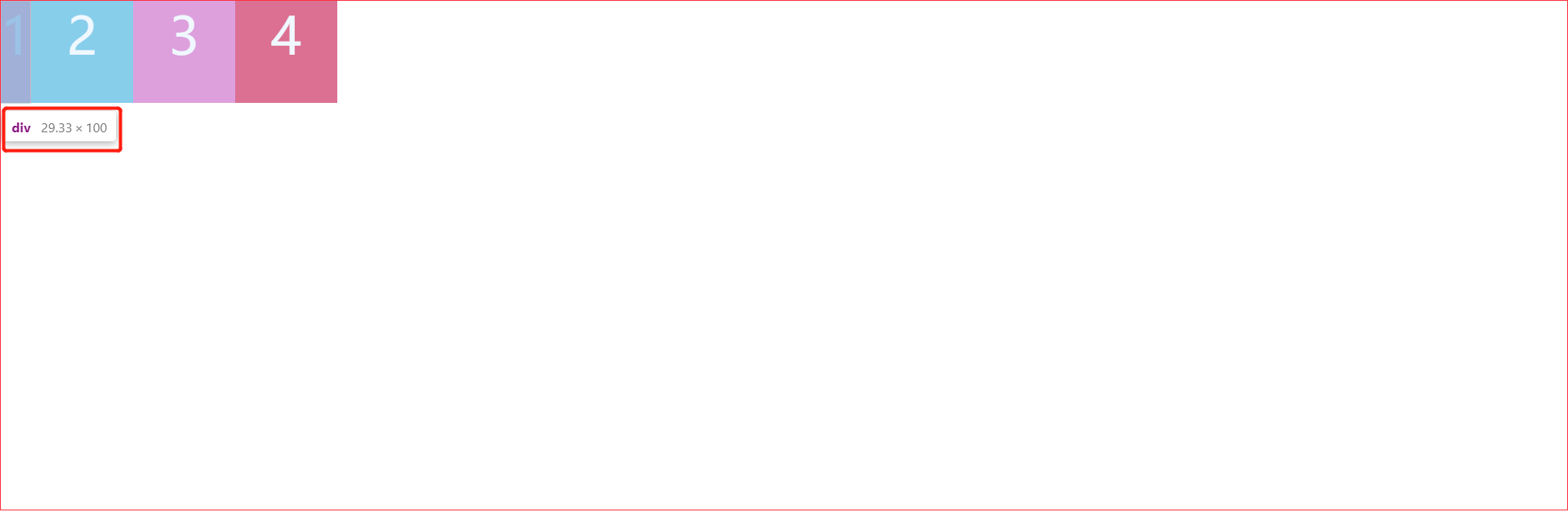
弹性容器宽度不够时就要压缩弹性盒子的宽度,通过 flex-shrink 配置,默认值为1。我们来看下面这个例子,给弹性容器设置宽度600px,给每个弹性盒子设置宽度200px,弹性盒子总宽度加起来本应该为200*4=800px,现在多出了200px。由于 flex-shrink没设置默认为1,所以看到弹性盒子宽度被均分了。

        .box {
            width: 600px;
            display: flex;
            //弹性容器宽度
            height: 500px;
            border: 1px solid #ff3040;
        }
        .box div {
            //弹性盒子宽度
            width: 200px;
            height: 100px;
            color: aliceblue;
            font-size: 50px;
            text-align: center;
        }
        .box div:nth-child(1) {
            background-color: pink;
        }
        .box div:nth-child(2) {
            background-color: skyblue;
        }
        .box div:nth-child(3) {
            background-color: plum;
        }
        .box div:nth-child(4) {
            background-color: palevioletred;
        }
接下来,我们给1号弹性盒子设置flex-shrink:3,加上2、3、4盒子flex-shrink总共为6。
1号盒子压缩:200(3/6)=100px
2号盒子压缩:200(1/6)=33.33px
3号盒子压缩:200(1/6)=33.33px
4号盒子压缩:200(1/6)=33.33px
如图所示,由于边框压缩了盒子宽度,因为一开始我们设置了box-sizing: border-box,CSS3边框盒子的边框、内边距不再影响盒子宽度,所以1号弹性盒子少了1px的边框距离,其他盒子同理。原先弹性盒子设置为200px的宽度,压缩了100px后,得到了如图的尺寸。
        .box {
            width: 600px;
            display: flex;
            height: 500px;
            border: 1px solid #ff3040;
        }
        .box div {
            width: 200px;
            height: 100px;
            color: aliceblue;
            font-size: 50px;
            text-align: center;
        }
        .box div:nth-child(1) {
            background-color: pink;
            flex-shrink: 3;
        }
        .box div:nth-child(2) {
            background-color: skyblue;
        }
        .box div:nth-child(3) {
            background-color: plum;
        }
        .box div:nth-child(4) {
            background-color: palevioletred;
        }
以上就是自己对flex布局中弹性盒子伸缩比属性的一些拙见,如有错误,欢迎各位大神指出!


 扫一扫
扫一扫


 465
465

 被折叠的 条评论
为什么被折叠?
被折叠的 条评论
为什么被折叠?
 到【灌水乐园】发言


