


 本文介绍了一个使用CSS实现的动画案例,通过设置关键帧动画使多个球体围绕中心点旋转。该示例详细展示了如何为不同数量的球体设置动画参数,包括动画的延时、方向及持续时间等。
绕某个中心点进行旋转:
提示:这个主要是是利用animation,animation中的多个keyframes是同时进行的。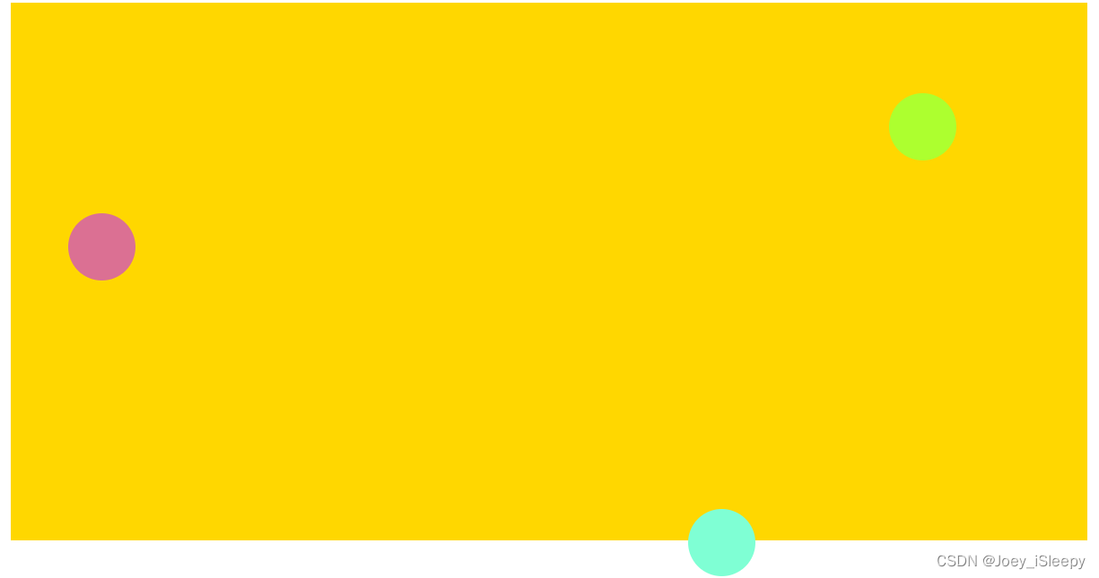
//球的个数
@ballNum: 3;
//动画完成一次的时长
@ballX: 5;
@ballY: 5;
//根据球的个数计算X延时秒数(负数)
@delayedX: (@ballX+ @ballY) / @ballNum;
//第二个球到最后一个球依次递减 (@delayedX-=@delayedX)
//Y延时秒数 ( @delayedX-=@delayedX 同理)
@dalayedY: @delayedX - (@ballX+ @ballY)/2;
//3个圆,x和y轴动画加起来是6s , 6s/3 等于 2s
每个球y轴动画延迟 从0递减2s,x轴与y相差动画时长的一半(3s/2)
<!DOCTYPE html>
<html lang="en">
  <head>
    <meta charset="UTF-8" />
    <meta http-equiv="X-UA-Compatible" content="IE=edge" />
    <meta name="viewport" content="width=device-width, initial-scale=1.0" />
    <title>Document</title>
    <style>
      .box {
        width: 800px;
        height: 400px;
        background: gold;
        position: relative;
      }
      .boxItem {
        width: 50px;
        height: 50px;
        border-radius: 50%;
        position: absolute;
      }


      .box1 {
        background-color: aquamarine;
        animation: animX 3s cubic-bezier(0.36, 0, 0.64, 1) -2s infinite alternate,
          animY 3s cubic-bezier(0.36, 0, 0.64, 1) -3.5s infinite alternate;
      }
      .box2 {
        background-color: greenyellow;
        animation: animX 3s cubic-bezier(0.36, 0, 0.64, 1) -4s infinite alternate,
          animY 3s cubic-bezier(0.36, 0, 0.64, 1) -5.5s infinite alternate;
      }
      .box3 {
        background-color: palevioletred;
        animation: animX 3s cubic-bezier(0.36, 0, 0.64, 1) -6s infinite alternate,
          animY 3s cubic-bezier(0.36, 0, 0.64, 1) -7.5s infinite alternate;
      }

      @keyframes animX {
        0% {
          left: 4%;
        }
        100% {
          left: 96%;
        }
      }
      @keyframes animY {
        0% {
          top: 4%;
        }
        100% {
          top: 96%;
        }
      }
    </style>
  </head>
  <body>
    <div class="box">
      <div class="boxItem box1"></div>
      <div class="boxItem box2"></div>
      <div class="boxItem box3"></div>
    </div>
  </body>
</html>


 扫一扫
扫一扫


 397
397

 被折叠的 条评论
为什么被折叠?
被折叠的 条评论
为什么被折叠?
 到【灌水乐园】发言


