


01 Android UI
1.1 UI
1.2 Android UI
02 布局
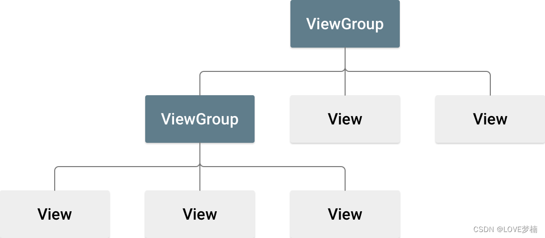
2.1 布局的结构
2.2 声明布局
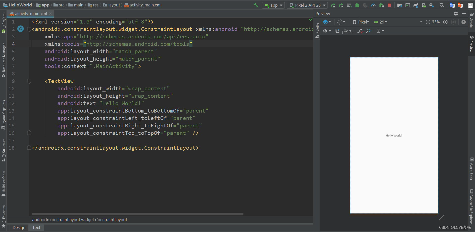
<?xml version="1.0" encoding="utf-8"?>
<androidx.constraintlayout.widget.ConstraintLayout
xmlns:android="http://schemas.android.com/apk/res/android"
xmlns:app="http://schemas.android.com/apk/res-auto"
xmlns:tools="http://schemas.android.com/tools"
android:layout_width="match_parent"
android:layout_height="match_parent"
tools:context=".MainActivity">
<TextView
android:layout_width="wrap_content"
android:layout_height="wrap_content"
android:text="Hello World!"
app:layout_constraintBottom_toBottomOf="parent"
app:layout_constraintLeft_toLeftOf="parent"
app:layout_constraintRight_toRightOf="parent"
app:layout_constraintTop_toTopOf="parent" />
</androidx.constraintlayout.widget.ConstraintLayout>
ConstraintLayout constraintLayout = new ConstraintLayout(this);
TextView view = new TextView(this);
view.setText("Hello World!");
constraintLayout.addView(view);
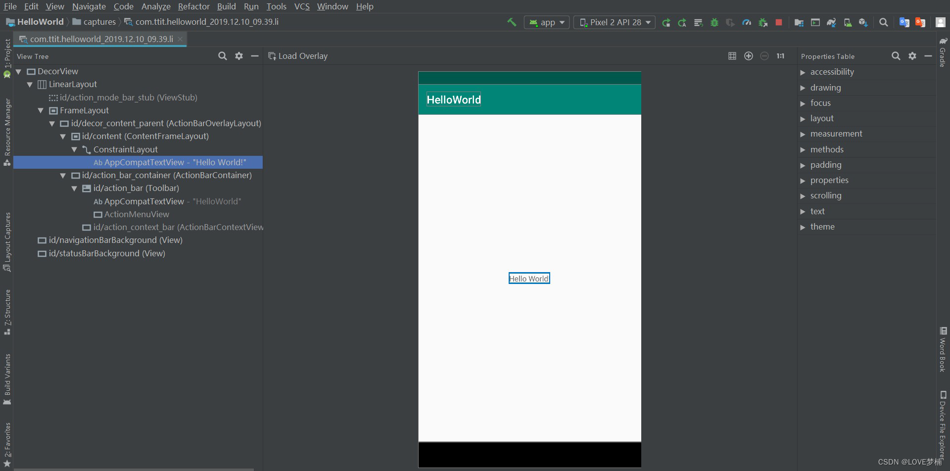
* 提示 : 使用 Layout Inspector 调试布局,可以查看通过代码创建的布局
1. 在连接的设备或模拟器上[运行您的应用]。
2. 依次点击 Tools > Layout Inspector。
2.3 编写XML
<?xml version="1.0" encoding="utf-8"?>
<LinearLayout
xmlns:android="http://schemas.android.com/apk/res/android"
android:layout_width="match_parent"
android:layout_height="match_parent"
android:orientation="vertical" >
<TextView android:id="@+id/text"
android:layout_width="wrap_content"
android:layout_height="wrap_content"
android:text="Hello, I am a TextView" />
<Button android:id="@+id/button"
android:layout_width="wrap_content"
android:layout_height="wrap_content"
android:text="Hello, I am a Button" />
</LinearLayout>
2.4 加载 XML 资源
@Override
protected void onCreate(Bundle savedInstanceState) {
super.onCreate(savedInstanceState);
setContentView(R.layout.activity_main);
}
2.5 属性
<TextView
android:id="@+id/tv"
android:layout_width="wrap_content"
android:layout_height="wrap_content"
android:text="Hello World!"
android:textSize="24sp"/>
<Button
android:id="@+id/btn"
android:layout_width="wrap_content"
android:layout_height="wrap_content"
android:text="按钮"/>
2.6 ID
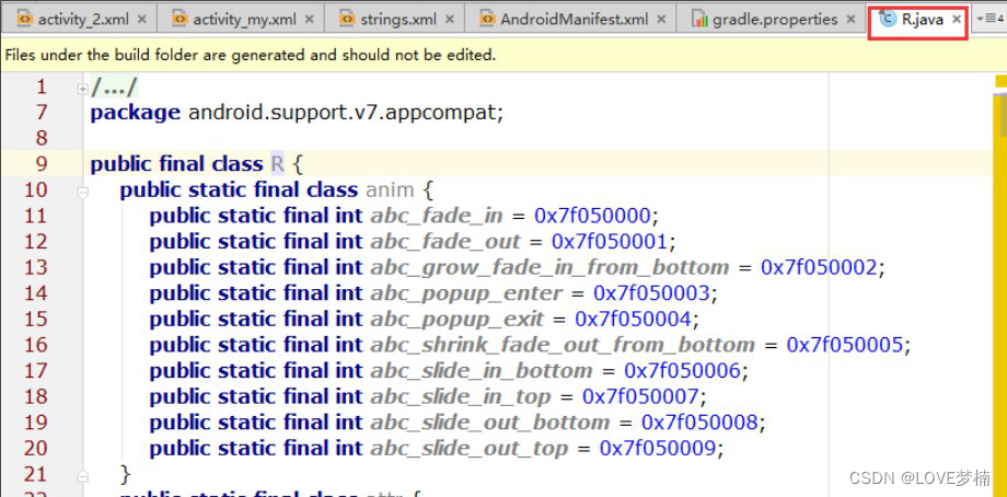
android:1 id="@+id/tv"
字符串开头处的 @ 符号指示 XML 解析器应解析并展开 ID 字符串的其余部分,并将其标识为 ID 资源。加号 (+) 表示这是一个新的资源名称,必须创建该名称并将其添加到我们的资源(在 R.java 文件中)内。Android 框架还提供许多其他 ID 资源。引用 Android 资源 ID 时,不需要加号,但 必须添加 android 软件包命名空间
android:id="@android:id/empty"
添加 android 软件包命名空间后,我们现在将从 android.R 资源类而非本地资源类引用 ID R.java 文件
tips: @+id 和 @id区别:
<TextView
android:id="@+id/tv"
android:layout_width="wrap_content"
android:layout_height="wrap_content"
android:text="Hello World!"
android:textSize="24sp"/>
TextView textView = (TextView) findViewById(R.id.tv);
2.7 布局参数 LayoutParams
<TextView
android:layout_width="100dp"
android:layout_height="200dp"
android:layout_marginLeft="10dp" //左边距
android:layout_marginTop="10dp" //上边距
android:text="Hello World!" />
布局参数作用是给我们的视图设定在布局中位置和大小
TextView tv = new TextView(this);
LinearLayout linearLayout = new LinearLayout(this);
LinearLayout.LayoutParams layoutParams =
(LinearLayout.LayoutParams)tv.getLayoutParams();
layoutParams.leftMargin = 30; //左边距
layoutParams.topMargin = 30;//上边距
layoutParams.width = 100;//宽
layoutParams.height = 200;//高
tv.setLayoutParams(layoutParams);
linearLayout.addView(tv);
一般而言,建议不要使用绝对单位(如像素)来指定布局宽度和高度。更好的方法是使用相对测量 单位(如与密度无关的像素单位 (dp) 、 wrap_content 或 match_parent ),因为其有助于确 保您的应用在各类尺寸的设备屏幕上正确显示。
wrap_content 指示您的视图将其大小调整为内容所需的尺寸。
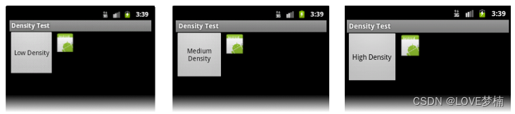
2.8 布局位置
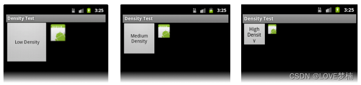
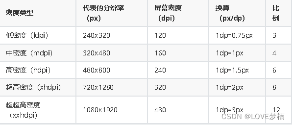
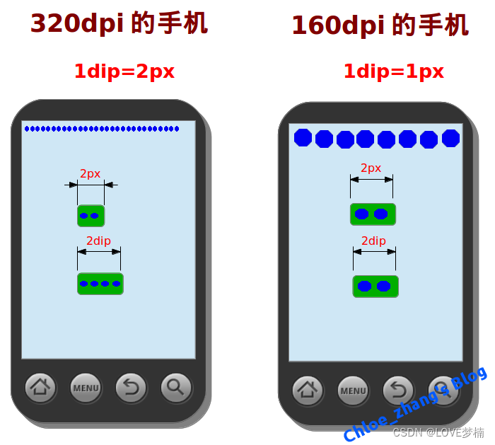
dp (dip) Density independent pixels ,设备无关像素。它与“像素密度”密切相关 ;
dpi像素密度: 每英寸包含的像素数
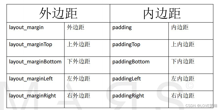
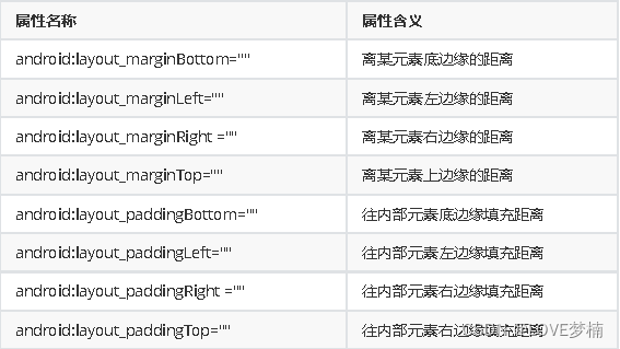
2.9 内边距和外边距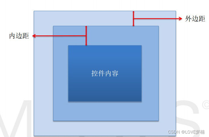
03 常用布局
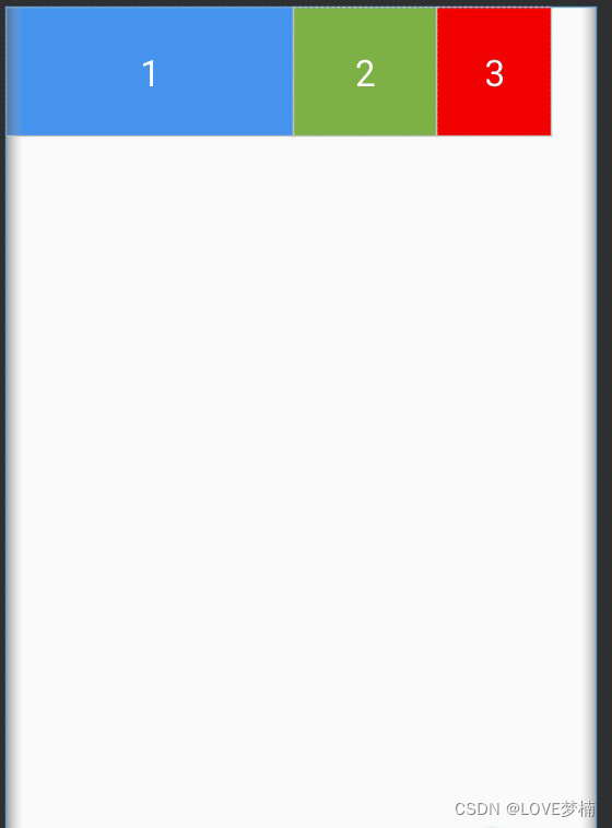
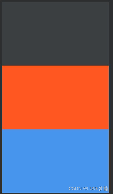
3.1 线性布局 - LinearLayout
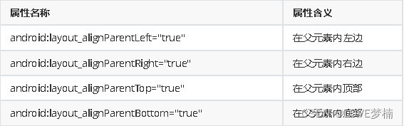
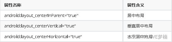
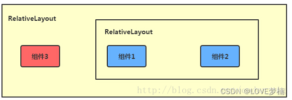
3.2 相对布局 - RelativeLayout
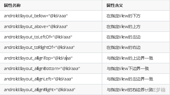
相对于父元素
对齐方式
间隔
父容器定位属性示意图
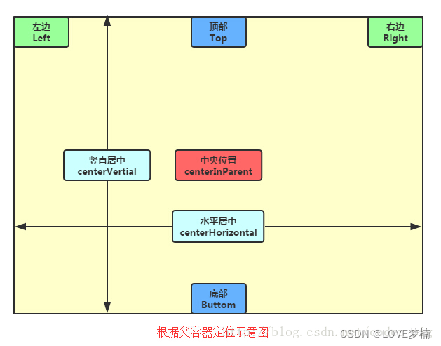
根据兄弟组件定位
3.3 帧布局 - FrameLayout
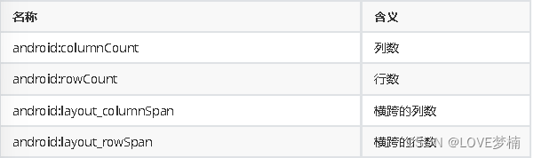
3.4 网格布局 GridLayout
04 常用组件
4.1 TextView
文本常用属性:
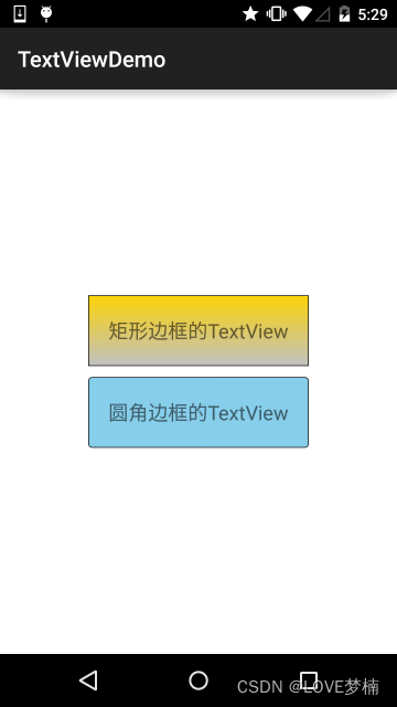
文本设置边框
<?xml version="1.0" encoding="utf-8"?>
<shape
xmlns:android="http://schemas.android.com/apk/res/android"
>
<!-- 设置一个黑色边框 -->
<stroke android:width="2px" android:color="#000000"/>
<!-- 渐变 -->
<gradient
android:angle="270"
android:endColor="#C0C0C0"
android:startColor="#FCD209" />
<!-- 设置一下边距,让空间大一点 -->
<padding
android:left="5dp"
android:top="5dp"
android:right="5dp"
android:bottom="5dp"/>
</shape>
<?xml version="1.0" encoding="utf-8"?>
<shape
xmlns:android="http://schemas.android.com/apk/res/android"
>
<!-- 设置透明背景色 -->
<solid android:color="#87CEEB" />
<!-- 设置一个黑色边框 -->
<stroke
android:width="2px"
android:color="#000000" />
<!-- 设置四个圆角的半径 -->
<corners
android:bottomLeftRadius="10px"
android:bottomRightRadius="10px"
android:topLeftRadius="10px"
android:topRightRadius="10px" />
<!-- 设置一下边距,让空间大一点 -->
<padding
android:bottom="5dp"
android:left="5dp"
android:right="5dp"
android:top="5dp" />
</shape>
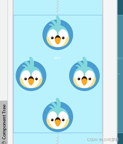
带图片(drawableXxx)的TextView
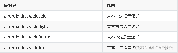
应用场景
属性使用:
<RelativeLayout xmlns:android="http://schemas.android.com/apk/res/android"
xmlns:tools="http://schemas.android.com/tools"
android:layout_width="match_parent"
android:layout_height="match_parent"
tools:context="com.jay.example.test.MainActivity" >
<TextView
android:layout_width="wrap_content"
android:layout_height="wrap_content"
android:layout_centerInParent="true"
android:drawableTop="@drawable/show1"
android:drawableLeft="@drawable/show1"
android:drawableRight="@drawable/show1"
android:drawableBottom="@drawable/show1"
android:drawablePadding="10dp"
android:text="嗯哼" />
</RelativeLayout>
4.2 EditText(输入框)
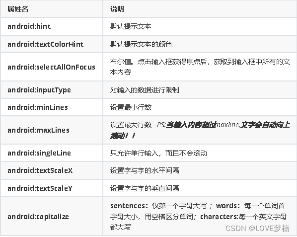
android:inputType="none"
android:inputType="text"
android:inputType="textCapCharacters"
android:inputType="textCapWords"
android:inputType="textCapSentences"
android:inputType="textAutoCorrect"
android:inputType="textAutoComplete"
android:inputType="textMultiLine"
android:inputType="textImeMultiLine"
android:inputType="textNoSuggestions"
android:inputType="textUri"
android:inputType="textEmailAddress"
android:inputType="textEmailSubject"
android:inputType="textShortMessage"
android:inputType="textLongMessage"
android:inputType="textPersonName"
android:inputType="textPostalAddress"
android:inputType="textPassword"
android:inputType="textVisiblePassword"
android:inputType="textWebEditText"
android:inputType="textFilter"
android:inputType="textPhonetic"
android:inputType="number"
android:inputType="numberSigned"
android:inputType="numberDecimal"
android:inputType="phone"//拨号键盘
android:inputType="datetime"
android:inputType="date"//日期键盘
android:inputType="time"//时间键盘
设置EditText获得焦点,同时弹出小键盘
edit.requestFocus(); //请求获取焦点
edit.clearFocus(); //清除焦点
低版本的系统直接requestFocus就会自动弹出小键盘了
InputMethodManager imm = (InputMethodManager)
getSystemService(Context.INPUT_METHOD_SERVICE);
imm.toggleSoftInput(0, InputMethodManager.HIDE_NOT_ALWAYS);
第二种 :
InputMethodManager imm = (InputMethodManager)
getSystemService(Context.INPUT_METHOD_SERVICE);
imm.showSoftInput(view,InputMethodManager.SHOW_FORCED);
imm.hideSoftInputFromWindow(view.getWindowToken(), 0); //强制隐藏键盘
EditText光标位置的控制
setSelection();//一个参数的是设置光标位置的,两个参数的是设置起始位置与结束位置的中
间括的部分,即部分选中
4.3 Button(按钮)
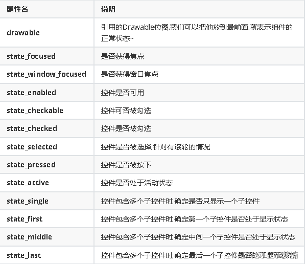
btn_bg1.xml
<?xml version="1.0" encoding="utf-8"?>
<selector xmlns:android="http://schemas.android.com/apk/res/android">
<item android:drawable="@color/color1" android:state_pressed="true"
/>
<item android:drawable="@color/color4" android:state_enabled="false"
/>
<item android:drawable="@color/color3" />
</selector>
<?xml version="1.0" encoding="utf-8"?>
<LinearLayout
xmlns:android="http://schemas.android.com/apk/res/android"
android:layout_width="match_parent"
android:layout_height="match_parent"
android:orientation="vertical"
android:paddingTop="50dp">
<Button
android:id="@+id/btnOne"
android:layout_width="match_parent"
android:layout_height="64dp"
android:background="@drawable/btn_bg1"
android:text="按钮"
android:textColor="#ffffff"
android:textSize="20sp"
android:textStyle="bold" />
<Button
android:id="@+id/btnTwo"
android:layout_width="match_parent"
android:layout_height="64dp"
android:text="按钮不可用"
android:textColor="#000000"
android:textSize="20sp"
android:textStyle="bold" />
</LinearLayout>
MainActivity.java
public class MainActivity extends Activity {
private Button btnOne,btnTwo;
@Override
protected void onCreate(Bundle savedInstanceState) {
super.onCreate(savedInstanceState);
setContentView(R.layout.activity_main);
btnOne = (Button) findViewById(R.id.btnOne);
btnTwo = (Button) findViewById(R.id.btnTwo);
btnTwo.setOnClickListener(new OnClickListener() { //按钮绑定点击
事件
@Override
public void onClick(View v) {
if(btnTwo.getText().toString().equals("按钮不可用")){
btnOne.setEnabled(false);
btnTwo.setText("按钮可用");
}else{
btnOne.setEnabled(true);
btnTwo.setText("按钮不可用");
}
}
});
}
}
4.4 ImageView(图像视图)
2.常识:
① background通常指的都是背景,而src指的是内容!!
② 当使用src填入图片时,是按照图片大小直接填充,并不会进行拉伸,而使用background填入图
片,则是会根据ImageView给定的宽度来进行拉伸
<LinearLayout
xmlns:android="http://schemas.android.com/apk/res/android"
xmlns:tools="http://schemas.android.com/tools"
android:id="@+id/LinearLayout1"
android:layout_width="match_parent"
android:layout_height="match_parent"
android:orientation="vertical"
tools:context="com.jay.example.imageviewdemo.MainActivity" >
<ImageView
android:layout_width="wrap_content"
android:layout_height="wrap_content"
android:background="@drawable/pen" />
<ImageView
android:layout_width="200dp"
android:layout_height="wrap_content"
android:background="@drawable/pen" />
<ImageView
android:layout_width="wrap_content"
android:layout_height="wrap_content"
android:src="@drawable/pen" />
<ImageView
android:layout_width="200dp"
android:layout_height="wrap_content"
android:src="@drawable/pen" />
</LinearLayout>
2.背景(对应background属性):setBackgroundDrawable();
<ImageView
android:layout_gravity="center"
android:padding="20dp"
android:layout_width="200dp"
android:layout_height="200dp"
android:background="@drawable/shape_bg"
android:src="@mipmap/pen" />
scaleType 属性 android:scaleType
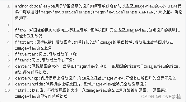
1. fitEnd , fitStart , fitCenter
<ImageView
android:background="#ffc"
android:layout_width="300dp"
android:layout_height="wrap_content"
android:layout_gravity="center"
android:scaleType="fitStart"
android:src="@mipmap/ic_launcher" />
2. centerCrop 与centerInside
1.centerCrop:按横纵比缩放,直接完全覆盖整个ImageView
2.centerInside:按横纵比缩放,使得ImageView能够完全显示这个图片
3. fitXY
不按比1例缩放图片,目标是把图片塞满整个View
4. matrix
1.从ImageView的左上角开始绘制原图,原图超过ImageView的部分作裁剪处理
5. center
保持原图的大小,显示在ImageView的中心。当原图的size大于ImageView的size,超过
部分裁剪处理。
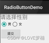
4.5 RadioButton(单选按钮)&Checkbox(复选框)
1. RadioButton (单选按钮) 基本用法与事件处理:
<LinearLayout xmlns:android="http://schemas.android.com/apk/res/android"
xmlns:tools="http://schemas.android.com/tools"
android:id="@+id/LinearLayout1"
android:layout_width="match_parent"
android:layout_height="match_parent"
android:orientation="vertical"
tools:context=".MainActivity" >
<TextView
android:layout_width="wrap_content"
android:layout_height="wrap_content"
android:text="请选择性别"
android:textSize="23dp"
/>
<RadioGroup
android:id="@+id/radioGroup"
android:layout_width="wrap_content"
android:layout_height="wrap_content"
android:orientation="horizontal">
<RadioButton
android:id="@+id/btnMan"
android:layout_width="wrap_content"
android:layout_height="wrap_content"
android:text="男"
android:checked="true"/>
<RadioButton
android:id="@+id/btnWoman"
android:layout_width="wrap_content"
android:layout_height="wrap_content"
android:text="女"/>
</RadioGroup>
<Button
android:id="@+id/btnpost"
android:layout_width="wrap_content"
android:layout_height="wrap_content"
android:text="提交"/>
</LinearLayout>
获得选中的值:这里有两种方法
第一种是为RadioButton 设置一个事件监听器setOnCheckChangeListener
RadioGroup radgroup = (RadioGroup) findViewById(R.id.radioGroup);
//第一种获得单选按钮值的方法
//为radioGroup设置一个监听器:setOnCheckedChanged()
radgroup.setOnCheckedChangeListener(new OnCheckedChangeListener() {
@Override
public void onCheckedChanged(RadioGroup group, int checkedId) {
RadioButton radbtn = (RadioButton) findViewById(checkedId);
Toast.makeText(getApplicationContext(), "按钮组值发生改变,你选
了" + radbtn.getText(), Toast.LENGTH_LONG).show();
}
});
PS:另外有一点要切记,要为每个RadioButton 添加一个id,不然单选功能不会生效!!!
第二种方法是通过单击其他按钮获取选中单选按钮的值,当然我们也可以直接获取,这个看需求~
Button btnchange = (Button) findViewById(R.id.btnpost);
RadioGroup radgroup = (RadioGroup) findViewById(R.id.radioGroup);
//为radioGroup设置一个监听器:setOnCheckedChanged()
btnchange.setOnClickListener(new OnClickListener() {
@Override
public void onClick(View v) {
for (int i = 0; i < radgroup.getChildCount(); i++) {
RadioButton rd = (RadioButton) radgroup.getChildAt(i);
if (rd.isChecked()) {
Toast.makeText(getApplicationContext(), "点击提交按
钮,获取你选择的是:" + rd.getText(), Toast.LENGTH_LONG).show();
break;
}
}
}
});
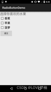
2. CheckBox (复选框)
public class MainActivity extends AppCompatActivity implements
View.OnClickListener,CompoundButton.OnCheckedChangeListener{
private CheckBox cb_one;
private CheckBox cb_two;
private CheckBox cb_three;
private Button btn_send;
@Override
protected void onCreate(Bundle savedInstanceState) {
super.onCreate(savedInstanceState);
setContentView(R.layout.activity_main);
cb_one = (CheckBox) findViewById(R.id.cb_one);
cb_two = (CheckBox) findViewById(R.id.cb_two);
cb_three = (CheckBox) findViewById(R.id.cb_three);
btn_send = (Button) findViewById(R.id.btn_send);
cb_one.setOnCheckedChangeListener(this);
cb_two.setOnCheckedChangeListener(this);
cb_three.setOnCheckedChangeListener(this);
btn_send.setOnClickListener(this);
}
@Override
public void onCheckedChanged(CompoundButton compoundButton, boolean b)
{
if(compoundButton.isChecked())
Toast.makeText(this,compoundButton.getText().toString(),Toast.LENGTH_SHORT)
.show();
}
@Override
public void onClick(View view) {
String choose = "";
if(cb_one.isChecked())choose += cb_one.getText().toString() + "";
if(cb_two.isChecked())choose += cb_two.getText().toString() + "";
if(cb_three.isChecked())choose += cb_three.getText().toString() +
"";
Toast.makeText(this,choose,Toast.LENGTH_SHORT).show();
}
}
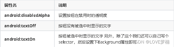
自定义点击效果
<?xml version="1.0" encoding="utf-8"?>
<selector xmlns:android="http://schemas.android.com/apk/res/android">
<item
android:state_enabled="true"
android:state_checked="true"
android:drawable="@mipmap/checked"/>
<item
android:state_enabled="true"
android:state_checked="false"
android:drawable="@mipmap/uncheck" />
</selector>
写好后,我们有两种方法设置,也可以说一种吧!你看看就知道了~
<style name="MyCheckBox"
parent="@android:style/Widget.CompoundButton.CheckBox">
<item name="android:button">@drawable/checkbox</item>
</style>
然后布局那里:
style="@style/MyCheckBox"
2 android:paddingLeft="20dp"
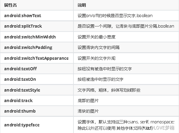
4.6 开关按钮ToggleButton和开关Switch
2. Switch
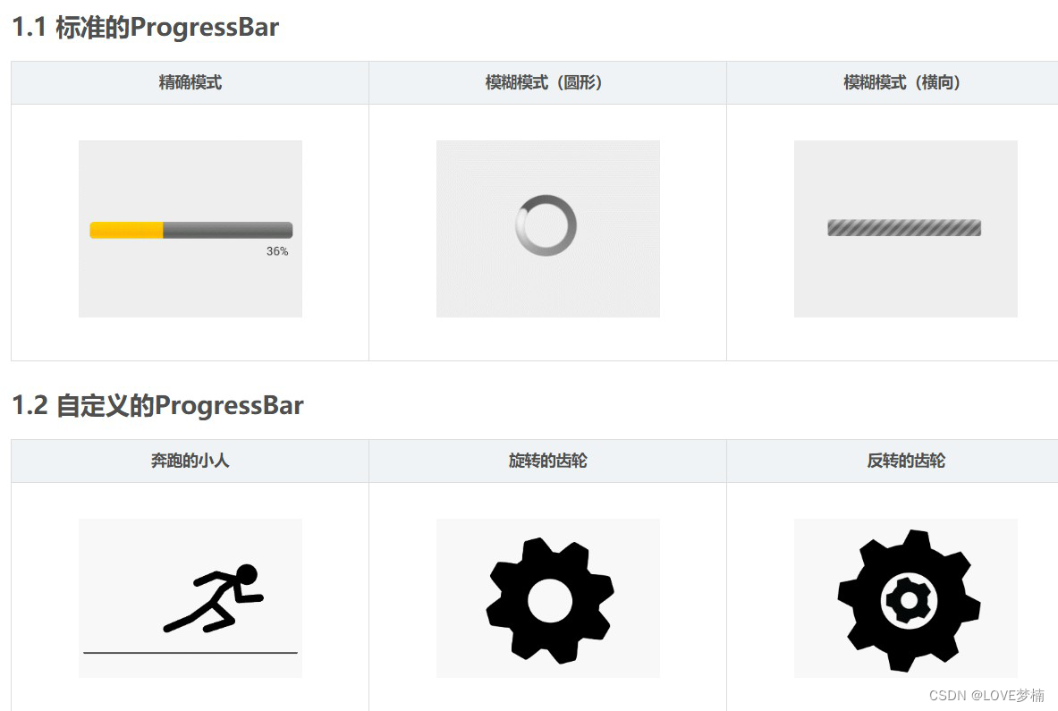
4.7 ProgressBar进度条
2.android:progress:进度条已完成进度值
3.android:progressDrawable:设置轨道对应的Drawable对象
4.android:indeterminate:如果设置成true,则进度条不精确显示进度
5.android:indeterminateDrawable:设置不显示进度的进度条的Drawable对象
6.android:indeterminateDuration:设置不精确显示进度的持续时间
7.android:secondaryProgress:二级进度条,类似于视频播放的一条是当前播放进度,一条是
缓冲进度,前者通过progress属性进行设置!
2.getProgress():返回进度
3.getSecondaryProgress():返回次要进度
4.incrementProgressBy(int diff):指定增加的进度
5.isIndeterminate():指示进度条是否在不确定模式下
6.setIndeterminate(boolean indeterminate):设置不确定模式下
横向进度条(精确模式或模糊模式,这取决于Android:indeterminate)。
Widget.ProgressBar
中号的圆形进度条(模糊模式)。
Widget.ProgressBar.Small
小号的圆形进度条(模糊模式)。
Widget.ProgressBar.Large
大号的圆形进度条(模糊模式)。
Widget.ProgressBar.Inverse
中号的圆形进度条(模糊模式),该样式适用于亮色背景(例如白色)。
Widget.ProgressBar.Small.Inverse
小号的圆形进度条(模糊模式),该样式适用于亮色背景(例如白色)。
Widget.ProgressBar.Large.Inverse
4.8 SeekBar拖动条
android:max="100" //滑动条的最大值
android:progress="60" //滑动条的当前值
android:secondaryProgress="70" //二级滑动条的进度
android:thumb = "@mipmap/sb_icon" //滑块的drawable
接着要说下SeekBar的事件了,SeekBar.OnSeekBarChangeListener 我们只需重写三个对应的方法:
2.onStartTrackingTouch:按住SeekBar时会触发
3.onStopTrackingTouch:放开SeekBar时触发
SeekBar定制
<?xml version="1.0" encoding="utf-8"?>
<selector xmlns:android="http://schemas.android.com/apk/res/android">
<item android:state_pressed="true"
android:drawable="@mipmap/seekbar_thumb_pressed"/>
<item android:state_pressed="false"
android:drawable="@mipmap/seekbar_thumb_normal"/>
</selector>
2.条形栏Bar的Drawable:sb_bar.xml
<?xml version="1.0" encoding="utf-8"?>
<layer-list
    xmlns:android="http://schemas.android.com/apk/res/android">
    <item android:id="@android:id/background">
        <shape>
            <solid android:color="#FFFFD042" />
        </shape>
    </item>
    <item android:id="@android:id/secondaryProgress">
        <clip>
          <shape>
    <solid android:color="#FFFFFFFF" />
          </shape>
        </clip>
    </item>
    <item android:id="@android:id/progress">
        <clip>
         <shape>
            <solid android:color="#FF96E85D" />
         </shape>
         </clip>
    </item>
</layer-list>
3.然后布局引入SeekBar后,设置下progressDrawable与thumb即可
<SeekBar
    android:id="@+id/sb_normal"
    android:layout_width="match_parent"
    android:layout_height="wrap_content"
    android:maxHeight="5.0dp"
    android:minHeight="5.0dp"
    android:progressDrawable="@drawable/sb_bar"
    android:thumb="@drawable/sb_thumb"/>
4.9 ScrollView(滚动条)
super.fling(velocityY / 2); //速度变为原来的一半
}
tips: ScrollView控件中只能包含一个View或一个ViewGroup
public class ScrollViewActivity extends AppCompatActivity implements
View.OnClickListener {
    private Button btn_down;
    private Button btn_up;
    private ScrollView scrollView;
    private TextView txt_show;

@Override
public void onCreate(Bundle savedInstanceState) {
    super.onCreate(savedInstanceState);
    setContentView(R.layout.scrollview_layout);
    bindViews();
}

private void bindViews() {
   btn_down = (Button) findViewById(R.id.btn_down);
   btn_up = (Button) findViewById(R.id.btn_up);
   scrollView = (ScrollView) findViewById(R.id.scrollView);
   txt_show = (TextView) findViewById(R.id.txt_show);
   btn_down.setOnClickListener(this);
   btn_up.setOnClickListener(this);
   StringBuilder sb = new StringBuilder();
   for (int i = 1; i <= 100; i++) {
   sb.append("我是一条文本内容 * " + i + "\n");
   }
   txt_show.setText(sb.toString());
}
@Override
public void onClick(View v) {
   switch (v.getId()) {
      case R.id.btn_down:
         scrollView.fullScroll(ScrollView.FOCUS_DOWN);
         break;
      case R.id.btn_up:
         scrollView.fullScroll(ScrollView.FOCUS_UP);
         break;
}
}
}
<?xml version="1.0" encoding="utf-8"?>
<LinearLayout xmlns:android="http://schemas.android.com/apk/res/android"
    android:layout_width="match_parent"
    android:layout_height="match_parent"
    android:orientation="vertical">

<Button
    android:id="@+id/btn_down"
    android:layout_width="match_parent"
    android:layout_height="wrap_content"
    android:text="滚动到底部" />

<Button
    android:id="@+id/btn_up"
    android:layout_width="match_parent"
    android:layout_height="wrap_content"
    android:text="滚动到顶部" />

<ScrollView
    android:id="@+id/scrollView"
    android:layout_width="match_parent"
    android:layout_height="wrap_content"
    android:layout_weight="1">

    <TextView
       android:id="@+id/txt_show"
       android:layout_width="wrap_content"
       android:layout_height="wrap_content"
       android:text="" />
    </ScrollView>
</LinearLayout>
4.10 Date & Time组件
1. TextClock(文本时钟)
TextClock可以以字符串格式显示当前的日期和时间,因此推荐在Android 4.2以后使用
TextClock。
这个控件推荐在24进制的android系统中使用,TextClock提供了两种不同的格式, 一种是在24进制中显示时间和日期,另一种是在12进制中显示时间和日期。大部分人喜欢默认的设置。
<TextClock
     android:layout_width="wrap_content"
     android:layout_height="wrap_content"
     android:format12Hour="MM/dd/yy h:mmaa"/>
   <TextClock
       android:layout_width="wrap_content"
       android:layout_height="wrap_content"
       android:format12Hour="MMM dd, yyyy h:mmaa"/>
<TextClock
       android:layout_width="wrap_content"
       android:layout_height="wrap_content"
       android:format12Hour="MMMM dd, yyyy h:mmaa"/>
<TextClock
       android:layout_width="wrap_content"
       android:layout_height="wrap_content"
       android:format12Hour="E, MMMM dd, yyyy h:mmaa"/>
<TextClock
       android:layout_width="wrap_content"
       android:layout_height="wrap_content"
       android:format12Hour="EEEE, MMMM dd, yyyy h:mmaa"/>
<TextClock
       android:layout_width="wrap_content"
       android:layout_height="wrap_content"
       android:format12Hour="Noteworthy day: 'M/d/yy"/>
2. AnalogClock(模拟时钟)
android:hand_hour //表时针图片
android:hand_minute //分时针图片
<AnalogClock
    android:layout_width="100dp"
    android:layout_height="100dp"
    android:dial="@mipmap/ic_c_bg"
    android:hand_hour="@mipmap/zhen_shi"
    android:hand_minute="@mipmap/zhen_fen" />
3. Chronometer(计时器)
<LinearLayout
xmlns:android="http://schemas.android.com/apk/res/android"
     xmlns:tools="http://schemas.android.com/tools"
     android:layout_width="match_parent"
     android:layout_height="match_parent"
     android:orientation="vertical"
     tools:context=".MainActivity">

     <Chronometer
        android:id="@+id/chronometer"
        android:layout_width="fill_parent"
        android:layout_height="wrap_content"
        android:gravity="center"
        android:textColor="#ff0000"
        android:textSize="60dip" />
<LinearLayout
    android:layout_width="fill_parent"
    android:layout_height="wrap_content"
    android:layout_margin="10dip"
    android:orientation="horizontal">
<Button
        android:id="@+id/btnStart"
        android:layout_width="fill_parent"
        android:layout_height="wrap_content"
        android:layout_weight="1"
        android:text="开始记时" />
<Button
        android:id="@+id/btnStop"
        android:layout_width="fill_parent"
        android:layout_height="wrap_content"
        android:layout_weight="1"
        android:text="停止记时" />
<Button
        android:id="@+id/btnReset"
        android:layout_width="fill_parent"
        android:layout_height="wrap_content"
        android:layout_weight="1"
        android:text="重置" />
<Button
        android:id="@+id/btn_format"
        android:layout_width="wrap_content"
        android:layout_height="wrap_content"
        android:text="格式化" />
    </LinearLayout>
</LinearLayout>
public class MainActivity extends AppCompatActivity implements
View.OnClickListener,Chronometer.OnChronometerTickListener{

   private Chronometer chronometer;
   private Button btn_start,btn_stop,btn_base,btn_format;

   @Override
   protected void onCreate(Bundle savedInstanceState) {
      super.onCreate(savedInstanceState);
      setContentView(R.layout.activity_main);
      initView();
}

private void initView() {
  chronometer = (Chronometer) findViewById(R.id.chronometer);
  btn_start = (Button) findViewById(R.id.btnStart);
  btn_stop = (Button) findViewById(R.id.btnStop);
  btn_base = (Button) findViewById(R.id.btnReset);
  btn_format = (Button) findViewById(R.id.btn_format);

  chronometer.setOnChronometerTickListener(this);
  btn_start.setOnClickListener(this);
  btn_stop.setOnClickListener(this);
  btn_base.setOnClickListener(this);
  btn_format.setOnClickListener(this);
}

@Override
public void onClick(View v) {
  switch (v.getId()){
    case R.id.btnStart:
         chronometer.start();// 开始计时
       break;
    case R.id.btnStop:
         chronometer.stop();// 停止计时
       break;
    case R.id.btnReset:
         chronometer.setBase(SystemClock.elapsedRealtime());//复位
       break;
    case R.id.btn_format:
         chronometer.setFormat("Time:%s");// 更改时间显示格式
       break;
  }
}

@Override
public void onChronometerTick(Chronometer chronometer) {
    String time = chronometer.getText().toString();
    if(time.equals("00:00")){
        Toast.makeText(MainActivity.this,"时间到了~",Toast.LENGTH_SHORT).show();
  }
 }
}
4. DatePicker(日期选择器)
2 android:calendarViewShown:是否显示日历视图
3 android:datePickerMode:组件外观,可选值:spinner,calendar 前者效果如下,默认
效果是后者
4 android:dayOfWeekBackground:顶部星期几的背景颜色
5 android:dayOfWeekTextAppearance:顶部星期几的文字颜色
6 android:endYear:去年(内容)比如2010
7 android:firstDayOfWeek:设置日历列表以星期几开头
8 android:headerBackground:整个头部的背景颜色
9 android:headerDayOfMonthTextAppearance:头部日期字体的颜色
10 android:headerMonthTextAppearance:头部月份的字体颜色
11 android:headerYearTextAppearance:头部年的字体颜色
12 android:maxDate:最大日期显示在这个日历视图mm / dd / yyyy格式
13 android:minDate:最小日期显示在这个日历视图mm / dd / yyyy格式
14 android:spinnersShown:是否显示spinner
15 android:startYear:设置第一年(内容),比如19940年
16 android:yearListItemTextAppearance:列表的文本出现在列表中。
17 android:yearListSelectorColor:年列表选择的颜色
public class MainActivity extends AppCompatActivity implements
DatePicker.OnDateChangedListener{

  @Override
  protected void onCreate(Bundle savedInstanceState) {
      super.onCreate(savedInstanceState);
      setContentView(R.layout.activity_main);
      DatePicker dp_test = (DatePicker) findViewById(R.id.dp_test);
      Calendar calendar = Calendar.getInstance();
      int year=calendar.get(Calendar.YEAR);
      int monthOfYear=calendar.get(Calendar.MONTH);
      int dayOfMonth=calendar.get(Calendar.DAY_OF_MONTH);
      dp_test.init(year,monthOfYear,dayOfMonth,this);
}

  @Override
  public void onDateChanged(DatePicker view, int year, int
monthOfYear, int dayOfMonth) {
      Toast.makeText(MainActivity.this,"您选择的日期是:"+year+"年"+
(monthOfYear+1)+"月"+dayOfMonth+"日!",Toast.LENGTH_SHORT).show();
  }
}
5. TimePicker(时间选择器)
public class MainActivity extends AppCompatActivity{

  @Override
  protected void onCreate(Bundle savedInstanceState) {
     super.onCreate(savedInstanceState);
     setContentView(R.layout.activity_main);
     TimePicker tp_test = (TimePicker) findViewById(R.id.tp_test);
     tp_test.setOnTimeChangedListener(new
TimePicker.OnTimeChangedListener() {
        @Override
        public void onTimeChanged(TimePicker view, int hourOfDay,
int minute) {
           Toast.makeText(MainActivity.this,"您选择的时间
是:"+hourOfDay+"时"+minute+"分!",Toast.LENGTH_SHORT).show();
}
});
}
}
6. CalendarView(日历视图)
android:maxDate :最大的日期显示在这个日历视图mm / dd / yyyy格式
android:minDate:最小的日期显示在这个日历视图mm / dd / yyyy格式
android:weekDayTextAppearance:工作日的文本出现在日历标题缩写
public class MainActivity extends AppCompatActivity{
   @Override
   protected void onCreate(Bundle savedInstanceState) {
     super.onCreate(savedInstanceState);
     setContentView(R.layout.activity_main);
     CalendarView cv_test = (CalendarView)
findViewById(R.id.cv_test);
     cv_test.setOnDateChangeListener(new
CalendarView.OnDateChangeListener() {
     @Override
     public void onSelectedDayChange(CalendarView view, int
year, int month, int dayOfMonth) {
     Toast.makeText(MainActivity.this,"您选择的时间是:"+ year
+ "年" + month + "月" + dayOfMonth + "日",Toast.LENGTH_SHORT).show();
}
});
}
}
4.11 ListView
1. getCount 填充的数据集数
2. getItem 数据集中指定索引对应的数据项
3. getItemId 指定行所对应的ID
4. getView 每个Item所显示的类容
public class News {
  private String title;
  private String content;
  private int aIcon;

  public News() {
}

public News(String title, String content, int aIcon) {
  this.title = title;
  this.content = content;
  this.aIcon = aIcon;
}

public String getTitle() {
  return title;
}

public void setTitle(String title) {
  this.title = title;
}

public String getContent() {
  return content;
}

public void setContent(String content) {
  this.content = content;
}

public int getaIcon() {
  return aIcon;
}

public void setaIcon(int aIcon) {
  this.aIcon = aIcon;
}
}
public class NewsAdapter extends BaseAdapter {

  private List<News> mData;
  private Context mContext;

  public NewsAdapter(List<News> mData, Context mContext) {
     this.mData = mData;
     this.mContext = mContext;
}

@Override
public int getCount() {
     return mData.size();
}

@Override
public Object getItem(int position) {
     return mData.get(position);
}

@Override
public long getItemId(int position) {
     return position;
}

@Override
public View getView(int position, View convertView, ViewGroup parent) {
     convertView =
LayoutInflater.from(mContext).inflate(R.layout.listview_item_layout,
parent, false);
     ImageView img_icon = (ImageView)
convertView.findViewById(R.id.img_icon);
     TextView title = (TextView)
convertView.findViewById(R.id.tv_title);
     TextView content = (TextView)
convertView.findViewById(R.id.tv_content);
     img_icon.setBackgroundResource(mData.get(position).getaIcon());
     title.setText(mData.get(position).getTitle());
     content.setText(mData.get(position).getContent());
     return convertView;
}
}
public class ListViewActivity extends AppCompatActivity {
   private List<News> mData = null;
   private Context mContext;
   private NewsAdapter mAdapter = null;
   private ListView listView;

   @Override
   protected void onCreate(Bundle savedInstanceState) {
     super.onCreate(savedInstanceState);
     setContentView(R.layout.listview_layout);
     mContext = this;
     listView = (ListView) findViewById(R.id.listview);
     mData = new LinkedList<News>();
     for (int i = 0; i < 10; i++) {
        mData.add(new News("我是一个新闻标题---- " + i, "我是一个新闻内容----
" + i, R.mipmap.news));
     }
     mAdapter = new NewsAdapter(mData, mContext);
     listView.setAdapter(mAdapter);
     listView.setOnItemClickListener(new
AdapterView.OnItemClickListener() {
     @Override
     public void onItemClick(AdapterView<?> parent, View view, int
position, long id) {
     Toast.makeText(mContext, "点击了第" + position + "条数据",
Toast.LENGTH_SHORT).show();
}
});
}
}
<?xml version="1.0" encoding="utf-8"?>
<LinearLayout xmlns:android="http://schemas.android.com/apk/res/android"
  android:layout_width="match_parent"
  android:layout_height="100dp"
  android:gravity="center_vertical"
  android:orientation="horizontal"
  android:padding="15dp">

<ImageView
  android:id="@+id/img_icon"
  android:layout_width="130dp"
  android:layout_height="80dp"
  android:src="@mipmap/news"/>

<RelativeLayout
  android:layout_width="0dp"
  android:layout_height="wrap_content"
  android:layout_marginLeft="20dp"
  android:layout_weight="1">

  <TextView
     android:id="@+id/tv_title"
     android:layout_width="wrap_content"
     android:layout_height="wrap_content"
     android:layout_alignParentTop="true"
     android:text="我是一个新闻标题---- 1"
     android:textColor="#000000"
     android:textSize="18dp" />

  <TextView
     android:id="@+id/tv_content"
     android:layout_width="wrap_content"
     android:layout_height="wrap_content"
     android:layout_alignParentBottom="true"
     android:text="我是新闻内容---- 1"
     android:textColor="#000000"
     android:textSize="14dp" />
   </RelativeLayout>
</LinearLayout>
BaseAdapter 优化
inflate()每次都要加载一次xml,其实这个convertView是系统提供给我们的可供复用的View
的缓存对象
if(convertView == null){
convertView =
LayoutInflater.from(mContext).inflate(R.layout.item_list_animal,parent,false);
}
二.ViewHolder重用组件
static class ViewHolder{
ImageView img_icon;
TextView txt_aName;
TextView txt_aSpeak;
}

@Override
public View getView(int position, View convertView, ViewGroup parent) {
   ViewHolder holder = null;
   if (convertView == null) {
      convertView =
LayoutInflater.from(mContext).inflate(R.layout.listview_item_layout, parent, false);
      holder.img_icon = (ImageView)convertView.findViewById(R.id.img_icon);
   holder.title = (TextView)convertView.findViewById(R.id.tv_title);
   holder.content = (TextView)convertView.findViewById(R.id.tv_content);
   convertView.setTag(holder);
} else {
   holder = (ViewHolder) convertView.getTag();
}

holder.img_icon.setBackgroundResource(mData.get(position).getaIcon());
   holder.title.setText(mData.get(position).getTitle());
   holder.content.setText(mData.get(position).getContent());
   return convertView;
}
ListView item多布局实现
package com.ttit.helloworld.adapter;

import android.content.Context;
import android.view.LayoutInflater;
import android.view.View;
import android.view.ViewGroup;
import android.widget.BaseAdapter;
import android.widget.ImageView;
import android.widget.TextView;
import com.ttit.helloworld.R;
import com.ttit.helloworld.entity.News;
import java.util.List;

public class NewsAdapter2 extends BaseAdapter {

   private List<News> mData;
   private Context mContext;
   //定义两个类别标志
   private static final int TYPE_NEWS_1 = 0;
   private static final int TYPE_NEWS_2 = 1;
   public NewsAdapter2(List<News> mData, Context mContext) {
      this.mData = mData;
      this.mContext = mContext;
}

@Override
public int getCount() {
     return mData.size();
}

@Override
public Object getItem(int position) {
     return mData.get(position);
}

@Override
public long getItemId(int position) {
     return position;
}

//返回对应item布局类型
@Override
public int getItemViewType(int position) {
     if (position % 2 == 0) {
         return TYPE_NEWS_1;
} else {
         return TYPE_NEWS_2;
}
}
//总共多少item布局类型
@Override
public int getViewTypeCount() {
     return 2;
}

  @Override
  public View getView(int position, View convertView, ViewGroup parent)
{
    int type = getItemViewType(position); //获取布局类型
    ViewHolder holder1 = null;
    ViewHolder2 holder2 = null;
    if (convertView == null) {
      switch (type) {
         case TYPE_NEWS_1:
           holder1 = new ViewHolder();
           convertView =
LayoutInflater.from(mContext).inflate(R.layout.listview_item_layout, parent, false);
holder1.img_icon = (ImageView)convertView.findViewById(R.id.img_icon);
holder1.title = (TextView)convertView.findViewById(R.id.tv_title);
holder1.content = (TextView)convertView.findViewById(R.id.tv_content);
convertView.setTag(holder1);
      break;
case TYPE_NEWS_2:holder2 = new ViewHolder2();
convertView =LayoutInflater.from(mContext).inflate(R.layout.listview_item_layout2, parent, false);
holder2.img_icon = (ImageView)convertView.findViewById(R.id.img_icon);
holder2.title = (TextView)convertView.findViewById(R.id.tv_title);
holder2.content = (TextView)convertView.findViewById(R.id.tv_content);
convertView.setTag(holder2);
     break;
}
} else {
     switch (type) {
         case TYPE_NEWS_1:
            holder1 = (ViewHolder) convertView.getTag();
            break;
         case TYPE_NEWS_2:
            holder2 = (ViewHolder2) convertView.getTag();
            break;
}
}
     switch (type) {
         case TYPE_NEWS_1:
holder1.img_icon.setBackgroundResource(mData.get(position).getaIcon());
holder1.title.setText(mData.get(position).getTitle());
holder1.content.setText(mData.get(position).getContent());
            break;
         case TYPE_NEWS_2:
holder2.img_icon.setBackgroundResource(mData.get(position).getaIcon());
holder2.title.setText(mData.get(position).getTitle());
holder2.content.setText(mData.get(position).getContent());
            break;
}
        return convertView;
}
static class ViewHolder {
    ImageView img_icon;
    TextView title;
    TextView content;
}

static class ViewHolder2 {
    ImageView img_icon;
    TextView title;
    TextView content;
}
}
4.12 GridView网格视图
GridViewActivity.java
package com.ttit.helloworld;
import android.content.Context;
import android.os.Bundle;
import android.view.View;
import android.widget.AdapterView;
import android.widget.GridView;
import android.widget.Toast;
import androidx.annotation.Nullable;
import androidx.appcompat.app.AppCompatActivity;
import com.ttit.helloworld.adapter.GridViewAdpater;
import com.ttit.helloworld.entity.Icon;
import java.util.ArrayList;
import java.util.List;
public class GridViewActivity extends AppCompatActivity {
   private Context mContext;
   private GridView grid_photo;
   private GridViewAdpater mAdapter = null;
   private List<Icon> mData = null;

@Override
protected void onCreate(@Nullable Bundle savedInstanceState) {
   super.onCreate(savedInstanceState);
   setContentView(R.layout.gridview_layout);
   mContext = this;//视图层V
   grid_photo = (GridView) findViewById(R.id.gridView);//数据源M
   mData = new ArrayList();
   mData.add(new Icon(R.mipmap.iv_icon_1, "图标1"));
   mData.add(new Icon(R.mipmap.iv_icon_2, "图标2"));
   mData.add(new Icon(R.mipmap.iv_icon_3, "图标3"));
   mData.add(new Icon(R.mipmap.iv_icon_4, "图标4"));
   mData.add(new Icon(R.mipmap.iv_icon_5, "图标5"));
   mData.add(new Icon(R.mipmap.iv_icon_6, "图标6"));
   mData.add(new Icon(R.mipmap.iv_icon_7, "图标7"));
   //控制层C
   mAdapter = new GridViewAdpater(mData, mContext);

   grid_photo.setAdapter(mAdapter);
   //点击事件
   grid_photo.setOnItemClickListener(new
AdapterView.OnItemClickListener() {
   @Override
   public void onItemClick(AdapterView<?> parent, View view, intposition, long id) {
   Toast.makeText(mContext, "你点击了~" + position + "~项",Toast.LENGTH_SHORT).show();
}
});
}
}
4.13 Spinner列表选项框
android:dropDownVerticalOffset:设置列表框的水平竖直距离
android:dropDownSelector:列表框被选中时的背景
android:dropDownWidth:设置下拉列表框的宽度
android:gravity:设置里面组件的对其方式
android:popupBackground:设置列表框的背景
android:prompt:设置对话框模式的列表框的提示信息(标题),只能够引用string.xml 中的资源
id,而不能直接写字符串
android:spinnerMode:列表框的模式,有两个可选值: dialog:对话框风格的窗口 dropdown:
下拉菜单风格的窗口(默认)
可选属性:android:entries:使用数组资源设置下拉列表框的列表项目
4.14 ExpandableListView可折叠列表
1. 扩展BaseExpandableListAdpter实现ExpandableAdapter。
2. 使用SimpleExpandableListAdpater将两个List集合包装成ExpandableAdapter
3. 使用simpleCursorTreeAdapter将Cursor中的数据包装成SimpleCuroTreeAdapter 本节示
例使用的是第一个,扩展BaseExpandableListAdpter,我们需要重写该类中的相关方法。
4.15 Toast 吐司
4.16 AlertDialog对话框
Step 1:创建AlertDialog.Builder对象;
Step 2:调用setIcon()设置图标,setTitle()或setCustomTitle()设置标题;
Step 3:设置对话框的内容:setMessage()还有其他方法来指定显示的内容;
Step 4:调用setPositive/Negative/NeutralButton()设置:确定,取消,中立按钮;
Step 5:调用create()方法创建这个对象,再调用show()方法将对话框显示出来;
java设计模式:建造者模式-Builder模式
4.17 PopupWindow 悬浮框
与AlertDialog区别:
本质区别为:AlertDialog是非阻塞式对话框:AlertDialog弹出时,后台还可以做事情;而
PopupWindow是阻塞式对话框:PopupWindow弹出时,程序会等待,在PopupWindow退出前,程序一直等待,只有当我们调用了dismiss方法的后,PopupWindow退出,程序才会向下执行。这两种区别的
表现是:AlertDialog弹出时,背景是黑色的,但是当我们点击背景,AlertDialog会消失,证明程序
不仅响应AlertDialog的操作,还响应其他操作,其他程序没有被阻塞,这说明了AlertDialog是非阻
塞式对话框;PopupWindow弹出时,背景没有什么变化,但是当我们点击背景的时候,程序没有响应,只允许我们操作PopupWindow,其他操作被阻塞。
1 setContentView(View contentView):设置PopupWindow显示的View
2 getContentView():获得PopupWindow显示的View
3 showAsDropDown(View anchor):相对某个控件的位置(正左下方),无偏移
4 showAsDropDown(View anchor, int xoff, int yoff):相对某个控件的位置,有偏移
5 showAtLocation(View parent, int gravity, int x, int y): 相对于父控件的位置(例如正中央Gravity.CENTER,下方Gravity.BOTTOM等),可以设置偏移或无偏移 PS:parent这个参数
只要是activity中的view就可以了!
6 setWidth/setHeight:设置宽高,也可以在构造方法那里指定好宽高, 除了可以写具体的值,还可以用WRAP_CONTENT或MATCH_PARENT, popupWindow的width和height属性直接和第一层View相对应。
7 setFocusable(true):设置焦点,PopupWindow弹出后,所有的触屏和物理按键都由PopupWindows 处理。其他任何事件的响应都必须发生在PopupWindow消失之后,(home 等系统层面的事件除外)。 比如这样一个PopupWindow出现的时候,按back键首先是让PopupWindow消失,第二次按才是退出 activity,准确的说是想退出activity你得首先让PopupWindow消失,因为不并是任何情况下按back PopupWindow都会消失,必须在PopupWindow设置了背景的情况下 。
8 setAnimationStyle(int):设置动画效果


 扫一扫
扫一扫


 1529
1529


 被折叠的 条评论
为什么被折叠?
被折叠的 条评论
为什么被折叠?
 到【灌水乐园】发言


