


 该文章介绍了多种在前端实现页面元素居中布局的方法,包括使用定位(position)结合margin,利用absolute定位和translate(),以及应用flex布局。对于已知和未知宽高的情况,提供了不同的解决方案。
前端页面布局 居中
居中
已知容器宽高
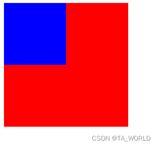
<!DOCTYPE html>
<html lang="en">
<head>
    <meta charset="UTF-8">
    <meta http-equiv="X-UA-Compatible" content="IE=edge">
    <meta name="viewport" content="width=device-width, initial-scale=1.0">
    <title>居中</title>
    <style>
        .container {
            width: 200px;
            height: 200px;
            background-color: red;
        }

        .content {
            width: 100px;
            height: 100px;
            background-color: blue;
        }
    </style>
</head>
<body>
    <div class="container">
        <div class="content"></div>
    </div>
</body>
</html>
一、定位与margin值为自身的一半
.content {
	position:relative;
}

.content {
	position: absolute;
    top: 100px;
    left: 100px;
    margin: -50px;
}
二、子元素设置 position: absolute,margin:auto 平均分配 margin
.container {
	position:relative;
}

.content {
    position: absolute;
    top: 0;
    bottom: 0;
    left: 0;
    right: 0;
    margin:auto;
}
未知宽高
一、定位与translate()
.container {
	position:relative;
}

.content {
    position: absolute;
	top: 50%;
    left: 50%;
    transform: translate(-50%,-50%);
}
二、flex布局
.container {
    display: flex;
    justify-content: center;
    align-items: center;
}
或
.container {
    display: flex;
}

.content {
	margin:auto;
}
垂直居中
一、flex布局
.container {
 display:flex;
 align-items:center;
}
二、定位+(translate或margin)
.container {
	position:relative;
}

.content {
	/*margin-top:-(高度/2) 已知高度的情况下使用*/
	transform:translateY(-50%)
}
水平居中
块元素:
margin: 0 auto;
文本:
text-align: center;


 扫一扫
扫一扫


 954
954

 被折叠的 条评论
为什么被折叠?
被折叠的 条评论
为什么被折叠?
 到【灌水乐园】发言


