


 该文通过示例代码详细解释了CSS中的相对定位和绝对定位概念,演示了如何使用`position`属性改变元素位置,并介绍了z-index如何控制元素的层叠顺序。此外,还讨论了父元素对绝对定位的影响以及透明度和动画效果的应用。
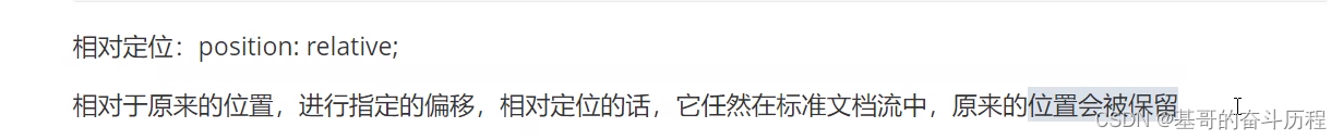
1.相对定位
relative:相对于原来位置移动,元素设置此属性之后仍然处在文档流中,不影响其他元素的布局---菜鸟教程
<!DOCTYPE html>
<html lang="en">
<head>
    <meta charset="UTF-8">
    <title>Title</title>
<!--相对定位
相对定位相对于自己原来的位置进行偏移-->
</head>
<style>
    body{
        padding: 20px;
    }
    div{
        margin: 10px;
        padding: 5px;
        font-size: 12px;
        color: black;
        line-height: 25px;

    }

    #father{
        border: 1px solid #564666;
        padding: 0;
    }
    #first{
        background-color: #FFCC70;
        border: 1px dashed yellow;
        position: relative;
        top: -30px;
        left: 30px;
    }
    #second{
        border: 1px dashed black;
        background-color:#573323;
    }
    #third{
        border: 1px dashed red;
        background-color: brown;
        position: relative;
        bottom: -20px;
    }


</style>
<body>

<div id="father">
    <div id="first">第一个盒子</div>
    <div id="second">第二个盒子</div>
    <div id="third">第三个盒子</div>


</div>

</body>
</html>
练习
<!DOCTYPE html>
<html lang="en">
<head>
    <meta charset="UTF-8">
    <title>Title</title>
    <style>
        div{
            width: 300px;
            height: 100px;
            margin: 0;
            padding: 0;
        }
        #father{
            width: 300px;
            height: 300px;
            border: 1px solid red;
            padding: 10px;
        }
        #one{
            width: 300px;
            height: 100px;
        }
         a{

             display: inline-block;
             width: 100px;
             height: 100px;
             background-color: pink;
             text-decoration: none;
             line-height: 100px;
             text-align: center;
             color: white;

         }
         a:hover{
             background: blue;

         }
         #first{
             position: relative;
             top: -100px;
         }
         #second{
             position: relative;
               top: -200px;
             left: 200px;
         }
           #fourth{
               position: relative;
               left: 95px;
           }
           #fifth{
               position: relative;
               left: -5px;

           }
    </style>
</head>
<body>
<div id="father">
          <div id="one">            </div>
         <div id="two"><a href="#" id="first">链接1</a>    <a href="#" id="fifth">链接5</a>   <a href="#" id="second">链接2</a>      </div>
            <div> <a href="#" id="third">链接3</a>     <a href="#" id="fourth">链接4</a>                   </div>


</div>


</body>
</html>
2.绝对定位
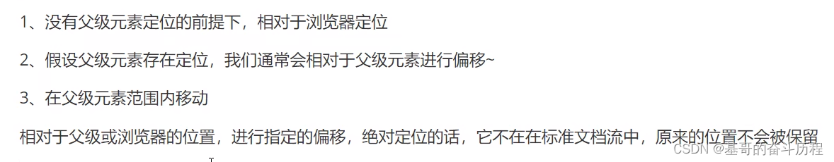
但是因为是绝对定位,所以这个元素依然可以随意地定位,换句话说父级元素的定位只是给绝对定位选了个默认的起始位置,准确的说法是:绝对定位的起始位置由它的父级元素决定
比如父级元素是边框,那这个绝对定位在没有设置偏移的情况下默认在边框里面
狂神说错了,准确的说法是绝对定位的默认位置由它的父级元素决定
#second{
    border: 1px dashed black;
    background-color:#573323;
    position: absolute;
    right: -16px;
}
#father{
    border: 1px solid #564666;
    padding: 0;
    position: relative;
}
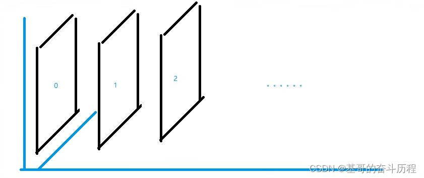
3.z-index
<!DOCTYPE html>
<html lang="en">
<head>
    <meta charset="UTF-8">
    <title>Title</title>
    <link rel="stylesheet" href="style.css"type="text/css">
</head>
<body>
       <div id="content">
           <ul>
               <li><img src="images/a.jpg" alt=""></li>
               <li class="tipText">学习微服务,找狂神</li>
               <li><a href="#" class="tipBg"></a></li>
               <li>时间:2023-1-17</li>
               <li>地点:月球一号基地</li>


           </ul>


       </div>


</body>
</html>
#content{
width: 670px;
padding: 0;
margin: 0;
overflow: hidden;
font-size: 12px;
line-height: 25px;
border: 1px #000 solid;
}
ul,li{
padding: 0;
margin: 0;
list-style: none;
}
/*父级元素相对定位*/
#content ul{
position: relative;
}
.tipText,.tipBg{
position: absolute;
width:670px;
height: 25px;
top: 356px;
}
.tipText{
color: white;
z-index: 99;
}
.tipBg{
background: black;
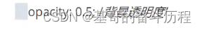
opacity:0.3 ;/*背景透明度*/
/*filter: alpha(opacity=50);*/
}
a:hover{
background:blue;
}
opacity:0.5背景透明度


 扫一扫
扫一扫


 275
275

 被折叠的 条评论
为什么被折叠?
被折叠的 条评论
为什么被折叠?
 到【灌水乐园】发言


