


响应式布局 and 弹性格局布局
响应式定义:
响应式布局(Responsive Layouts)页面的设计与开发应当根据用户行为以及设备环境,进行相应的响应和调整。
一个网站应该能适配多个终端。
- 设置 viewport / scale
- 使用流体宽度(max / min-width)
- 媒体查询 (Media Queries)
- Rem单位转换
- 移动优先
<body>
<!-上面一大堆是什么东西--->
<div id="widescreen"><h1>Widescreen</h1></div>
<div id="normal"><h1>Normal</h1></div>
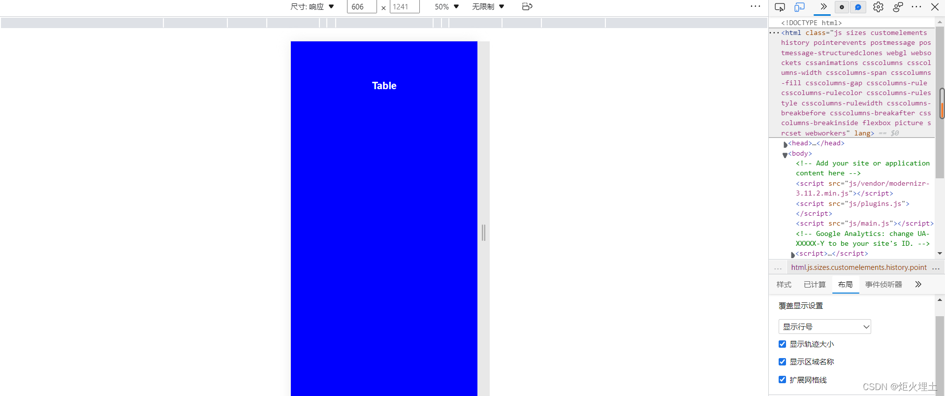
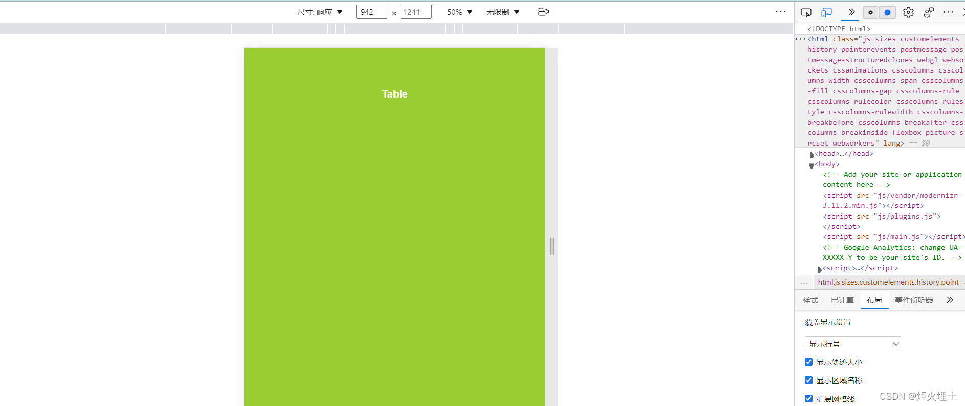
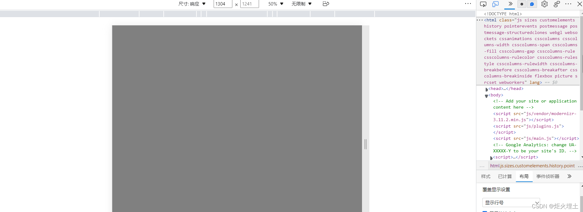
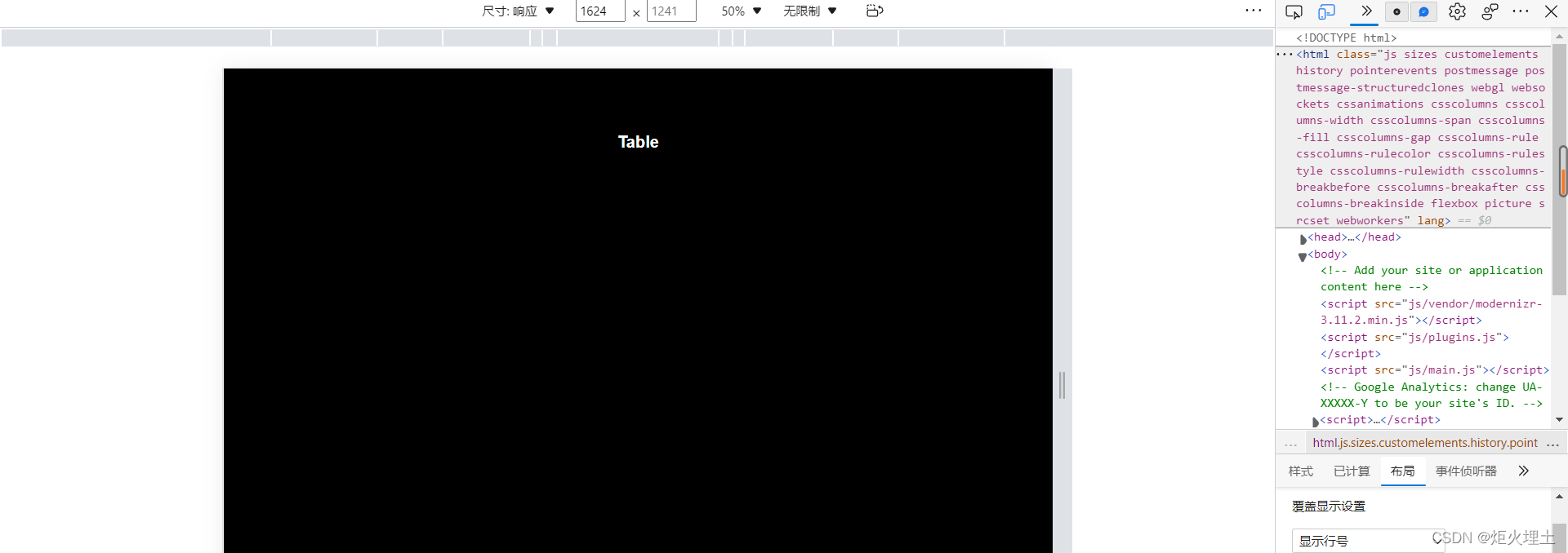
<div id="table"><h1>Table</h1></div>
<div id="smartphone"><h1>Smartphone</h1></div>
<div id="landscape"><h1>Landscape</h1></div>
</body>
<style>
    body{
      font-family: Arial,Helvetica,sans-serif;
      background: gray;
      color:white;
      text-align: center;
      padding-top: 100px;
    }

    h1{
      display: none;
    }
    /*smartphone*/
    /*max-width500以内的显示smartphone布局*/
    @media (max-width: 500px) {
      body{
        background: red;
      }
      #smartphone h1{
        display: block;
      }

    }
    /*table*/
    /*在501到768之间的,显示table布局*/
    @media (min-width: 501px) and (max-width: 768px) {
      body{
        background: blue;
      }
      #table h1{
        display: block;
      }

    }

    /*normal*/
    /*在769到1200之间的,显示normal布局*/
    @media (min-width: 769px) and (max-width: 1200px) {
      body{
        background: yellowgreen;
      }
      #table h1{
        display: block;
      }
    }

    /*landscape*/
    /*在769到1200之间的,显示normal布局*/
    @media (min-width: 1201px) and(max-width:1500px)  {
      body{
        background: blueviolet;
      }
      #table h1{
        display: block;
      }
    }

    /*widescreen*/
    /*大于1501的,显示widescreen布局*/
    @media (min-width: 1501px)  {
      body{
        background: black;
      }
      #table h1{
        display: block;
      }
    }
  </style>
 <!--在格式小于768px时,执行href路径下的CSS样式-->
  <link rel="stylesheet" media="screen and (max-width:768px)" href="css/main.css">
嗨嗨嗨
windows系统可使用F12打开开发者工具
以下用edge浏览器演示效果
点击最上方的尺寸,可以选择不同尺寸的虚拟机演示效果
当尺寸选择随机的时候,可以通过鼠标自由的拉伸页面尺寸

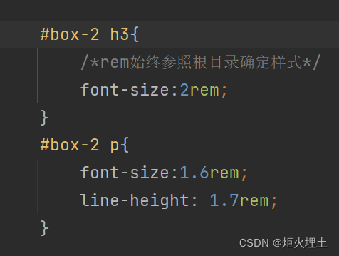
em和rem
em属性设定会按照上一层目录的格式进行计算
而rem始终会参照html根目录确定样式
默认font值是16px,p标签font-size:1.6rem。则是在16的基础上乘以1.6
得出font结果为25.6px
vh和vw
height: 100vh;/*将整个页面分成一百份*/
在背景中插入图片的时候,如果图片与浏览器的尺寸不相同。会出现图片出现多次的问题。
background:black url("图片的链接或者位置") no-repeat center center/cover
表示图片在背景中不会重复,在中心位置并且能完全覆盖。
<header>定义文档的页眉
padding容器内距离,margin容器外距离
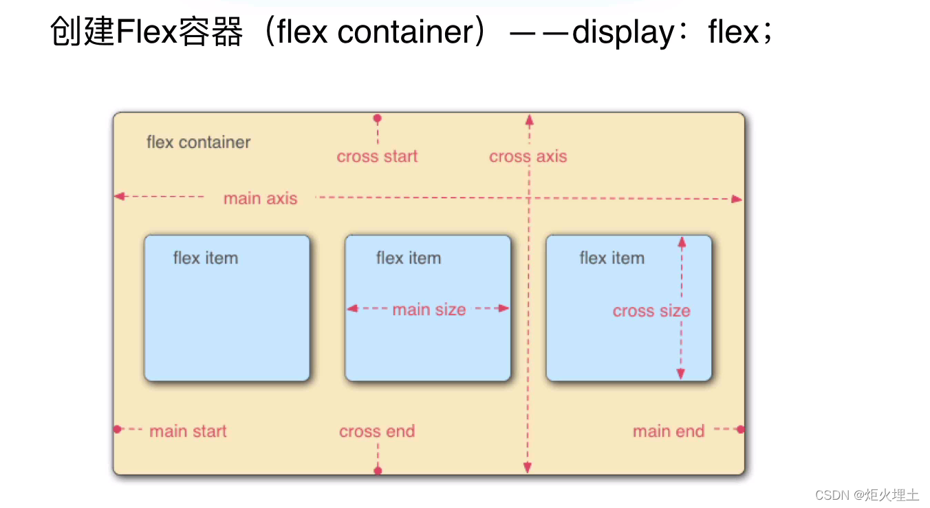
弹性盒子布局
(Flexbox Layouts)
-
弹性盒子是CSS3的一种新的布局方式(当页面需要适应不同的屏幕大小和设备类型的时候,确保元素有恰当的行为和布局方式)
-
代替浮动使得布局更加简便
-
对齐方向包含了水平方向和垂直方向
-
弹性项目通过CSS重新排序
display:flex;
/*默认值是row横向排列,column是纵向排列*/
		flex-direction: row;/*排列*/
		flex-wrap: wrap;/*换行*/
元素在主轴上的对齐方式
justify-content: center;
元素在交叉轴上的对齐方式
align-items: center;
调整宽度,效果与width相同
flex-basis:100px;
对元素进行单独的设置
align-self: flex-start;
order对元素进行排序,默认值为0
order:2;
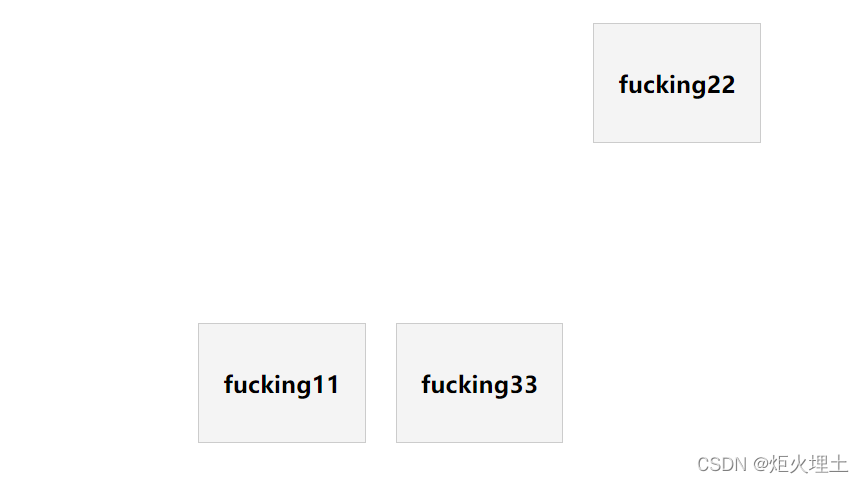
以下为此代码演示的效果
<!DOCTYPE html>
<html lang="en">
<head>
	<meta charset="UTF-8">
	<meta name="viewport" content="width=device-width,initial-scale=1.0">
	<meta http-equiv="x-ua-compatible" content="ie=edge">
	<title>Em & Rem Units</title>
	<style>
		#container{
			display: flex;
			justify-content: center;/*项目在主轴上的对齐方式*/
			height: 600px;
			align-items: center;/*项目在交叉轴上的对齐方式*/
			flex-wrap: wrap;
		}
		.item{
			background: #f4f4f4;
			border:#ccc solid 1px;
			padding:1rem;
			text-align: center;
			margin:0.75rem;
			flex-basis:100px;/*跟width效果相同*/
		}

		.item-2{
			align-self: flex-start;/*可以对单个元素进行设置*/
			order:2;/*默认值为0,可以对元素进行排序*/
		}
	</style>
</head>
<body>
	<div id="container">
		<div class="item item-1"><h3>fucking11</h3></div>
		<div class="item item-2"><h3>fucking22</h3></div>
		<div class="item item-3"><h3>fucking33</h3></div>

	</div>
</body>
</html>


 扫一扫
扫一扫


 被折叠的 条评论
为什么被折叠?
被折叠的 条评论
为什么被折叠?
 到【灌水乐园】发言


