


 文章介绍了如何使用CSS解决两个相邻div之间的阴影重叠问题,通过移除其中一个div的阴影并添加一个伪元素来模拟阴影,实现了优雅的效果。这种方法避免了复杂的box-shadow属性组合,通过调整伪元素的位置和阴影属性达到理想效果。
如题,本文想要达到的目标是:去掉两个同时设有阴影且紧挨着的 div 相邻边出现的阴影
先看结果:
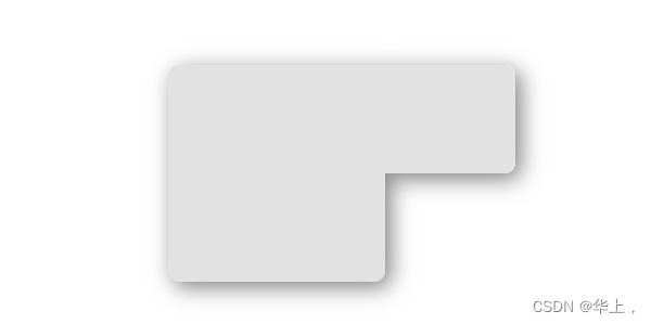
多么优雅~
就是这么个情况
前几天由于项目需要,自己又觉得 box-shadow 肯定有什么特殊的属性值来只设置三边阴影,就这点小需求自个儿捣鼓半天,也没整出啥方法来。在网上搜到的全是:
.small {
    /* x 偏移量 | y 偏移量 | 阴影模糊半径 | 阴影扩散半径 | 阴影颜色 */
    box-shadow: 12px -10px 20px -10px rgba(0, 0, 0, 0.5),
      12px 12px 20px -10px rgba(0, 0, 0, 0.5);
  }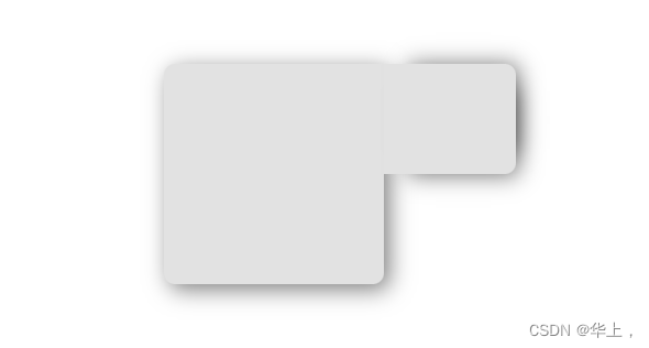

这啥?顾此失彼,这是哪门子解决问题
不过换个实用性的角度,项目中阴影不会设计得如此之大,而且不用写过多代码,要达到效果只需花点时间精细地调整其属性值。不失为一个好方法,是值得一用的。
不过,我不服气啊,后来我换着各种表述去问了ChatGPT,它给出的各种答案都是匪夷所思,八竿子打不着边儿。好家伙,难道没有解决这个问题的办法吗?
灵感要来咧
欸嘿嘿~ 办法总是多种多样的,我这就有其中之一
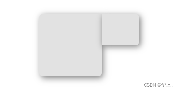
原效果:
来看 dom 结构:
<body>
  <div class="container">
    <div class="big"></div>
    <div class="small"></div>
  </div>
</body>大体思路是:把 small 的阴影给去掉,再给 small 块一个伪元素,让它与 small 的宽高一模一样,让这个伪元素的层级在 big 之下去展示阴影,即可达到文章顶部预览图的优雅效果。
css代码供参考:
.small {
    position: relative;
    width: 120px;
    height: 100px;
    border-radius: var(--both-br);
  }

.small::before {
    content: '';
    position: absolute;
    display: block;
    top: 0;
    left: 0;
    width: 100%;
    height: 100%;
    border-radius: var(--both-br);
    background: transparent;
    box-shadow: var(--both-shadow);
    z-index: -1;
  }
多说三嘴
不要复制粘贴,不要复制粘贴,不要复制粘贴。看完思路关掉标签页去写个小 demo 尝试一下是最好的喔,可以内化于心喔,百年不忘喔。

demo完整代码如下
<!DOCTYPE html>
<html lang="en">

<head>
  <meta charset="UTF-8">
  <meta http-equiv="X-UA-Compatible" content="IE=edge">
  <meta name="viewport" content="width=device-width, initial-scale=1.0">
  <title>Document</title>
</head>

<body>
  <div class="nothing">
    <div class="big"></div>
    <div class="small"></div>
  </div>
  <div class="bullshit">
    <div class="big"></div>
    <div class="small"></div>
  </div>
  <div class="container">
    <div class="big"></div>
    <div class="small"></div>
  </div>
</body>
<style>
  html,
  body {
    margin: 0;
    padding: 0;
  }

  body {
    background: #fff;
    width: 100vw;
    height: 100vh;

    display: flex;
    flex-direction: column;
    justify-content: center;
    align-items: center;
  }

  .nothing,
  .bullshit,
  .container {
    /* --both-shadow: 5px 5px 20px rgba(0, 0, 0, 0.5); */
    --both-shadow: 0 0 20px rgba(0, 0, 0, 0.5);
    --both-br: 0 10px 10px 0;
    display: flex;
    margin: 50px;
  }

  .nothing .big,
  .nothing .small,
  .bullshit .big,
  .bullshit .small,
  .container .big,
  .container .small {
    background: #e2e2e2;
  }

  .nothing .big,
  .bullshit .big,
  .container .big {
    width: 200px;
    height: 200px;
    border-radius: 10px 0 10px 10px;
    box-shadow: var(--both-shadow);
  }

  .nothing .small,
  .bullshit .small,
  .container .small {
    position: relative;
    width: 120px;
    height: 100px;
    border-radius: var(--both-br);
  }

  .nothing .small {
    box-shadow: var(--both-shadow);
  }

  .bullshit .small {
    /* x 偏移量 | y 偏移量 | 阴影模糊半径 | 阴影扩散半径 | 阴影颜色 */
    box-shadow: 12px -10px 20px -10px rgba(0, 0, 0, 0.5),
      12px 12px 20px -10px rgba(0, 0, 0, 0.5);
  }

  .container .small::before {
    content: '';
    position: absolute;
    display: block;
    top: 0;
    left: 0;
    width: 100%;
    height: 100%;
    border-radius: var(--both-br);
    background: transparent;
    box-shadow: var(--both-shadow);
    z-index: -1;
  }
</style>

</html>


 扫一扫
扫一扫


 被折叠的 条评论
为什么被折叠?
被折叠的 条评论
为什么被折叠?
 到【灌水乐园】发言


