


html css 期末大作业 完整版
一、源码地址
https://drive.uc.cn/s/f1e0070021a94
需要的伙伴 自取
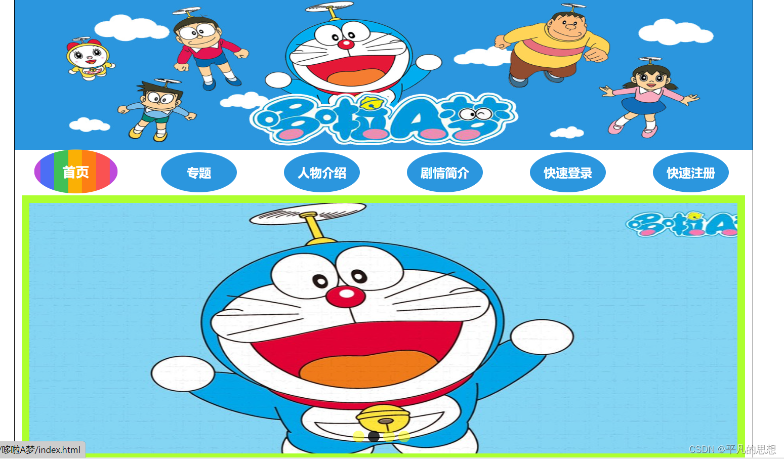
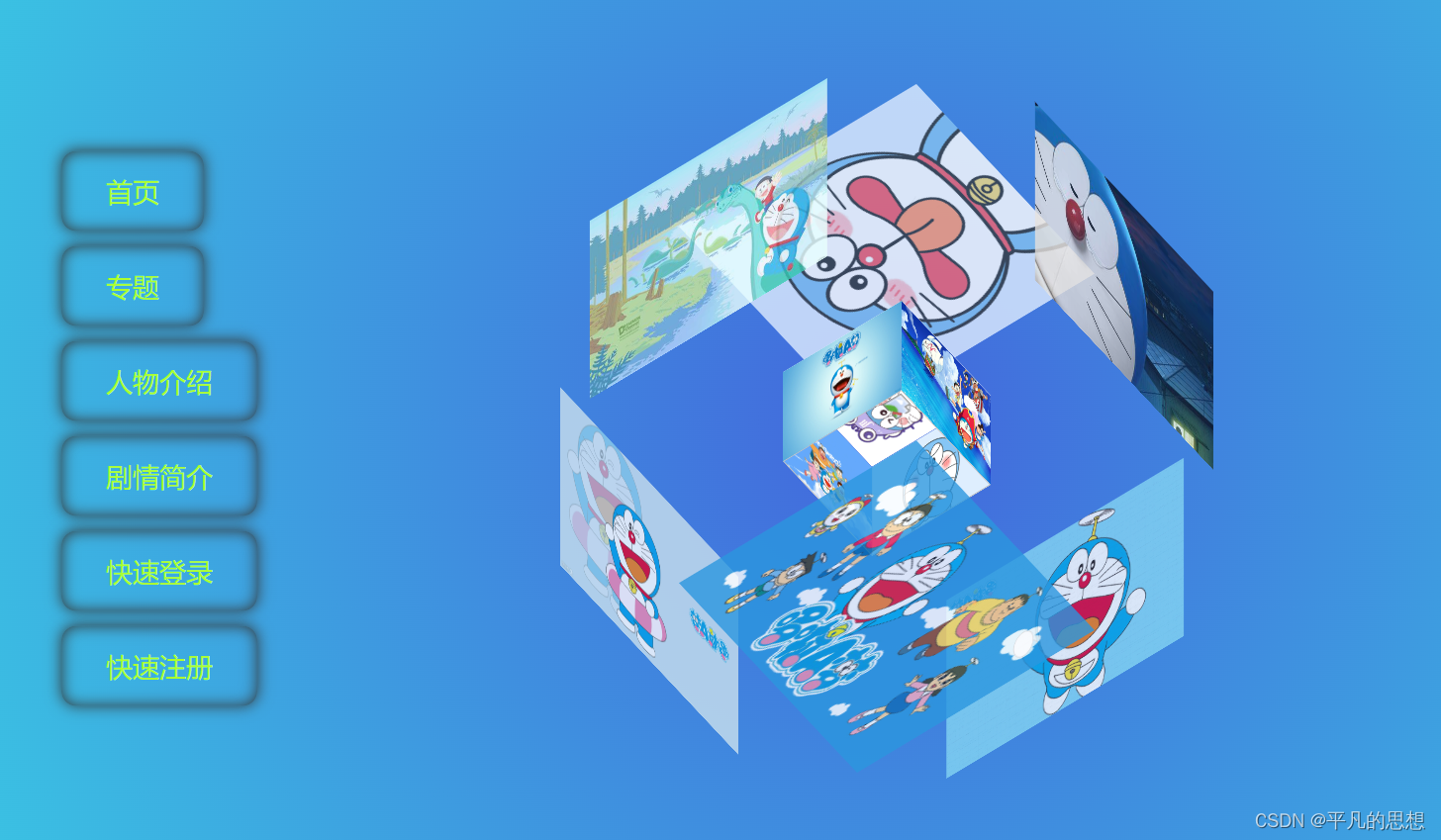
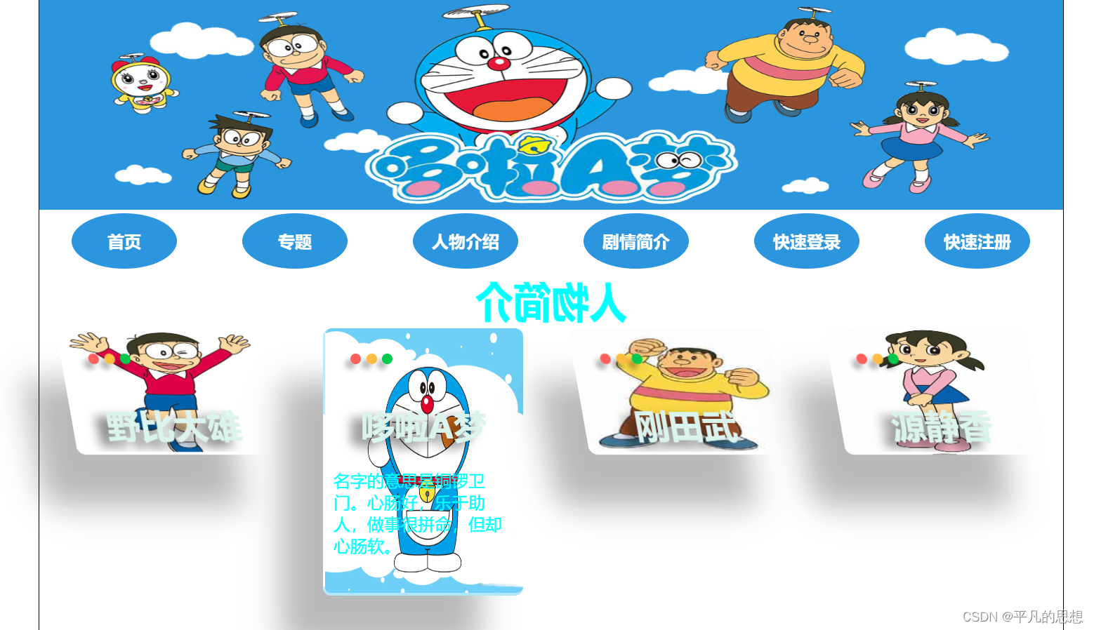
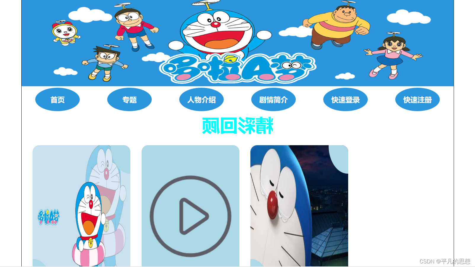
二、效果图
三、代码实现
1.index.html
<!DOCTYPE html>
<html lang="en">
<head>
    <meta charset="UTF-8">
    <meta http-equiv="X-UA-Compatible" content="IE=edge">
    <meta name="viewport" content="width=device-width, initial-scale=1.0">
    <title>主页</title>
    <style>
        *{
            margin: 0;
            padding: 0;
            box-sizing: border-box;
        }
      .main{
        width: 80%;
        height: 100%;
        margin: auto;
        border: 1px black solid;
      }
      .tou img{
        display: block;
          width: 100%;
          height: 200px;
          margin: auto;
      }
      .n1{
        list-style: none;
        display: flex;
        flex-direction: row;
        justify-content: space-around;
        height: 60px;
      }
      .n1 li{
        line-height: 60px;
      }
      .n1 li a{
        text-decoration: none;
      }

      button {
  --width: 100px;
  --timing: 2s;
  border: 0;
  width: var(--width);
  padding-block: 1em;
  color: #fff;
  font-weight: bold;
  font-size: 1em;
 background-image: url(./image/6.jpg);
  transition: all 0.2s;
  border-radius: 50%;
}

button:hover {
  background-image: linear-gradient(to right, rgb(250, 82, 82), rgb(250, 82, 82) 16.65%, rgb(190, 75, 219) 16.65%, rgb(190, 75, 219) 33.3%, rgb(76, 110, 245) 33.3%, rgb(76, 110, 245) 49.95%, rgb(64, 192, 87) 49.95%, rgb(64, 192, 87) 66.6%, rgb(250, 176, 5) 66.6%, rgb(250, 176, 5) 83.25%, rgb(253, 126, 20) 83.25%, rgb(253, 126, 20) 100%, rgb(250, 82, 82) 100%);
  animation: var(--timing) linear dance6123 infinite;
  transform: scale(1.1) translateY(-1px);
}

@keyframes dance6123 {
  to {
    background-position: var(--width);
  }
}

      .banner {
			width: 98%;
			margin: auto;
			border: 10px solid greenyellow;
			height: 350px;
			position: relative;
			overflow: hidden;
		}

		.imgList {
			list-style: none;

			position: absolute;
		}

		.imgList img {
			width: 1000px;
			height: 350px;
		}

		.imgList li {
			float: left;
			margin-right: 20px;
		}

		.circle {
			position: absolute;
			bottom: 15px;
			left: 50%;
			transform: translateX(-50%);
		}

		.circle a {
			width: 15px;
			height: 15px;
			background: yellow;
			display: block;
			border-radius: 50%;
			opacity: .5;
			float: left;
			margin-right: 5px;
			cursor: pointer;
		}

		.circle a.hover {
			background: black;
			opacity: .8;
		}

        .book {
  position: relative;
  border-radius: 10px;
  width: 220px;
  height: 300px;
  background-color: whitesmoke;
  -webkit-box-shadow: 1px 1px 12px #000;
  box-shadow: 1px 1px 12px #000;
  -webkit-transform: preserve-3d;
  -ms-transform: preserve-3d;
  transform: preserve-3d;
  -webkit-perspective: 2000px;
  perspective: 2000px;
  display: -webkit-box;
  display: -ms-flexbox;
  display: flex;
  -webkit-box-align: center;
  -ms-flex-align: center;
  align-items: center;
  -webkit-box-pack: center;
  -ms-flex-pack: center;
  justify-content: center;
  color: #000;

}

.cover {
  top: 0;
  position: absolute;
  background-color: lightgray;
  width: 100%;
  height: 100%;
  border-radius: 10px;
  cursor: pointer;
  -webkit-transition: all 0.5s;
  transition: all 0.5s;
  transform-origin: 0;
  -webkit-box-shadow: 1px 1px 12px #000;
  box-shadow: 1px 1px 12px #000;
  display: -webkit-box;
  display: -ms-flexbox;
  display: flex;
  -webkit-box-align: center;
  -ms-flex-align: center;
  align-items: center;
  -webkit-box-pack: center;
  -ms-flex-pack: center;
  justify-content: center;
}
.cover1{
    background-image: url(./image/2.jpg);
    background-size: 100% 100%;
    background-position: center;
}
.cover2{
    background-image: url(./image/3.jpg);
    background-size: 100% 100%;
    background-position: center;
}
.cover3{
    background-image: url(./image/4.jpg);
    background-position: center;
    background-size: 100% 100%;
}
.cover4{
    background-image: url(./image/5.jpg);
    background-size: 100% 100%;
    background-position: center;
}
.book:hover .cover {
  -webkit-transition: all 0.5s;
  transition: all 0.5s;
  -webkit-transform: rotatey(-80deg);
  -ms-transform: rotatey(-80deg);
  transform: rotatey(-80deg);
}
.card{
    margin-top: 40px;
    display: flex;
        flex-direction: row;
        justify-content: space-around;
}
.font img{
    width: 100%;
    height: 150px;
    margin-top: 40px;
}
    </style>
</head>
<body>
    <div class="main">
        <div class="tou">
            <img src="./image/6.jpg">
        </div>
    <nav class="first">
     <ul class="n1">
        <li><a href="./index.html"> <button>首页</button></a></li>
        <li><a href="./zhuanti.html"><button>专题</button></a></li>
        <li><a href="./renwu.html"><button>人物介绍</button></a></li>
        <li><a href="./juqing.html"><button>剧情简介</button></a></li>
        <li><a href="./zhu.html"><button>快速登录</button></a></li>
        <li><a href="./deng.html"><button>快速注册</button></a></li>
     </ul>
    </nav>
    <div class="banner">
		<ul class="imgList">
			<li><img src="./image/2.jpg" alt=""></li>
			<li><img src="./image/3.jpg" alt=""></li>
			<li><img src="./image/4.jpg" alt=""></li>
			<li><img src="./image/5.jpg" alt=""></li>
		</ul>
		<div class="circle">
		</div>
	</div>
    <div class="card">
         <div class="book">
        <div class="cover cover1">
        </div>
       </div>
       <div class="book">
        <div class="cover cover2">
        </div>
       </div>
       <div class="book">
        <div class="cover cover3">
        </div>
       </div>
       <div class="book">
        <div class="cover cover4">
        </div>
       </div>
    </div>
   <div class="font">
    <img src="./image/14.jpg" alt="cc">
   </div>
    </div>
    	<script>
		window.onload = function () {
			var imgList = document.querySelector('.imgList');
			var circle = document.querySelector('.circle');
			var thisIndex = 0;
			var imgListLi = imgList.children;
			var circleA = circle.children;
			var flag = true;
			imgList.style.width = imgList.children.length * 1020 + 'px';
			for (var i = 0; i < imgList.children.length; i++) {
				var aNode = document.createElement('a');
				aNode.setAttribute('index', i);	//设置自定义属性
				if (i == 0) {
					aNode.className = 'hover';
				}
				circle.appendChild(aNode);
			}
			circle.addEventListener('click', function (e) {
				if (flag) {
					flag = false;
					if (e.target.nodeName != 'A') {
						return false;
					}
					thisIndex = e.target.getAttribute('index');
					slow(imgList, -thisIndex * 1020, function () {
						flag = true;
					});
					circleChange();
				}
			})
			function antoChange() {
				setInterval(function () {
					if (flag) {
						flag = false;
						if (thisIndex >= circleA.length) {
							thisIndex = 0;
						}
						slow(imgList, -thisIndex * 1020, function () {
							flag = true;
						});
						circleChange();
						thisIndex++;
					}
				}, 3000);
			}
			function circleChange() {
				for (var i = 0; i < circleA.length; i++) {
					circleA[i].className = '';
				}
				circleA[thisIndex].className = 'hover';
			}
			function slow(obj, target, callback) {
				obj.myInter = setInterval(function () {
					var offsetLeft = obj.offsetLeft;
					var num = (target - offsetLeft) / 10;
					num > 0 ? num = Math.ceil(num) : num = Math.floor(num);
					if (offsetLeft == target) {
						clearInterval(obj.myInter);
						callback && callback();
					} else {
						obj.style.left = offsetLeft + num + 'px';
					}
				}, 10)
			}
			antoChange();
		}
	</script>
</body>
</html>
2.renwu.html
<!DOCTYPE html>
<html lang="en">
<head>
    <meta charset="UTF-8">
    <meta http-equiv="X-UA-Compatible" content="IE=edge">
    <meta name="viewport" content="width=device-width, initial-scale=1.0">
    <title>人物简介</title>
    <style>
        *{
            margin: 0;
            padding: 0;
            box-sizing: border-box;
        }
      .main{
        width: 80%;
        height: 100%;
        margin: auto;
        border: 1px black solid;
      }
      .tou img{
        display: block;
          width: 100%;
          height: 200px;
          margin: auto;
      }
      .font img{
    width: 100%;
    height: 150px;
    margin-top: 40px;
}
.n1{
        list-style: none;
        display: flex;
        flex-direction: row;
        justify-content: space-around;
        height: 60px;
      }
      .n1 li{
        line-height: 60px;
      }

      .n1 li a{
        text-decoration: none;
      }
      .card {
  width: 190px;
  height: 120px;
  padding: 0.5rem;
  border-radius: 8px;
  backdrop-filter: blur(5px);
  border-bottom: 3px solid rgba(255, 255, 255, 0.440);
  border-left: 2px  rgba(255, 255, 255, 0.545) outset;
  box-shadow: -40px 50px 30px rgba(0, 0, 0, 0.280);
  transform: skewX(10deg);
  transition: .4s;
  overflow: hidden;
  color: white;
}
.card1{
    background-image: url(./image/da.jpg);
    background-position: center;
    background-size: 100% 100%;
}
.card2{
    background-image: url(./image/do.jpg);
    background-position: center;
    background-size: 100% 100%;
}
.card3{
    background-image: url(./image/gang.jpg);
    background-position: center;
    background-size: 100% 100%;
}
.card4{
    background-image: url(./image/jing.jpg);
    background-position: center;
    background-size: 100% 100%;
}
.card5{
    background-image: url(./image/xiao.jpg);
    background-position: center;
    background-size: 100% 100%;
}
.card:hover {
  height: 254px;
  transform: skew(0deg);
}

.align {
  padding: 1rem;
  display: flex;
  flex-direction: row;
  gap: 5px;
  align-self: flex-start;
}

.red {
  width: 10px;
  height: 10px;
  border-radius: 50%;
  background-color: #ff605c;
  box-shadow: -5px 5px 5px rgba(0, 0, 0, 0.280);
}

.yellow {
  width: 10px;
  height: 10px;
  border-radius: 50%;
  background-color: #ffbd44;
  box-shadow: -5px 5px 5px rgba(0, 0, 0, 0.280);
}

.green {
  width: 10px;
  height: 10px;
  border-radius: 50%;
  background-color: #00ca4e;
  box-shadow: -5px 5px 5px rgba(0, 0, 0, 0.280);
}

.card h1 {
  text-align: center;
  margin: 1.3rem;
  color: rgb(218, 244, 237);
  text-shadow: -10px 5px 10px rgba(0, 0, 0, 0.573);
}

.cc{
    width: 100%;
    display: flex;
    flex-direction: row;
    justify-content: space-around;
}


h4{
		   text-align:center;
		   color:#00FFFF;
		   font-size:40px;
		   -webkit-transform-style:preserve-3d;
		   -webkit-animation:run  ease-in-out 9s infinite;
		}
		@-webkit-keyframes run{
		   0%{
		      -webkit-transform:rotateX(-5deg) rotateY(0);
		   }
		   50%{
		      -webkit-transform:rotateX(0) rotateY(180deg);
		   }
		   100%{
		      -webkit-transform:rotateX(5deg) rotateY(360deg);
		   }

		}
p{
    color: #00FFFF;
}
button {
  --width: 100px;
  --timing: 2s;
  border: 0;
  width: var(--width);
  padding-block: 1em;
  color: #fff;
  font-weight: bold;
  font-size: 1em;
 background-image: url(./image/6.jpg);
  transition: all 0.2s;
  border-radius: 50%;
}

button:hover {
  background-image: linear-gradient(to right, rgb(250, 82, 82), rgb(250, 82, 82) 16.65%, rgb(190, 75, 219) 16.65%, rgb(190, 75, 219) 33.3%, rgb(76, 110, 245) 33.3%, rgb(76, 110, 245) 49.95%, rgb(64, 192, 87) 49.95%, rgb(64, 192, 87) 66.6%, rgb(250, 176, 5) 66.6%, rgb(250, 176, 5) 83.25%, rgb(253, 126, 20) 83.25%, rgb(253, 126, 20) 100%, rgb(250, 82, 82) 100%);
  animation: var(--timing) linear dance6123 infinite;
  transform: scale(1.1) translateY(-1px);
}

@keyframes dance6123 {
  to {
    background-position: var(--width);
  }
}
    </style>
</head>
<body>
    <div class="main">
        <div class="tou">
            <img src="./image/6.jpg">
        </div>
        <nav class="first">
            <ul class="n1">
                <li><a href="./index.html"><button>首页</button></a></li>
                <li><a href="./index.html"><button>专题</button></a></li>
                <li><a href="./renwu.html"><button>人物介绍</button></a></li>
                <li><a href="./juqing.html"><button>剧情简介</button></a></li>
                <li><a href="./zhu.html"><button>快速登录</button></a></li>
                <li><a href="./deng.html"><button>快速注册</button></a></li>
            </ul>
           </nav>
           <h4>人物简介</h4>

<div class="cc">
           <div class="card card1">
            <div class="align">
                <span class="red"></span>
                <span class="yellow"></span>
                <span class="green"></span>
            </div>

            <h1>野比大雄</h1>
            <p>
                单纯天真的个乐天派,成天吊儿郎当地混日子。性格懒惰,天生迟钝,什么时候都慢半拍,迟到纪录和罚站纪录等等屡次创造新纪录。是个倒霉蛋。
            </p>
        </div>
        <div class="card card2">
            <div class="align">
                <span class="red"></span>
                <span class="yellow"></span>
                <span class="green"></span>
            </div>

            <h1>哆啦A梦</h1>
            <p>
                名字的意思是铜锣卫门。心肠好,乐于助人,做事很拼命,但却心肠软。
            </p>
        </div>
        <div class="card card3">
            <div class="align">
                <span class="red"></span>
                <span class="yellow"></span>
                <span class="green"></span>
            </div>

            <h1>刚田武</h1>
            <p>
                大雄的同班同学,大家都叫他“胖虎”。任性,蛮横,又贪婪。
            </p>
        </div>
        <div class="card card4">
            <div class="align">
                <span class="red"></span>
                <span class="yellow"></span>
                <span class="green"></span>
            </div>

            <h1>源静香</h1>
            <p>
                大雄的青梅竹马,也是大雄未来的妻子。聪明乖巧、成绩优秀、心地善良,很受大家的欢迎。
            </p>
        </div>
    </div>
   <div class="font">
    <img src="./image/14.jpg" alt="cc">
   </div>
    </div>

</body>
</html>
3.zhuanti.html
<!DOCTYPE html>
<html>

	<head>
		<meta charset="utf-8" />
		<title>专题</title>
	<style>
        html {
            background:radial-gradient(circle,rgb(67, 102, 220),rgb(58, 196, 227));
        height: 100%;
}


.wrap {
	position: relative;
	position: absolute;
	top: 0;
	right: 0;
	bottom: 0;
	left: 0;
	width: 200px;
	height: 200px;
	margin: auto;
}


.cube {
	width: 200px;
	height: 200px;
	margin: 0 auto;
	transform-style: preserve-3d;
	transform: rotateX(-30deg) rotateY(-80deg);
	-webkit-animation: rotate 20s infinite;
	animation-timing-function: linear;
}

@-webkit-keyframes rotate {
	from {
		transform: rotateX(0deg) rotateY(0deg);
	}
	to {
		transform: rotateX(360deg) rotateY(360deg);
	}
}

.cube div {
	position: absolute;
	width: 200px;
	height: 200px;
	opacity: 0.8;
	transition: all .4s;
}


/*定义所有图片样式*/

.pic {
	width: 200px;
	height: 200px;
}

.cube .out_front {
	transform: rotateY(0deg) translateZ(100px);
}

.cube .out_back {
	transform: translateZ(-100px) rotateY(180deg);
}

.cube .out_left {
	transform: rotateY(90deg) translateZ(100px);
}

.cube .out_right {
	transform: rotateY(-90deg) translateZ(100px);
}

.cube .out_top {
	transform: rotateX(90deg) translateZ(100px);
}

.cube .out_bottom {
	transform: rotateX(-90deg) translateZ(100px);
}


/*定义小正方体样式*/

.cube span {
	display: bloack;
	width: 100px;
	height: 100px;
	position: absolute;
	top: 50px;
	left: 50px;
}

.cube .in_pic {
	width: 100px;
	height: 100px;
}

.cube .in_front {
	transform: rotateY(0deg) translateZ(50px);
}

.cube .in_back {
	transform: translateZ(-50px) rotateY(180deg);
}

.cube .in_left {
	transform: rotateY(90deg) translateZ(50px);
}

.cube .in_right {
	transform: rotateY(-90deg) translateZ(50px);
}

.cube .in_top {
	transform: rotateX(90deg) translateZ(50px);
}

.cube .in_bottom {
	transform: rotateX(-90deg) translateZ(50px);
}


/*鼠标移入后样式*/

.cube:hover .out_front {
	transform: rotateY(0deg) translateZ(200px);
}

.cube:hover .out_back {
	transform: translateZ(-200px) rotateY(180deg);
}

.cube:hover .out_left {
	transform: rotateY(90deg) translateZ(200px);
}

.cube:hover .out_right {
	transform: rotateY(-90deg) translateZ(200px);
}

.cube:hover .out_top {
	transform: rotateX(90deg) translateZ(200px);
}

.cube:hover .out_bottom {
	transform: rotateX(-90deg) translateZ(200px);
}
.first{
    position: absolute;
    left: 20px;
    top: 50%;
    transform: translateY(-50%);

}
li{
    list-style: none;
    margin-top: 10px;
}
button {
  padding: 15px 30px;
  font-size: 18px;
  outline: none;
  border: none;
  border-radius: 10px;
  transition: 0.5s;
  background: transparent;
  color: greenyellow;
  box-shadow: 0 0 10px #363636, inset 0 0 10px #363636;
}

button:hover {
  animation: a 0.5s 1 linear;
}

@keyframes a {
  0% {
    transform: scale(0.7, 1.3);
  }

  25% {
    transform: scale(1.3, 0.7);
  }

  50% {
    transform: scale(0.7, 1.3);
  }

  75% {
    transform: scale(1.3, 0.7);
  }

  100% {
    transform: scale(1, 1);
  }
}
    </style>
	</head>

	<body>
        <nav class="first">
            <ul class="n1">
               <li><a href="./index.html"> <button>首页</button></a></li>
               <li><a href="./zhuanti.html"><button>专题</button></a></li>
               <li><a href="./renwu.html"><button>人物介绍</button></a></li>
               <li><a href="./juqing.html"><button>剧情简介</button></a></li>
               <li><a href="./zhu.html"><button>快速登录</button></a></li>
               <li><a href="./deng.html"><button>快速注册</button></a></li>
            </ul>
           </nav>
		<!--/*外层最大容器*/-->
		<div class="wrap">
			<!--	/*包裹所有元素的容器*/-->
			<div class="cube">
				<!--前面图片 -->
				<div class="out_front">
					<img src="./image/1.jpg" class="pic" />
				</div>
				<!--后面图片 -->
				<div class="out_back">
					<img src="./image/2.jpg" class="pic" />
				</div>
				<!--左图片 -->
				<div class="out_left">
					<img src="./image/3.jpg" class="pic" />
				</div>
				<div class="out_right">
					<img src="./image/4.jpg" class="pic" />
				</div>
				<div class="out_top">
					<img src="./image/5.jpg" class="pic" />
				</div>
				<div class="out_bottom">
					<img src="./image/6.jpg" class="pic" />
				</div>
				<!--小正方体 -->
				<span class="in_front">
				<img src="./image/7.jpg" class="in_pic" />
			</span>
				<span class="in_back">
			     <img src="./image/8.jpg" class="in_pic" />
			</span>
				<span class="in_left">
				<img src="./image/9.jpg" class="in_pic" />
			</span>
				<span class="in_right">
				<img src="./image/10.jpg" class="in_pic" />
			</span>
				<span class="in_top">
				<img src="./image/11.jpg" class="in_pic" />
			</span>
				<span class="in_bottom">
				<img src="./image/12.jpg" class="in_pic" />
			</span>
			</div>
		</div>
	</body>
</html>
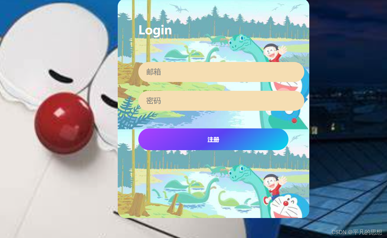
4.zhu.html
<!DOCTYPE html>
<html lang="en">
<head>
    <meta charset="UTF-8">
    <meta http-equiv="X-UA-Compatible" content="IE=edge">
    <meta name="viewport" content="width=device-width, initial-scale=1.0">
    <title>Document</title>
    <style>
        body{
            background-image: url(./image/1.jpg);
            background-repeat: no-repeat;
            background-size: cover;
        }
        .login {
  width: 340px;
  height: 400px;
  margin: auto;
 background-image: url(./image/4.jpg);
  padding: 47px;
  padding-bottom: 57px;
  color: #fff;
  border-radius: 17px;
  padding-bottom: 50px;
  font-size: 1.3em;
        }

.login input[type="text"],
.login input[type="password"] {
  opacity: 1;
  display: block;
  border: none;
  outline: none;
  width: 100%;
  padding: 13px 18px;
  margin: 20px 0 0 0;
  font-size: 0.8em;
  border-radius: 100px;
  background: wheat;
  color: #fff;
}

.login input:focus {
  animation: bounce 1s;
  -webkit-appearance: none;
}

.login input[type=submit],
.login input[type=button],
.h1 {
  border: 0;
  outline: 0;
  width: 100%;
  padding: 13px;
  margin: 40px 0 0 0;
  border-radius: 500px;
  font-weight: 600;
  animation: bounce2 1.6s;
}

.h1 {
  padding: 0;
  position: relative;
  top: -35px;
  display: block;
  margin-bottom: -0px;
  font-size: 1.3em;
}

.btn {
  background: linear-gradient(144deg, #af40ff, #5b42f3 50%, #00ddeb);
  color: #fff;
  padding: 16px !important;
}

.btn:hover {
  background: linear-gradient(144deg, #1e1e1e , 20%,#1e1e1e 50%,#1e1e1e );
  color: rgb(255, 255, 255);
  padding: 16px !important;
  cursor: pointer;
  transition: all 0.4s ease;
}

.login input[type=text] {
  animation: bounce 1s;
  -webkit-appearance: none;
}

.login input[type=password] {
  animation: bounce1 1.3s;
}

.ui {
  font-weight: bolder;
  background: -webkit-linear-gradient(#B563FF, #535EFC, #0EC8EE);
  -webkit-background-clip: text;
  -webkit-text-fill-color: transparent;
  border-bottom: 4px solid transparent;
  border-image: linear-gradient(0.25turn, #535EFC, #0EC8EE, #0EC8EE);
  border-image-slice: 1;
  display: inline;
}

@media only screen and (max-width: 600px) {
  .login {
    width: 70%;
    padding: 3em;
  }
}

@keyframes bounce {
  0% {
    transform: translateY(-250px);
    opacity: 0;
  }
}

@keyframes bounce1 {
  0% {
    opacity: 0;
  }

  40% {
    transform: translateY(-100px);
    opacity: 0;
  }
}

@keyframes bounce2 {
  0% {
    opacity: 0;
  }

  70% {
    transform: translateY(-20px);
    opacity: 0;
  }
}
    </style>
</head>
<body>
    <form action="./index.html">
        <div class="login wrap">
        <div class="h1">Login</div>
        <input pattern="^([a-zA-Z0-9_\-\.]+)@((\[[0-9]{1,3}\.[0-9]{1,3}\.[0-9]{1,3}\.)|(([a-zA-Z0-9\-]+\.)+))([a-zA-Z]{2,4}|[0-9]{1,3})(\]?)$" placeholder="邮箱" id="email" name="email" type="text">
        <input placeholder="密码" id="password" name="password" type="password">
        <input value="注册" class="btn" type="submit">
      </div>
    </form>

</body>
</html>
总结
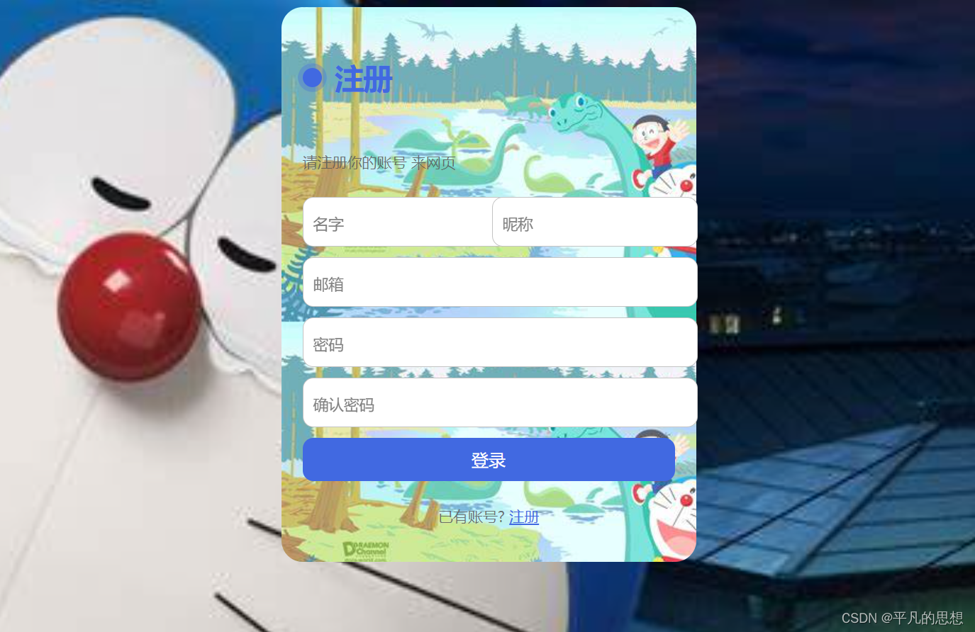
代码太多了 其他代码 有需要的伙伴 自取 ;所要图片也在里面。


 扫一扫
扫一扫


 4547
4547

 被折叠的 条评论
为什么被折叠?
被折叠的 条评论
为什么被折叠?
 到【灌水乐园】发言


