


 本文详细介绍了CSS的各个重要概念,包括外部样式表、内部样式表和内联样式表的使用,选择器权重、选择器类型(如全局、子代、后代选择器)以及伪类和伪元素的应用。深入探讨了盒模型,包括内容、内边距、边框和外边距,以及不同类型的元素布局。此外,还涵盖了文本样式、图片样式、定位和弹性盒子布局等内容,是理解CSS不可多得的参考资料。
目录
CSS
CSS(Cascading Style Sheets, 层叠样式表),控制DOM元素的视觉外观。
同于设置和布置网页 设置字体,颜色,大小,间距甚至还可以用来排版
CSS样式由选择符和属性组成,选择符后面跟着属性,但被一对花括号所包围。属性和值由冒号分隔,每个属性声明以分号结尾。 例如:
    <style>
    .box1 {
      color: tomato;
      font-size: 32px;
    }
    </style>
外部样式表
通过link引用,称为外部样式表
<link rel="stylesheet" href="../css/style.css">
内部样式表
选择器 {
属性名;属性值;
属性名;属性值;
……
}
在相同规则的选择器下,遵循就近原则
  <style>
    .box1 {
      color: tomato;
      font-size: 32px;
    }

    .box1 {
      color: tomato;
      font-size: 24px;
    }
  </style>
内联样式表
通过元素上的style定义样式:内联样式
  <div style="color:tomato;font-size: 32px;">
    这里有很多很多的字
  </div>
css文件之间的引用 @import
使style具有style1的h1样式
style1.css :
h1{
  color: darkcyan;
}
style.css :
@import 'style1.css';
.box2 {
  color: #666;
  font-size: 32px;
}
选择器权重
不同的选择器,权重是不一样的
1.如果我的样式是声明在style这个标签里面,里面的任何选择器,都具备1000的权重
2.所有的id选择器,默认权重100
3.含有类选择,属性选择器,伪类选择器,权重是10
4.选择器中包含伪元素选择器,则为1分
    /* 类选择器 */
    .Class_h1 {
      color: bisque;
     /* 颜色是可以被继承的属性 */
    }

    /* 标签选择器 */
    h1 {
      color: yellow;
    }

	/* id选择器 */
    #Id_h2 {
      color: red;
    }
!important
强制让样式属性具备最高最高优先级,可以完全覆盖掉旧的规则
    .Class_h1 {
      color: bisque !important;
    }
选择器
全局选择器
整个body都会受到影响
写法: * 号加大括号
<style>
    * {
      margin: 0;
      padding: 0;
      /* 清空内外边距,使页面更加美观*/
    }
</style>
子代选择器
只会影响到第一层元素,不会影响之后的层级元素
通俗来讲就是:只会影响到儿子辈,不会影响孙子辈及之后
写法:大于号加点 + 子类元素名
<style>
	.div1>.son1 {
      border: 1px solid #18d39b;
    }
</style>
后代选择器
之后的层级元素都会继承样式
写法:空格加点 + 子类元素名
<style>
	.div1 .son1 {
      border: 1px solid red;
    }
</style>
inherit 继承父类
当前修改样式这个元素会必定继承父元素的样式
	.li1 a {
      color: inherit;
    }
initial 与浏览器一致
设置为和浏览器保持一致的样式
	.li2 a {
      color: initial;
    }
unset 自然继承
设置的自然继承,如果能够继承样式就继承,如果不能够就保持原有的样子
    .li3 a {
      color: unset;
    }
类型选择器
	h1 {
      /* 类型选择器 */
    }
类选择器
	.box1 {
      /* 类选择器 */
    }
id选择器
	#box1 {
      /* id选择器 */
    }
标签属性选择器
    a[title] {
      /* 标签属性选择器 */
      /* title为a标签的title属性 */
      font-size: 32px;
    }
1.值完全等于
	a[href='https://www.baidu.com/'] {
      /* 值完全等于 */
      color: salmon;
    }
2.值以什么开头
	a[href^='#'] {
      /* 以什么属性值开头的 */
      color: red;
    }
3.值以什么结尾
	a[href$='#'] {
      /* 以什么属性值结尾的 */
      color: red;
    }
4.值包含什么
	a[href*='#'] {
      /* 包含了属性值的 */
      color: red;
    }
伪类选择器
冒号后面追加固定关键词。
hover 鼠标放上去的效果
设置一个按钮
  <div class="btn">
    这是一个按钮
  </div>
按钮样式设置:
<style>
	.btn {
          width: 120px;
          height: 40px;
          line-height: 38px;
          text-align: center;
          background-color: black;
          color: yellow;
          border: 3px solid yellow;
          border-radius: 8px;
          cursor: pointer;
          /* width、height:div盒子的长和宽
		  	 line-height:字体实际在按钮内所占的高度
		  	 text-align:文字在按钮里的位置
		  	 background-color:按钮的背景颜色
		  	 color:按钮内字体的颜色
		  	 border:设置此按钮边框的线宽度以及颜色
		  	 border-radius:此按钮边框的角的弧度
		  	 cursor:设置当鼠标放在上面时,鼠标会变成手指(pointer)样式
          */
        }
</style>
按钮本来的样子:

按钮的效果设置:鼠标放到按钮上时变换颜色
<style>
	.btn:hover {
      /* :hover 鼠标放上去的效果 */
      background-color: blue;
      color: white;
    }
</style>
鼠标放上去时的样子:

修改元素样式
创建示例需要的div:
	<div class="box1">
      <p>这是一个p标签</p>
      <p>这是一个p标签</p>
      <p>这是一个p标签</p>
      <p>这是一个p标签</p>
      <p>这是一个p标签</p>
      <p>这是一个p标签</p>
      <p>这是一个p标签</p>
    </div>
first-child 修改第一个元素的样式
<style>
	.box1 p:first-child {
	 /* 此处bold为字体加粗效果 */
      font-weight: bold;
    }
</style>
last-child 修改最后一个元素的样式
<style>
    .box1 p:last-child {
      font-weight: bold;
    }
</style>
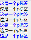
nth-child 修改指定位置元素的样式
nth-child : 修改指定位置的元素 或指定倍数的元素
<style>
    .box1 p:nth-child(2n-1) {
	 /* 此处修改的是奇数位元素的样式*/
      color: blue;
    }
</style>
完成后的总效果图:
伪元素
双冒号后面加上固定的关键词
创建示例所需的p标签:
	<p class="p1">
      这里有很多的文本这里有很多的文本这里有很多的文本这里有很多的文本这里有很多的文本这里有很多的文本这里有很多的文本这里有很多的文本这里有很多的文本这里有很多的文本这里有很多的文本这里有很多的文本这里有很多的文本
    </p>
first-line 修改第一行的样式
<style>
	.p1::first-line {
      color: red;
    }
</style>
first-line 修改第一个字的样式
<style>
	.p1::first-letter {
      color: red;
    }
</style>
after 在元素之后放下什么
<style>
	.p1::after {
      content: '🙂';
      /* content可以为空,但一定要写!*/
      /* content中表示文字类型的内容,这个微笑是打字打出来的,下面before同理 */
    }
</style>
before 在元素之前放下什么
<style>
	.p1::before {
      content: '🍌';
    }
</style>
伪元素部分总效果图展示:

盒模型
在网页中,一个元素占有空间的大小由几个部分构成,其中包括元素的内容(content),元素的内边距(padding),元素的边框(border),元素的外边距(margin)四个部分。
这四个部分占有的空间中,有的部分可以显示相应的内容,而有的部分只用来分隔相邻的区域或区域。4个部分一起构成了css中元素的盒模型。
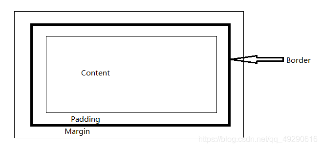
content 表示的显示的内容,大小和通过width和height来设置
padding 包裹在内容区域外部的空白空间 用padding进行设置 内边距
margin 最外面的区域 是盒子和其他元素之间的空白区域 用margin来设置 外边距
border 是盒子的厚度 大小用border去设置
  <div class="box1">
    内容 - content
  </div>
块级标签与内联元素盒模型的区别
块级标签
盒子会在内联的方向上扩展并占据父容器在该方向上的所有可用空间,在绝大数情况下意味着盒子会和父容器一样宽
每个盒子都会换行
width 和 height 属性可以发挥作用
内边距(padding), 外边距(margin) 和 边框(border) 会将其他元素从当前盒子周围“推开”
内联元素
盒子不会产生换行。
width 和 height 属性将不起作用。
垂直方向的内边距、外边距以及边框会被应用但是不会把其他处于 inline 状态的盒子推开。
水平方向的内边距、外边距以及边框会被应用且会把其他处于 inline 状态的盒子推开。
盒子的外边距(Margin)设置
<style>
	 .box {
      background-color: #efefef;
      width: 300px;
      height: 300px;

	  /* 直接写出每个外边距*/
      /* margin-top: 30px;
      margin-bottom: 20px;
      margin-left: 60px;
      margin-right: 40px; */

      /* margin: 60px; */
      /* 一次性设置所有的外边距 */

      /* margin: 30px 60px; */
      /* 两个值:第一个表示上下,第二个表示左右 */

      /* margin: 30px 60px 10px; */
      /* 三个值 第一个上边 第二左右 第三下边 */

      margin: 30px 60px 10px 5px;
      /* 四个值 顺时针: 上右下左 */
      }
</style>
盒子的内边距(Padding)设置
与外边距规则一致
<style>
	 .box {
      background-color: #efefef;
      width: 300px;
      height: 300px;

      /* padding: 60px; */
      /* 一次性设置所有的内边距 */

      /* padding: 30px 60px; */
      /* 两个值:第一个表示上下,第二个表示左右 */

      /* padding: 30px 60px 10px; */
      /* 三个值 第一个上边 第二左右 第三下边 */

      padding: 30px 60px 10px 5px;
      /* 四个值 顺时针: 上右下左 */
      }
</style>
盒子的边框或厚度(Border)设置
	  直接设置所有边的属性,宽度 边框线类型 颜色
	  border: 3px solid white;

	  单独设置:
	  线的宽度
      border-width: 10px;
      线的类型
      border-style: dotted;
      /* dotted(点线)  soild(单实线)  double(双实线)  dashed(虚线)*/
      线的颜色
      border-color: red;

	  单独设置每一条边的样式 颜色,线的类型,宽度
      border-top: red dashed 10px;
      border-left: brown solid 10px;

	  弧度值
      border-radius: 50%;
      /* 左下,右下,左上,右上弧度*/
      border-bottom-left-radius: 10px;
      border-bottom-right-radius: 20px;
      border-top-left-radius: 30px;
      border-top-right-radius: 40px;
块级标签居中设置
	  /* 块级标签 */
      /* 让块级标签在父元素里水平居中,无法垂直居中 */
      margin: 0 auto;
      /* 让所有的值自适应计算,缩放页面时依然保持居中 */
      /* margin: 30px auto 30px auto;
      margin: 30px auto; */
      /* 内联元素,内联块级元素在父元素里水平居中,无法垂直居中,通过控制文本居中,来达到内联元素,内联块级元素水平居中的效果 */
      text-align: center;
创建示例样式所需div,span:
  <div class="box">
    <span>这是一个span标签</span>
  </div>
替代盒模型(IE盒模型)
给替代盒模型设置 width 和 height,设置的是 border box。width和height设置的大小等于border padding content加起来的宽高。
使用这个模型,所有宽度都是可见宽度,所以内容宽度是该宽度(width)减去边框(border-left+border-right)和填充(padding-left+ padding-right)部分。
浏览器默认会使用标准盒子模型。
如果需要使用替代盒模型,可以通过为其设置 box-sizing: border-box 来实现。
<style>
	 .box {
	  box-sizing: border-box;
</style>
标签显示模式 display
<style>
	 .box {
      display: inline;
      /* 将指定的元素转换为内联元素 */

      display: inline-block;
      /* 将指定的元素转换为内联块级元素 */

      display: block;
      /* 将指定元素转换为块级元素 */

      display: none;
      /* 将指定的元素隐藏起来,并且这个隐藏会失去宽高 */
    }
  </style>
图片样式设置
背景图片样式设置
background-repeat,background-size
	.box {
      border: 1px solid #000;
      /* background-image: url('../imgs/01be6c5e8aa690a801216518c2ae5d.jpg@2o.jpg'); */
      height: 600px;
      width: 600px;

      /* background-repeat: repeat;  */
      /* x轴和y轴重复铺满整个元素 (默认值)*/
      background-repeat: repeat-x;
      /* x轴铺满 */
      background-repeat: repeat-y;
      /* 不铺,只会显示一个 */
      background-repeat: no-repeat;


	  /* 调整背景图片大小 可以百分比,可以设置像素大小*/
	  background-size: 50% 50%;
      /* 百分比是相对当前元素进行百分比计算,一个值的时候控制宽高同时缩放,两个值时,第一个值为宽,第二个值为高 */
      /* background-size: 500px 500px; */

      }
background-color 背景颜色
	  background-color: transparent;
      /* html里可以调整颜色值的都支持:颜色的关键词,颜色十六进制的值#000000,rgb(),rgba(),hsl,hsla()
      transparent 透明 */
	  /* 实际开发最常用到:颜色十六进制的值#000000,rgb(),rgba() */
	  /* rgb():是通过Red Green Blue三元色,通过这三种颜色的不同浓度,来表示出不同的颜色。 */
	  /* rgba()
	  	 a代表透明度,取值范围0-1;
         0:完全透明;
         1:完全不透明 */
CSS常用样式
文字相关样式
文字状态:(font-style)
	.fontStyle {
      font-style: normal;
      /* 默认值(正常状态) */
      font-style: oblique;
      /* 字体倾斜 */
      font-style: italic;
      /* 字体倾斜 */
    }
设置文字的粗体值 (fontWeight)
	.fontWeight {
      /* font-weight: normal; 默认*/

      /* font-weight: bold; 加粗*/
      /* font-weight: bolder;  更粗*/

      font-weight: lighter;
      /* 变细 */
    }
英文字母大小写设置 (text-transform)
	.Transfrom {
      /* text-transform: uppercase; 字母大写 */
      /* text-transform: lowercase 字母全小写; */
      /* text-transform: capitalize; 单词的首字母大写 */
      /* text-transform: none; 默认值 */
    }
控制文本是否有上、下划线,删除线
text-decoration
	.decoration {
      /* text-decoration: underline; 下划线 */
      /* text-decoration: line-through; 删除线 */
      /* text-decoration: overline; 上划线 */
    }
阴影 (text-shadow,box-shadow)
推荐阴影的值不要超过8px,不然可能会不美观
样式设置:
	.shawdow {
	  /*   x轴距离  y轴距离  虚化值  颜色*/
      text-shadow: 4px 4px 10px #666;
      box-shadow: 4px 4px 10px red;
      margin: 20px 0;
    }
测试盒子:
  <div class="shawdow">
    这是很多字这是很多字这是很多字这是很多字这是很多字这是很多字这是很多字这是很多字这是很多字这是很多字
  </div>
运行结果:

文本对齐方式 (text-align)
样式设置:
	.textAlign {
      width: 300px;
      border: 1px solid #666;
      text-align: center;
      /* 居中 center 靠左 left 靠右 right */
    }
测试盒子:
<div class="textAlign">
    这是很多字这是很多字这是很多字这是很多字
</div>
运行结果: 
行间距 (line-height)
测试盒子:
<div class="lineHeight">
    这是很多字这是很多字这是很多字这是很这是很多字这是很多字这是很多字这是很这是很多字这是很多字这是很多字这是很这是很多字这是很多字这是很多字这是很这是很多字这是很多字这是很多字这是很这是很多字这是很多字这是很多字这是很这是很多字这是很多字
</div>
设置样式:
	.lineHeight {
      /* box-sizing: border-box; */
      border: 1px solid #666;
      height: 120px;

      /* line-height: 118px; */
      /* 虚假的让一个内联元素/或文本垂直居中 */

	  line-height: 1.5;
	  /* 设置行间距,推荐1.5倍或2倍,也可以直接调像素值,如118px */
	}

字间距,单词间距,段前间距
letter-spacing,word-spacing,text-indent
.spacing {
      /* letter-spacing: 16px; */
      /* 字和字之间间距 */
      /* word-spacing: 16px; */
      /* 单词与单词之间的间距 */
      text-indent: 2em;
      /* 段前间距,1em等于当前文本一个字的大小 */
}
font 将多个文本属性一次性设置
一步到位,但不推荐使用,因为一次性设置的值太多,且必须按照顺序写,易出错
.font {
      font: italic normal bold normal 3em/1.5 '隶书';
      /* font-style, font-variant, font-weight, font-stretch, font-size/line-height, and font-family */
      /* 按顺序写 */
 }
单行隐藏效果:省略号
	.box1 {
      white-space: nowrap;
      /* 文本不换行 */
      overflow: hidden;
      /* 超出的文本隐藏 */
      text-overflow: ellipsis;
      /* 将超出的部分显示为省略号 */
      height: 300px;
    }
示例用盒子:
  <div class="box box1">
    这是很多文字 这是很多文字 这是很多文字 这是很多文字 这是很多文字 这是很多文字 这是很多文字 这是很多文字 这是很多文字 这是很多文字 这是很多文字
  </div>
显示效果图:

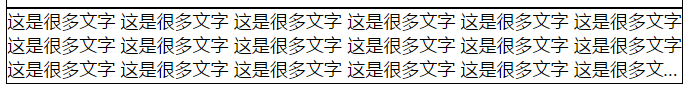
多行隐藏效果:省略号
样式设置:
	.box2 {
      height: 66px;
      display: -webkit-box;
      /* 将对象转换为弹性盒模型 */
      -webkit-box-orient: vertical;
      /* 设置弹性盒模型子元素的排列方式 */
      -webkit-line-clamp: 3;
      /* 限制文本行数 */
      overflow: hidden;
      /* 超出部分隐藏 */
      margin-bottom: 100px;
    }
示例用盒子:
<div class="box box2">
    这是很多文字 这是很多文字 这是很多文字 这是很多文字 这是很多文字 这是很多文字这是很多文字 这是很多文字 这是很多文字 这是很多文字 这是很多文字 这是很多文字这是很多文字 这是很多文字 这是很多文字 这是很多文字 这是很多文字
    这是很多文字这是很多文字 这是很多文字 这是很多文字 这是很多文字 这是很多文字 这是很多文字 这是很多文字 这是很多文字 这是很多文字 这是很多文字 这是很多文字 这是很多文字 这是很多文字 这是很多文字 这是很多文字
  </div>
运行结果:
css单位
绝对单位
像素-px
相对单位
em 在 font-size 中使用是相对于父元素的字体大小,在其他属性中使用是相对于自身的字体大小,如 width
rem 根元素的字体大小
滚动条设置
	.box1 {
	  /* 同时控制x,y轴上的滚动条 */
	  overflow: auto;
	  /* auto:默认值,元素需要滚动条时会出现滚动条,hidden代表隐藏滚动条,scroll代表必定会有滚动条 */

	  /* 单独控制x,y轴上的滚动条 */
      overflow-x: scroll;
      overflow-y: hidden;
    }
列表相关样式
设置无序列表前方的小圆点样式
list-style-type (list-style-image)
	 .ul_style {
	  /* 将无序列表的小圆点样式修改为:*/
      /* list-style-type: '-'; 指定字符 */
      /* list-style-type: disc; 实心圆
         list-style-type: circle; 空心圆
         list-style-type: square; 小方块
         */

      /* list-style-type: none; 去除前方的小圆点 */

	  /* 将前方小圆点修改为图片 */
      /* list-style-image: url('../imgs/admin/icon_帮助.svg'); */
    }
超链接相关样式(link,visited)
	a:link {
      /* 没有访问过的 */
      color: #666;
    }

    a:visited {
      /* 已经访问过的 */
      color: red;
    }
鼠标对超链接互动相关样式(hover,active)
	a:hover {
      /* 鼠标经过时 */
      font-size: 32px;
    }

    a:active {
      /* 鼠标按压时 */
      font-weight: bolder;
    }
元素的外围框
outline
	/* focus 聚焦 鼠标点击输入框时触发outline效果 */
	input:focus {
      outline: solid red;
      /* 元素的外围框 */
    }
点击效果:
导入外部字体样式
@font-face
导入外部字体:
	@font-face {
      font-family: '方正瘦金书简体';
      /* 给导入字体的文件起名字 */
      src: url('../css/方正瘦金书简体.ttf');
      /* 导入外部字体文件的地址 */
    }

    .family {
      font-family: '方正瘦金书简体';
      font-size: 32px;
    }
测试用盒子:
<!-- 外部的web字体 -->
  <div class="family">
    这是很多字这是很多字这是很多字这是很这是很多字这是很多字这是很多字这是很这是很多字这是很多字这是很多字这是很这是很多字这是很多字这是很多字这是很这是很多字这是很多字这是很多字这是很这是很多字这是很多字这是很多字
  </div>
页面效果:

定位 position
相对定位 relative
relative 相对浏览器进行移动
虽然你可以改变他在页面中的位置,但是原本的空间不会空出来
	.Relative {
      position: relative;
      /* 不推荐移动相对定位的元素 */
      width: 100px;
      height: 100px;
      background-color: black;
      color: #fff;
    }
绝对定位 absolute
absolute 相对于父元素进行移动
	.Absolute {
      position: absolute;
      /* bottom: 300;
      right: 300px; */
      left: 300px;
      top: 300px;
      /* 如果定位位置冲突了, 默认从左上角开始定位 */
      width: 100px;
      height: 100px;
      background-color: black;
      color: #fff;
      z-index: 9;
      /* z-index 决定了定位元素的堆叠顺序(上下层显示) */
    }
固定定位 fixed
fixed 根据浏览器的可见区域进行定位
类似于弹窗广告,你怎么滑动滚动条,他都在你当前页面的某个位置待着
	.Fixed {
      position: fixed;
      width: 100px;
      height: 300px;
      border-radius: 3px;
      text-align: center;
      padding: 10px;
      background-color: #e76262;
      right: 60px;
      top: 120px;
    }
静态定位 static
浮动布局
做一个例子:
<!DOCTYPE html>
<html lang="en">
<head>
<meta charset="UTF-8">
<meta http-equiv="X-UA-Compatible" content="IE=edge">
<meta name="viewport" content="width=device-width, initial-scale=1.0">
<title>Document</title>
<style>
* {
margin: 0;
padding: 0;
}
.div_content {
background: #efefee;
height: 140px;
/* overflow: hidden; */
}
.box {
height: 120px;
width: 120px;
margin: 10px;
background: #666;
float: left
}
.box3::after {
content: '';
/* display: block; */
clear: both;
}
.nav_content {
position: fixed;
top: 0;
left: 0;
background-color: #ffe300;
/* height: 56px; */
width: 100%;
z-index: 999;
}
.nav_content nav {
width: 800px;
/* height: 56px; */
margin: 0 auto;
}
ul {
list-style-type: none;
}
.ul_content {
height: 56px;
}
.ul_content>li {
float: left;
width: 120px;
text-align: center;
/* line-height: 56px; */
/* color: #666; */
position: relative;
cursor: pointer;
}
.ul_content>li>a {
color: #000;
text-decoration: none;
font-size: 12px;
display: inline-block;
line-height: 56px;
height: 56px;
width: 120px;
}
.ul_content>li:hover a {
background-color: #222;
color: #ffe300;
}
a.acitve {
font-weight: bolder;
}
.ul_item {
display: none;
box-sizing: border-box;
position: absolute;
width: 180px;
background-color: #fff;
text-align: left;
left: 0;
border-bottom-left-radius: 6px;
border-bottom-right-radius: 6px;
box-shadow: 0px 2px 4px #fafafa;
}
.ul_item>li {
padding: 10px;
line-height: 24px;
margin: 8px 0;
}
.ul_item>li:hover {
background-color: #ffe300;
}
/* 如果要改变:hover对象本身的样式,直接在后面追加{},里面写样式 */
/* 如果要改变:hover对象里面子元素的样式,父元素:hover[空格]子元素{写样式} */
/* 如果要改变:hover对象里兄弟元素(同层同级别)的样式 兄元素:hover~弟元素{写样式} */
.ul_content>li:hover .ul_item {
display: block;
}
.zhanwei {
height: 400px;
background-color: #efefef;
color: #fff;
padding: 10px;
text-align: center;
margin-bottom: 10px;
}
.content .zhanwei:first-child {
margin-top: 56px;
}
</style>
</head>
<body>
<!-- <div class="div_content">
<div class="box box1"></div>
<div class="box box2"></div>
<div class="box box3"></div>
</div> -->
<div class="nav_content">
<nav>
<ul class="ul_content">
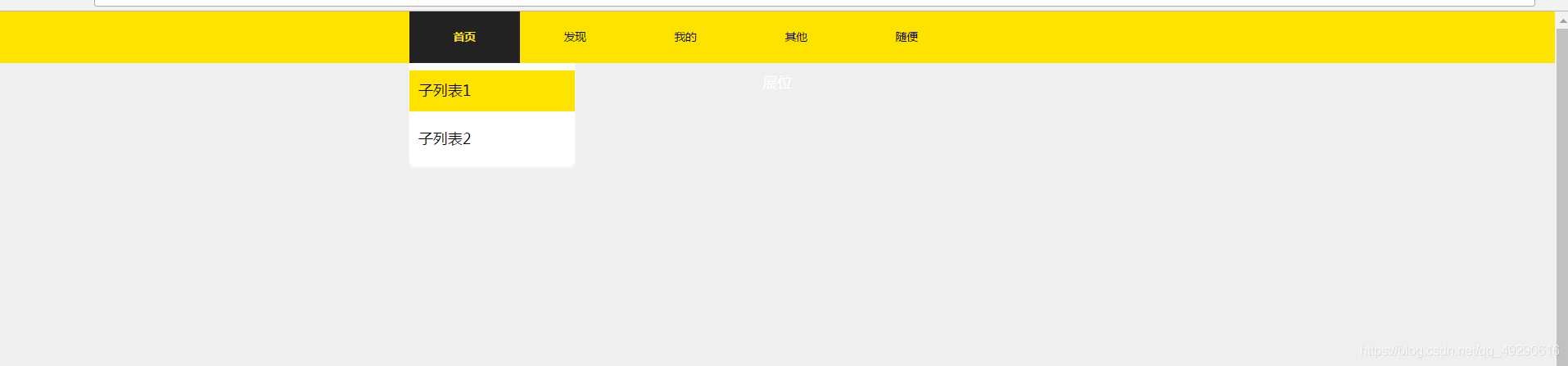
<li>
<a class="acitve" href="">首页</a>
<ul class="ul_item">
<li>子列表1</li>
<li>子列表2</li>
</ul>
</li>
<li><a href="">发现</a>
<ul class="ul_item">
<li>子列表1</li>
<li>子列表2</li>
</ul>
</li>
<li><a href="">我的</a>
<ul class="ul_item">
<li>子列表1</li>
<li>子列表2</li>
<li>子列表3</li>
</ul>
</li>
<li><a href="">其他</a></li>
<li><a href="">随便</a></li>
</ul>
</nav>
</div>
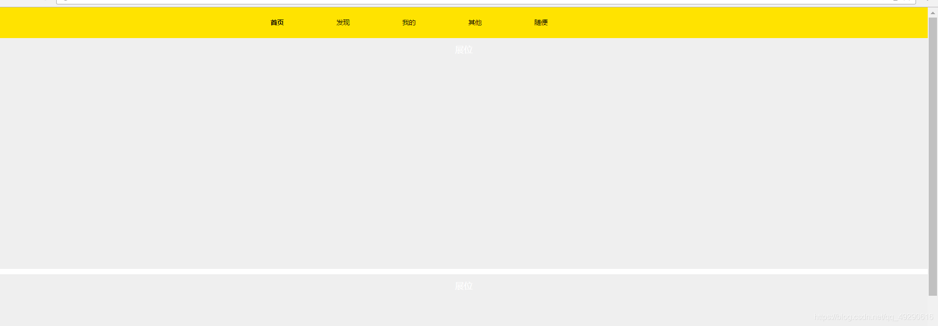
<div class="content">
<div class="zhanwei">展位</div>
<div class="zhanwei">展位</div>
<div class="zhanwei">展位</div>
</div>
</body>
</html>
页面显示图:
弹性盒子布局
body部分:
<body>
  <div class="box1">
    <span class="box_item">
      box_item1
    </span>
    <span class="box_item">
      box_item2
    </span>
    <span class="box_item">
      box_item3
    </span>
    <span class="box_item">
      box_item3
    </span>
    <span class="box_item">
      box_item3
    </span>
    <span class="box_item">
      box_item1
    </span>
    <span class="box_item">
      box_item2
    </span>
    <span class="box_item">
      box_item3
    </span>
    <span class="box_item">
      box_item3
    </span>
    <span class="box_item">
      box_item3
    </span>
    <span class="box_item">
      box_item1
    </span>
    <span class="box_item">
      box_item2
    </span>
    <span class="box_item">
      box_item3
    </span>
    <span class="box_item">
      box_item3
    </span>
    <span class="box_item">
      box_item3
    </span>
  </div>
</body>
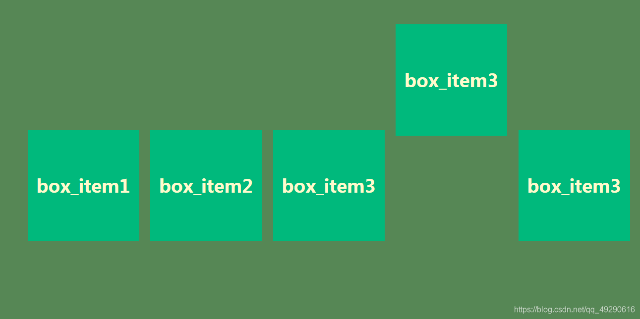
弹性盒子样式设置:
	* {
      margin: 0;
      padding: 0;
    }

	.box1 {
      height: 600px;
      background-color: #568755;
      padding: 50px;
      /* -------------------------- */
      /* 父容器中常用到的属性 */
      display: flex;
      /* 将父元素变成了属于弹性盒子的容器, 子元素将具备弹性盒子特性*/


	  flex-direction: row;
      /* 决定了子元素(项目)在主轴上的方向 */
      /* flex-direction: row | row-reverse | column | column-reverse; */
      /* row(默认值):主轴为水平方向,起点在左端。
         row-reverse:主轴为水平方向,起点在右端。
         column:主轴为垂直方向,起点在上沿。
         column-reverse:主轴为垂直方向,起点在下沿。 */


      flex-wrap: nowrap;
      /* 子元素换行的方式 */
      /* flex-wrap: nowrap | wrap | wrap-reverse; */
      /* nowrap(默认):不换行。
         wrap:换行,第一行在上方。
         wrap-reverse:换行,第一行在下方。
      */


      /* 定义了子元素在x轴上的对齐模式 */
      justify-content: flex-start;
      /*
        flex-start(默认值):左对齐
        flex-end:右对齐
        center: 居中
        space-between:两端对齐,项目之间的间隔都相等。
        space-around:每个项目两侧的间隔相等。
       */


      align-items: center;
      /* 定义了子元素在y轴(交叉轴)上的对齐方式 */
      /*
        flex-start:交叉轴的起点对齐。
        flex-end:交叉轴的终点对齐。
        center:交叉轴的中点对齐。
        */
    }
元素挤压效果 flex-shrink
	.box_item {
      background-color: #00b97c;
      margin: 10px;
      height: 200px;
      width: 200px;
      color: lemonchiffon;
      text-align: center;
      line-height: 200px;
      font-size: 32px;
      font-weight: bold;
      /* -------------------------- */
      /* 项目中常用的属性 */
      flex-shrink: 0;
      /* 1 (默认值)代表空间不足时会自动将项目(子元素)进行挤压
         非1的数,表示不会挤压项目
      */
    }
项目y轴排列方式
子元素中某个项目,或者多个项目在y轴上的排列方式
	.box1 .box_item:nth-child(4) {
      align-self: flex-start;
      /*
        flex-start:交叉轴的起点对齐。
        flex-end:交叉轴的终点对齐。
        center:交叉轴的中点对齐。
        */
    }
显示效果:


 扫一扫
扫一扫


 1390
1390

 被折叠的 条评论
为什么被折叠?
被折叠的 条评论
为什么被折叠?
 到【灌水乐园】发言


