


 本文展示了如何使用CSS和HTML创建一个3D旋转动画,通过`.box`元素及其内部子元素的变换,实现六面体在不同角度的动态旋转。关键帧动画让 `.box1-6` 各种颜色的盒子以独特路径旋转,是前端视觉效果的实战教程。
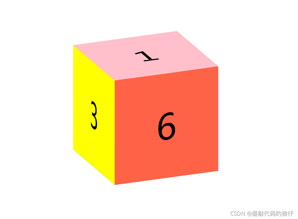
代码如下
css代码:
<style>
.box{
width: 300px;
height: 300px;
margin: 200px auto;
position: relative;
transform-style: preserve-3d;
transform:rotateX(-20deg) rotateY(20deg);
font-size: 100px;
text-align: center;
line-height: 300px;
animation: movee 10s linear infinite;
}
@keyframes movee{
0%{
transform:rotateX(-20deg) rotateY(20deg);
}
50%{
transform:rotateX(-20deg) rotateY(380deg);
}
100%{
transform:rotateX(-380deg) rotateY(380deg);
}
}
.box>div{
position: absolute;
left: 0;
top: 0;
}
.box1{
width: 300px;
height: 300px;
background-color: pink;
transform: rotateX(90deg) translateZ(150px);
}
.box2{
width: 300px;
height: 300px;
background-color: green;
transform: rotateX(-90deg) translateZ(150px);
}
.box3{
width: 300px;
height: 300px;
background-color: yellow;
transform: rotateY(-90deg) translateZ(150px);
}
.box4{
width: 300px;
height: 300px;
background-color: red;
transform: rotateY(90deg) translateZ(150px);
}
.box5{
width: 300px;
height: 300px;
background-color: palegreen;
transform: rotateY(180deg) translateZ(150px);
}
.box6{
width: 300px;
height: 300px;
background-color: blue;
transform: translateZ(150px);
}
</style>
HTML代码:
<div class="box">
<div class="box1">1</div>
<div class="box2">2</div>
<div class="box3">3</div>
<div class="box4">4</div>
<div class="box5">5</div>
<div class="box6">6</div>
</div>


 扫一扫
扫一扫


 8353
8353

 被折叠的 条评论
为什么被折叠?
被折叠的 条评论
为什么被折叠?
 到【灌水乐园】发言


