


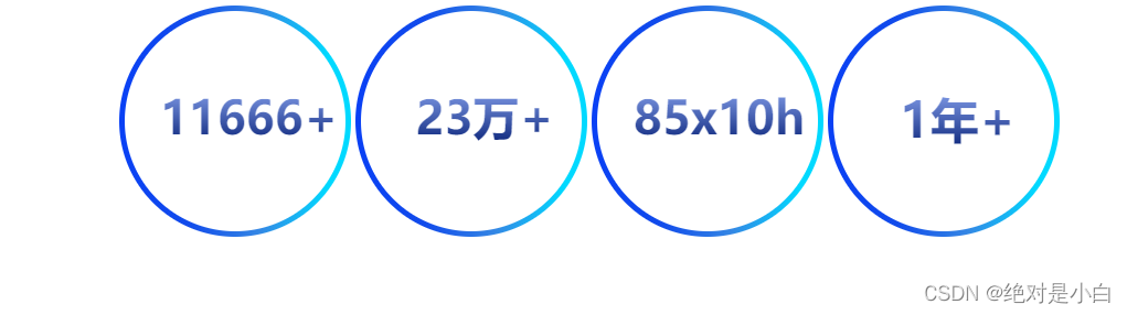
1.实现文字渐变色
<style>
.text{
 background-image: -webkit-linear-gradient(bottom, rgb(7, 33, 119), rgb(151, 178, 252), rgb(0, 217, 255));
            -webkit-background-clip: text;
            -webkit-text-fill-color: transparent;
}
</style>
2.实现圆以及边框渐变色
 <style>
        .circle {
            width: 100%;
            height: 100%;
            background: #fff;
            border-radius: 50%;
        }

        .content {
            width: 210px;
            height: 210px;
            box-sizing: border-box;
            padding: 5px;
            border-radius: 50%;
//边框色
            background-image: -webkit-linear-gradient(left, rgb(9, 64, 245) 0%, rgb(17, 75, 235) 30%, rgb(52, 134, 228) 60%, rgb(0, 217, 255) 90%);
        }


    </style>
<body>
<div class="content">
      <div class="circle">
</div>
</div>
</body>
3.js实现数字递增
<script>
 function NumAutoPlusAnimation(targetEle, options) {

        options = options || {};

        var $this = document.getElementById(targetEle),
            time = options.time || $this.data('time'), //总时间--毫秒为单位
            finalNum = options.num || $this.data('value'),
            regulator = optio
最低0.47元/天 解锁文章


 扫一扫
扫一扫


 被折叠的 条评论
为什么被折叠?
被折叠的 条评论
为什么被折叠?
 到【灌水乐园】发言


