


 本文介绍如何通过CSS的`:hover`伪类和关键帧动画,改变`flex`属性,实现在鼠标悬停时网格布局中子元素的尺寸变化,以达到类似表格的效果。
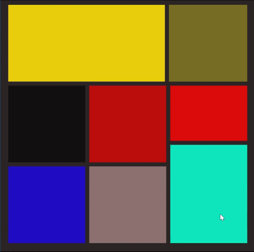
一、使用效果
老规矩,先看看实现的效果,如下
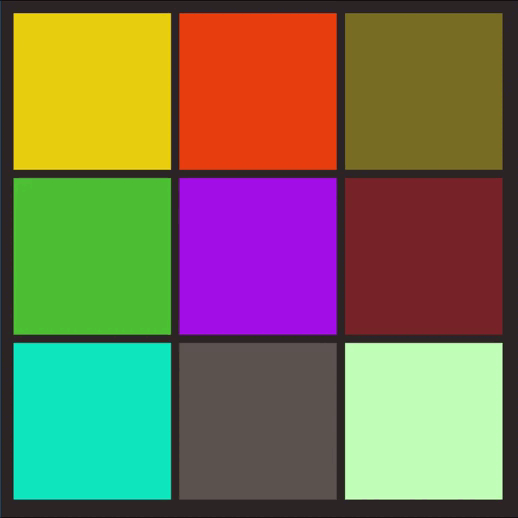
原理很简单:通过:hover+关键帧将子元素的flex:1改为flex:2,代码如下
二、代码
<!DOCTYPE html>
<html lang="en">
  <head>
    <meta charset="UTF-8" />
    <meta http-equiv="X-UA-Compatible" content="IE=edge" />
    <meta name="viewport" content="width=device-width, initial-scale=1.0" />
    <title>flex中的网格状布局</title>
  </head>
  <body>
    <div class="page">
      <div class="box">
        <div class="top">
          <div class="a"></div>
          <div class="b"></div>
          <div class="c"></div>
        </div>
        <div class="center">
          <div class="d"></div>
          <div class="e"></div>
          <div class="f"></div>
        </div>
        <div class="bottom">
          <div class="g"></div>
          <div class="h"></div>
          <div class="i"></div>
        </div>
      </div>
    </div>
  </body>
  <style>
    .page {
      display: flex;
      width: 100vw;
      height: 100vh;
      display: flex;
      justify-content: center;
      align-items: center;
      background-color: #2d2525;
    }

    .box {
      width: 600px;
      height: 600px;
      display: flex;
      flex-direction: column;
    }

    .box > div > div {
      margin: 5px;
    }
    .top {
      flex: 1;
      display: flex;
    }
    .top:hover {
      flex: 2;
      animation: big 0.5s;
    }
    .top > div:hover {
      flex: 2;
      animation: big 0.5s;
    }
    .center {
      flex: 1;
      display: flex;
    }
    .center:hover {
      flex: 2;
      animation: big 0.5s;
    }
    .center > div:hover {
      flex: 2;
      animation: big 0.5s;
    }
    .bottom {
      flex: 1;
      display: flex;
    }
    .bottom:hover {
      flex: 2;
      animation: big 0.5s;
    }
    .bottom > div:hover {
      flex: 2;
      animation: big 0.5s;
    }
    .a {
      flex: 1;
      background-color: #e7ce0f;
    }
    .b {
      flex: 1;
      background-color: #e73e0f;
    }
    .c {
      flex: 1;
      background-color: #786e24;
    }
    .d {
      flex: 1;
      background-color: #4ebf34;
    }
    .e {
      flex: 1;
      background-color: #a30fe7;
    }
    .f {
      flex: 1;
      background-color: #78242a;
    }
    .g {
      flex: 1;
      background-color: #0fe7bf;
    }
    .h {
      flex: 1;
      background-color: #5c5350;
    }
    .i {
      flex: 1;
      background-color: #c1ffb8;
    }
    @keyframes big {
      0% {
        flex: 1;
      }
      100% {
        flex: 2;
      }
    }
  </style>
</html>
三、更多的样式
同理,我们可以运用flex布局实现更多的表格形式,如下
参考文章:
关于flex布局可以参考这篇文章:弹性盒子布局详解(flex布局)-优快云博客


 扫一扫
扫一扫


 417
417

 被折叠的 条评论
为什么被折叠?
被折叠的 条评论
为什么被折叠?
 到【灌水乐园】发言


