


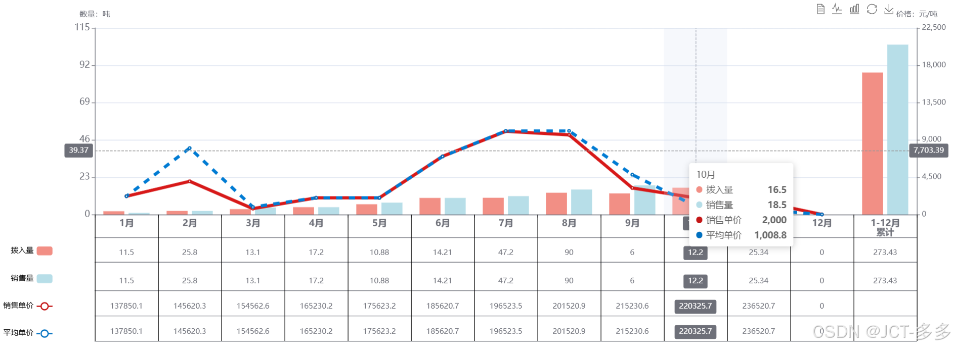
实现效果图:
实现代码:
<!DOCTYPE html>
<html lang="en">

<head>
    <meta charset="UTF-8">
    <meta name="viewport" content="width=device-width, initial-scale=1.0">
    <title>Document</title>
    <script src="../Assets/js/config.js"></script>
</head>

<body>
    <div id="main"></div>
</body>
<script>
    let map = {
        销售单价: [2200.0, 4000.9, 700.0, 2003.2, 2005.6, 7006.7, 10035.6, 9602.2, 3200.6, 2000.0, 1602.4, 0],
        市场价: [2200.6, 8005.9, 900.0, 2006.4, 2008.7, 7000.7, 10075.6, 10082.2, 4800.7, 1008.8, 600.0, 0],
        拨入量: [2.0, 2.2, 3.3, 4.5, 6.3, 10.2, 10.3, 13.4, 13.0, 16.5, 12.0, 0, 87.5],
        销售量: [1.0, 2.2, 4.3, 4.5, 7.3, 10.2, 11.3, 15.4, 18.0, 18.5, 12.0, 0, 104.7]
    };
    var myChart = echarts.init(document.getElementById('main'), null, {
        width: 1500,
        height: 550
    });
    var option = {
        darkMode: true,
        grid: {
            x: 150,
            y: 45,
            x2: 50,
            y2: 210,
        },
        tooltip: {
            trigger: "axis",
            axisPointer: {
                type: "cross",
                crossStyle: {
                    color: "#999"
                }
            }
        },
        toolbox: {
            feature: {
                dataView: { show: true, readOnly: false },
                magicType: { show: true, type: ["line", "bar"] },
                restore: { show: true },
                saveAsImage: { show: true }
            },
            right: 80,
        },
        legend: {
            align: "right",
            itemGap: 30,
            orient: "vertical",
            textStyle: { color: "#000" },
            bottom: 10,
            left: 0,
            data: ["拨入量", "销售量", "销售单价", "平均单价"]
        },
        xAxis: [
            {
                type: "category",
                max: 12,
                interval: Math.ceil(12) / 12,
                axisLabel: {
                    fontWeight: "bold",
                    show: true,
                    textStyle: {
                        // color: "#f4f4f4",
                        fontSize: "14px"
                    }
                },
                data: ["1月", "2月", "3月", "4月", "5月", "6月", "7月", "8月", "9月", "10月", "11月", "12月", "1-12月\n累计"],
                axisPointer: {
                    type: "shadow"
                }
            },
            {
                position: "bottom", // 将分组x轴位置定至底部,不然默认在顶部
                offset: 45, // 向下偏移,使分组文字显示位置不与原x轴重叠
                // axisLine: {
                //   show: false // 隐藏分组x轴的轴线
                // },
                axisTick: {
                    length: -200, // 延长刻度线做分组线
                    inside: true, // 使刻度线相对轴线在上面与原x轴相接,默认在轴线下方
                    lineStyle: { color: "#000" } // 非必须,仅为了演示,明显标示出分组刻度线
                    // interval: function(index, value) {
                    //   return index === 0 || index === 2 || index === 5; // 在0、5、6处各画一条刻度线
                    // }
                    // interval: 1,
                },
                // min: -30,
                max: 12,
                interval: 1,
                axisLabel: {
                    inside: true, // 使刻度名称相对轴线在上面与原x轴相接,默认在轴线下方
                    interval: 0 // 强制显示全部刻度名
                },
                data: [""]
            },
            {
                position: "bottom", // 将分组x轴位置定至底部,不然默认在顶部
                offset: 36, // 向下偏移,使分组文字显示位置不与原x轴重叠
                max: 12,
                interval: Math.ceil(12) / 12,
                axisTick: {
                    length: 0, // 延长刻度线做分组线
                    inside: true, // 使刻度线相对轴线在上面与原x轴相接,默认在轴线下方
                    lineStyle: { color: "#000" } // 非必须,仅为了演示,明显标示出分组刻度线
                },
                axisLabel: {
                    inside: true, // 使刻度名称相对轴线在上面与原x轴相接,默认在轴线下方
                    interval: 0 // 强制显示全部刻度名
                }
            },
            {
                position: "bottom", // 将分组x轴位置定至底部,不然默认在顶部
                offset: 75, // 向下偏移,使分组文字显示位置不与原x轴重叠
                max: 12,
                interval: 1,
                axisTick: {
                    length: 0, // 延长刻度线做分组线
                    inside: true, // 使刻度线相对轴线在上面与原x轴相接,默认在轴线下方
                    lineStyle: { color: "#000" } // 非必须,仅为了演示,明显标示出分组刻度线
                },
                axisLabel: {
                    inside: true, // 使刻度名称相对轴线在上面与原x轴相接,默认在轴线下方
                    interval: 0 // 强制显示全部刻度名
                },
                data: [11.5, 25.8, 13.1, 17.2, 10.88, 14.21, 47.2, 90, 6, 12.2, 25.34, 0, 273.43]
            },
            {
                position: "bottom", // 将分组x轴位置定至底部,不然默认在顶部
                offset: 120, // 向下偏移,使分组文字显示位置不与原x轴重叠
                max: 12,
                interval: Math.ceil(12) / 12,
                axisTick: {
                    length: 0, // 延长刻度线做分组线
                    inside: true, // 使刻度线相对轴线在上面与原x轴相接,默认在轴线下方
                    lineStyle: { color: "#000" } // 非必须,仅为了演示,明显标示出分组刻度线
                },
                axisLabel: {
                    inside: true, // 使刻度名称相对轴线在上面与原x轴相接,默认在轴线下方
                    interval: 0 // 强制显示全部刻度名
                },
                data: [11.5, 25.8, 13.1, 17.2, 10.88, 14.21, 47.2, 90, 6, 12.2, 25.34, 0, 273.43]
            },
            {
                position: "bottom", // 将分组x轴位置定至底部,不然默认在顶部
                offset: 160, // 向下偏移,使分组文字显示位置不与原x轴重叠
                max: 12,
                interval: 1,
                axisTick: {
                    length: 0, // 延长刻度线做分组线
                    inside: true, // 使刻度线相对轴线在上面与原x轴相接,默认在轴线下方
                    lineStyle: { color: "#000" } // 非必须,仅为了演示,明显标示出分组刻度线
                },
                axisLabel: {
                    inside: true, // 使刻度名称相对轴线在上面与原x轴相接,默认在轴线下方
                    interval: 0 // 强制显示全部刻度名
                },
                data: [137850.1, 145620.3, 154562.6, 165230.2, 175623.2, 185620.7, 196523.5, 201520.9, 215230.6, 220325.7, 236520.7, 0]
            },
            {
                position: "bottom", // 将分组x轴位置定至底部,不然默认在顶部
                offset: 200, // 向下偏移,使分组文字显示位置不与原x轴重叠
                max: 12,
                interval: 1,
                axisTick: {
                    length: 0, // 延长刻度线做分组线
                    inside: true, // 使刻度线相对轴线在上面与原x轴相接,默认在轴线下方
                    lineStyle: { color: "#000" } // 非必须,仅为了演示,明显标示出分组刻度线
                },
                axisLabel: {
                    inside: true, // 使刻度名称相对轴线在上面与原x轴相接,默认在轴线下方
                    interval: 0 // 强制显示全部刻度名
                },
                data: [137850.1, 145620.3, 154562.6, 165230.2, 175623.2, 185620.7, 196523.5, 201520.9, 215230.6, 220325.7, 236520.7, 0]
            }
        ],
        yAxis: [
            {
                type: "value",
                name: "数量:吨",
                // min: 0,
                max: Math.ceil(115),
                interval: Math.ceil(115) / 5,
                axisLabel: {
                    formatter: "{value}",
                    textStyle: {
                        // color: "#f4f4f4",
                        fontSize: "14px"
                    }
                }
            },
            {
                type: "value",
                name: "价格:元/吨",
                // min: 0,
                max: Math.ceil(22500),
                // splitNumber: 6,
                interval: Math.ceil(22500) / 5,
                axisLabel: {
                    formatter: "{value}"
                }
            }
        ],
        series: [
            {
                name: "拨入量",
                type: "bar",
                unit: "吨",
                groupName: "拨入/销售量",
                data: map["拨入量"],
                itemStyle: {
                    color: "rgb(242, 143, 133)"
                },
            },
            {
                name: "销售量",
                type: "bar",
                unit: "吨",
                groupName: "拨入/销售量",
                data: map["销售量"],
                itemStyle: {
                    color: "rgb(183, 222, 232)"
                }
            },
            {
                name: "销售单价",
                type: "line",
                yAxisIndex: 1,
                unit: "元/吨",
                data: map["销售单价"],
                itemStyle: {
                    color: "rgb(196, 23, 23)"
                },
                lineStyle: {
                    width: 5
                }
            },
            {
                name: "平均单价",
                type: "line",
                yAxisIndex: 1,
                unit: "元/吨",
                data: map["市场价"],
                itemStyle: {
                    color: "rgb(0, 112, 192)"
                },
                lineStyle: {
                    width: 5,
                    type: [10, 10],
                    dashOffset: 5
                }
            }
        ]
    };
    myChart.setOption(option);
</script>

</html>


 481
481

 被折叠的 条评论
为什么被折叠?
被折叠的 条评论
为什么被折叠?
 到【灌水乐园】发言


