


浮动布局
1、元素添加浮动属性后就会变成是块级元素,可以设置宽高
| 选项 | 说明 |
|---|---|
| left | 向左浮动 |
| right | 向右浮动 |
| none | 不浮动(默认) |
浮动会对后面的元素产生影响简单说,2个盒子,第一个添加浮动属性,第二个盒子会占据第一个盒子的位置,但是给第二个盒子添加浮动属性,对第一个盒子没有影响
示例一(给第二个盒子添加浮动)
<!DOCTYPE html>
<html lang="en">
  <head>
    <meta charset="UTF-8" />
    <meta
      name="viewport"
      content="width=device-width, initial-scale=1.0"
    />
    <title>Document</title>
    <style>
      main {
        box-sizing: border-box;
        width: 200px;
        height: 300px;
        border: 2px solid black;
        padding: 50px;
      }
      div {
        width: 100px;
        height: 100px;
        border: 3px solid blanchedalmond;
        /* float: left; */
      }
      div:nth-child(2) {
        background: yellowgreen;
        float: left;
      }
    </style>
  </head>
  <body>
    <main>
      <div></div>
      <div></div>
    </main>
  </body>
</html>
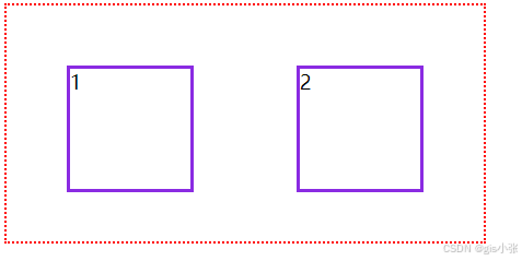
2、浮动是有边界的
下面示例大盒子中的小盒子浮动范围是不超过大盒子内边距的
<!DOCTYPE html>
<html lang="en">
  <head>
    <meta charset="UTF-8" />
    <meta
      name="viewport"
      content="width=device-width, initial-scale=1.0"
    />
    <title>Document</title>
    <style>
      main {
        width: 400px;
        height: 200px;
        border: 2px dotted red;
        padding: 50px;
        box-sizing: border-box;
      }
      div {
        height: 100px;
        width: 100px;
        border: 3px solid blueviolet;
      }
      div:nth-child(1) {
        float: left;
      }
      div:nth-child(2) {
        float: right;
      }
    </style>
  </head>
  <body>
    <main>
      <div>1</div>
      <div>2</div>
    </main>
  </body>
</html>
3、清除浮动
方法一:使用css提供的clear属性
| 选项 | 说明 |
|---|---|
| left | 清除左浮动 |
| right | 清除右浮动 |
| both | 清除左右浮动 |
示例
<!DOCTYPE html>
<html lang="en">
  <head>
    <meta charset="UTF-8" />
    <meta
      name="viewport"
      content="width=device-width, initial-scale=1.0"
    />
    <title>Document</title>
    <style>
      div:nth-child(1) {
        border: 1px solid red;
        float: left;
      }
      div:nth-child(2) {
        border: 1px solid green;
        float: right;
      }
      div:nth-child(3) {
        border: 1px solid blue;
        /* clear: left; 会跑到右边去*/
        /* clear: right;会跑到左边去 */
        clear: both; /*在原来的位置,不受浮动影响*/
      }
      div {
        width: 200px;
        height: 200px;
      }
    </style>
  </head>
  <body>
    <div></div>
    <div></div>
    <div></div>
  </body>
</html>
方法二:使用伪元素::after
方法三:在父元素中使用overflow:hidden触发bfc机制
<!DOCTYPE html>
<html lang="en">
  <head>
    <meta charset="UTF-8" />
    <meta
      name="viewport"
      content="width=device-width, initial-scale=1.0"
    />
    <title>Document</title>
    <style>
      main {
        border: 1px solid red;
        width: 400px;
        overflow:hidden//触发BFC机制
      }
      main::after {
        content: '';
        display: block;
        clear: both;
      }
      div {
        width: 100px;
        height: 100px;
        background-color: blue;
        margin: 10px;
        float: left;
      }
    </style>
  </head>
  <body>
    <main>
      <div></div>
      <div></div>
    </main>
  </body>
</html>
4、提升技巧,利用float属性,让元素显示不同的形状
| 选项 | 说明 |
|---|---|
| circle | 圆形 |
| ellipse | 椭圆 |
| polygon | 多边形 |
<!DOCTYPE html>
<html lang="en">
  <head>
    <meta charset="UTF-8" />
    <meta
      name="viewport"
      content="width=device-width, initial-scale=1.0"
    />
    <title>Document</title>
    <style>
      span {
        float: left;
        width: 100px;
        height: 100px;
        background-color: red;
        /* clip-path: circle(100% at 100px 0); at前面代表半径,后面代表圆心 */
        /* clip-path: ellipse(100% 50% at 100px 0);at前面代表长轴和短轴,后面代表圆心 */
        /* clip-path: polygon(100px 0, 100px 100px, 0 100px);每组坐标代表一个点,组成三角形 */
      }
    </style>
  </head>
  <body>
    <main>
      <span></span>
      <p></p>
    </main>
  </body>
</html>
定位布局
定位的基本思想很简单,它允许你定义元素框相对于其正常位置应该出现的位置,或者相对于父元素、另一个元素甚至浏览器窗口本身的位置。
定位类型
| 选项 | 说明 |
|---|---|
| static | 默认 |
| relative | 相对定位(相对于自己) |
| absolute | 绝对定位(相对于最近的有定位属性的祖先元素) |
| fixed | 固定定位(相对于视口) |
| sticky | 粘性定位 |
位置偏移
可以为部分类型的定位元素设置上、下、左、右 的位置偏移。
| 选项 | 说明 |
|---|---|
| top | 距离顶边 |
| bottom | 距离下边 |
| left | 距离左部 |
| right | 距离右部 |
通过定位设置元素尺寸
<!DOCTYPE html>
<html lang="en">
<head>
  <meta charset="UTF-8">
  <meta name="viewport" content="width=device-width, initial-scale=1.0">
  <title>Document</title>
  <style>
    main{
      position: relative;
      width: 200px;
      height: 200px;
      border: 2px solid blueviolet;
    }
    div{
      position: absolute;
      top: 50%;
      left: 50%;
      right: 0;
      bottom: 0;
      background-color: aqua;
    }
  </style>
</head>
<body>
  <main>
    <div></div>
  </main>
</body>
</html>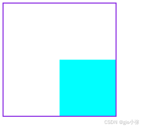
居中定位
<style>
  body {
    padding: 50px;
  }
  article {
    width: 400px;
    height: 400px;
    border: solid 6px blueviolet;
    position: relative;
  }
  div {
    width: 200px;
    height: 200px;
    background: #f2a67d;
    position: absolute;
    left: 50%;
    margin-left: -100px;
    top: 50%;
    margin-top: -100px;
  }

</style>

<article>
        <div></div>
    </article>
滚动行为
绝对定位元素会随着滚动条发生滚动
<style>
body {
padding: 50px;
}
main {
width: 300px;
height: 200px;
border: solid 10px blueviolet;
position: relative;
overflow: scroll;
}
main article {
height: 600px;
}
main article div {
width: 200px;
height: 200px;
position: absolute;
}
main article div:nth-of-type(1) {
background: red;
left: 0px;
z-index: 2;
}
</style>
...
<main>
<article>
<div></div>
</article>
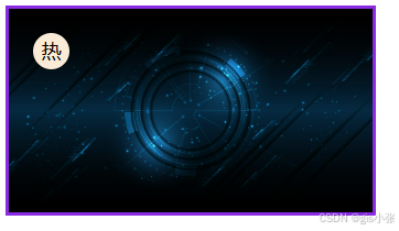
</main>图标定位
<!DOCTYPE html>
<html lang="en">
  <head>
    <meta charset="UTF-8" />
    <meta
      name="viewport"
      content="width=device-width, initial-scale=1.0"
    />
    <title>Document</title>
    <style>
      main {
        width: 300px;
        border: 3px solid blueviolet;
        overflow: hidden;
        /* padding: 0; */
        position: relative;
      }
      main > img {
        max-width: 300px;
        float: left;
      }
      span {
        display: inline-block;
        width: 30px;
        height: 30px;
        text-align: center;
        line-height: 30px;
        background-color: antiquewhite;
        border-radius: 50%;
        position: absolute;
        top: 20px;
        left: 20px;
        box-shadow: 0 5px 5px rgba(red, green, blue, 0.6);
      }
    </style>
  </head>
  <body>
    <main>
      <img
        src="./image/a4aa0643f204383fef56c4e21323fa07.jpg"
        alt=""
      />
      <span>热</span>
    </main>
  </body>
</html>
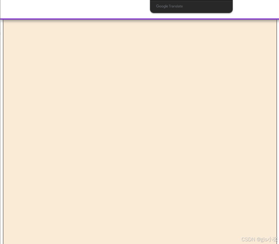
固定定位
<!DOCTYPE html>
<html lang="en">
  <head>
    <meta charset="UTF-8" />
    <meta
      name="viewport"
      content="width=device-width, initial-scale=1.0"
    />
    <title>Document</title>
    <style>
      header {
        position: fixed;
        height: 60px;
        border-bottom: 4px solid #7f35c9;
        box-shadow: 1px 5px 8px rgba(100, 100, 100, 0.6);
        /* z-index: 100; */
        background-color: #fff;
        top: 0;
        left: 0;
        right: 0;
      }
      article {
        height: 3000px;
        background-color: antiquewhite;
        border: 1px solid #000;
      }
    </style>
  </head>
  <body>
    <header></header>
    <article></article>
  </body>
</html>
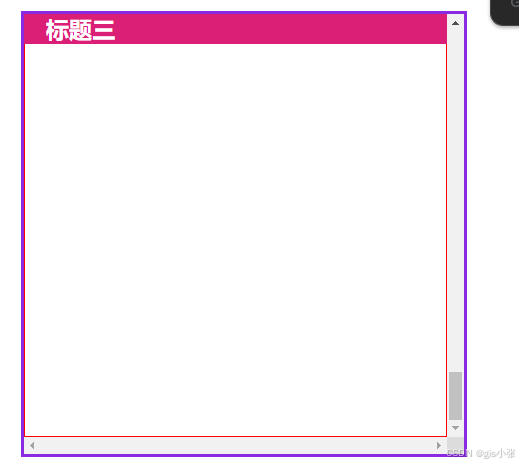
粘性定位
<!DOCTYPE html>
<html lang="en">
  <head>
    <meta charset="UTF-8" />
    <meta
      name="viewport"
      content="width=device-width, initial-scale=1.0"
    />
    <title>同级定位</title>
    <style>
      * {
        margin: 0;
        padding: 0;
      }
      main {
        padding: 30px;
        font-size: 14px;
      }
      main article {
        border: 3px solid blueviolet;
        width: 400px;
        height: 400px;
        overflow: scroll;
      }
      main article h2 {
        background-color: #db1f77;
        color: white;
        text-indent: 20px;
        position: sticky;
        top: 0;
      }
      main article section {
        height: 1000px;
        border: 1px solid red;
      }
    </style>
  </head>
  <body>
    <main>
      <article>
        <h2>标题一</h2>
        <section></section>
        <h2>标题二</h2>
        <section></section>
        <h2>标题三</h2>
        <section></section>
      </article>
    </main>
  </body>
</html>
掌握以上知识,恭喜你已经拿下浮动布局与定位布局了!!!


 扫一扫
扫一扫


 被折叠的 条评论
为什么被折叠?
被折叠的 条评论
为什么被折叠?
 到【灌水乐园】发言


