


1.css简介

1.1 什么是css
Cascading Style Sheet 层叠级联样式表
css : 表现(美化页面)
字体,颜色,边距,高度,宽度,背景图片,网页定位,网页浮动…
1.2 发展史
css1.0
css2.0 DIV(块)+css,html和css结构分离的思想,网页变得简单
css2.1 浮动,定位
css3.0 圆角,阴影,动画…浏览器兼容性
1.3 快速入门
<!DOCTYPE html>
<html lang="en">
<head>
    <meta charset="UTF-8">
    <title>Title</title>
<!--规范,<style>里可以写css代码
语法:
    选择器{
    声明1;
    声明2;
    }
-->
<style>
    h1{color: red}
</style>
</head>
<body>
<h1>我是标题</h1>
</body>
</html>
1.4 CSS的优势:
- 内容和表现分离
- 网页结构表现统一,可以实现复用
- 样式十分的丰富
- 建议使用独立html的css文件
- 利于SEO,容易被搜索引擎收录,Vue前端框架不容易被搜索引擎收录
1.5 CSS的3种导入方式
<!--优先级:就近原则-->
<!--内部样式-->
    <style>
        h1{
            color:green;
        }
    </style>
<!--外部样式-->
 <link rel="stylesheet" href="css/style.css">
</head>
<body>
<!--行内元素,在标签元素中,编写一个style属性,编写样式即可,如果有多个要用分号-->
<h1 style="color: red"></h1>
</body>
拓展:
外部样式两种写法
-
链接式:是html中
<!--外部样式--> <link rel="stylesheet" href="css/style.css"> -
导入式:css2.0中
    <style>
       @import url("css/style.css");
    </style>
1.6选择器
作用:选择页面上的某一个或者某一类元素
1基本选择器
1.标签选择器:选择一类标签 标签{}
<head>
    <meta charset="UTF-8">
    <title>Title</title>
    <style>
        /*标签选择器会选择到页面上所有的这个标签的元素*/
        h1{
            color: #13ce8f;
        }
    </style>
</head>
<body>
<!--idea中选择颜色式 color:#123131左边会有颜色选择器-->
<h1>java</h1>
<h1>cc</h1>
<p>前端</p>
</body>
2.类选择器 class
选择所有class属性一致的标签,跨标签 .类名{}
<head>
    <meta charset="UTF-8">
    <title>Title</title>
    <style>
        /*类选择器的格式  .class的名称{} 好处是可以多个标签归类也可以跨标签,是同一个class,可以复用同一个属性*/
        .wang{
            color: red;
        }
        .zi{
            color: aliceblue;
        }
        .jian{
            color: lightsalmon;
        }
    </style>
</head>
<body>
<h1 class="wang">sdf</h1>
<h1  class="zi">sdf</h1>
<h1 class="jian">sfdg</h1>
</body>
</html>
3.id选择器
全局统一 #id名{}
<head>
    <meta charset="UTF-8">
    <title>Title</title>
    /*
    id选择器:id必须保证全局唯一
    #id名称{}
    不遵循就近原则
    优先级:id选择器>class选择器>标签选择器
    */
    <style>
        #wang{
            color: #ff653f;
        }
    </style>
</head>
<body>
<h1 id="wang">sjkher</h1>
<h1>sjkher</h1>
<h1>sjkher</h1>
<h1>sjkher</h1>
<h1>sjkher</h1>
</body>
</html>
4.层次选择器
(为了好记起的名字)
1.后代选择器:在某个元素的后面
  /*后代选择器   body中所有p标签*/
    body p{
        background: red;
    }
2.子选择器
  /*子选择器  body下的第一层标签才有,后面的没有*/
     body>p{
         background: lightsalmon;
     }
3.相邻兄弟选择器
 /*兄弟选择器   active所定位的标签之下的一个同级p标签 */
    .active+p{
        background: darkred;
    }
<p class="active">p2</p>
<p>p3</p>
4.通用选择器
  /*通用兄弟选择器,当前选中元素的向下的所有兄弟元素*/
    .active~p{
        background: darkred;
    }
5.结构伪类选择器
伪类:条件,还有一些特效,鼠标移上去会显示 title="test"会有悬浮字
 <style>
        /*ul的第一个元素*/
        ul li:first-child{
            background: #ff653f;
        }
        /*ul的最后一个元素*/
        ul li:last-child{
            background: lightsalmon;
        }
    /*选中p1:定位到父元素,选择当前的第一个元素
     p:nth-child(1):选择当前p元素的父级元素,选中父级元素的第一个,并且是当前元素才生效。
    */
        p:nth-child(1){
            background: #13ce8f;
        }
        /*选中父元素下的p元素的第二个,类型*/
        p:nth-of-type(2){
            background: lightsalmon;
        }

        a:hover{
            /*鼠标移上去会有显示*/
            background: aqua;
        }
    </style>
</head>
<body>
<a href="">skhdfoi</a>
<p>p1</p>
<p>p2</p>
<p>p3</p>
<ul>
    <li>l1</li>
    <li>l2</li>
    <li>l3</li>
</ul>
</body>
</html>
6.属性选择器(常用)
id+class结合
<!DOCTYPE html>
<html lang="en">
<head>
    <meta charset="UTF-8">
    <title>Title</title>
    <style>
        .demo a{
            float:left;/*浮动*/
            display: block;
            height: 50px;
            width: 50px;
            border-radius: 10px;/*圆角边框*/
            background: aqua;
            text-align: center;/*对齐方式*/
            color: red;/*文字颜色*/
            text-decoration: none;/*去下滑线*/
            margin-right:5px;
            /*盒子模型,内边距,边框,外边距
            外边距,每个元素向右偏移5元素*/
            font: bold 20px/50px Arial;/*粗体,行高*/

        /* 属性名,属性名=属性值*/
            /*存在id属性的元素  a[属性名]{}*/
            a[id]{
                background: #13ce8f;
            }
            a[id=first]{
                background: blue;
            }
        /*class中有links的元素
        *=是包含这个元素
        ^=以这个开头
        $=以这个结尾
         */

          a[class*="links"]{
              background: deepskyblue;
          }
          /*选中href中以http开头的元素*/
        a[href^=http]{
            background: bisque;
        }
        a[href$=pdf]{
            background: yellow;
        }
        }
    </style>
</head>
<body>
<p class="demo">
    <a href="http://www.baidu.com" class="links item first" id="first">1</a>
    <a href="" class="links item active" target="_blank"  title="test">2</a>
    <a href="images/123.html" class="links item">3</a>
    <a href="images/123.png" class="links item">4</a>
    <a href="images/123.jpg" class="links item">5</a>
    <a href="abc" class="links item">6</a>
    <a href="/a.pdf" class="links item">7</a>
    <a href="/abc.pdf" class="links item">8</a>
    <a href="abc.doc" class="links item">9</a>
    <a href="abcd.doc" class="link item last">10</a>
</p>
</body>
</html>
2.美化网页
2.1为什么要美化网页
1.有效的传递页面信息
2.美化网页,网页漂亮,才能吸引用户
3.凸显页面的主题
4.提高用户体验
span标签:重点要突出的字,使用span套起来,实则没什么意义,是约定俗称的东西,就像div标签一样,往div标签中写一些样式
    <title>Title</title>
    <style>
        #title1{
            font-size:50px ;
        }
    </style>
</head>
<body>
欢迎学习<span id="title1">java</span>
</body>
</html>
2.2字体样式
<style>
        /* font-family 改字体样式 */
        /*font-size: 字体大小 */
        /*font-weight: 字体粗细*/
        /*color :字体颜色*/
        /*
        字体风格(斜体),字体粗细,字体大小,字体样式
          p{
          一般字体这样写
             font: oblique bolder 12px "楷体";
           }*/
        body{
            /* "Perpetua"是英文字体样式,楷体是中文字体样式,中间用逗号隔开;*/
            font-family: "Perpetua",楷体;
            color: darkred;
        }
        h1{
            font-size: 50px;
        }
        .p1{
            font-weight: bold;
        }
    </style>
</head>
<body>
<h1>介绍</h1>
<p>真柏,柏科属,匍匐灌木,高达75厘米,枝条延地面扩展,褐色,密生小枝,枝梢及小枝向上斜展。</p>
<p>刺形叶三叶交叉轮生,条状披针形,先端渐尖成角质锐尖头,长6-8毫米,上面凹,有两条白粉气孔带,气孔带常在上部汇合,
    绿色中脉仅下部明显,不达叶之先端,下面凸起,蓝绿色,沿中脉有细纵槽。球果近球形,被白粉,成熟时黑色,径8-9毫米,
    有2-3粒种子;种子长约4毫米,有棱脊。
</p>
<p>When I wake up in the morning,

      You are all I see;

      When I think about you,

      And how happy you make me。

      You're everything I wanted;

      You're everything I need;

      I look at you and know;

      That you are all to me。

      Barry Fitzpatrick
</p>
</body>
2.3文本样式
1.颜色 color rgb rgba
2.文本对齐方式 text-align=center
3.首行缩进 text-indent:2em
4.行高 line-height
5.装饰 text-decoration
6.文本图片水平对齐:vertical-align: middle;
<!DOCTYPE html>
<html lang="en">
<head>
    <meta charset="UTF-8">
    <title>Title</title>
<!--    颜色:单词,RGB 0~f,RGBA:透明度,渐变
         排版:text-align:center 居中
        首行缩进:text-indent: 1个1em是一个字
        行高:line-height;,和块的高度一致就可以上下居中
-->
    <style>
        h1{
            /*color: darkred;*/
            /*color: rgb(0,255,255);*/
            color: rgba(0,255,255,0.5);
            text-align: left;
        }
        .p1{
            text-indent: 2em;
        }
        .p3{
            background: #ff653f;
            height: 300px;
            line-height: 300px;
        }
        /*下划线*/
        .l1{
            text-decoration: underline;
        }
        /*中划线*/
        .l2{
            text-decoration: line-through;
        }
        /*上划线*/
        .l3{
            text-decoration: overline;
        }
        /*超链接去下划线*/
        a{
            text-decoration: none;
        }

    </style>
</head>
<body>
<p class="l1">sds</p>
<p class="l2">sds</p>
<p class="l3">sds</p>
<h1>介绍</h1>
<p>真柏,柏科属,匍匐灌木,高达75厘米,枝条延地面扩展,褐色,密生小枝,枝梢及小枝向上斜展。</p>
<p>刺形叶三叶交叉轮生,条状披针形,先端渐尖成角质锐尖头,长6-8毫米,上面凹,有两条白粉气孔带,气孔带常在上部汇合,
</p>
<p class="p3">
      When I wake up in the morning,

      You are all I see;

      When I think about you,

      And how happy you make me。

</p>
</body>
</html>

<!--    水平对齐~ 参照物,a,b -->
    <style>
        img,span{
            vertical-align: middle;
        }
    </style>
</head>
<body>
<p>
    <img src="images/a.png" alt="">
    fjgsegfgs
</p>
2.4阴影
     /* text-shadow: 阴影颜色,水平偏移,垂直偏移,阴影半径*/
        #price{
            text-shadow: deepskyblue 10px 10px 10px;
        }
2.5超链接伪类
正常情况下 a:hover
        /*默认的颜色*/
        a{
            text-decoration: none;
            color: #090a09;
        }
        /*鼠标悬浮的颜色(只需要记住hover)*/
        a:hover{
            color: orange;
        }
        /*鼠标按住未释放的状态*/
        a:active{
            color: green;
        }
        a:visited{
            color: darkred;
        }
        /* text-shadow: 阴影颜色,水平偏移,垂直偏移,阴影半径*/
        #price{
            text-shadow: deepskyblue 10px 10px 10px;
        }
    </style>
</head>
<body>
<a href="#">
    <img src="images/1.jpg" alt="">
</a>
<p>
    <a href="#">码出高效:java开发手册</a>
</p>
<p>
  <a href="">作者:孤尽</a>
</p>
<p id="price">
    ¥99
</p>
</body>
2.6 列表
        /*
        list-style:
        none 去掉圆点
        circle:空心圆
        decimal:数字
        square:正方形
        导航栏的话一般是<div id="nav"> </div>而不是<nav></nav>
        */
2.7背景
背景图片
背景颜色
<style>
        div{
            width: 1000px;
            height: 700px;
            border: 1px solid red;
            /*默认全部平铺  url资源的指定路径*/
            background-image: url("images/2.png");
            /*颜色 图片 图片位置 平铺方式*/
            background:red url(".../images/d.gif") 270px 10px no-repeat;
        }
        /*水平平铺*/
        .div1{
            background-repeat: repeat-x;
        }
        /*竖直平铺*/
        .div2{
            background-repeat: repeat-y;
        }
        /*不平铺,就一个图片*/
        .div3{
            background-repeat: no-repeat;
        }
    </style>
</head>
<body>
<div class="div1"></div>
<div class="div2"></div>
<div class="div3"></div>
</body>
</html>
2.8渐变
参考网站:https://www.grabient.com
<!DOCTYPE html>
<html lang="en">
<head>
    <meta charset="UTF-8">
    <title>Title</title>
<!--    径向渐变,圆形渐变-->
    把image去掉,直接当背景颜色。
    参考网站:https://www.grabient.com
    <style>
        body{
           /* background-color: #4158D0;
            background-image: -webkit-linear-gradient(66deg, #4158D0 0%, #C850C0 46%, #FFCC70 100%);
            background-image: -moz-linear-gradient(66deg, #4158D0 0%, #C850C0 46%, #FFCC70 100%);
            background-image: -o-linear-gradient(66deg, #4158D0 0%, #C850C0 46%, #FFCC70 100%);
            background-image: linear-gradient(66deg, #4158D0 0%, #C850C0 46%, #FFCC70 100%);*/
            background-color: #4158D0;
            background: -webkit-linear-gradient(66deg, #4158D0 0%, #C850C0 46%, #FFCC70 100%);
            background: -moz-linear-gradient(66deg, #4158D0 0%, #C850C0 46%, #FFCC70 100%);
            background: -o-linear-gradient(66deg, #4158D0 0%, #C850C0 46%, #FFCC70 100%);
            background: linear-gradient(66deg, #4158D0 0%, #C850C0 46%, #FFCC70 100%);
        }
    </style>
</head>
<body>
<p>
<h3>hfdsaldfk</h3>
</p>
</body>
</html>
3.盒子模型
3.1 什么是盒子模型
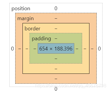
margin:外边距
padding:内边距
border:边框
3.2 边框
1.边框的粗细
2.边框的样式
3.边框的颜色
<style>
        /*body总有一个默认的外边距,外边距置为0*/
      h1,ul,li,a,body{
            margin: 0;
          padding: 0;
          text-decoration: none;
        }
        /*border: 粗细,样式:solid实线,dashed虚线,颜色*/
        #box{
            width: 300px;
            border: 1px solid red;

        }
        h2{
            font-size: 16px;
            background-color: #ff653f;
            line-height: 30px;
            color: ;
        }
        form{
            background: green;
        }
        div:nth-of-type(1) input{
            border: 3px solid black;
        }
        div:nth-of-type(2) input{
            border: 2px  dashed royalblue;
        }
    </style>
</head>
<body>
<div id="box">
    <h2>会员登录</h2>
    <form action="#">
        <div>
            <span>用户名:</span>
            <input type="text">
        </div>
        <div>
            <span>密码:</span>
            <input type="text">
        </div>
        <div>
            <span>邮箱:</span>
            <input type="text">
        </div>

    </form>
</div>

</body>
</html>
3.3 内外边距
<!DOCTYPE html>
<html lang="en">
<head>
    <meta charset="UTF-8">
    <title>Title</title>
<!--    外边距的妙用:居中  margin:上下0,左右居中-->
    <style>
        #box{
            width: 300px;
            border: 1px solid red;
            margin: 0 auto;
        }
        /*
        顺时针旋转,外边距
        margin:0
        margin:0 1px
        margin:0 1px 2px 3px 上右下左
        */
        h2{
            font-size: 16px;
            background-color: #ff653f;
            line-height: 30px;
            color: white;
            margin: 0 1px;
        }
        form{
            background: green;
        }

        input{
            border: 1px solid black;
        }
        div:nth-of-type(1){
            /*内边距同外边距一样,也有上右下左*/
            padding: 10px;
        }
    </style>
</head>
<body>
<!--养成习惯,所有东西套个div-->
<div id="box">
    <h2>会员登录</h2>
    <form action="#">
        <div>
            <span>用户名:</span>
            <input type="text">
        </div>
        <div>
            <span>密码:</span>
            <input type="text">
        </div>
        <div>
            <span>邮箱:</span>
            <input type="text">
        </div>

    </form>
</div>
</body>
</html>
盒子的计算方式:你这个元素到底多大?
margin+border+padding+内容宽度
3.4 圆角边框
4个角
<style>
    /*圆角边框border-radius:不能超过100px*/
    div{
        width: 50px;
        height: 50px;
        margin: 30px;
       background: red;
        border-radius: 50px 0px 0px 0px;
    }
    img{
        border-radius: 25px;
    }
</style>

</head>
<body>
<div></div>
<img src="images/2.png" alt="">
</body>
</html>
3.5 盒子阴影
    <meta charset="UTF-8">
    <title>Title</title>
    <style>
        img{
           margin: 0 auto;/*居中的要求,块元素,块元素有固定的宽度*/
            box-shadow: 10px 10px 1px yellow;
            border-radius: 50px;
        }
    </style>
</head>
<body>
<div style="width: 500px;display: block;text-align: center">
<img src="2.png" alt="">
</div>
</body>
4.浮动
4.1 标准文档流
网页内容不会被布局影响。
4.2 float
左右浮动 float
clear:both消除浮动
块级元素:独占一行
h1 p div 列表。。
行内元素:不独占一行,和width,和height无关
如:span a标签 img strong
4.3 display
可以把行内元素变成块元素,块元素变成行内元素,行内元素可以包含在块内元素中,display也是行内元素的一种方式,但是通常使用float
 /*
    block:块元素
    inline:行内元素
    inline-block:是块元素,但是可以内联,行元素,在一行
    none:变消失
    */
    <style>
        div{
            width: 100px;
            height: 100px;
            border: 1px solid red;
            display: inline;
        }
        span{
            width: 100px;
            height: 100px;
            border: 1px solid red;
            display: block;
        }
    </style>
</head>
<body>
<div>块元素</div>
<span>行内元素</span>
4.4父级边框塌陷的问题
/*左侧不允许有浮动*/
clear: left;
/*右侧不允许有浮动*/
clear: right;
/*两侧不允许有浮动*/
 clear: both;
解决方法
1.增加父级元素的高度
  #father{
            border: 1px solid red;
            height: 300px;
        }
2,增加空的div标签,清除浮动
<div class="clear"></div>
       clear{
            clear: both;
            padding: 0;
            margin: 0;
        }
3.overflow
在父级元素中添加一个overflow,大部分时候用hidden
    /*自动溢出
    overflow: hidden;隐藏
    overflow: scroll;滚动条
    */
    <style>
        cen{
            width: 200px;
            height: 150px;
            overflow: hidden;
        }
    </style>
    <div id="cen">
    <img src="" alt="">
    <p>shfdguesk;lkfelwfvesjlfkleskjbvjk;wlkfdekf</p>
</div>
4.在父类添加伪类:after
     #father:after{
           content: '';
            display: block;
            clear: both;
        }
小结:
1.浮动元素后面增加空div
简单,代码中尽量避免空div
2.设置父元素的高度
简单,元素假设有了固定的高度,就会被限制
3.overflow
下拉的一些场景避免使用
4.父类添加一个伪类:after(推荐使用)
对比
display
方向不可以控制
float
浮动起来的话会脱离标准文档流,所以要解决父级边框塌陷的问题
5.定位
5.1相对定位
<!--    相对定位,相对于自己原来的位置进行偏移-->
    <style>
        body{
            padding: 20px;
        }
        div{
            margin: 10px;
            padding: 5px;
            font-size: 12px;
            line-height: 25px;
        }
        #father{
            border: 1px solid red;
            padding: 0;
        }
        #first{
            border: 1px dashed #4158D0;
            background-color:#090a09 ;

            position: relative;/*相对定位:首先来个position,然后上下左右*/
            top: -20px;/*上*/
            left: 20px;/*左*/

        }
        #second{
            border: 1px dashed  #C850C0;
            position: relative;/*相对定位:上下左右*/
            bottom: 10px;/*下*/
            right: 20px;/*右*/
        }
        #third{
            border: 1px dashed  #13ce8f;
        }
    </style>
</head>
<body>
<div id="father">
    <div id="first">第一个盒子</div>
    <div id="second">第二个盒子</div>
    <div id="third">第三个盒子</div>
</div>

</body>
</html>
相对定位:position:relative
相对于原来的位置,进行指定的偏移,相对定位的话,它仍然在标准文档流中,原来的位置会被保留。
top: -20px;/*上*/
left: 20px;/*左*/
bottom: 10px;/*下*/
right: 20px;/*右*/
<style>
        #box{
            width: 300px;
            height: 300px;
            padding: 10px;
            border: 2px solid red;
        }
        a{
            width: 100px;
            height: 100px;
            text-decoration: none;/*去掉下划线*/
            background: #fd00f9;
            line-height: 100px;/*文本居中*/
            text-align: center;
            color: white;
            display: block;/*变块元素*/
        }
        .a2,.a4{
            position: relative;
            left: 200px;
            top: -100px;
        }
        .a5{
            position: relative;
            left: 100px;
            top: -300px;
            background: #4158D0;
        }
    </style>
</head>
<body>
<div id="box">
    <a class="a1" href="#">1</a>
    <a class="a2" href="#">2</a>
    <a class="a3" href="#">3</a>
    <a class="a4" href="#">4</a>
    <a class="a5" href="#">5</a>
</div>

</body>
</html>
5.2绝对定位
定位:基于。。定位,上下左右。
1.没有父级元素定位的前提下,相对于浏览器定位
2.假设父级元素存在定位,我们通常会相对于父级元素进行偏移。
3.在父级元素范围内移动
相对于浏览器或父级元素的位置,进行指定的偏移,相对定位的话,它不在标准文档流中,原来的位置不会被保留。
    <!--   绝对定位-->
    <style>
        body{
            padding: 20px;
        }
        div{
            margin: 10px;
            padding: 5px;
            font-size: 12px;
            line-height: 25px;
        }
        #father{
            border: 1px solid red;
            padding: 0;
            position: relative;
        }
        #first{
            border: 1px dashed #4158D0;
            background-color:#090a09 ;
        }
        #second{
            border: 1px dashed  #C850C0;
            position: absolute;/*绝对定位*/
            right: 20px;
            top: 10px;
        }
        #third{
            border: 1px dashed  #13ce8f;
        }
    </style>
</head>
<body>
<div id="father">
    <div id="first">第一个盒子</div>
    <div id="second">第二个盒子</div>
    <div id="third">第三个盒子</div>
</div>

</body>
</html>
5.3 固定定位 fixed
 <style>
        body{
            height: 1000px;
        }
        div:nth-of-type(1){
            width: 100px;
            height: 100px;
            background: red;
            position: absolute;/*绝对定位,相对于浏览器*/
            right: 0;
            bottom: 0;
        }
        div:nth-of-type(2){
            width: 50px;
            height: 50px;
            background: yellow;
            position: fixed;/*fixed  固定定位*/
            right: 0;
            bottom: 0;
        }
    </style>
</head>
<body>
<div>div1</div>
<div>div2</div>
</body>
</html>
5.4 z-index和透明度
图层:z-index:默认是0,最高无限~999
opacity: 0.5;/背景透明度/
#content{
    padding: 0;
    margin: 0;
    overflow: hidden;
    font-size:12px ;
    line-height: 25px;
    border: 1px solid red;
    width: 350px;
}
ul,li{
    padding: 0px;
    margin: 0px;
    list-style: none;
}
/*父级元素相对定位*/
#content ul{
    position: relative;
}
.tipText,.tipBg{
    position: absolute;
    with:380px;
    top: 216px;
    height: 25px;
}
.tipBg{
    background: #090a09;
}
.tipText{
    color: white;
    z-index: 999;/*设为999*/
    opacity: 0.5;/*背景透明度*/

}
<head>
    <meta charset="UTF-8">
    <title>Title</title>
    <link rel="stylesheet" href="style.css">
</head>
<body>
<div id="content">
    <ul>
        <li><img src="1.png" alt=""></li>
        <li class="tipText">前端</li>
        <li class="tipBg"></li>
        <li>时间:2099-1-1</li>
    </ul>
</div>
</body>
</html>
6.动画
html5Canvas动画:https://www.html5tricks.com/tag/html5-canvas/
例子:卡巴斯基网络威胁实时地图:https://cybermap.kaspersky.com/cn/


 扫一扫
扫一扫


 477
477

 被折叠的 条评论
为什么被折叠?
被折叠的 条评论
为什么被折叠?
 到【灌水乐园】发言


