利用vue中的组件通信原理 封装类似element-ui的按钮组件

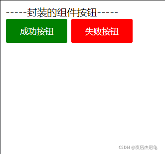
本文档展示了一个使用Vue.js封装的自定义组件,该组件实现了按钮的动态样式,包括成功和失败两种类型。组件通过props接收父组件传递的type值,并根据type值动态改变按钮的样式,如背景颜色、边框、文字颜色等。同时,按钮在鼠标按下、抬起、移入和移出时有不同的样式效果。

摘要生成于 C知道 ,由 DeepSeek-R1 满血版支持, 前往体验 >

<!DOCTYPE html>

<html lang="en">

<head>

    <meta charset="UTF-8">

    <meta http-equiv="X-UA-Compatible" content="IE=edge">

    <meta name="viewport" content="width=device-width, initial-scale=1.0">

    <title>document</title>

    <script src="./vue.js"></script>

</head>

<body>

    <div id="app">

        {{msg}} <br>

        <!-- 自定义属性type -->

        <el-button type='success'>成功按钮</el-button>

        <el-button type='error'>失败按钮</el-button>


    </div>

    <script>

        let bt = {

            props: {

                // 接收父组件传递过来的type值并设置值类型

                type: {

                    type: String,

                    default: '默认内容'

                }

            },

            // :style动态获取data内的style样式

            template: `

            <button  :style='style[type]' @mousedown='buttonDownAll(type)' @mouseup='buttonUpAll(type)' @mouseover='buttonOverAll(type)' @mouseleave='buttonLeaveAll(type)' >

                <slot></slot>

                </button>

            `,

            data() {

                return {

                    style: {

                        // 成功按钮静态样式

                        success: {

                            // 圆角边框(驼峰命名法 border-radius———>borderRadius)

                            // 本人样式设置的不好 还请自行更改样式

                            borderRadius: '3px',

                            backgroundColor: 'green',

                            color: 'white',

                            border: '1px solid white',

                            height: '40px',

                            width: '100px'

                        },

                        // 失败按钮默认样式

                        error: {

                            borderRadius: '3px',

                            backgroundColor: 'red',

                            color: 'white',

                            border: '1px solid white',

                            height: '40px',

                            width: '100px'

                        }

                    }

                }

            }, methods: {

                // 鼠标按下事件

                // 传入type值 通过swith case判断执行谁的样式

                buttonDownAll(type) {

                    switch (type) {

                        case 'success':

                            this.style.success = {

                                borderRadius: '3px',

                                backgroundColor: 'green',

                                color: 'white',

                                opacity: 0.8,

                                border: '1px solid white',

                                height: '40px',

                                width: '100px'

                            }

                            break;

                        case 'error':

                            this.style.error = {

                                borderRadius: '3px',

                                backgroundColor: 'red',

                                color: 'white',

                                border: '1px solid white',

                                height: '40px',

                                width: '100px',

                                opacity: 0.6,

                            }

                            break;

                        default:

                            console.log('没有该类型按钮');

                            break;

                    }

                },

                // 鼠标抬起事件(恢复默认样式)

                buttonUpAll(type) {

                    switch (type) {

                        case 'success':

                            this.style.success = {

                                borderRadius: '3px',

                                backgroundColor: 'green',

                                color: 'white',

                                opacity: 0.6,

                                border: '1px solid white',

                                height: '40px',

                                width: '100px'

                            }

                            break;

                        case 'error':

                            this.style.error = {

                                borderRadius: '3px',

                                backgroundColor: 'red',

                                color: 'white',

                                border: '1px solid white',

                                height: '40px',

                                width: '100px'

                            }

                            break;

                        default:

                            console.log('没有该类型按钮');

                            break;

                    }

                },

                // 鼠标移入事件

                buttonOverAll(type) {

                    switch (type) {

                        case 'success':

                            this.style.success = {

                                borderRadius: '3px',

                                backgroundColor: 'green',

                                color: 'white',

                                opacity: 0.6,

                                border: '1px solid white',

                                height: '40px',

                                width: '100px'

                            }

                            break;

                        case 'error':

                            this.style.error = {

                                borderRadius: '3px',

                                backgroundColor: 'red',

                                color: 'white',

                                border: '1px solid white',

                                height: '40px',

                                width: '100px',

                                opacity: 0.6,

                            }

                            break;

                        default:

                            console.log('没有该类型按钮');

                            break;

                    }

                },

                // 鼠标移出事件(恢复默认样式)

                buttonLeaveAll(type) {

                    switch (type) {

                        case 'success':

                            this.style.success = {

                                borderRadius: '3px',

                                backgroundColor: 'green',

                                color: 'white',

                                border: '1px solid white',

                                height: '40px',

                                width: '100px'

                            }

                            break;

                        case 'error':

                            this.style.error = {

                                borderRadius: '3px',

                                backgroundColor: 'red',

                                color: 'white',

                                border: '1px solid white',

                                height: '40px',

                                width: '100px'

                            }

                            break;

                        default:

                            console.log('没有该类型按钮');

                            break;

                    }

                }

            },

        }

        // Vue.component('el-button', bt)

        const vm = new Vue({

            el: '#app',

            data: {

                msg:'-----封装的组件按钮-----'

            },

            methods: {

            },

            components:{

                'el-button':bt,

            }

        })

    </script>

</body>

</html>

评论
添加红包

请填写红包祝福语或标题

红包个数最小为10个

红包金额最低5元

当前余额3.43前往充值 >
需支付:10.00
成就一亿技术人!
领取后你会自动成为博主和红包主的粉丝 规则
hope_wisdom
发出的红包
实付
使用余额支付
点击重新获取
扫码支付
钱包余额 0

抵扣说明:

1.余额是钱包充值的虚拟货币,按照1:1的比例进行支付金额的抵扣。
2.余额无法直接购买下载,可以购买VIP、付费专栏及课程。

余额充值