


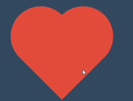
 本文分享了如何使用CSS3动画技巧制作一个酷炫的心形效果,适合前端开发者提升技能。通过关键帧动画实现45度旋转和缩放,带你领略前端视觉特效的魅力。
<style>
        * {
            margin: 0;
            padding: 0;
        }

        body {
            width: 100vw;
            height: 100vh;
            background-color: #34495e;
            display: flex;
            justify-content: center;
            align-items: center;
        }

        .heart {
            width: 200px;
            height: 200px;
            background: #e74c3c;
            transform: rotate(45deg) scale(.5);
            animation-name: hd;
            animation-duration: 2s;
            animation-iteration-count: 4;
            opacity: 0.5;
        }

        .heart::before {
            content: '';
            width: 200px;
            height: 200px;
            border-radius: 50%;
            position: absolute;
            background: #e74c3c;
            transform: translateX(-100px);
        }

        @keyframes hd {
            25% {
                opacity: 1;
                transform: rotate(45deg) scale(1);
            }
            50% {
                opacity: 0.5;
                transform: rotate(45deg) scale(.5);
            }
            75% {
                opacity: 1;
                transform: rotate(45deg) scale(1);
            }
            85% {
                opacity: 0.5;
                transform: rotate(45deg) scale(.5);
            }
            to {
                opacity: 1;
                transform: rotate(45deg) scale(1);
            }
        }

        .heart::after {
            content: '';
            width: 200px;
            height: 200px;
            border-radius: 50%;
            position: absolute;
            background: #e74c3c;
            transform: translateY(-100px);
        }
    </style>
</head>

<body>
    <div class="heart">

    </div>
</body>
视频学习:【香香的干货】这么牛X的css3 animation动画,你会用了吗?css 前端开发工程师必学干货分享_哔哩哔哩_bilibili


 扫一扫
扫一扫


 被折叠的 条评论
为什么被折叠?
被折叠的 条评论
为什么被折叠?
 到【灌水乐园】发言


