


1.概念: 块级格式化上下文,block formating context
*******BFC是一个容器,用于管理内部的块级元素如何布局,与区域外部不相关
2.如何触发一个盒子的BFC
(1)display: inline-block
(2)float: left/right
(3)position: absolut/fixed
(4)overflow: hidden
3.BFC布局规则
(1)块级元素独占一行:内部的box在垂直方向上依次排列
(2)触发BFC的元素可以看见浮动。ps:只有块级看不见浮动,出发了BFC的盒子和文本类元素可以看到浮动
(3)同一BFC内部相邻的box会发生margin重叠。 ps: margin重叠三个条件:1)块级元素, 2)属同一BFC, 3) 相邻
(4)***计算BFC高度时,浮动元素也参与计算(暂时还没遇到)
4.应用
(1)阻止垂直margin重叠
1)阻止相邻兄弟元素margin重叠(margin合并问题:垂直方向上的兄弟结构margin取最大值)
<style>
p{
width: 100px;
line-height:100px;
text-align: center;
border:solid 1px black;
margin: 100px;
}
.wrapper{
position: absolute;
}
</style>
<link href="" rel="stylesheet">
</head>
<body>
10000
<p>1</p>
<p>2</p>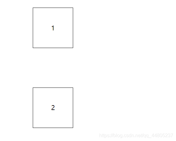
解决方法:
1)在p1外面包裹一层容器,并且触发容器的BFC;这样p1和p2就不在同一个BFC中了,不会出现margin合并。 p:也可以两者都加容器,并且触发BFC。只要保证不在同一个BFC内部就可以
2)一般不适用方法1,因为改变了HTML;一般增加margin的像素值,来达到想要的间距;或者单独增加margin-bottom的值
<style>
p{
width: 100px;
line-height:100px;
text-align: center;
border:solid 1px black;
margin: 100px;
}
.wrapper{
position: absolute;
}
</style>
<link href="" rel="stylesheet">
</head>
<body>
10000
<p>1</p>
<div class="wrapper">
<p>2</p>
</div>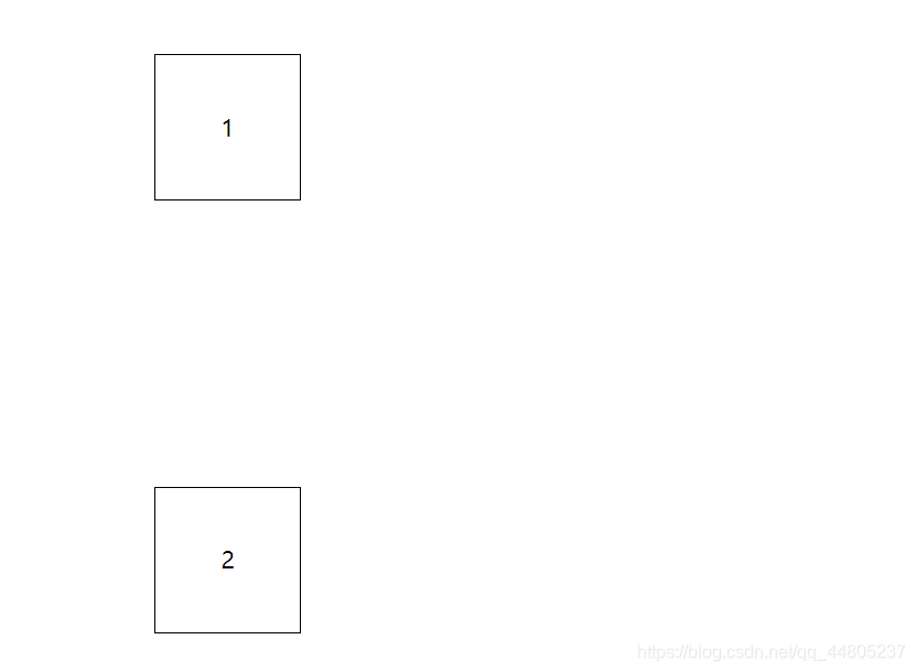
2)阻止父子元素margin重叠(margin塌陷问题:父子结构垂直方向上的margin取最大)(也叫margin值穿透)
条件: 父级盒子中 没有文字,没有边框,没有设置padding-top; 父子盒子一起按照两者最大的margin往下掉
表现:父子嵌套元素在垂直方向的margin,父子元素是结合在一起的,他们两个的margin会取其中最大的值
正常情况下,父级元素应该相对浏览器进行定位,子级相对父级定位.但由于margin的塌陷,父级相对浏览器定位.而子级没有相对父级定位,子级相对父级,就像坍塌了一样.
<style>
.box1{
width: 200px;
height: 200px;
background-color: red;
}
.box2{
width: 100px;
height: 100px;
background-color: green;
margin-top: 200px;
}
.wrapper{
position: absolute;
}
</style>
<link href="" rel="stylesheet">
</head>
<body>
10000
<div class="box1">
<div class="box2"></div>
</div>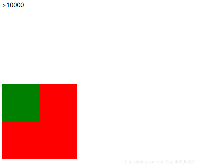
解决方法:
1) 为父级盒子设置边框或者内边距; 不建议使用
2)为父级盒子添加BFC(根据需要添加对应的BFC)
<style>
.box1{
width: 200px;
height: 200px;
background-color: red;
margin-top: 100px;
position: absolute;
}
.box2{
width: 100px;
height: 100px;
background-color: green;
margin-top: 200px;
}
.wrapper{
position: absolute;
}
</style>
<link href="" rel="stylesheet">
</head>
<body>
10000
<div class="box1">
<div class="box2"></div>
</div>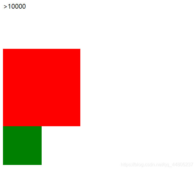
(2)触发BFC的元素能看到浮动,不会与产生浮动的元素重叠
利用BFC能看到浮动流的特点,实现自适应两栏布局
1)float:原始用法:实现报纸排版的文字环绕图片,如下代码蓝色区域所示:文字围绕着浮动元素排列
<style>
.box1{
width: 100px;
height: 100px;
float: left;
background-color: aqua;
}
.box2{
width: 200px;
height: 200px;
background-color: green;
/* overflow: hidden; */
}
</style>
<link href="" rel="stylesheet">
</head>
<body>
<!-- 10000 -->
<div class="box1">左浮动元素</div>
<div class="box2">
他大学预科毕业时获得的一份蒙台梭利学校的毕业文凭,以
及接受安娜•弗洛伊德在儿童精神分析方面的训练,是
他所获得的唯一的正规学业(相当于高中学历)。他完全成为
可以成为弗洛伊德所认为的精神分析家不必攻读医科专业的主
张的一名典型的范例。曾任匹滋堡大学医学院及哈佛大学医学
院的教授。
</div>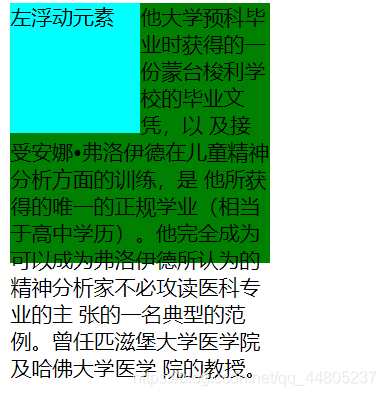
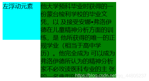
2)利用float与BFC实现自适应两栏布局:为box2添加overflow-hidden,触发BFC,消除浮动元素的影响。
左侧宽度固定,右侧自适应。
<style>
.box1{
width: 100px;
height: 100px;
float: left;
background-color: aqua;
}
.box2{
width: 200px;
height: 200px;
background-color: green;
overflow: hidden;
}
</style>
<link href="" rel="stylesheet">
</head>
<body>
<!-- 10000 -->
<div class="box1">左浮动元素</div>
<div class="box2">
他大学预科毕业时获得的一份蒙台梭利学校的毕业文凭,以
及接受安娜•弗洛伊德在儿童精神分析方面的训练,是
他所获得的唯一的正规学业(相当于高中学历)。他完全成为
可以成为弗洛伊德所认为的精神分析家不必攻读医科专业的主
张的一名典型的范例。曾任匹滋堡大学医学院及哈佛大学医学
院的教授。
</div>(3)利用BFC清除浮动
浮动元素会脱离文档流,使用浮动后需要清除浮动。
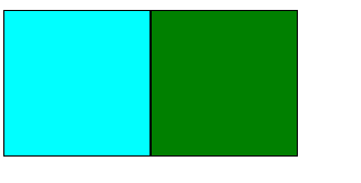
1)脱离文档流示例:box2设置inline-block前后,因为块级元素看不到浮动,触发BFC的盒子和文本类元素(inline-block)可以看到浮动
  <style>
    .box1{
      width: 100px;
      height: 100px;
      float: left;
      background-color: aqua;
      border: solid 1px black;
    }
    .box2{
      width: 100px;
      height: 100px;
      /* display: inline-block; */
      background-color: green;
      border: solid 1px black;
    }
  </style>
  <link href="" rel="stylesheet">
</head>
<body>
<!-- 10000 -->

<div class="box1"></div>
<div class="box2"></div>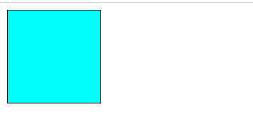
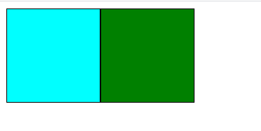
2)触发BFC清除浮动:
父级盒子触发BFC(这里使用的是overflow-hidden)前后:代码如下
wrapper内部的两个div产生了浮动,脱离了文档流,所以不能包裹到两个子元素。不能撑起没有设置宽高的父级

  <style>
    .box1{
      width: 100px;
      height: 100px;
      float: left;
      background-color: aqua;
      border: solid 1px black;
    }
    .box2{
      width: 100px;
      height: 100px;
      float: left;
      background-color: green;
      border: solid 1px black;
    }
    .wrapper{
      background-color: burlywood;
      /* overflow: hidden; */
    }
    /* .wrapper::after{
      content: ' ';
      clear: both;
      display: inline-block;
    } */
  </style>
  <link href="" rel="stylesheet">
</head>
<body>
<!-- 10000 -->
<div class="wrapper">
  <div class="box1"></div>
  <div class="box2"></div>
</div>
ps:这里使用伪元素清除浮动效果不好?


 扫一扫
扫一扫


 271
271

 被折叠的 条评论
为什么被折叠?
被折叠的 条评论
为什么被折叠?
 到【灌水乐园】发言


